
![]()
Chapter 7: Signs
This guide explains scoping and technical requirements in the ABA Standards for signs.
Notational tips for users of screen reading software follow. In this document ″ indicates inches and ′ indicates feet. Some images are paired with visually hidden notes. These annotations are prefaced with begin and end image notes.
Required Compliance
The Standards require accessible signs that are used to identify certain accessible elements and spaces. Other types of signs, however, including room numbers and room labels, are covered only where they are provided. The Standards address visual and tactile content on signs, where provided.
The following types of signs are exempt and not required to meet visual and tactile requirements:
- temporary (posted for 7 days or less);
- building addresses and directories;
- occupant names and company names and logos;
- menus;
- seat or row designations in assembly areas; and
- signs in non-public areas of detention or correctional facilities.
Signs covered by the Standards must meet specifications for visual requirements so that they are accessible to people with low vision. Several categories of signs also must meet tactile requirements so that they are accessible to people who are blind or have low vision. Tactile requirements primarily apply to signs typically located at doorways because doorways provide a cue for locating signs by touch.
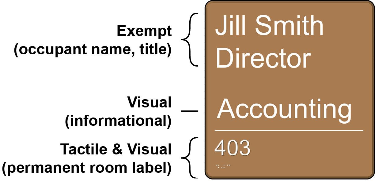
The requirements in this guide apply to certain types of content on signs. There can be multiple types of content provided on a single sign to which different provisions, as described below, may apply. For example, a single sign may provide a room number, which would be required to be visual and tactile, the hours of operation, which is only required to be visual, and the name of the occupant, which does not have to be visual or tactile. Each type of content provided must be evaluated to determine how the content must be made accessible.
Tactile Signs

|

|
|

|
Tactile requirements apply to these types of signs:
- interior and exterior signs identifying permanent rooms and spaces, where provided (§F216.2);
- required door labels at exit stairways, exit passageways, and exit discharge (§F216.4.1);
- required labels for floor levels, car controls, and emergency communication devices at elevators (§407.2.3.1, §407.2.3.2, §407.4.7.1.1, §407.4.9); and
- rail station identification signs at entrances and platforms or boarding areas (§810.6.1).
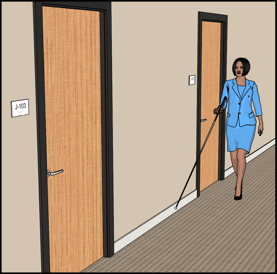
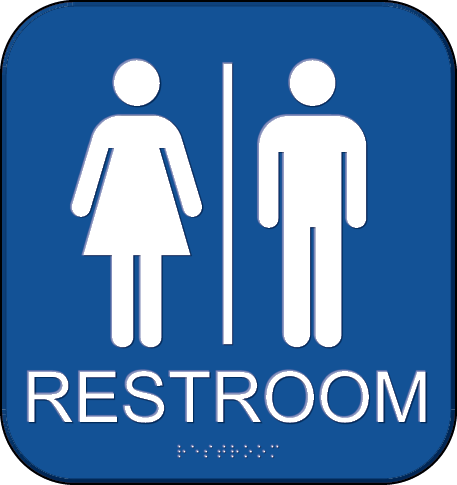
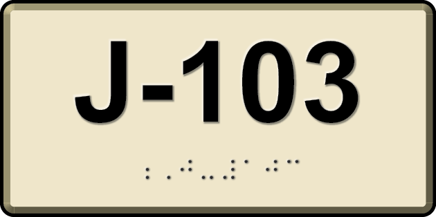
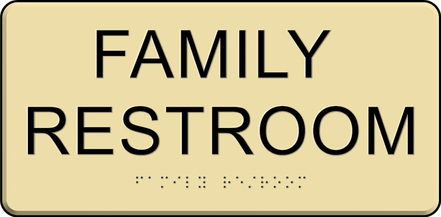
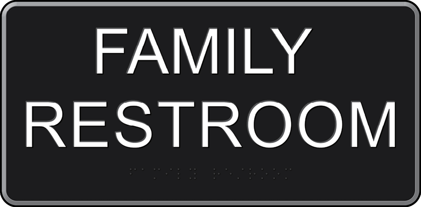
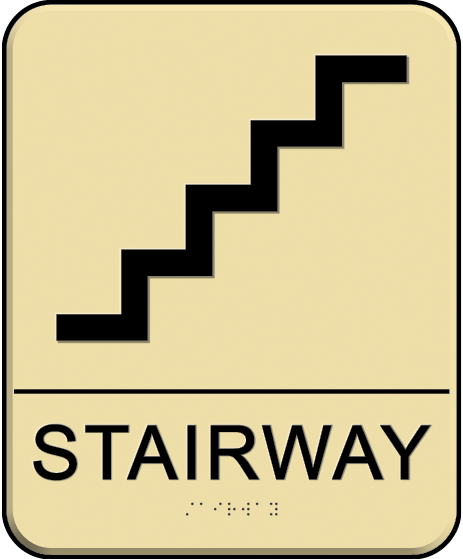
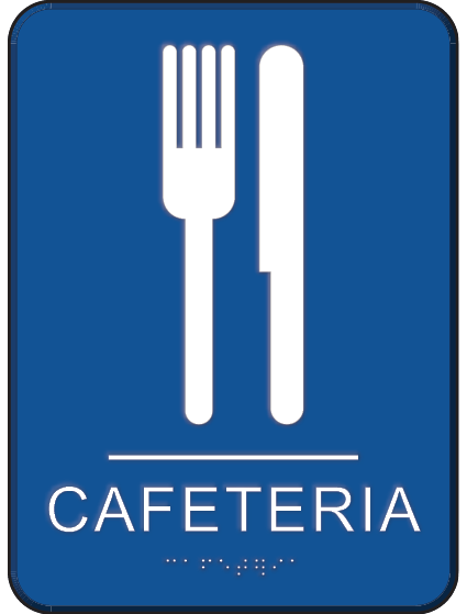
Designations of Permanent Rooms and Spaces
Signs that identify permanent rooms and spaces include:
- room and floor numbers or letters;
- room names; and
- labels for restrooms, locker rooms, cafeterias, libraries, conference rooms, mechanical rooms, and other permanent rooms or spaces.
Visual and tactile requirements apply to both interior and exterior signs labeling permanent rooms and spaces. However, exterior signs not located at the door to the space they serve do not have to be tactile but must meet visual requirements (§F216.2, Ex. 1).
|
|
|
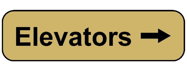
Directional and Informational Signs
Signs that provide direction to or information about interior spaces and facilities must meet visual requirements but are not required to be tactile. Examples of informational signs include instructions, rules of conduct, hours of operation, and similar content. Directional signs include all types of signs that provide direction to spaces and facilities. These requirements apply only where such signs are provided.
|

|

|
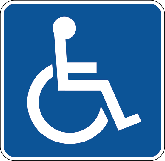
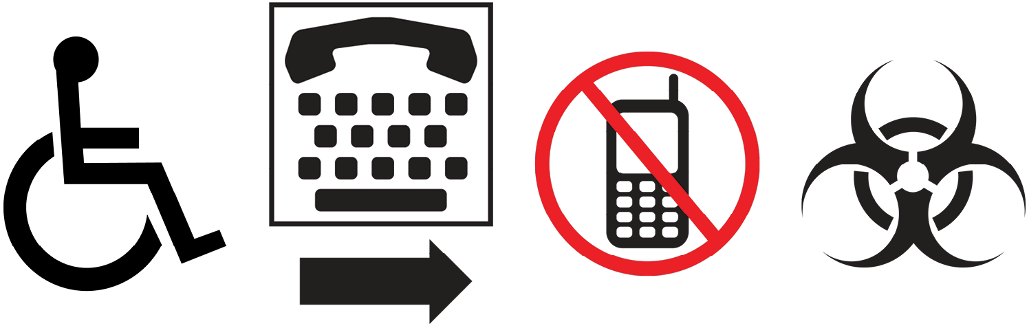
Required Accessibility Symbols
The Standards require certain spaces and elements be identified as accessible by providing signs that include International Symbols of:
- Accessibility;
- TTY, or Text Telephone which is a phone assistive device for people with hearing or speech impairments; or
- Access for Hearing Loss, which indicates availability of an assistive listening system.
|

|

|
Visual and Tactile Requirements on Single Sign
Tactile signs must have raised characters that are repeated in Grade 2 braille. In addition, they are subject to requirements for non-glare finish and color contrast for visual accessibility. Other information provided in addition to permanent room or space labels is not required to be raised or brailled but must meet visual criteria if informational or directional. Some information on such signs may be exempt, such as occupant names.
|
|
begin image notes.
Exempt (occupant name, title): Jill Smith; Director.
Visual (informational): Accounting.
Tactile & Visual (permanent room label): 403.
end image notes

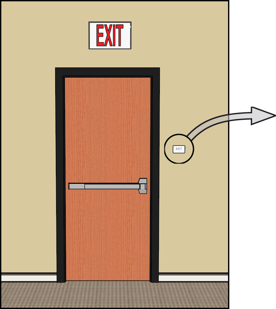
Means of Egress Signs
The Standards require that tactile and visual signs be provided to identify doors at exit stairways, exit passageways, and exit discharge. Exit passageways are horizontal fire resistance-rated components that lead to exit discharge or public ways. Exit discharge is the path from an exit to a public way.
Exit labels at other locations are not required to be tactile but must meet visual requirements. Life safety and building codes address the visibility and illumination of exit signs, which can also satisfy the visual requirements in the ABA Standards. At exit doors, the tactile requirements typically must be met on a separate sign.
|
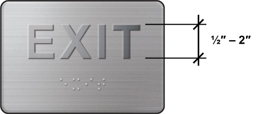
Begin image notes. Magnified cutaway detail shows tactile sign with raised letters E X I T having low contrast. The letters are dimensioned as half inch to two inchnes in height. Below the raised letters are four braille characters: e x i t. End image notes. When visual characters are provided on a separate sign (or separately on the same sign), tactile content does not need to meet finish and contrast requirements, and raised characters can have a slightly smaller character height (½ inch instead of ⅝ inch). |
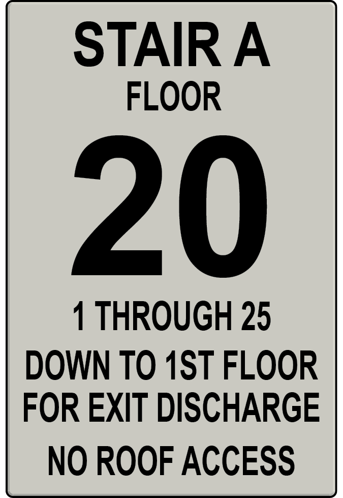
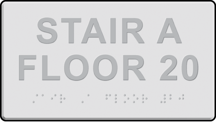
Begin image notes. Stair A, floor 20. 1 through 25, down to 1st floor, for exit discharge. No roof access. End image notes. |
|
Directional signs, including those for means of egress, required by the applicable life safety code, must comply with the visual requirements for information and directional signs (§703.5). In addition, directions to accessible means of egress required by the International Building Code (IBC) must meet visual criteria (§F216.4.3).
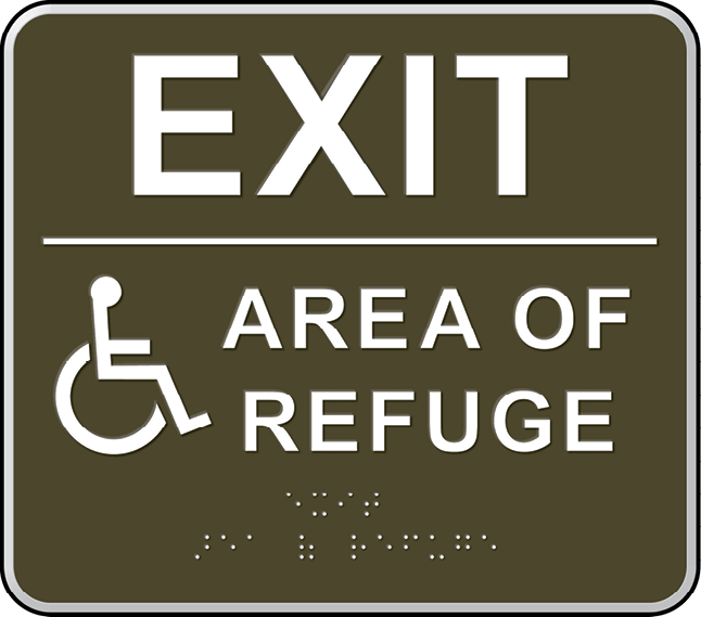
Areas of refuge are fire-resistance rated and smoke-protected areas where those persons who are unable to use stairs can register a call for evacuation assistance and await instructions or assistance. Required by the IBC in some buildings, areas of refuge must provide direct access to an exit stairway (or to an elevator equipped with standby power). Signs labeling areas of refuge must be tactile since they designate a permanent space.
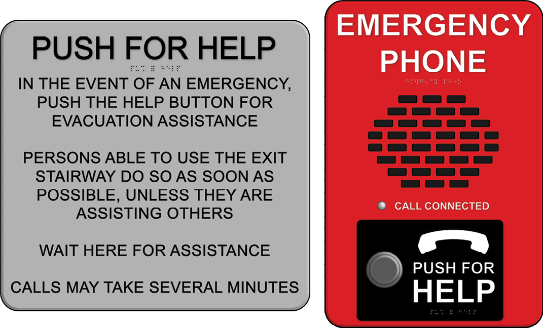
Begin image notes.
PUSH FOR HELP sign continutes: In the event of an emergency, push the help button for evacuation assistance.
Persons able to use the exit stairway do so as soon as possible, unless they are assisting others.
Wait here for assistance.
Calls may take several minutes.
Red speaker grill with EMERGENCY PHONE in large white letters.
Indicator lamp labled quote call connected unquote.
Large button labled with picture of telephone hand seet and quote push for HELP unquote.
End image notes.
Elevator Signs and Labels
The Standards require tactile signs (and, in some cases, symbols) at elevators, including labels for:
- floor designations at elevator hoistways (§407.2.3.1);
- destination-oriented elevator cars (§407.2.3.2);
- car control buttons (§407.4.7.1.1); and
- emergency communication devices (§407.4.9).
For signs at elevators, most of the criteria for raised and braille characters apply, but there are differences. For example, raised characters can be at least 2 inches high on hoistway floor level signs, and tactile content on control panels can be located outside the standard 48 inches – 60 inches mounting height. See Elevators and Platform Lifts Guide for more information.
Technical Requirements for Tactile Characters
Raised Characters
Criteria for raised characters address: depth, case, style, character height and proportions, stroke thickness, and line and character spacing.
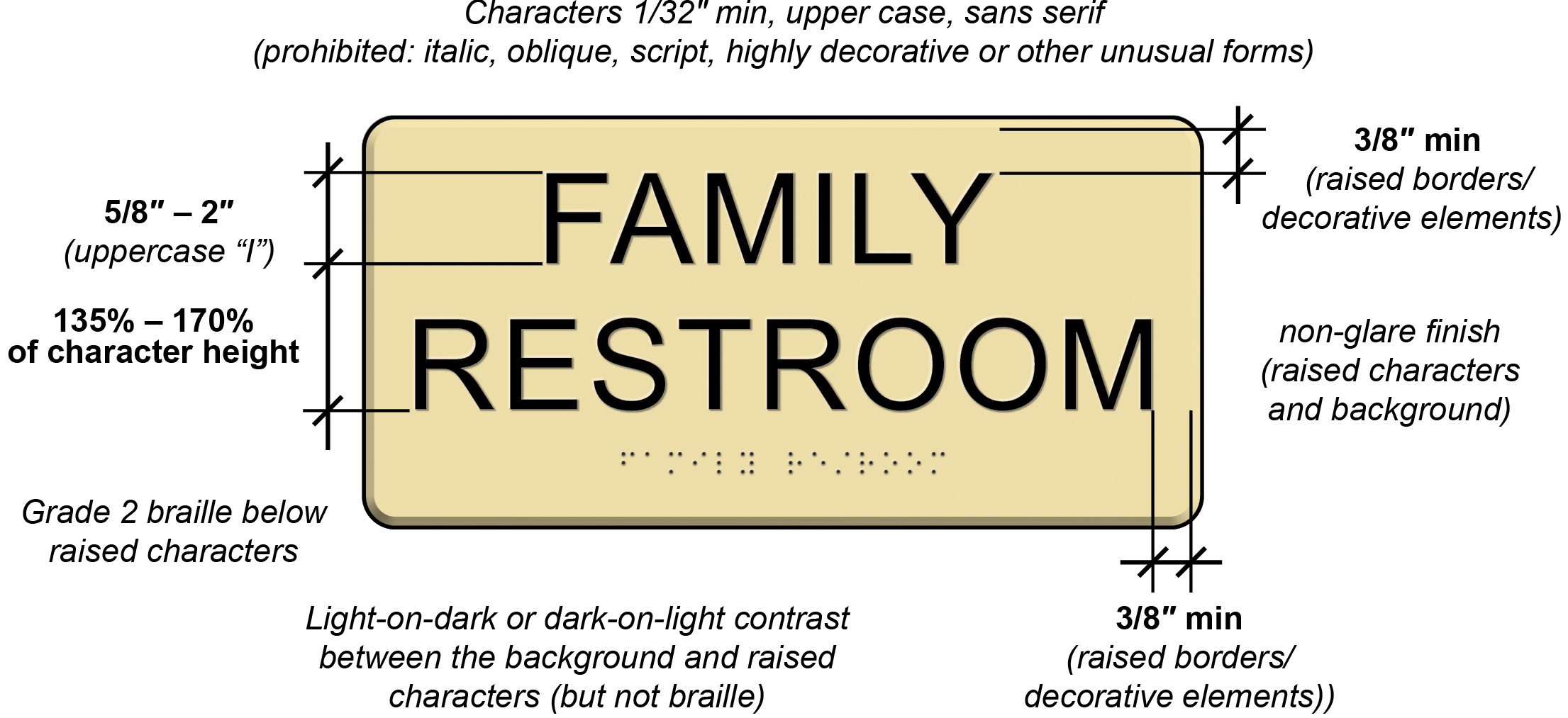
Begin image notes.
Characters raised 1/32″ min, upper case, sans serif; (prohibited: italic, oblique, script, highly decorative or other unusual forms).
Character height dimensioned as 5/8″ ‒ 2″ (uppercase “I”).
Vertical pace between lines of text dimensiond as 135% – 170% of character height.
Grade 2 braille below raised characters.
Space of 3/8″ min dimensioned between letters and (raised borders / decorative elements) shown at top and right of sign.
Light-on-dark or dark-on-light contrast between the background and raised characters (but not braille).
Non-glare finish for (raised characters and background).
End image notes.
Character spacing, as measured between the two closest points of adjacent characters excluding word spaces, is specified for rectangular and non-rectangular cross sections.


Begin image notes.
Distance between rectangular raised characters is one-eighth inch to four times stroke width.
End image notes.

Begin image notes.
Distance between top of beveled raised characters is one-eighth inch to four times stroke width.
Distance between bottom of beveled raised characters is one-sixteenth inch to four times stroke width.
End image notes.
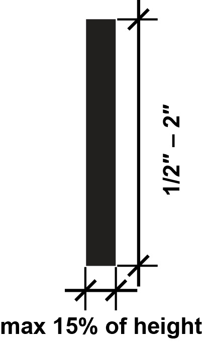
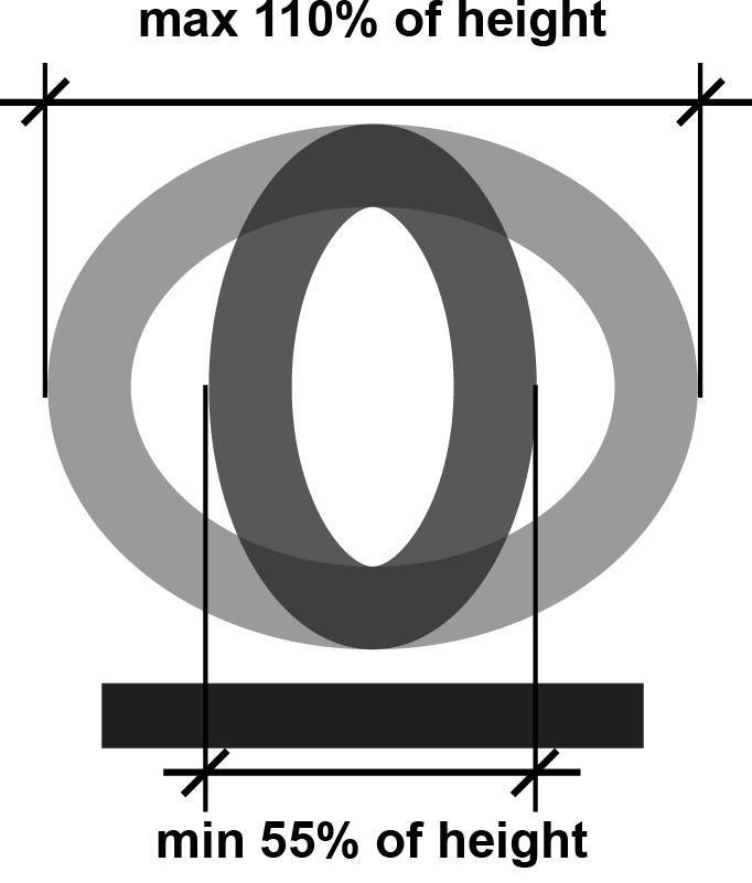
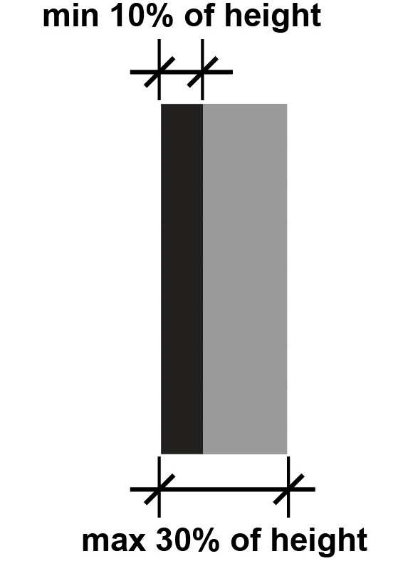
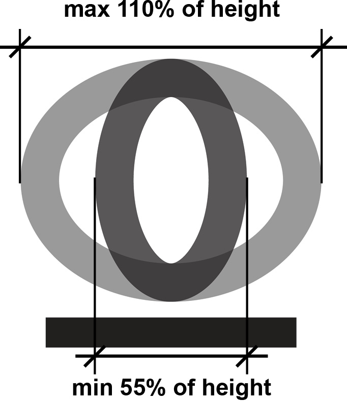
The stroke thickness of the uppercase letter “I” must be 15% maximum of the character height. Characters must be selected from fonts where the width of the uppercase letter “O” is 55% to 110% of the height of the uppercase letter “I.” Raised character height must be from 1/2 inch minimum to 2 inches maximum. Where raised characters also serve as visual characters, the minimum height is 5/8 inch.
Begin image notes. |
Begin image notes. |
Finish and Contrast
When a single set of characters is used to meet requirements for raised and visual characters, the characters and their background must have a non-glare finish. Characters must contrast with their background with either light-on-dark or dark-on-light. A minimum level of color contrast is not specified, but the higher the contrast, the better, especially for people with low vision. Finish and contrast requirements do not apply to braille.
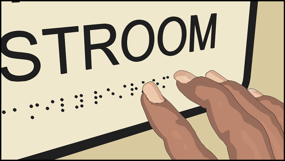
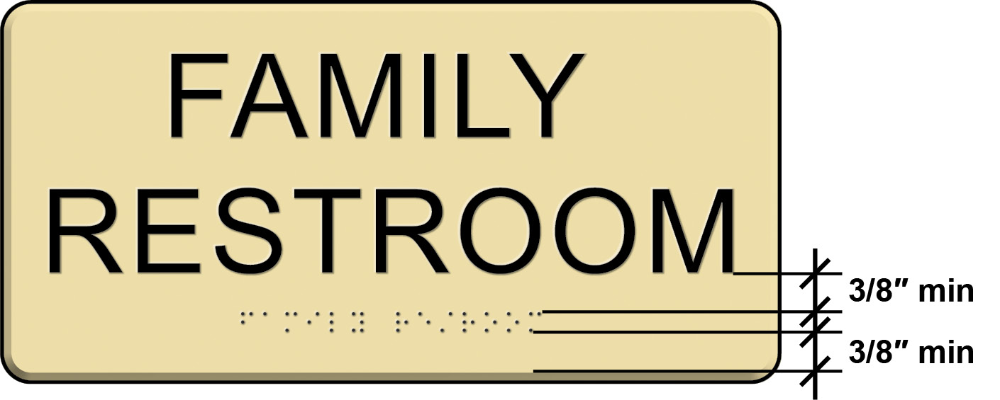
Braille
The content of raised characters also must be provided in contracted or “Grade 2” braille. This type of braille uses the same characters as standard braille but also includes characters to represent common words and letter combinations. Braille is read with a light sweeping touch, and braille dots must be domed or rounded. The Standards specify the height and diameter of dots and their spacing within and between cells.
Begin image notes.
Three-eights inch min dimensioned between text and braille.
Three-eights inch min inch min between braille and raised border.
End image notes.
The braille capital symbol precedes each capitalized word; the symbol is repeated to indicate all caps.
To ease reading, capitalization in braille is limited to the first word of sentences, proper nouns or names, individual letters, initials, and acronyms (but all raised characters must be uppercase).
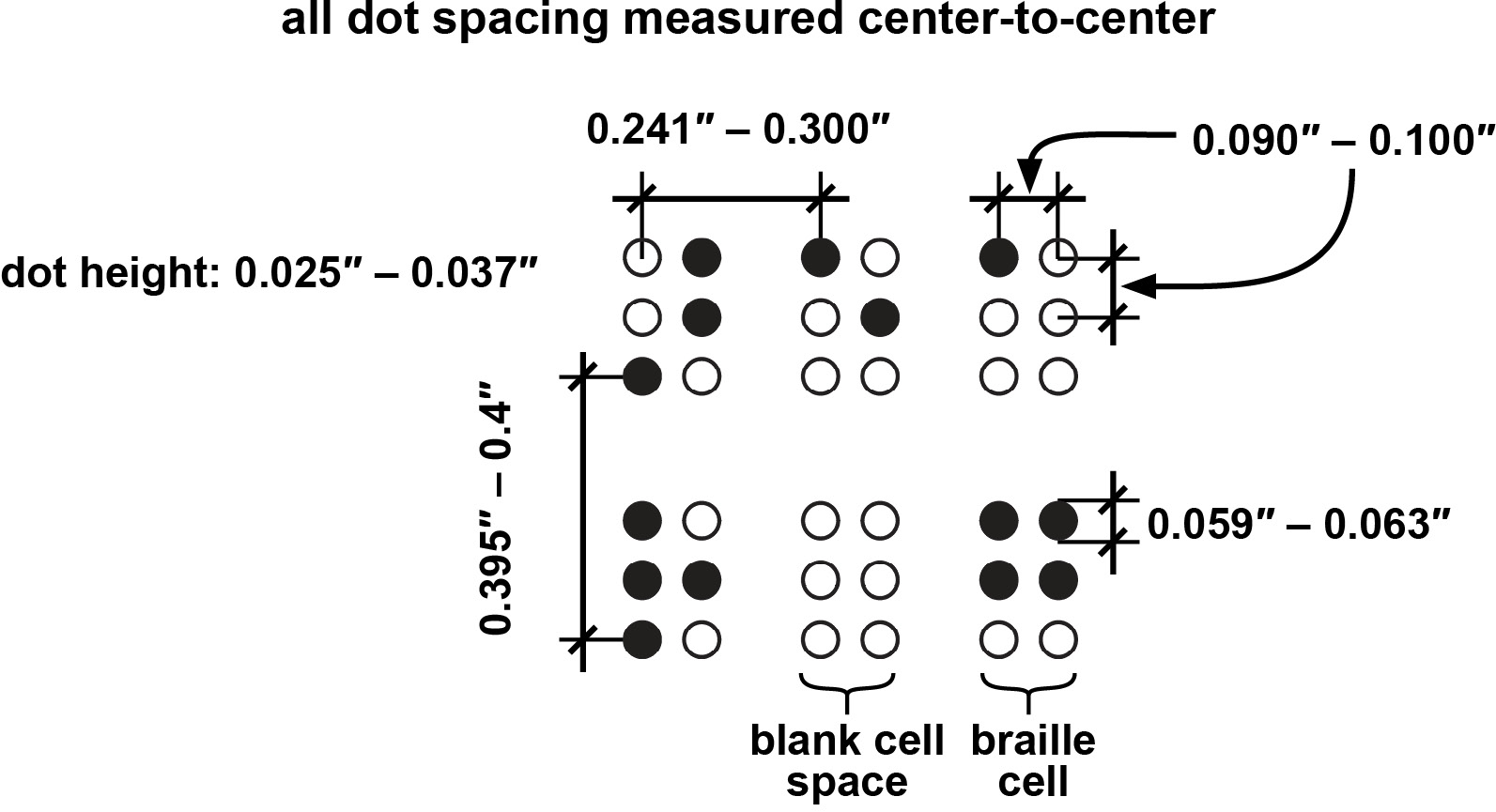
Begin image notes.
Label at top: all dot spacing measured center-to-center.
dot height: 0.025″ – 0.037″
Dimentions lines show: dot spacing between adjacent cells: 0.241″ – 0.300″
dot spacing within cell: 0.090″ – 0.100″
spacing between baseline of cells in separate lines: 0.395″ – 0.4″
dot diameter: 0.059″ – 0.063″
Lables at bottom for blank cell space, and braille cell.
End image notes.
Pictograms
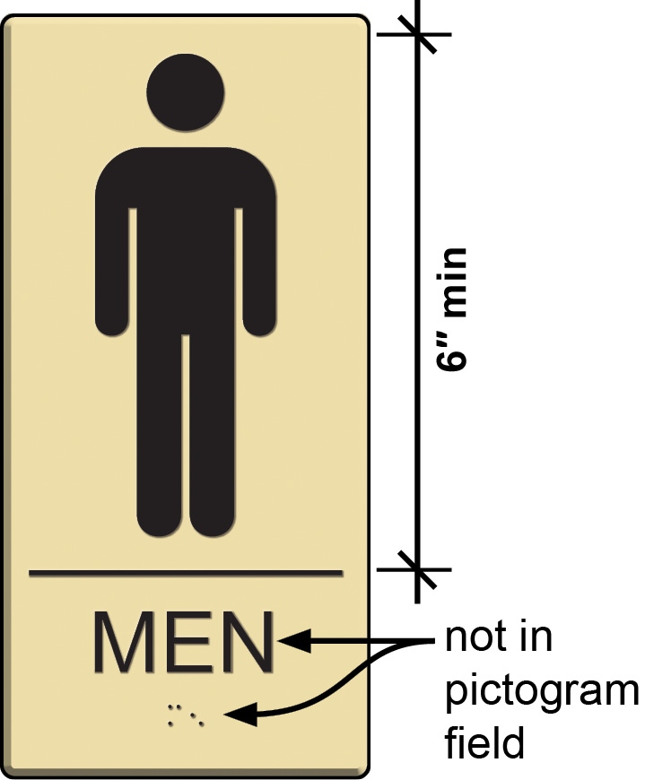
Begin image notes.
6″ min height of pictogram field.
Raised characters and braille not in pictogram field.
End image notes.
The Standards do not mandate the provision of pictograms other than the symbols of accessibility, which are informational pictograms. Where other pictograms are included on a sign to designate a permanent room or space, text descriptors in raised and braille characters are required directly below the pictogram field. The pictogram is not required to be raised. The pictogram field must be at least 6 inches high. (This applies to the field, not the pictogram itself.) The pictograms and fields must have a non-glare finish and a light-on-dark or dark-on-light contrast.
Note that these requirements apply to those pictograms that label a permanent room or space, such as a restroom, cafeteria, or stairway.
|
|
|
Informational Pictograms
Pictograms that provide information about a room or space or that are on directional signs, including accessibility symbols, are not required to provide tactile text descriptors or to be located on a field at least 6 inches high. Note, however, that specified accessibility symbols must meet finish and contrast criteria, which is discussed in more detail below. Examples of these types of pictograms include the International Symbol of Accessibility, the International Symbol of TTY directional sign, a pictogram indicating a no cellphone use area, and the biohazard symbol.
Installation Height and Location
Raised characters and braille on signs must be located 48 inches minimum above the finish floor or ground surface, measured from the baseline of the lowest tactile character, and 60 inches maximum above the finish floor or ground surface, measured from the baseline of the highest tactile character. This location is convenient for tactile reading.
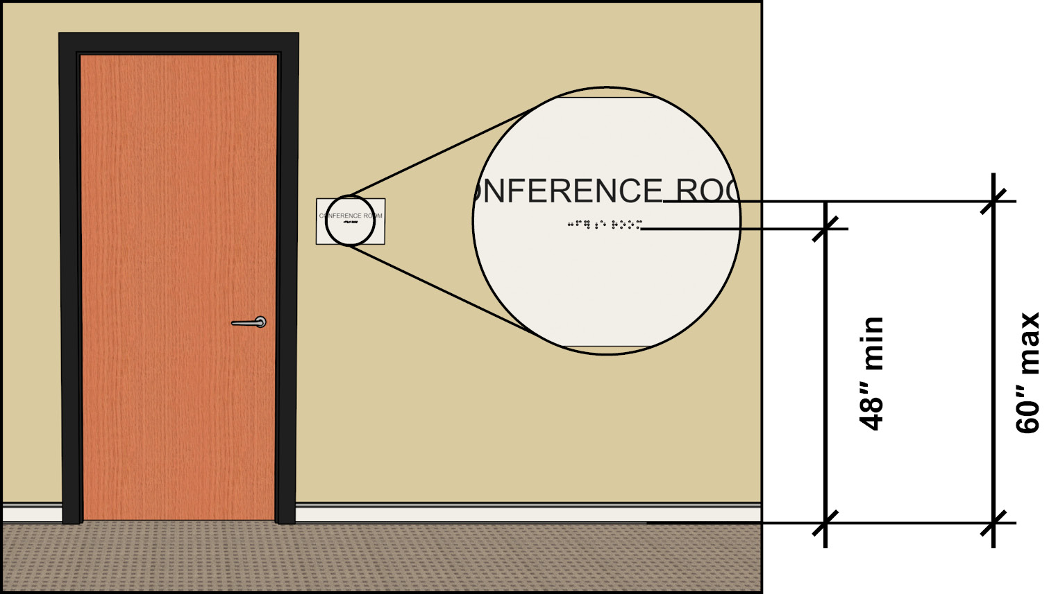
Begin image notes.
Dimensions: 48″ min height to braille baseline.
60″ max height to text baseline.
End image notes.
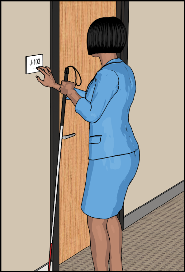
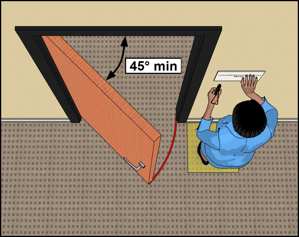
A clear floor space 18 inches minimum by 18 inches minimum must be centered on the tactile characters. This placement of the clear floor space provides unobstructed standing space at the sign for reading by touch. This space must be free of any protrusions to a height of 80 inches. For safety, the space must be located beyond the arc of any door swing to a 45° open position. This effectively sets a minimum, but not an absolute, distance of tactile signs from out-swinging doors. While the clear floor space must be centered on the tactile characters, signs can be located varying distances beyond the door swing.
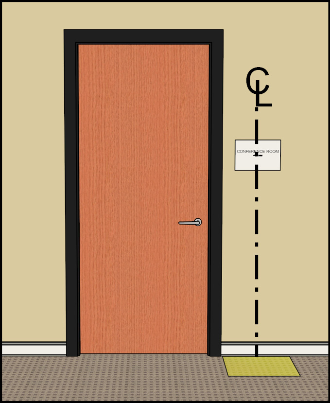
Location at Doors
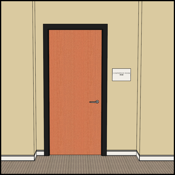
At single doors, tactile signs must be located alongside the door on the latch side. They are permitted on the push side of doors equipped with closers that do not have devices to keep them open.

If there is no wall space on the latch side, signs must be located on the nearest adjacent wall.
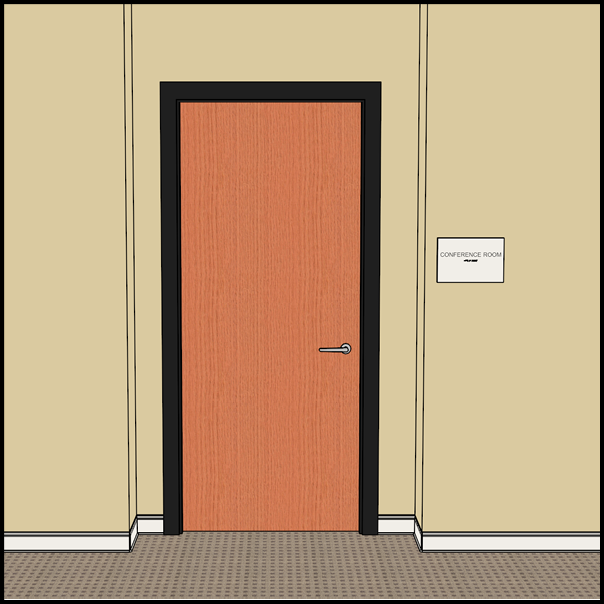
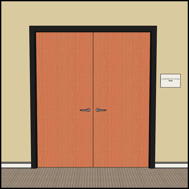
For double-leaf doors with one active leaf, the sign must be located on the inactive leaf. If each door has an active leaf, the sign must be located to the right of the door.

Technical Requirements for Characters
Specifications for visual characters cover finish and contrast, case, style, character proportion and height, stroke thickness, and line and character spacing.
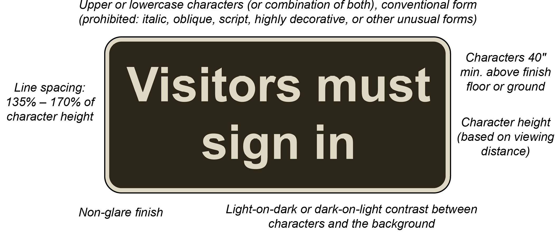
Begin image notes.
Upper or lowercase characters (or combination of both), conventional form (prohibited: italic, oblique, script, highly decorative or other unusual forms).
Line spacing: 135% – 170% of character height.
Characters 40” min. above finish floor or ground.
Character height (based on viewing distance).
Non-glare finish.
Light-on-dark or dark-on-light contrast between characters and the background.
End image notes.
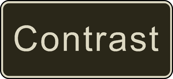
Characters must contrast with their background with either light-on-dark or dark-on-light and have a non-glare finish. A minimum level of contrast is not specified in the Standards. The higher the contrast, the better for legibility, particularly for people with low vision. Variated or textured backgrounds can reduce contrast and compromise readability.


The stroke thickness of the uppercase letter “I” must be from 10% to 30% of the character height. Characters must be selected from fonts where the width of the uppercase letter “O” is 55% to 110% of the height of the uppercase letter “I.”
Begin image notes. |
Begin image notes. |
Character Spacing
Character spacing, as measured between the two closest points of adjacent characters excluding word spaces, must be 10% to 35% of the character height.
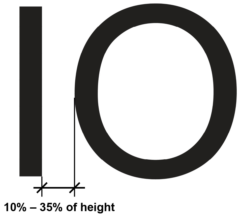
Begin image notes.
Distance between characters is 10% to 35% of character height
End image notes.
Character Height
The minimum height of characters is based on their height above the finish floor and the horizontal viewing distance. Horizontal viewing distance is the distance between the character and an obstruction preventing further approach to the sign.
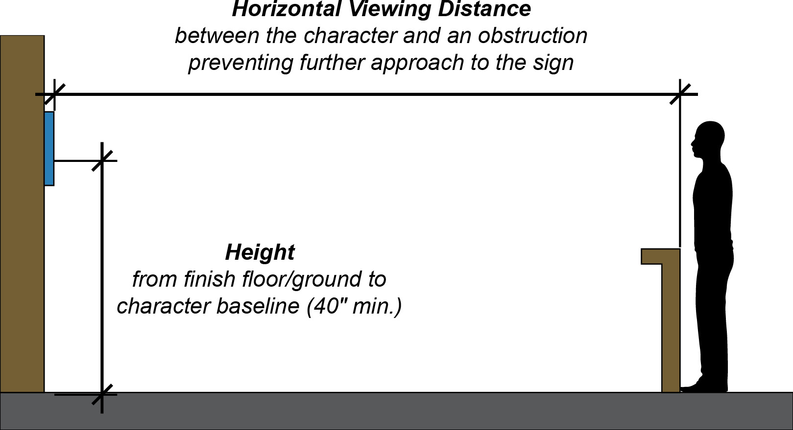
Begin image notes.
Horizontal Viewing Distance between the character and an obstruction preventing further approach to the sign.
Height from finish floor/ground to character baseline (40″ min.).
End image notes.
| Height | Viewing Distance | Min. Character Height |
|---|---|---|
| 40″ – 70″ | under 6′ | 5/8″ |
| 6′ or more | 5/8″ + 1/8″ per foot of viewing distance above 6’ | |
| above 70″ to 10′ | under 15′ | 2″ |
| 15′ or more | 2″ + 1/8″ per foot of viewing distance above 15′ | |
| above 10′ | under 21′ | 3″ |
| 21′ or more | 3″ + 1/8″ per foot of viewing distance above 21′ |
Headroom Clearance at Overhead Signs
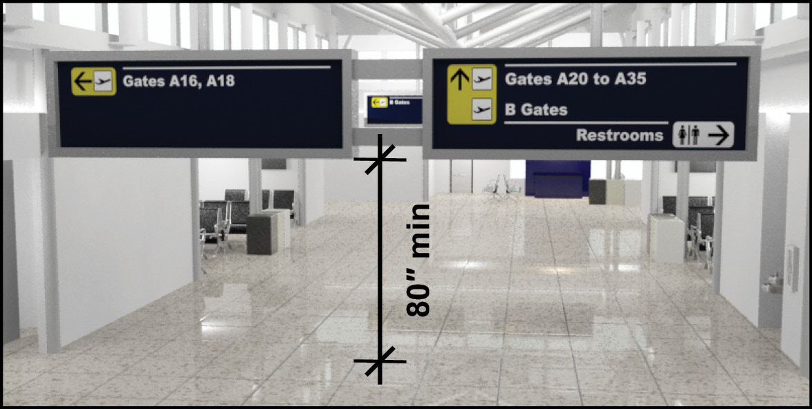
Signs above circulation paths must provide the required 80 inches minimum headroom clearance (§307.4).
Post-Mounted Signs
Signs and other objects mounted on posts or pylons that have leading edges of 27 inches to 80 inches high cannot protrude more than 12 inches into circulation paths. The 12-inch limit also applies to the clearance between multiple posts, excluding the sloping portions of handrails.
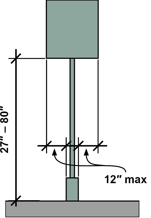
Begin image notes.
27 inch to 80 inch height to bottom of sign.
12 inch maximum from post mount to sign edge.
End image notes.
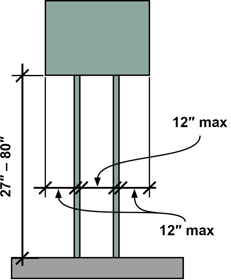
Begin image notes.
27 inch – 80 inch height to bottom of sign
12 inch maximum from post mount to sign edge
12 inch maximum between posts
End image notes.
Post-mounted signs with leading edges 27 inches maximum or above 80 inches can protrude any amount from posts or pylons.
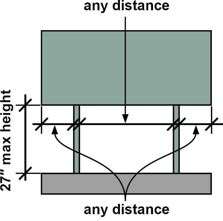
Begin image notes.
27″ max height to bottom of sign
any distance between posts
any distance from post to sign edge
end image notes.
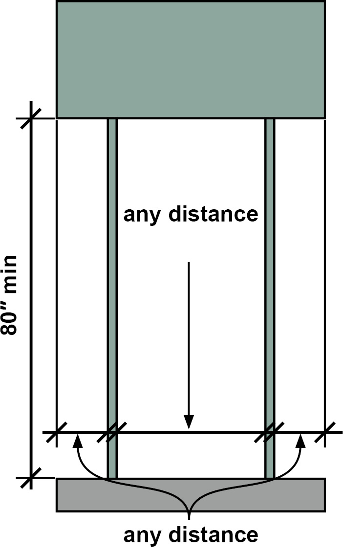
Begin image notes.
80″ min height to bottom of sign
any distance between posts
any distance from post to sign edge
End image notes.
Signs at Transportation Facilities
The requirements for signs apply fully to all types of transportation facilities subject to the Standards. The Standards also include some exceptions or requirements specific to signs at bus stops and rail stations.
Bus Route Signs
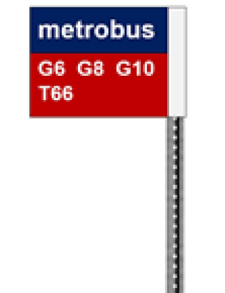
Signs that identify bus routes must comply with requirements for visual characters (§703.5), except those for the minimum location height (40 inches) and line spacing. Additionally, because the size of these signs is often limited, compliance with the minimum character height is required to the maximum extent feasible. Signs providing bus schedules, timetables, or maps are exempt from the sign requirements.
Rail Station Signs

Entrances
If signs are provided to identify the rail stations or station entrances, a tactile sign (§703.2) providing this information is required at each entrance. The tactile signs must be placed in uniform locations to the maximum extent feasible. If a station lacks a defined entrance, at least one tactile sign must be provided in a central location. In other facilities, exterior signs not located at the entrance or door they serve are not required to be tactile.
Platform or Boarding Area Signs
In addition, at least one tactile station identification sign is required on each platform or boarding area. Requirements for visual characters apply to signs at boarding areas, platforms, or mezzanines that list stations, routes, and destinations served by the station, excluding route maps. These types of signs must be uniformly located within the transit system to the maximum extent feasible. Visual characters are not required to exceed 3 inches where sign space is limited.
Station Names
The Standards also require the provision of signs labelling stations that meet the visual requirements (§703.5). These signs must be clearly visible from within vehicles on both sides (when not obstructed by another vehicle) and within passenger sight lines.
Audible Technology as an Alternative to Signs
Audible or “talking” sign systems and technologies that use infrared or other means to transmit information otherwise provided on signs may provide greater accessibility in the transit environments than tactile signs. They also can include wayfinding information not included on posted signs. The Standards generally recognize these technologies and permit them as an alternative to the tactile and visual requirements for entrance signs and platform or boarding area signs (§810.6).
Amusement Ride Signs
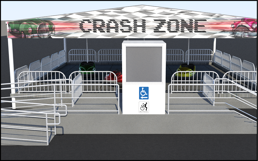
The Standards address access to amusement rides and include requirements for signs. Some amusement rides may accommodate wheeled mobility aids while others require transfer to a seat. The Standards require signs at entries to queues and waiting lines to identify the type of access provided by a ride. Signs indicating the location of the accessible load and unload areas must be provided at entries to queues and waiting lines.
Trailhead Signs
Begin image notes.
RIM RIDGE TRAIL:
Length, 15.3 mi (24.6 km);
Elevation Gain, 1420 (433m);
Elevation Loss, 3166 (965m).
GRADE:
Typical Grade, 4.7%;
Maximum Grade, 11%.
CROSS SLOPE:
Typical Cross Slope, 2%;
Maximum Cross Slope, 5%.
TREAD WIDTH:
Typical Width, 60 in (76 cm);
Minimum Width, 36 in (45 cm);
SURFACE:
Surface Type, Compacted Stone.
End image notes.
The ABA Standards include requirements for outdoor developed areas on federal lands, including trails, camp sites, and picnic areas. This requirement applies to new trailhead information signs regardless of whether the newly constructed or altered trail complies with the technical requirements for trails.
Where new trail information signs are provided at trailheads for use by hikers or pedestrians, they must include:
- the length of the trail or trail segment;
- surface type;
- typical and minimum tread width; and
- typical and maximum running slope and cross slope.
If trail information signs designate the name of the trail, only the name of the trail is required to comply with §703.5. The ISA is not required on trail signs.
Symbols of Accessibility
Symbols required by the Standards to label accessible features and spaces must:
- conform to referenced (and reprinted) international symbols;
- have a non-glare finish (both symbol and background); and
- contrast with the background (either light-on-dark or dark-on-light).
The Standards do not specify particular colors, a minimum color contrast level, nor the size of these symbols. Written content is not required or addressed, except in the case of van accessible parking signs, but can be included.
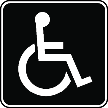
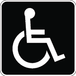
International Symbol of Accessibility
[§F216.5] – [§F216.8], [§F216.11], [§703.7.2.1]
The Standards reference the International Symbol of Accessibility (ISA), a long-standing global icon adopted by the International Organization for Standardization which represents over 160 national standard-setting entities and develops voluntary, consensus-based international standards. Uniform iconography promotes legibility, especially for people with low vision or cognitive disabilities. In addition, various codes and standards in the U.S., including the International Building Code (IBC), also require use of the ISA.
The ISA must be used to label, or provide direction to, these elements and spaces (unless all are accessible):
- entrances
- toilet rooms and bathing rooms
- parking
- check-out aisles
- existing compliant elevators
Use of Alternatives to the ISA
Any departure from the ABA Standards, including the referenced ISA, requires a waiver or modification (§F103). The agencies that implement the ABA Standards have authority to grant modifications and waivers on a case-by-case basis where “clearly necessary.” Modifications and waivers are rare and are usually considered only in unique circumstances that make compliance with certain provisions exceptionally problematic. The Access Board is responsible for making sure that modifications and waivers are based on findings of fact and are consistent with the ABA.
The Access Board provides more information in its Guidance on the International Symbol of Accessibility.
Entrances
|
|
If a facility has inaccessible entrances, the ISA must identify compliant entrances. At inaccessible entrances, directional signs meeting the visual requirements (§703.5) must be provided to indicate the nearest compliant entrance. If all entrances are accessible, these labels and directional signs are not required.
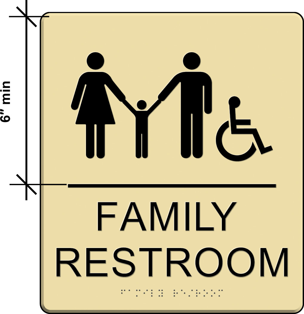
Toilet Rooms and Bathing Rooms
Where all toilet rooms and bathing rooms are accessible, which is often the case in new construction, designation by the ISA is not required. However, in areas where not all toilet or bathing rooms are accessible, then the ISA is required. For example, at clustered portable toilets (where at least 5% must comply) and clustered single user toilet rooms of the same type (where at least 50% must comply), the ISA must be used to identify those units and rooms that are accessible.
In alterations to existing facilities where existing toilet or bathing rooms do not comply, the ISA must be provided to:
- identify those rooms that are accessible; and
- provide direction to the nearest compliant toilet or bathing room.
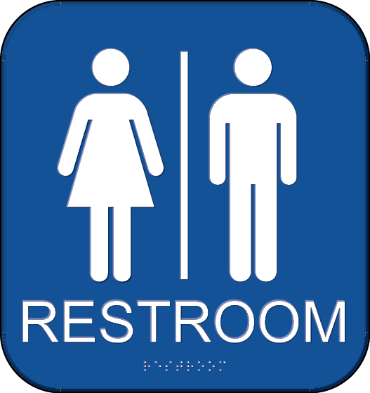
Begin image notes.
Pictogram field dimensioned as: 6″ min
End image notes.
Restroom Sign with ISA
The ISA must meet finish and contrast criteria but not requirements for the field height or text description.
Pictograms that identify restrooms and other permanent rooms or spaces (where provided) must be on a field at least 6″ high, meet finish and contrast criteria, and have tactile text descriptors below the field.
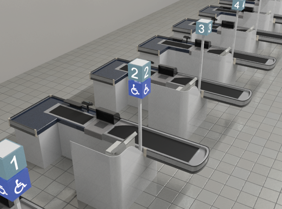
Check-out Aisles
Compliant check-out aisles must be labelled by the ISA unless all aisles serving the same function are accessible. The sign indicating accessibility must be in the same location as any other signs that identify check-out aisles by number, letter, or function.
Existing Elevators
If a facility has existing elevators that do not meet the Standards, compliant elevators must be labelled by the ISA.
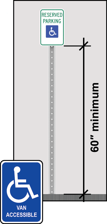
Parking Signs
Begin image notes.
60″ minimum dimensioned height from ground to bottom of sign.
At bottom is super-imposed ISA sign reading: Van Accessible.
End image notes.
Accessible parking spaces must be identified by signs with the ISA. The bottom edge of each sign must be at least 60 inches high measured from the ground surface so that they are visible while vehicles are parked in a space. These signs can be on posts, walls, or suspended from ceilings. ISA designations on the parking surface, even if required by a state or local government, cannot substitute for above-ground signs. State or local codes and regulations may address other sign characteristics, including size, color, and additional content, such as “reserved” or violation fines, but the ABA Standards do not require such characteristics.
Signs identifying van spaces must include the term “van accessible.” This designation is informative and not restrictive in identifying spaces suitable for vans since such spaces are not limited to only vans. It can be included on the main designation sign or provided on a separate sign.
Parking Sign Exceptions
Parking Facilities
(§F216.1), Ex. 2)
Parking facilities are subject only to provisions for parking space signs (§F216.5) and means of egress (§F216.4). No other sign requirements apply.
Sites with under 5 Spaces Total
(§F216.5), Ex. 1)
If a total of 4 or fewer (inaccessible and accessible) parking spaces is provided on a site, the required accessible space must comply but does not have to be identified by a sign (i.e., reserved exclusively for use by people with disabilities).

Residential Facilities
(§F216.5), Ex. 2)
At residential facilities, identification of accessible spaces is not required where spaces are assigned to specific dwelling units.

International Symbol of TTY
Some public payphones, where provided, must be equipped with TTYs to provide communication access for people with hearing or speech impairments. The International Symbol of TTY must be used to identify TTY-equipped phones. Directional signs indicating the location of the nearest TTY must be provided at phonebanks without TTYs. Additionally, where directional signs to public pay phones are provided, signs must also be provided to public TTYs. These directional signs must include the International Symbol of TTY and meet visual criteria in the Standards.

International Symbol of Access for Hearing Loss
Signs with the International Symbol of Access for Hearing Loss and compliant with the visual criteria are required to indicate the availability of assistive listening systems in assembly areas. These systems enhance sound signals for people who are hard of hearing and must be provided in assembly areas equipped with audio amplification and in courtrooms. Signs can be provided at each assembly area or each ticket office or window. Verbiage on signs is not specified, but it is helpful to indicate where assistive listening devices can be acquired.
Information Displays and Technologies
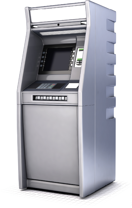
Display Screens
Requirements for fare machines and ATMs address display screens (§707.7) and require:
- screens to be visible from a point 40 inches above the center of the clear floor space;
- sans serif characters at least 3/16 inches high as based on uppercase letter “I”; and
- light-on-dark or dark-on-light contrast between the characters and the background.
Electronic Sign Systems and Audible Sign Technologies
Electronic signs that stream or scroll content, also known as variable message signs (VMS), pose unique accessibility considerations. New “talking sign” technologies, such as remote infrared audible sign (RIAS) systems, provide additional means of making sign content accessible. The ABA Standards do not address these technologies. However, recent editions of the ICC A117.1 accessibility standard, which is referenced by the IBC, provide specifications on VMS and RIAS (§703.7 and §703.8 in the 2009 and 2017 editions).
Summary
Application of Sign Requirements
| Sign | Tactile (§703.2 - 703.4) |
Visual (§703.5) |
Pictogram §703.6 |
Symbols of Accessibility §703.7 |
|---|---|---|---|---|
| * if tactile and visual characters provided separately, visual characters must fully meet 703.5 | ||||
| Permanent room or space designations | ✓ | ✓ (703.5.1)* |
✓ (if provided) |
|
| Doors at exit stairways / passageways / discharge | ✓ | ✓ (703.5.1)* |
✓ (if provided) |
|
| Informational and directional signs | ✓ | |||
| Required access symbols | ✓ | |||
Required Signs
| Required Sign | Scoping Provision | Technical Provisions |
|---|---|---|
| * Required at entrances, toilet and bathing rooms, parking spaces, check-out aisles, and existing elevators (unless all are accessible) and on directional signs to accessible entrances and toilet and bathing rooms. | ||
| Door labels at exit stairways / passageways / discharge | §216.4.1 |
|
 International Symbol of Accessibility *
|
§216.5-§216.8, §216.11 |
|
 International Symbol of TTY
|
§216.9 |
|
 International Symbol of Access for Hearing Loss
|
§216.10 |
|
| Amusement Ride Signs | §216.12 |
|
| Rail Station Identification Signs | §810.6.2 §810.6.3 |
|
Requirements for Visual and Raised Characters
| Visual Characters | Raised Characters | |
|---|---|---|
|
† 1/2” min. if visual characters provided on separate sign ‡ 1/16” min. measured at base of characters with non-rectangular cross sections |
||
| Finish | non-glare | |
| Contrast | light-on-dark or dark-on-light | |
| Depth | N/A | 1/32″ min |
| Case | upper, lower, or both | upper only |
| Style | conventional | sans serif |
| Prohibited Forms | italic, oblique, script, highly decorative, or unusual | italic, oblique, script, highly decorative, or unusual |
| Character Height | based on height above floor and viewing distance | 5/8″ – 2″ † |
| Character Proportion | “O” 55%-110% of “I” height | “O” 55%-110% of “I” height |
| Character Spacing | 10%-35% of the character height | 1/8” – 4x stroke width ‡ |
| Stroke Thickness | 10%-30% of “I” height | 15% max. of “I” height |
| Line Spacing | 135%-170% of character height | 135%-170% of character height |
| Height above finish floor or ground | 40″ min. | 48″ – 60″ |
| Accompanied by Grade II Braille | N/A | Yes |

Common Questions
General
Are signs labeling rooms and spaces with numbers or names required by the Standards?
No, the ABA Standards do not require signs labeling rooms and spaces. However, if such signs are provided, they must comply with the requirements. The Standards do require some facilities and spaces, such as toilet rooms and bathing rooms, to be identified by the ISA, unless all are accessible. The Standards also specify that certain exit doors be labelled as exits.
Are building names or addresses required to comply?
No, building names and addresses are not required to comply. Signs identifying suite, room, or dwelling unit numbers are required to comply.
Are signs provided in areas not used by the public required to comply?
In general, signs provided in areas not used by the public are required to comply. In detention and correctional facilities, signs not located in public use areas are not required to comply.
If a sign repeats information in another language, must those characters comply as well?
If a sign repeats information in other languages, only the English content must comply with these requirements. If a sign is only written in a language other than English, that sign must comply to the maximum extent feasible. The Standards do not address requirements for character sets or braille for languages other than English.
Can tactile characters and visual characters be provided separately on different signs?
Yes, tactile characters and visual characters can be provided on separate signs (or separately on the same sign). Visual characters provided separately must comply with all applicable criteria (§703.5). Tactile characters on signs where compliant visual characters are also provided must comply with all applicable requirements for raised and braille characters, but they are exempt from finish and contrast requirements and are permitted smaller cap heights (1/2 inch instead of 5/8 inch minimum).
Are redundant signs required to comply if a compliant sign is provided?
No, redundant signs provided in addition to compliant signs are not required to meet the Standards.
Tactile Signs
What types of signs are considered designations of “permanent rooms and spaces?”
Signs identifying permanent rooms and spaces pertain to designations, labels, or names for rooms and spaces that are unlikely to change over time or without significant alteration. Examples include signs labeling restrooms, break rooms, mechanical rooms and other spaces, room and floor numbers or letters, and room names. These types of signs also include exterior signs labelling permanent rooms and spaces, such as motel rooms and park restrooms. However, exterior signs not located at the door to the spaces they serve do not have to be tactile.
Does additional information that is included on a sign intended for custodial staff need to also be tactile?
Secondary room numbers or designations intended for maintenance or custodial staff that are provided in addition to general room numbers or names are not required to be tactile, but they must meet criteria for visual characters (§703.5). Tactile requirements apply to names or numbers that serve as the main or only designation of a room or space.
Are all exit doors required to be labelled by tactile signs?
No, tactile labels are required only at doors at exit stairways, exit passageways, and exit discharge. Exit passageways are horizontal fire-resistance-rated components that lead to exit discharge or public ways. Exit discharge is the path from an exit to a public way, such as a sidewalk. Exit labels at other locations, including those required by life safety and building codes, must meet visual requirements in the Standards, but not those for tactile characters.
Do raised characters need to meet all criteria for visual characters?
To be visually accessible, raised characters only have to meet requirements for finish and contrast (§703.5.1). However, visual characters provided separately from raised characters must fully meet all applicable provisions for visual characters (§703.5).
Can tactile signs be placed on doors?
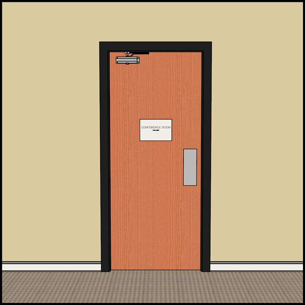
Tactile signs can be placed only on the push side of those doors that are equipped with closers and do not have a hold-open device.
What constitutes “hold-open devices” in determining whether a tactile sign can be placed on a door?
“Hold-open devices” pertains to devices that are fixed to doors and/or walls to keep the door in an open position. Examples include door stops mounted to doors, wall-mounted hooks, or similar hardware and magnetic products that keep doors in an open position. Non-fixed devices, such as moveable door stops, do not constitute “hold-open devices.”
Where should tactile signs be placed at doorways without doors?
The Standards do not specify the location of tactile signs at doorways without doors. Tactile signs at doorways without doors should be located close to the doorway so that they are easy to locate by touch. In addition, the location should be consistent within a facility. It is advisable to treat doorways without doors in the same way as doors with two active leaves, which also do not have a latch side for reference. Where a door has two active leaves, the sign must be located to the right of the doorway or, if wall space is insufficient at this location, on the nearest adjacent wall.
Where are tactile signs to be mounted at doors with a vision panel or sidelight on the latch side or at doors located in glass partitions?
Tactile signs may be mounted next to, or on, vision panels and sidelights located on the latch side of the door so long as the required 18” by 18” minimum clear floor space centered on the tactile characters is provided and is located outside the swing of the door open 45 degrees. Signs also can be mounted on the push side doors with closers that do not have hold-open devices. If a door is located in a glass partition, then the sign must be mounted on the glass partition, except where it is permitted to be on the door.
Is Unified English Braille acceptable as “Grade 2 Braille”?
Yes, the Braille Authority of North America (BANA) made Unified English Braille (UEB) the official braille of the U.S in 2016. UEB is contracted (Grade 2) braille, although it has some differences from the previous English Braille American Edition. For purposes of the ABA Standards, UEB is acceptable as Grade 2 braille.
Which content on braille signs must be capitalized?
The first word of sentences, proper nouns and names, individual letters of the alphabet, initials, and acronyms are the only items that are to be capitalized on braille signs. No other items are to be capitalized on braille signs, regardless of what may be capitalized on equivalent printed signs.
Can the 18-inch by 18-inch clear floor space required at tactile signs be offset from the wall or sign?
The clear floor space required at tactile signs can be offset from the wall or sign surface to accommodate limited protrusions, such as base molding. Other elements or protrusions that would offset this clear floor space more significantly are not allowed because they may impede a person’s ability to read signs tactilely.
Must braille be placed below all raised characters?
Braille must be located below the corresponding text; if the text is multi-lined, then braille must be located below the entire text. If there are multiple blocks of text on a sign, then braille should be placed below logical blocks of raised characters and not necessarily below all the raised characters.
Visual Signs
Are any colors specified for signs?
No, the Standards do not specify any colors for signs. The Standards only require that characters contrast from their background either light-on-dark or dark-on-light.
Why isn’t a minimum level of color contrast between characters and the background specified in the Standards?
Color contrast is based on a color’s light reflectance value (LFV), which measures the amount of a light a color reflects or absorbs. It is typically measured using a spectrophotometer. Measuring LFV accurately in the field can be difficult and is impacted by a variety of factors, including sign materials and lighting conditions.
For character height, what determines the horizontal viewing distance?
The horizontal viewing distance is the distance from the sign to a fixed obstruction that prevents a closer approach to the sign.
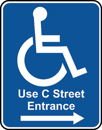
What are the requirements for the content of directional signs indicating the location of the nearest accessible facility (e.g., restroom, entrance, etc.)?
The Standards require that the sign include the ISA but do not specify or require other content. Directional signs can be as simple as the ISA and a directional arrow, but additional content may be helpful.
Can directional signs be located on the ground or floor?
Directional signs, including those required to indicate the location of accessible entrances and other accessible features and spaces, must comply with requirements for visual signs and be located at least 40 inches above the ground or floor. Redundant signs can be located on the floor or ground or in other non-compliant locations.
Can visual characters (e.g., room numbers, “men” and “women,” etc.) be arranged vertically in a column instead of horizontally in a line or row?
The Standards do not prohibit arrangement of characters vertically, but this design is not recommended. If visual or raised characters are arranged vertically, they must meet all requirements, including height and line spacing. Braille characters must not be arranged vertically because it would be difficult to decipher some braille words if the braille contractions are stacked instead of arranged horizontally.
Do the Standards address illumination levels at signs?
No, the Standards do not address illumination levels at or of signs. Life safety and building codes address the visibility and illumination of exit signs.
Pictograms
Are alternatives to, or variations of, the International Symbol of Accessibility (ISA) permitted?
The Standards require use of the ISA to label or provide direction to certain accessible spaces and elements, including entrances, toilet and bathing facilities, and check-out aisles (unless all are accessible). A symbol other than the specified ISA will not comply with the Standards. Any departure from the ABA Standards requires a waiver or modification (§F103). The agencies that implement the ABA Standards have authority to grant modifications and waivers on a case-by-case basis where “clearly necessary” (§F103). This applies only where use of the ISA is required by the Standards. On other signs not mandated by the Standards, compliance with the specified ISA is not required.
Does the ISA include borders around the icon?
No, the specified ISA does not include a border around the image.
Do pictograms labelling permanent rooms and spaces need to be raised?
No, pictograms are not required to be raised. Pictograms that label permanent rooms and spaces must include text descriptors in raised and braille characters below the pictogram field, which must be at least 6 inches high. In addition, pictograms must meet finish and contrast requirements.
Do all pictograms need to be on a field at least 6 inches high and have tactile text descriptors?
No, the specifications for field height and text descriptors apply only to those pictograms that label a permanent room or space, where provided. Examples include pictograms designating restrooms, stairways, cafeterias, and other permanent rooms and spaces. Pictograms that provide information about a room or space, including the ISA, or that are included on directional signs, are not required to meet these requirements (but mandated accessibility symbols must meet finish and contrast criteria).
Parking
Are signs for accessible parking required individually at each accessible parking space?
The Standards require parking spaces to be identified by the ISA, but they do not specifically require one sign for each space. Under the Standards, it may be possible to label multiple spaces with a sign so long as it is clear which spaces are designated as accessible.
Other Types of Signs
Are variable message signs or electric signs addressed by the Standards?
The Standards do not address variable message signs or electric signs. However, the ICC A117.1 Standard for Accessible and Usable Buildings and Facilities, which is referenced by the International Building Code, provides technical specifications for variable message signs (§703.7). The A117.1 Standard also covers remote infrared audible sign systems (§703.8).
August 2022

