
Best Practices for the Design of Accessible COVID-19 Home Tests
Acknowledgements
We would like to acknowledge the efforts of all of those involved in the development of these best practices:
Rapid Acceleration of Diagnostics (RADx®) Tech Program:
John Blackwood, Cathy Cambria, Mia Cirrincione, Jim Densmore, Sam Dolphin, Maren Downing, Emily B. Kennedy, Kevin Leite, Shaun Moshasha, Kim Noble, Clair O’Donovan, D’lynne Plummer, Adam Samuta, Mack Schermer, Sal Strods, Erika Tyburski, Brian Walsh.
Consortia for Improving Medicine with Innovation and Technology:
Michele Liston, Tracy McMahon.
Subject Matter Experts:
Jackie Anderson, Karl Belanger, Samantha Flax, Chancey Fleet, J. Bern Jordan, Jason Meddaugh, Corbb O’Connor, Helen Osborne, Ellen Ringlein, Romina Marazzato Sparano, Gregg Vanderheiden, Genevieve Walker, Lindsay Yazzolino, Kennedy Zimnik.
Veranex (formerly Ximedica):
Victoria Brown, Emma DeRoode, Nicole Lee, Susan McDonald, Becky Nelson.
Metaphase Design Group:
Marco S. Boscolo, Paul S. Danial, Praveen Prabhakar KR, Angie Reitenbach, Bryce G. Rutter.
Georgia Tech HomeLab:
W. Bradley Fain, Sarah Farmer, Adina Martinez, Amanda Peagler, Rebecca Sheiner.
Advocacy Groups:
Alliance on Aging and Vision Loss, American Council of the Blind, American Foundation for the Blind, American Geriatrics Society, Independence Through Enhancement of Medicare and Medicaid Coalition, National Disability Rights Network, National Federation of the Blind, World Institute on Disability.
U.S. Access Board:
Bruce Bailey, Phil Bratta, Bobby Stinnette.
National Institute of Biomedical Imaging and Bioengineering:
Christine Cooper, Karen Olsen, Patricia Wiley.
Government Agencies:
Centers for Disease Control and Prevention, U.S. Food and Drug Administration, National Center for Medical Rehabilitation Research, National Council on Disability, National Eye Institute, National Institute of Dental and Craniofacial Research, National Institute of Nursing Research, National Institute on Disability, Independent Living, Rehabilitation Research within the Administration for Community Living.
1. Background
In response to the COVID-19 pandemic, the National Institutes of Health (NIH) launched the Rapid Acceleration of Diagnostics (RADx®) initiative in 2020 to speed the innovation, development, commercialization, and implementation of COVID-19 testing technologies. The RADx Tech program, one arm of the initiative, was specifically designed to compress the customary technology development timeline from years down to just months. While NIH RADx Tech has increased testing capacity in the U.S., there is a continuing need to develop COVID-19 home tests that are accessible to all users, including populations that have no vision or low vision, have a reduced range of dexterity or motor skills, and are aging.
NIH RADx Tech began committing resources to increasing accessibility of COVID-19 home tests in early 2022. As a first step, the team consulted design groups and conducted research to locate existing accessible product design guidelines. Comprehensive guidelines for manufacturers around accessible design of in vitro diagnostic (IVD) products were nonexistent. Consequently, the team engaged advocacy groups with a deep knowledge of the experience and needs of target user populations. Importantly, these advocacy groups include members of the populations they serve.
NIH RADx Tech established a formal funding opportunity for accessible COVID-19 home tests. As part of this effort, RADx Tech engaged several different groups, including the Georgia Tech HomeLab, to conduct test accessibility evaluations; advocacy group partners to onboard accessibility design consultants from the target user populations; and academic centers specializing in accessibility to onboard additional subject matter experts (SMEs). SMEs provided individualized and detailed feedback on device usability and accessibility gaps, and collaborated with design firms to develop potential solutions. RADx Tech then worked with test kit manufacturers to bridge identified accessibility gaps on an accelerated timeline.
The primary objective of this best practices document is to capture and publicize learnings from the NIH RADx Tech accessibility program. What follows are detailed recommendations to assist manufacturers in the design of COVID-19 home tests that ensure greater accessibility for users that have no vision or low vision, have a reduced range of dexterity or motor skills, and are aging.
While the information presented emphasizes best practices for the design of COVID-19 home tests, many of these ergonomic and accessible design recommendations are transferable to home tests for other conditions and diseases.
An abridged version of Best Practices for the Design of Accessible COVID-19 Home Tests, released in 2022, included a limited set of topics. This 2023 publication expands upon and refines the best practices recommendations contained therein and supersedes the 2022 release.
2. Glossary
- Accessibility
- The practice of building or modifying products, services, and facilities with consideration for the needs of as many users as possible.
- Alternative (Alt) Text
- Text included in webpage HTML code or in a digital file tag structure that describes non-text media. It provides equal access for those viewing content with a braille display or screen reader.
- Assistive Technology (AT)
- Any item, piece of equipment, software program, or product system that is used to maintain or improve the functional capabilities of people with disabilities.
- Autofill
- A software feature that automatically inserts previously entered personal information into web form fields.
- Bluetooth
- A short-range wireless technology that enables data transfer between computers, tablets, phones, and other electronic devices.
- Braille
- A tactile reading and writing system in which raised dots represent the letters of the alphabet, numbers, and symbols.
- Braille Display
- A refreshable electronic display that converts digital information into tactile braille.
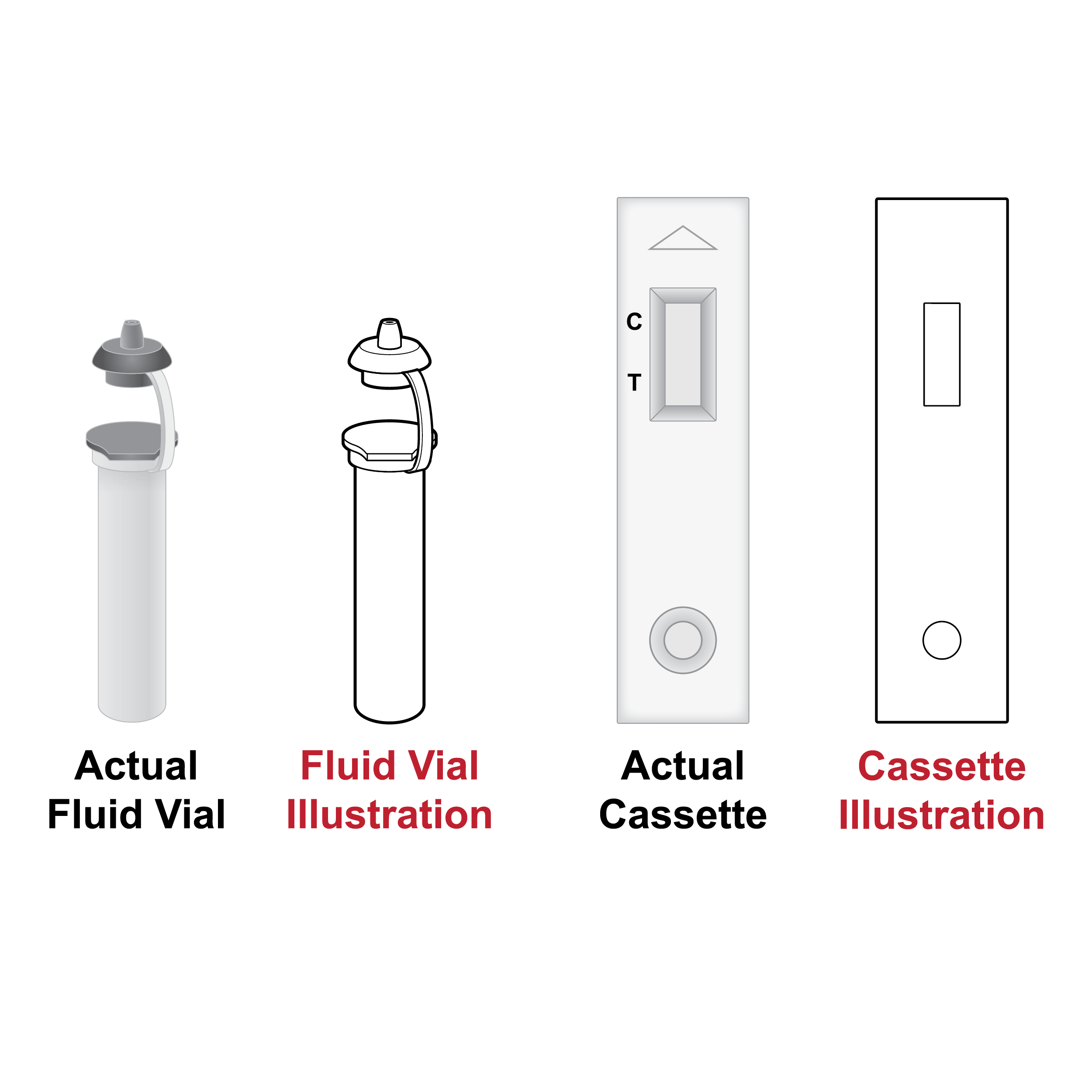
- Cassette
- For the purposes of this document, a medical device containing a lateral flow assay (LFA) strip. A liquid sample is introduced to one end of the strip and a result is processed and communicated visually or by a test reader once the sample flows through the strip.
- Closed Captions
- Text that is displayed on a video to provide equal access to all audio information as it is relayed, including nonspeech elements. Closed captions can be turned on and off by the viewer.
- Contrast
- The degree of difference in brightness for different colors, or shades/tones of the same color.
- Contrast Ratio
- A ratio of relative brightness or luminance.
- Dark Mode
- Display setting on a digital device showing light text on a dark screen.
- Digital Accessible Information System (DAISY)
- A standard for producing accessible and navigable multimedia documents such as digital audio books, periodicals, and computerized text. DAISY is designed to be a complete audio substitute for print material.
- Dropper Cap
- A cap with a small opening used with a fluid vial for expelling liquid samples in discrete drops into a cassette sample well.
- Embossed Printing
- A method of creating raised images, traditionally by pressing an image into paper or cardstock to create a three-dimensional design.
- Fluid Vial
- Container of buffer solution into which a sample may be introduced via swab. The liquid sample is then transferred using a dropper cap into a cassette sample well for processing.
- Font
- A specific size and weight variation of a typeface.
- Haptic Feedback
- Feedback that is perceptible by touch. Tends to be related to dynamic physical features (e.g., phone vibration; see also Tactile Feedback).
- High-fidelity Prototype
- A highly functional and interactive representation of a final product, often used to collect feedback in the later stages of design.
- Interactive Voice Response (IVR)
- An automated phone system technology that allows incoming callers to access information through a voice response system of pre-recorded messages and choose from menu options via a touch tone keypad selection or speech recognition.
- In Vitro Diagnostics (IVD)
- Tests done on samples such as fluid (e.g., nasal secretion on a swab) or tissue taken from the human body. IVDs can detect diseases or other conditions and can be used to monitor a person’s overall health to help cure, treat, mitigate, or diagnose diseases.
- Lateral Flow Assay (LFA)
- A paper-based device for the detection of a target substance in a liquid sample where results are displayed within 30 minutes.
- Legibility
- The ease with which someone can identify characters and symbols.
- Light Mode
- Display setting on a digital device showing dark text on a light screen.
- Looping Video
- A video that automatically and continuously repeats itself.
- Low-fidelity Prototype
- A nonfunctional and noninteractive representation of a final product, often used to collect feedback in the early stages of design.
- Multimodal
- Communicated and experienced in different ways (e.g., visually, audibly, and tactilely).
- Operating System (OS)
- Software that supports a computer, tablet, or basic smartphone functions, such as scheduling tasks, executing applications, and controlling peripherals (e.g., Android, iOS, macOS, Windows).
- Optical Character Recognition (OCR)
- Software that converts non-editable document formats such as PDFs, images, or paper documents into machine readable formats that are editable and searchable. OCR can be used to convert text into speech and/or braille.
- Quick Response (QR) Code
- A type of matrix barcode that can be read easily by a digital device and that stores information as a series of pixels in a square-shaped grid. The digital device generally displays a webpage after reading a QR code.
- Radio Frequency Identification (RFID)
- A radio frequency-based technology that allows the one-way transmission of data from an RFID tag (e.g., embedded chip) to a nearby RFID reader (e.g., smartphone). Building upon RFID, Near-Field Communication (NFC) additionally enables two-way communication between the tag and reader or two NFC capable devices.
- Readability
- The ease with which someone can understand written text.
- Responsive Web Design
- An approach to web design that aims to make webpages render well on a variety of devices and window or screen sizes from minimum to maximum display size.
- Sans Serif Typeface
- A typeface without small strokes or extensions at the end of its longer strokes (e.g., Helvetica).
- Serif Typeface
- A typeface with small strokes or extensions at the end of its longer strokes (e.g., Times New Roman).
- Screen Reader
- A form of assistive technology that converts text, buttons, images, and other elements on a computer, tablet, or smartphone screen into synthesized speech or refreshable braille (e.g., JAWS and NVDA for Windows, VoiceOver for iOS/macOS, and TalkBack for Android).
- Single Sign On (SSO)
- An authentication method that enables users to securely authenticate personal login to multiple applications and websites using one set of credentials.
- Swab
- Sample collection device with one part intended to be held in the hand and the other part used to collect the sample.
- Tactile Feedback
- Feedback that is perceptible by touch. Tends to be related to static physical features (e.g., a raised versus flush button; see also Haptic Feedback).
- Tamper-evident Seal
- A container closure that deters and/or allows detection of the removal or alteration of the container’s contents before purchase.
- Test Kit
- The complete set of physical components and instructions required to complete one or more IVD home tests.
- Test Reader
- Disposable or reusable device which accepts a cassette and/or analyzes a sample and provides a test result. Readers may function independently or in combination with supporting technology.
- Text-to-speech (TTS) Engine
- Software that converts digital text into intelligible speech.
- Timestamps
- A link that enables the user to jump to a desired portion of a video without having to rewatch the entire video or guess the clip’s chronological position along a video play bar.
- Typeface
- A set of fonts (i.e., text characters) with a common style.
- Unique Device Identifier (UDI)
- Numeric or alphanumeric barcode on medical device labels and packages. The barcode specifically identifies the labeler and the version or model of a device. Additionally, it identifies the variable manufacturing specifications and may include serial number, lot or batch number, date of manufacturing and/or expiration date, etc.
- Usability
- The degree of ease or difficulty experienced by a user to correctly complete a task or group of tasks associated with a product.
- User Interface
- Method or means by which a human interacts with or controls a product, website, or application.
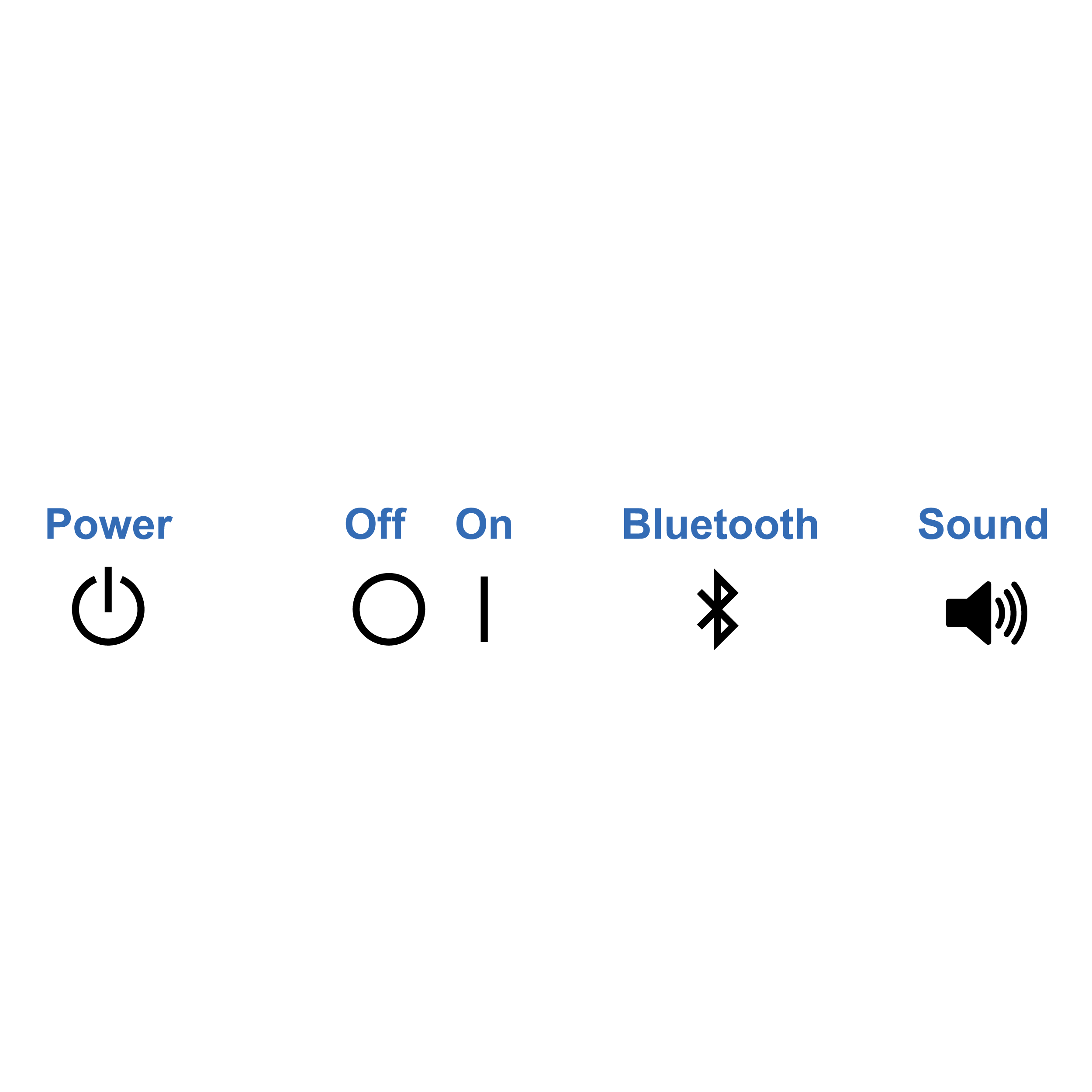
3. Symbols Guide
 Audio / Sound
- Audible output or feedback from a device
 No Audio / Sound
 - Absence of audible output or feedback from a device
 Bluetooth
- Indicates Bluetooth connectivity
 Haptic or Vibration
- Dynamic physical feedback on a device
 Hourglass
- Indicates date or time; often used as a visual icon next to an expiration date
 Off
Off- Indicates the “off” state of an electronic device
 On
On- Indicates the “on” state of an electronic device
 Phone
Phone- Indicates the use of a telephone
 Power
Power- Power on-off indicator/button on an electronic device
 QR Code
- Generic representation of a Quick Response (QR) code
 Warning
 - Indicates a critical warning
4. Design Considerations
Accessible product design/redesign requires more than incremental improvements to individual test kit components. To create a truly accessible at-home COVID-19 testing experience, the end-to-end workflow should be considered. A holistic review includes consideration of how various test kit components function together to create a seamless testing experience from kit acquisition through component disposal. Features incorporated to improve usability for one user group should improve usability for all. Universal design – “the design and composition of an environment [or product] so that it can be accessed, understood, and used to the greatest extent possible by all people regardless of their age, ability or disability” – is an appropriate and achievable goal. [1]
Below are several guiding principles for universal design of COVID-19 home tests:
- Engage target end users early (see 7. Assessing Usability).
- Simplify workflow.
- Fewer steps are easier to document, manage, and execute.
- Fewer components are easier to identify and handle and are less likely to be misplaced.
- Intuitive and familiar design elements and nomenclature reduce ambiguity.
- Provide multi-modal test instructions.
- Provide both physical and digital test instructions.
- Provide digital test instructions on an accessible webpage, as a downloadable document, and in a closed-captioned video tutorial with descriptive audio.
- Eliminate the need for precision, where possible.
- Steps that require precision (e.g., liquid transfer, counting drops, aligning parts with tight tolerances) may cause barriers to independent completion and increase potential for user error.
- Avoid small components.
- Larger components are easier to manipulate and see and are less likely to be misplaced.
- Incorporate simultaneous nonvisual (e.g., audible, haptic) and visual cues.
- Illustrations should be simple, high-contrast, shaded line drawings with alt text.
5. Engaging End User Advocacy Groups
Human factors engineers are accustomed to being the end user advocates within the design development process. As such, they research users, learn about specific needs, and ensure these characteristics are included in the iterative and final designs. In situations where the end user needs are difficult to understand, it can be challenging for human factors engineers to effectively advocate for an optimized design. It is therefore essential to engage directly with end users, both individually and through advocacy groups that include members of the populations they serve.
Advocacy groups are informed resources for:
- expediting the learning process by providing access to a network of informed, experienced resources;
- confirming assumptions around product use and potential misuse;
- identifying user needs, preferences, and pitfalls in design;
- assessing designs for accessibility and usability; and
- arranging real-time design reviews and critiques.
Manufacturers should plan to have ongoing relationships with end users. The more consistent their involvement, the more robust the final design will be. Designs should be assessed by end users representing a broad range of capabilities. Always plan to make design materials accessible to people with disabilities and circulate them prior to review.
6. Regulatory and Design Control
The U.S. Food and Drug Administration (FDA) is responsible for protecting public health by ensuring the safety, efficacy, and security of human and veterinary drugs, biological products, medical devices, and radiation-emitting products; and by ensuring the safety of our nation’s food supply and cosmetics. [2] Within FDA, the Center for Devices and Radiological Health (CDRH) is responsible for ensuring the safety and effectiveness of medical devices and eliminating unnecessary exposure to radiation-emitting products. [3]
A medical device is broadly defined in Section 201(h) of the Federal Food, Drug, and Cosmetic Act as “any instrument, machine, contrivance, implant, in vitro reagent that’s intended to treat, cure, prevent, mitigate, [or] diagnose disease in man”. [2] Medical devices are classified based on risk: Class I devices demonstrate low risk, Class II devices demonstrate moderate risk, and Class III devices demonstrate high risk. [4]
A wealth of practical information on regulations pertaining to design, marketing, and distribution of medical devices is produced by the Division of Industry and Consumer Education (DICE) within CDRH. [5] CDRH Learn is a useful educational tool that consists of learning modules describing many aspects of medical devices, covering both premarket and post-market topics. Modules are provided in various formats, including videos, audio recordings, and slide presentations. [6]
User Needs and Accessibility
Per 21 CFR Section 820.30, design control requirements apply to Class II and III medical devices, and a select group of Class I devices. These regulations require the manufacturer to base its design controls on the complexity and risks associated with its devices. [7]
It includes new designs (premarket) and improvements or modifications to existing device designs (post-market). Design control begins after feasibility, or “Proof of Concept”, and continues throughout the product lifecycle. The first and most crucial step is identifying and documenting the user needs that will be used as the basis of product development during each phase. Defining user needs as they relate to accessibility is fundamental and ensures that the right product is designed. This is especially true for the design of over-the-counter (OTC) tests used outside of the clinical environment. These tests pose unique risks created by the interactions between the user, the use environment, and the device.
The general user population for these tests includes individuals that have no vision or low vision, have a reduced range of dexterity or motor skills, and are aging.
These groups must be considered when creating the user needs for an accessible OTC product. To confirm that such products are safe and effective in the hands of the intended user, validation testing must be performed in accordance with FDA recommendations to confirm the end user can use the product as intended (see 7. Assessing Usability). [8]
These topics are further described in the seminal recommended practice document created by the Association for the Advancement of Medical Instrumentation (AAMI). The stated purpose of this document, ANSI/AAMI HE75:2009/(R2018) Human Factors Engineering - Design of Medical Devices, is to provide a relevant source of human factors engineering (HFE) information, design criteria, and guidelines for medical devices. [9] The human factors design information and methodologies described may be used through all phases of design. Note that FDA recognizes most, but not all, of this standard. Specifically, FDA does not recognize Section 9 (Usability testing) as it conflicts with FDA guidance in “Applying Human Factors and Usability Engineering to Medical Devices.” [8] Additional information is provided in the FDA presentation “How to Use Consensus Standards in Premarket Submissions.” [10]
7. Assessing Usability
The best practices outlined in this document will aid manufacturers in creating an accessible and usable home test kit; however, understanding how well (or poorly) a design meets user needs requires design assessments. [11]
Early in the product development process, manufacturers should conduct a user feedback study with end users unfamiliar with the product, collecting feedback on low-fidelity prototypes. This is called a formative assessment. The objective of this type of study is to gather information about which features should or should not be carried forward as the design develops. Participants are often encouraged to describe concepts that may bridge gaps from the present design to a more optimal design.
As the design progresses, manufacturers should conduct an additional user feedback study with end users unfamiliar with the product, collecting feedback on high-fidelity prototypes that users employ to complete actual workflow steps. This is called a formative quantitative simulation-based assessment. Participants are encouraged to think aloud while moments of user delight or user frustration are identified. The objective of this type of study is to gain feedback on the design, including what type of information should be relayed in labeling and instructions. This study should be conducted in a simulated home environment, complete with anticipated distractions and hindrances (e.g., low lighting, background noise, clutter).
At the end of the development cycle, manufacturers should conduct a human factors validation study with end users unfamiliar with the product, collecting feedback on production-equivalent packaging, labeling, and devices, while users proceed through the entire workflow without interruption. This is called a summative assessment. This study should also be conducted in a simulated home environment. Refer to FDA guidance “Applying Human Factors and Usability Engineering to Medical Devices” for details. [8]
Any user errors or near misses should be noted, and after the study participant completes the full workflow, study staff should probe for reasons why the user error or near miss occurred to determine the root cause.
8. Instructions
- 8.1 Legibility
- 8.2 Readability and Layout
- 8.3 Language
- 8.4 Illustrations and Symbols
- 8.5 Printed Embodiment
- 8.6 Digital Embodiment
8.1 Legibility
Issue
- Some test instructions use mixed or hard-to-read typefaces, fonts, and other text features.
- Entirely capitalized words are communicated by screen readers letter-by-letter, making interpretation challenging.
Recommendation
- Consistently use an easy-to-read, sans serif typeface such as Arial, Calibri, Helvetica, Verdana, etc.
- Do not use italicized text, which reduces legibility for some users. Emphasize important content via boldface text.
- Do not capitalize entire words. Emphasize important content via text labels (e.g., ‘Warning’, ‘Note’).
- Avoid underlining, except for clickable links.
Issue
 Key information hard to distinguish
- Content is displayed such that it is challenging to distinguish key and supporting information.
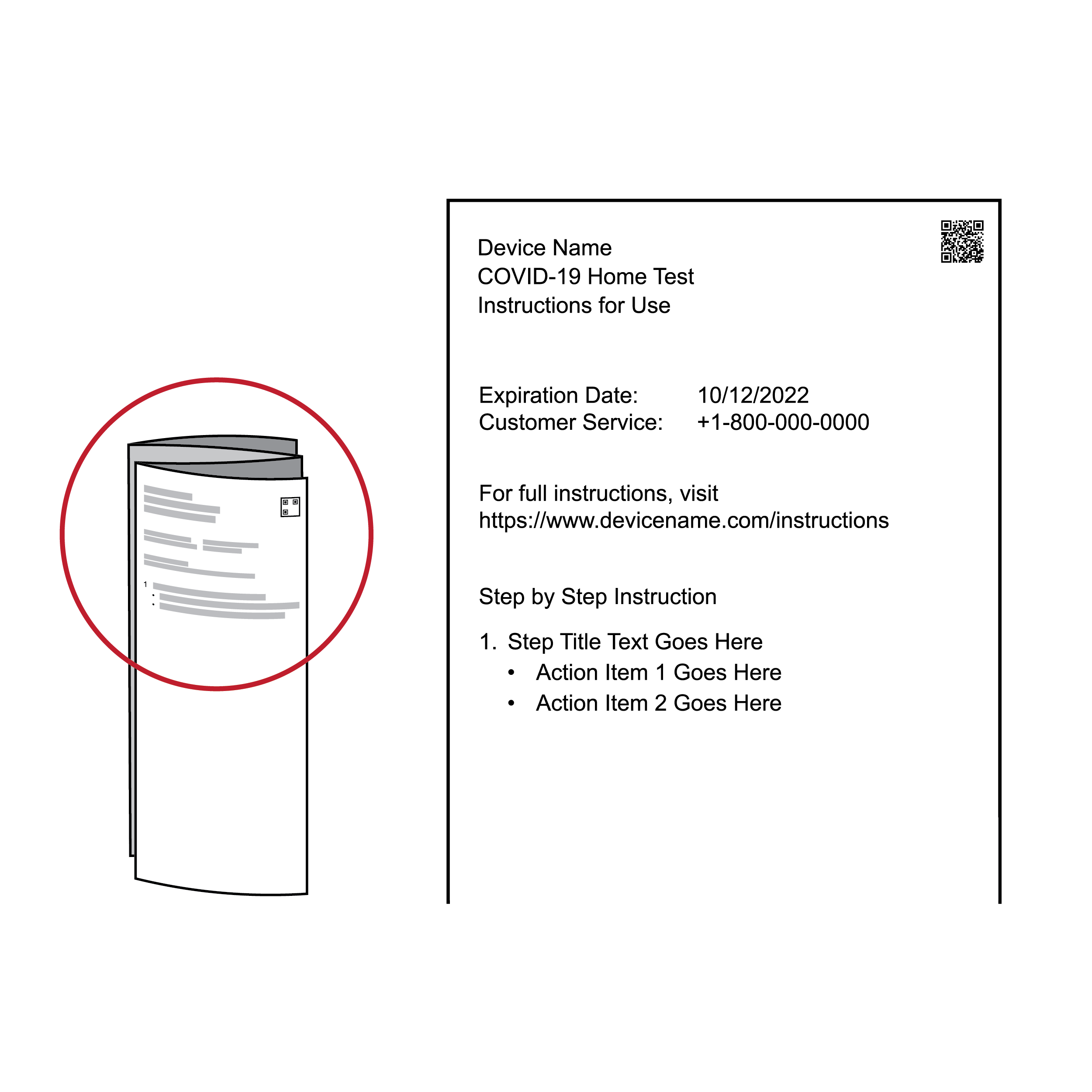
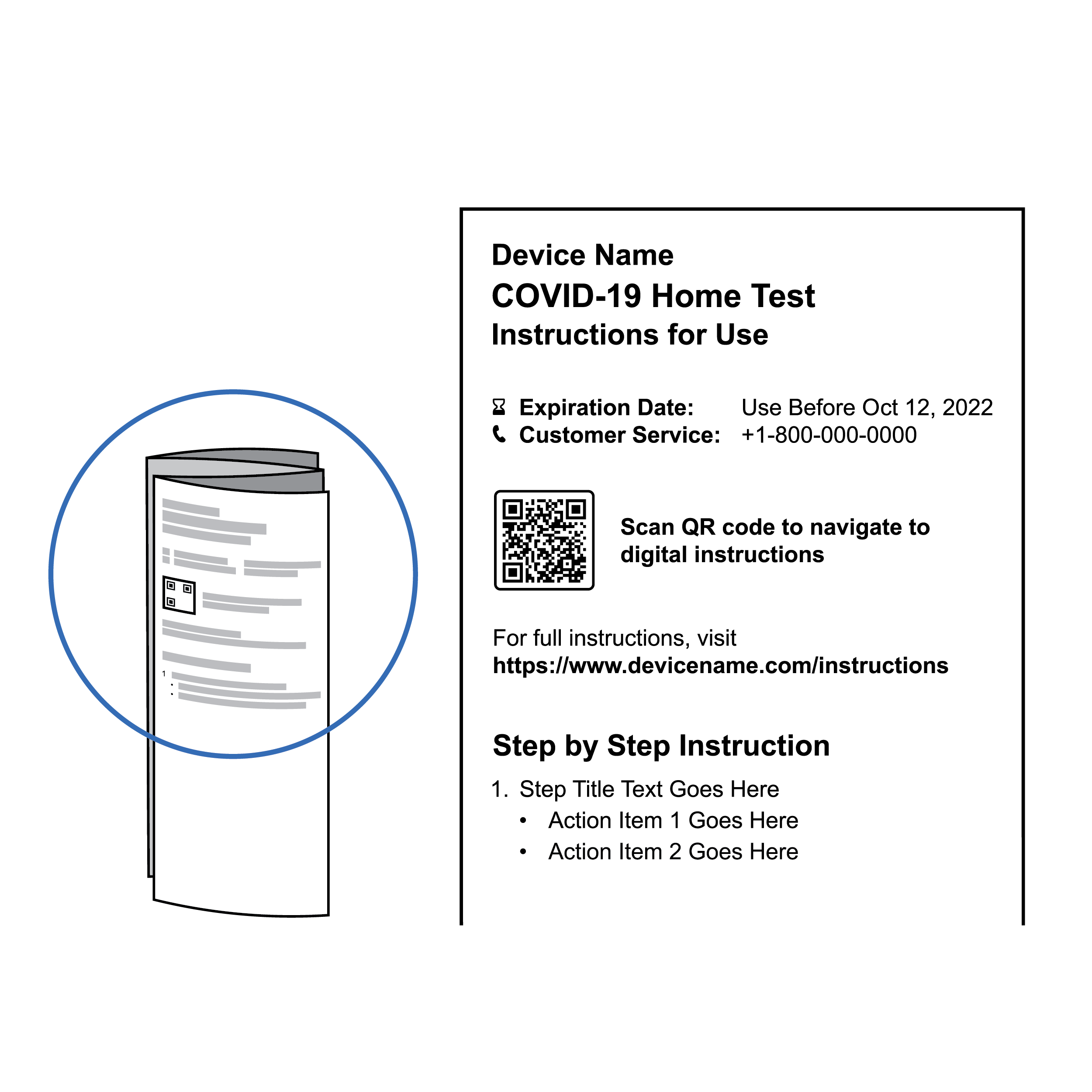
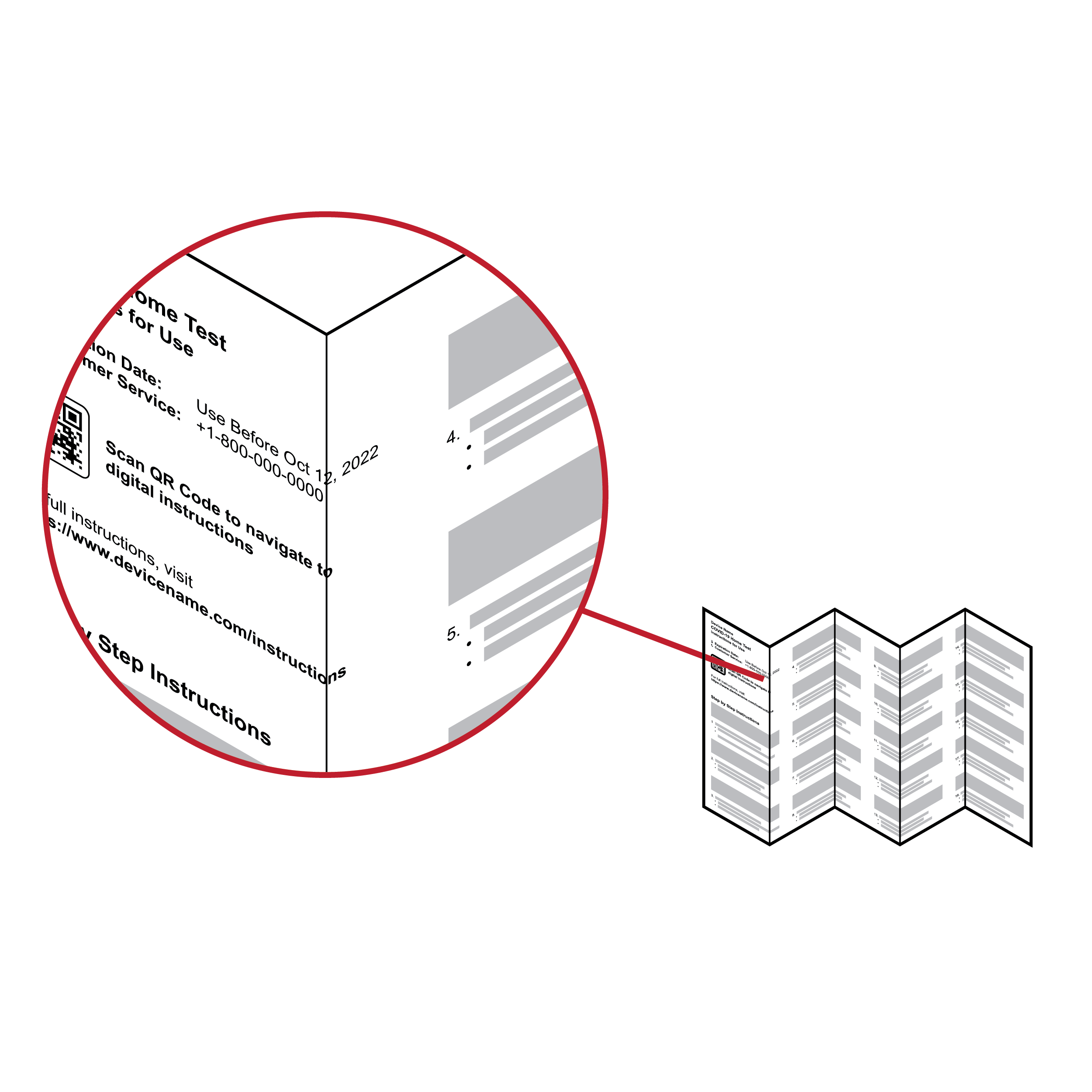
- Expiration dates and QR codes are small and difficult to locate.
- Presenting critical information without text labels creates issues with OCR interpretation (e.g., an expiration date presented as a number string may not be recognized as a date).
Recommendation
 Key information stands apart
- Present key information in large and/or boldface font (minimum 14 point, ideally 18 point or larger).
- Include a QR code linking to digital instructions sized 0.8 inches (20.3 mm) square or larger to align with current industry practice.
- Present expiration date with abbreviated or spelled-out month, numerical day and year (e.g., Oct 12, 2022), as well as in unique device identifier (UDI) format (e.g., 2022-10-12). Ideally, identify expiration date via text label (e.g., ‘Expiration Date, ‘Use before’ or ‘Do not use after.’).
- Label critical information such as the product website, customer service phone number, and customer service email with text to provide context to users employing OCR applications.
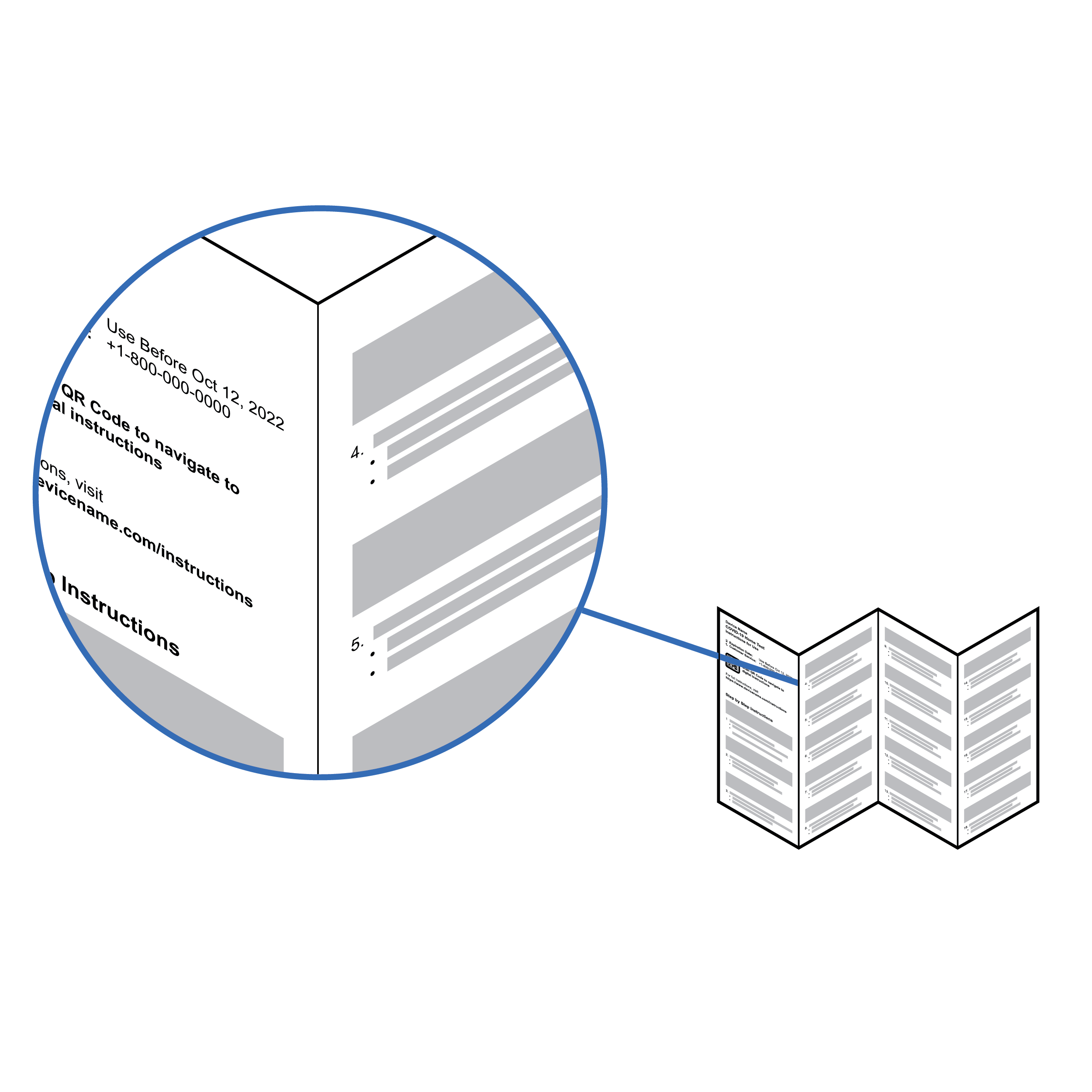
Issue
 Poor color combination; test instructions with poor legibility
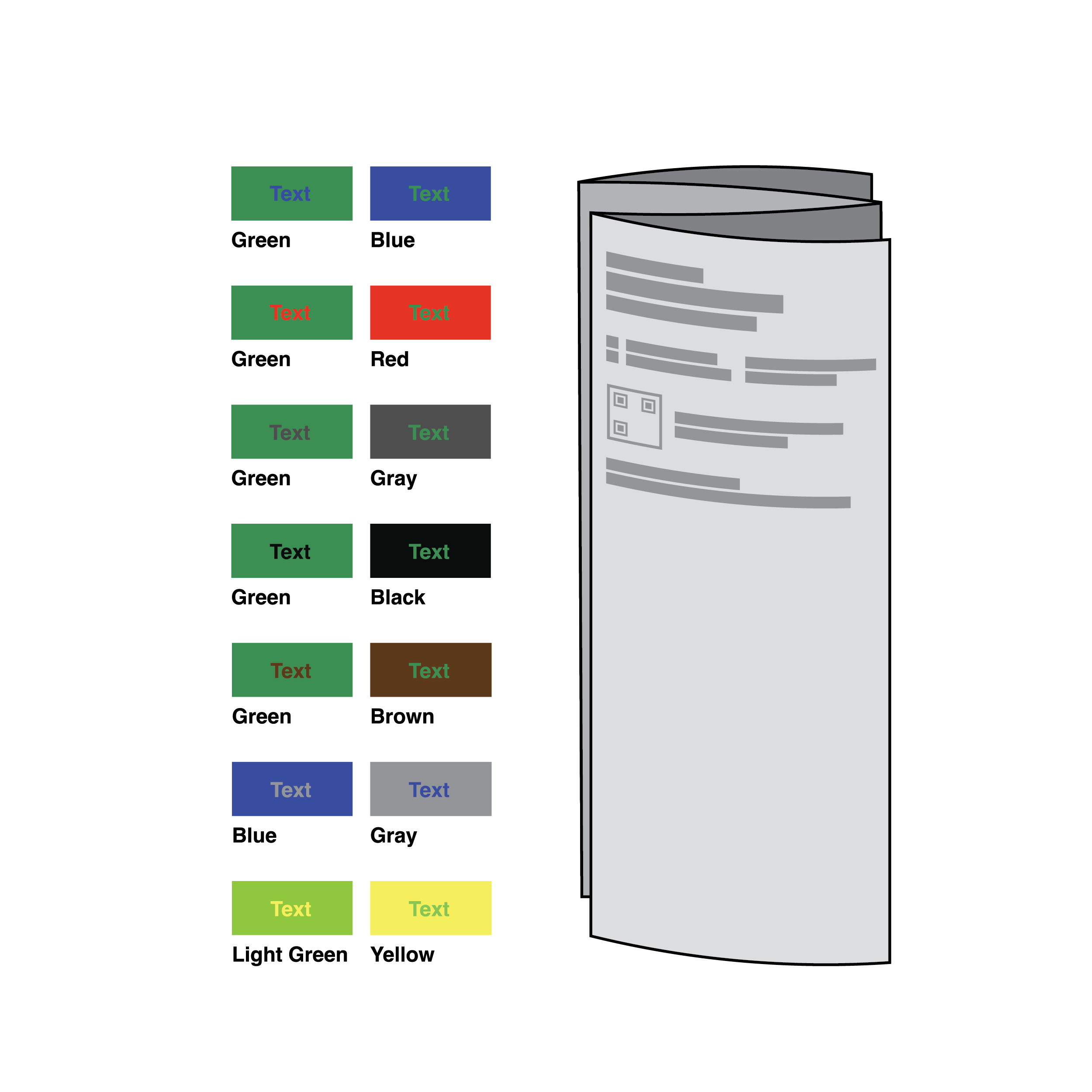
Information may be provided with poor color contrast, making it challenging to perceive key information.
Recommendation
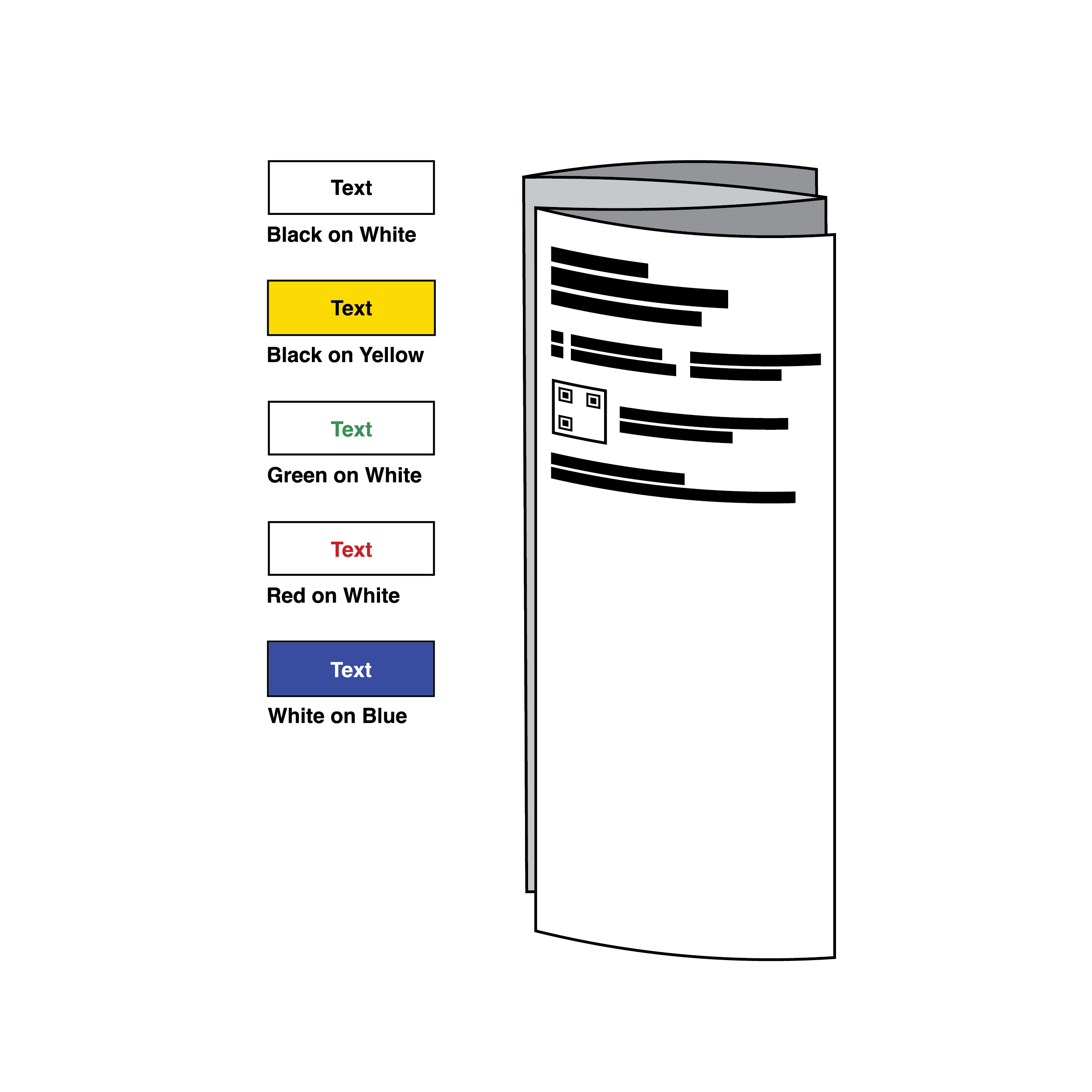 Recommended color combination; legible test instructions
Color contrast should allow for clear differentiation between the text and background. Provide a minimum contrast ratio of 4.5:1 for 14 point or smaller font and 3:1 for larger font. Contrast ratio compares relative luminance of text and background color and can be measured using free color contrast checker tools like TPGi’s Colour Contrast Analyser (CCA). [12]
8.2 Readability and Layout
Issue
- Steps requiring multiple actions or tasks can be challenging to comprehend and follow.
- Too much information can be presented in a format that is difficult to follow with individual steps consuming variable amounts of page space.
Recommendation
- Provide a single, actionable task for each step.
- Break text describing workflow steps into block paragraphs of comparable length, using bullet points where possible.
Issue
 Text layout with inconsistent information flow
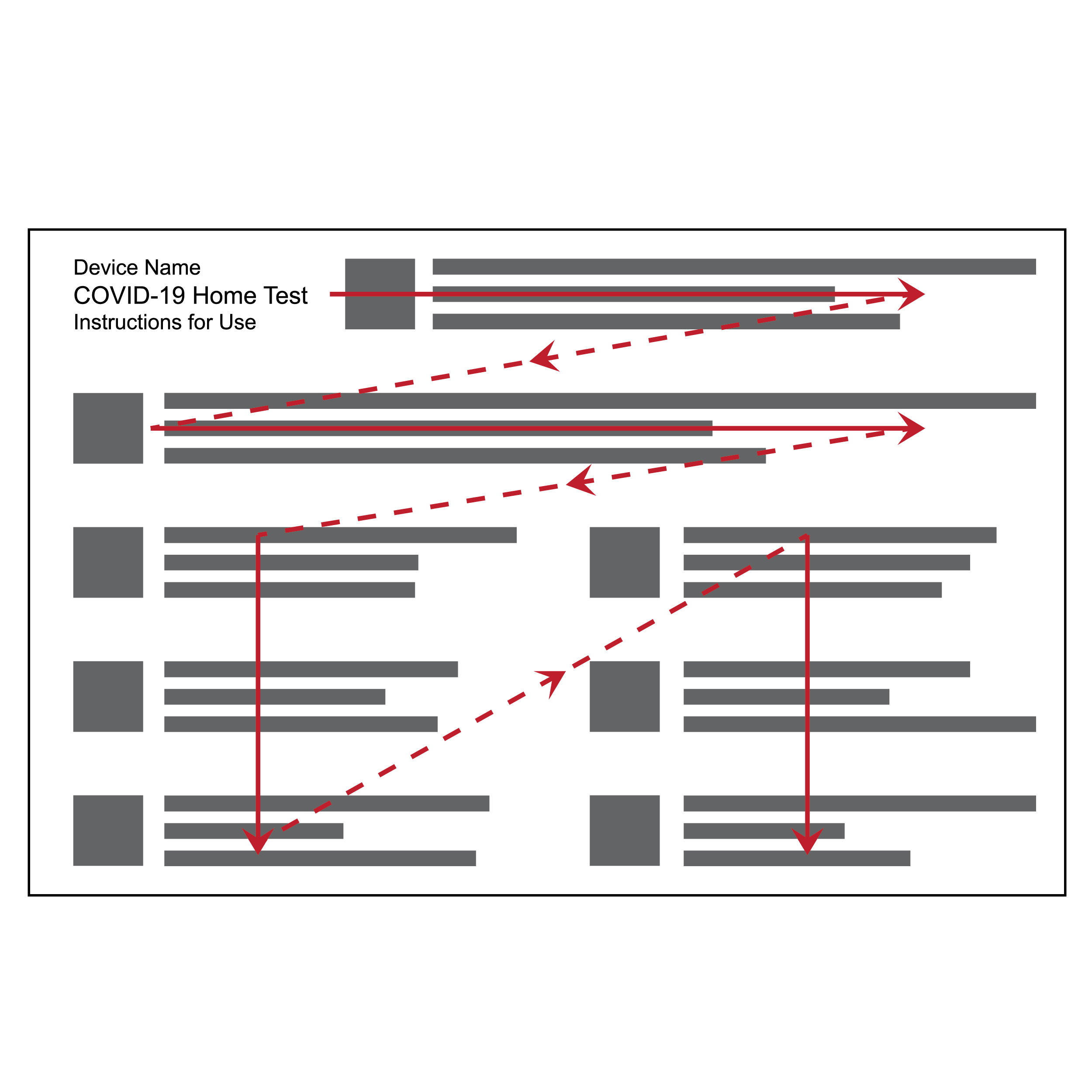
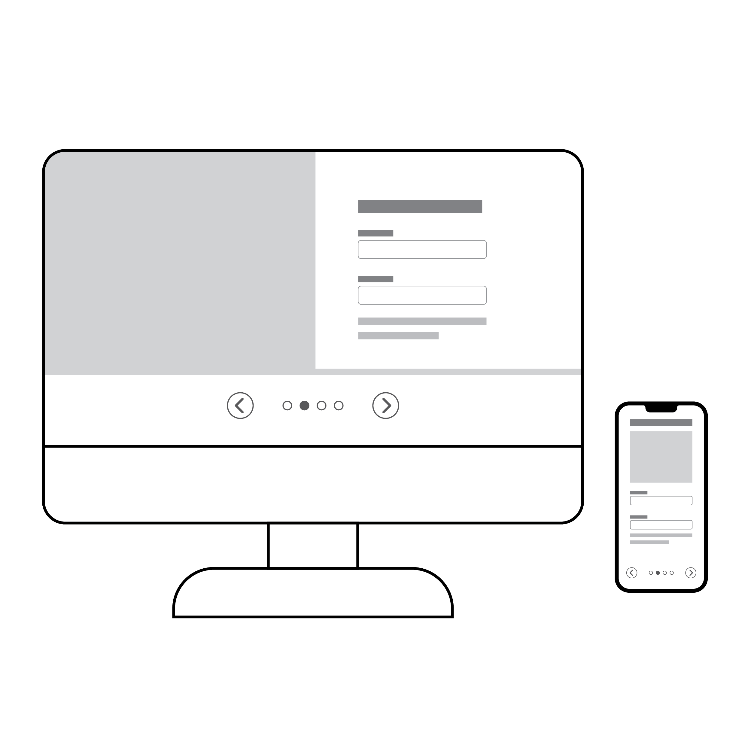
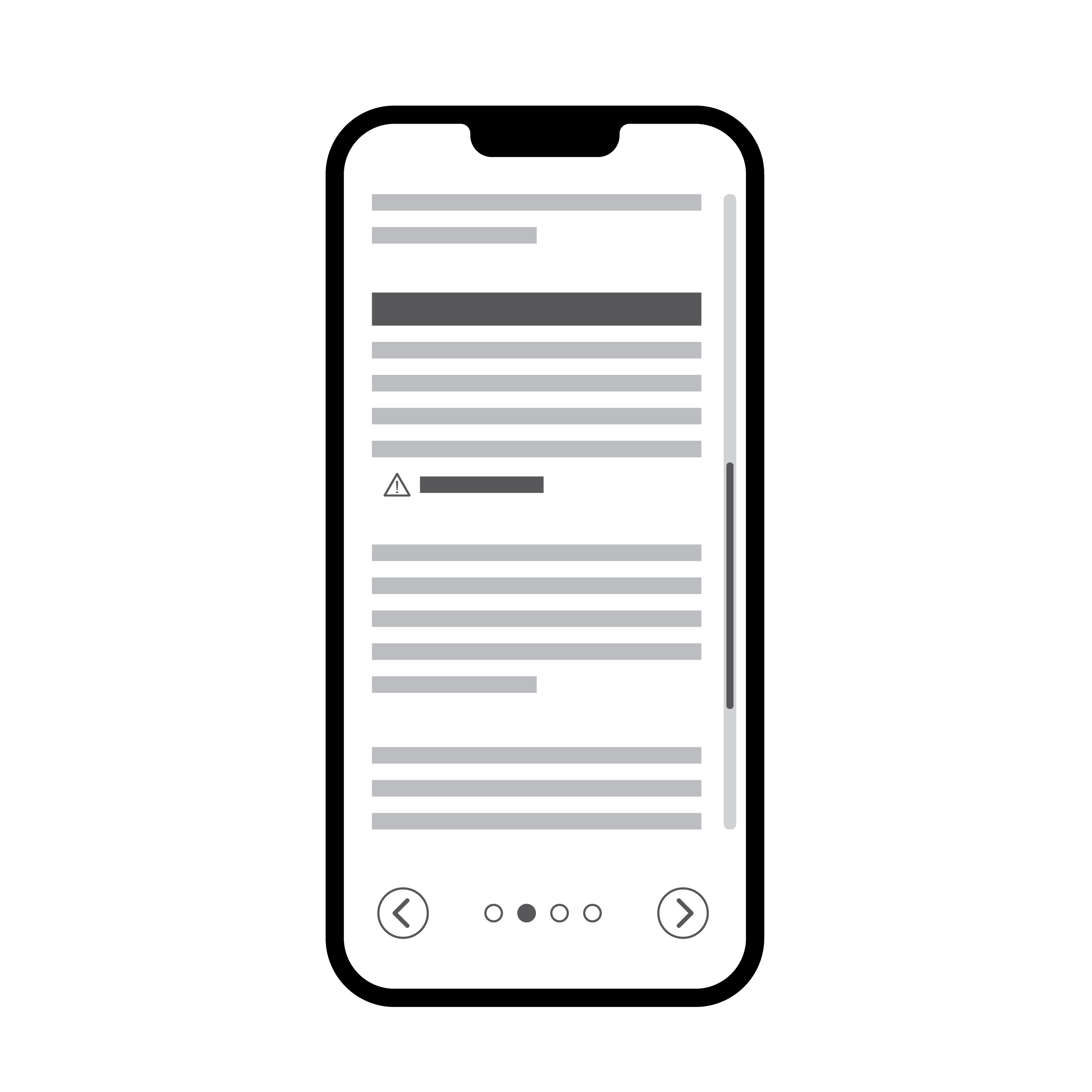
- Blocks of text may be presented in different layouts, with some sequences of blocks reading left to right and others top to bottom, making following along cumbersome.
- Large, unbroken blocks of text make digesting information difficult, and wide columns make some users physically dizzy.
Recommendation
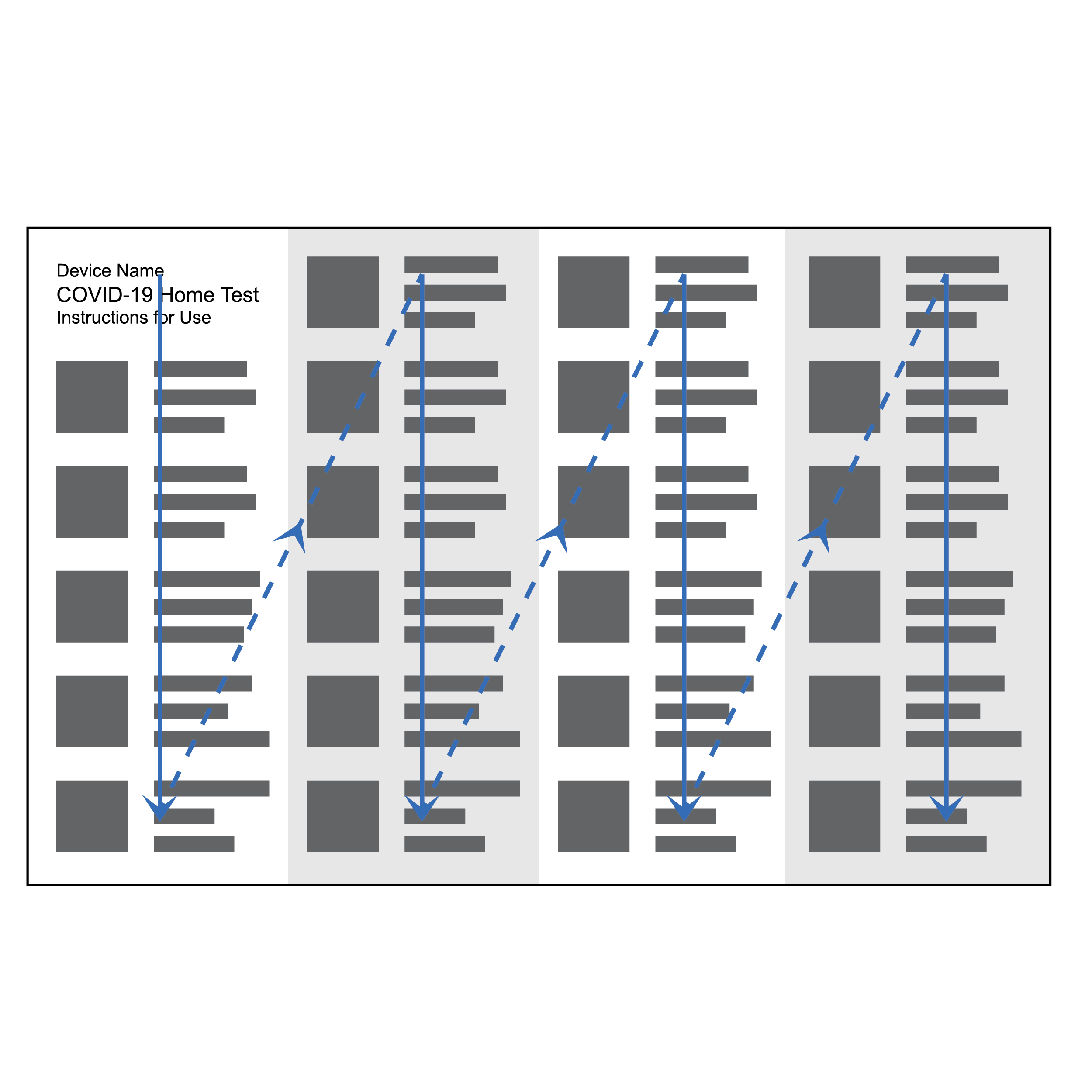 Recommended text layout and information flow
- Use the flow scheme shown above with columns arranged left to right. Two columns on 8.5 x 11 inches (216 x 279 mm) U.S. letter size paper in portrait orientation, or four columns on 11 x 17 inches (279 x 432 mm) tabloid size paper in landscape orientation works well.
- Text columns should be equal width and include proportioned column gutters.
Issue
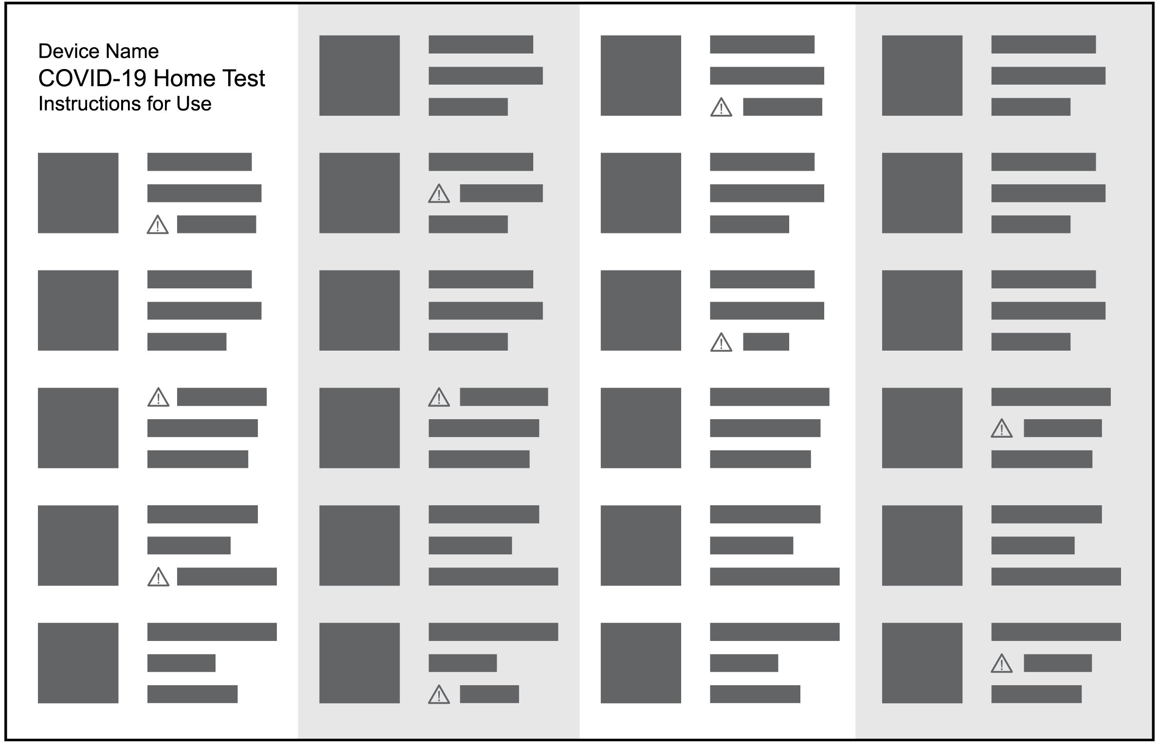 Numerous warnings embedded in copy
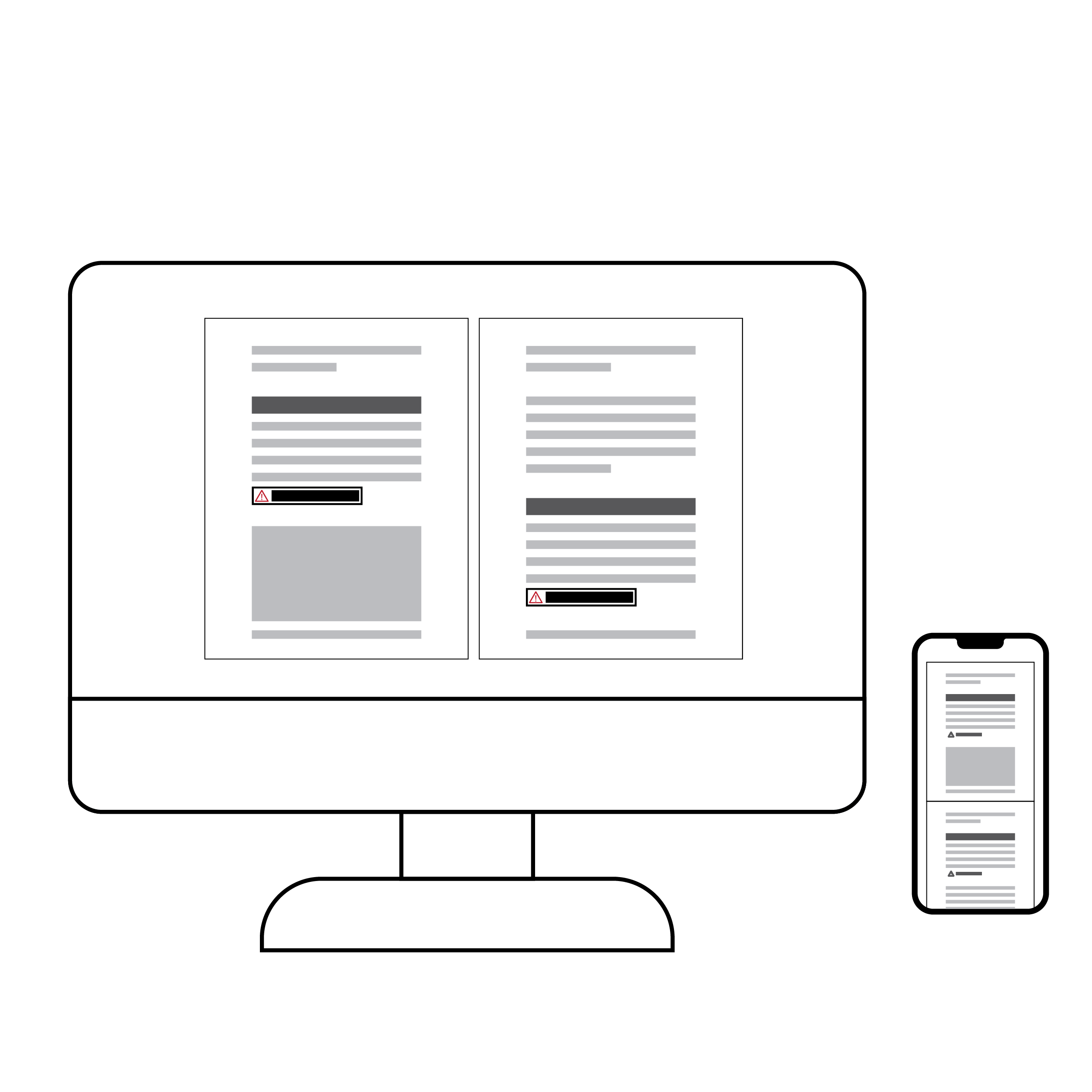
Warnings are presented inconsistently making it hard to locate them or allow the critical warnings to attract the appropriate amount of attention.
Recommendation
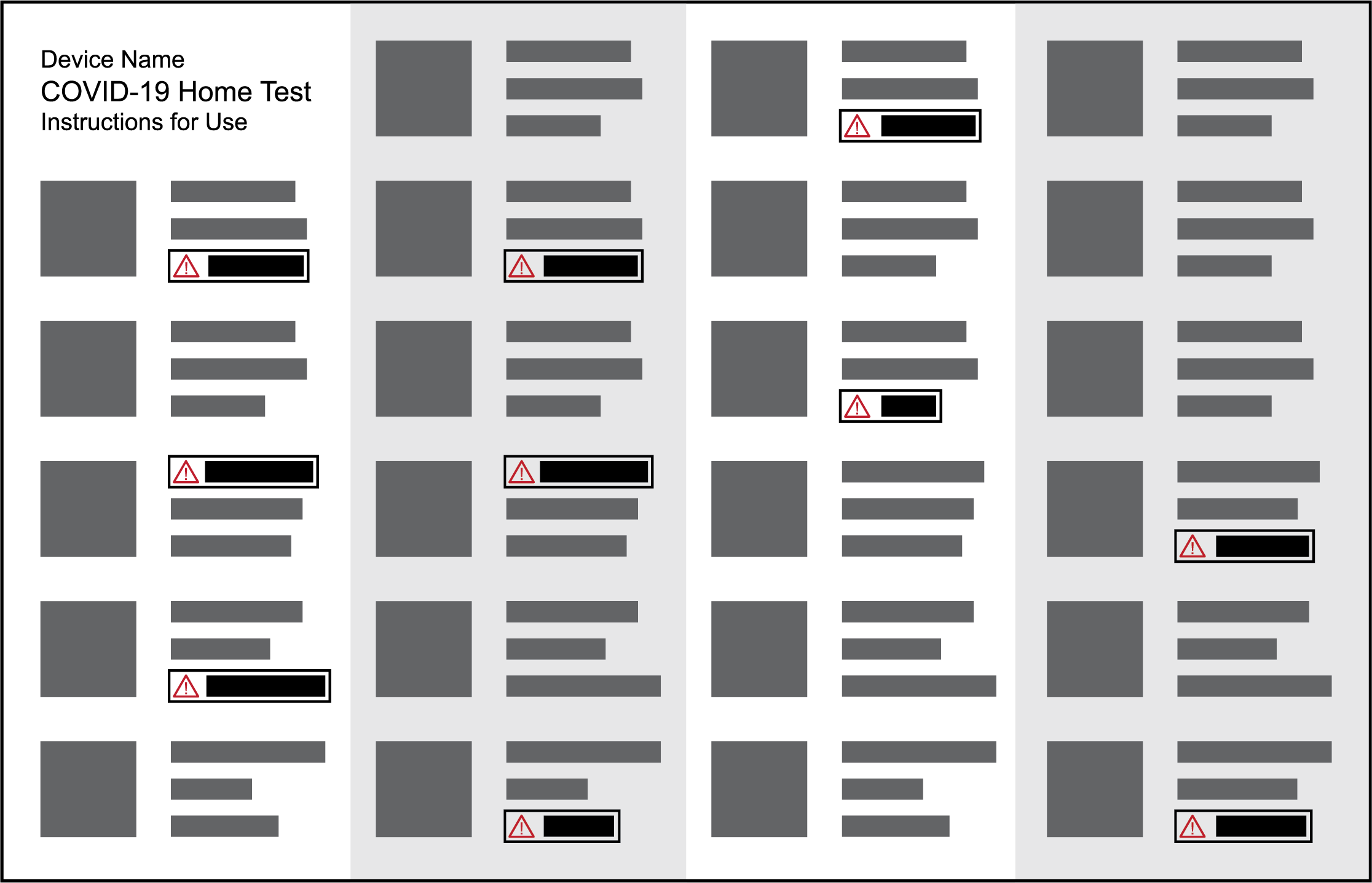 Targeted warnings, visually differentiated from plain copy
Critical warnings (e.g., those where user error is associated with the greatest risk of an invalid test result) should be communicated in a consistent manner (e.g., with a red warning symbol and boldface font in a text box callout).
8.3 Language
- Plain Language
- Descriptive Language
- Alternative Text
- Braille
Plain Language
Plain language is a process for developing a communication (such as a printed document, webpage, or mobile application screen) that allows intended users to “find what they need, understand what they find, and use what they find to meet their needs”. [13] [14]
Plain language is the process of developing user-appropriate information. It includes purpose, structure, expression, design, and evaluation.
Purpose: identify and describe the target users and the communication goals.
- Develop clear information goals.
- Select document content with the target users in mind.
- Align content structure and design to target users’ needs, skills, and interests
- Use target user information, such as reading level, experience, and style preferences, when developing content.
Structure: group and present content with a clear rationale to guide the user.
- Organize the document with ease of access in mind.
- Use familiar structures to make document navigation logical and relatable.
- Create balance in information delivery: not too lengthy, in order to maintain attention, and not too short, in order to provide sufficient context.
- Create document flow by grouping related content and using descriptive headers.
- Divide document sections clearly and consistently.
- Limit header levels to three or fewer.
- Present sequential items in a numbered list rather than a bulleted list.
- Use parallel structures for equivalent content.
Expression: select words, sentence structure, and overall organization for logic and empathy to promote comprehension and engagement.
- Use terminology specific to the end user.
- Provide the lay user with an explanation of unfamiliar or technical terms.
- Incorporate descriptive language where possible (see 8.3 Language • Descriptive Language).
- Mix sentence length, with an average of 12-15 words per sentence.
- Lead paragraphs with key information.
- Create coherence by grouping related ideas, with transition words between sections when appropriate.
- Use a bias-free conversational tone, focusing on positive outcomes and desired behaviors.
- Use warnings to convey potential negative outcomes
- Match hyperlinked text to the landing webpage titles.
Design: apply information design to enhance legibility, readability, and comprehension.
- Ensure document design elements support the message as well as user comprehension.
- Use typography to support legibility (see 8.1 Legibility).
- Use layout to support readability.
- Use whitespace to highlight information organization.
- Use clear and meaningful illustrations to support comprehension.
- Use illustrations of desired behaviors and results, when possible.
- Omit unnecessary elements that create distraction.
Evaluation: develop and test wording, structure, and design with end users.
- Elicit input from target users to determine needs, preferences, usability, and satisfaction before, during, and after development of a document. (See 5. Engaging End User Advocacy Groups and 7. Assessing Usability).
- Develop information with input from target users.
- Select valid methods for measuring understanding and actionability of information.
- Measure information clarity, accuracy, and usefulness with the target users.
- Ask target users if it is clear who the information is for and what the purpose is.
- Ask target users to paraphrase key concepts and show how they would find information in the document.
- Compare before and after versions of the information to confirm plain language improvement.
Descriptive Language
Language should be descriptive and provide nonvisual points of reference and instruction for better end user comprehension. In general, word count should be minimized while still providing effective descriptions. Ideally, descriptive language should be included in body text of test instructions, but additional supporting information may be provided via alt text or ‘More Info’ redirects.
Issue
- Certain practices create unnecessary ambiguity, such as referring to components or features generally as “this” or “that” and using abbreviations/ acronyms.
- Test instructions sometimes refer to components and features inconsistently.
- Component descriptions lack sufficient detail.
Recommendation
- Avoid using pronouns.
- Avoid using abbreviations or acronyms. If necessary, clearly define the abbreviation or acronym at first instance and use consistently thereafter.
- Use the same name for a component or feature throughout the test instructions and labels on components or packaging.
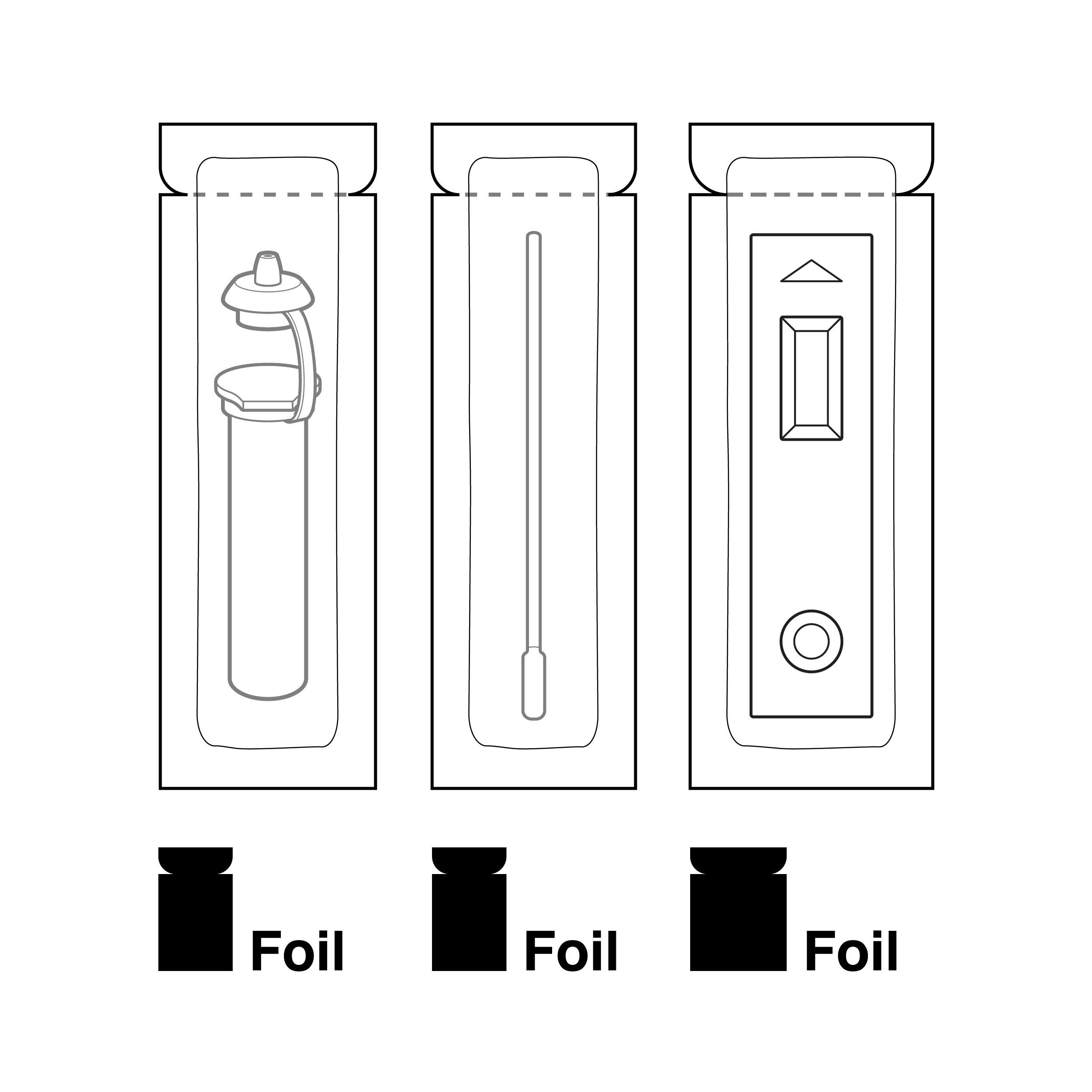
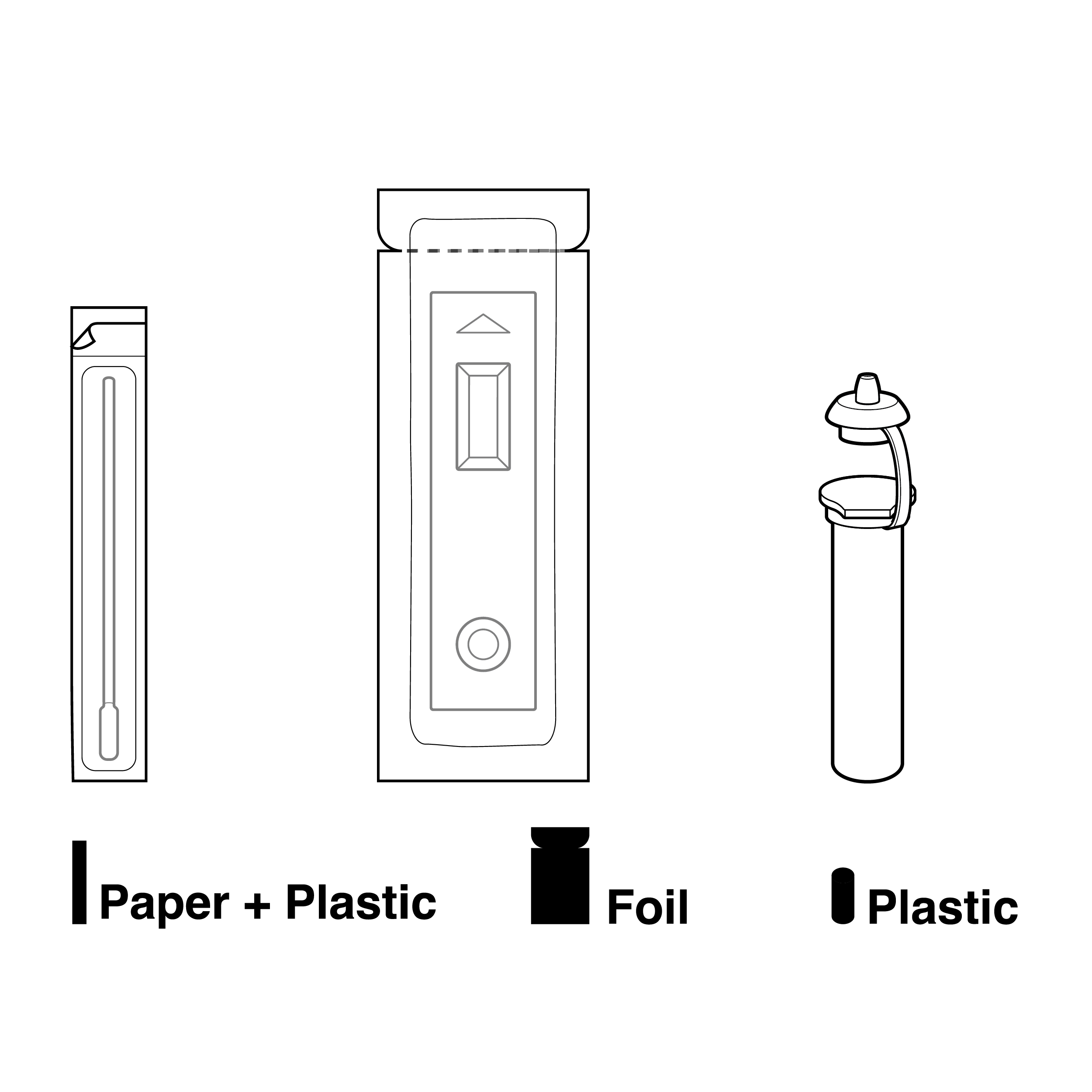
- Components should be described with both tactile and visual references. Terminology used should focus on differentiating components by feel, such as through shape, texture, material, or weight. Example descriptors:
- Shape: rectangular, cylindrical, long, thin, wide, flat, narrow, tall
- Texture: smooth, rough, soft, hard, raised
- Material: paper, plastic, foil, metal
- Weight: heavy, lightweight
Issue
Color is used and described ineffectively.
Recommendation
- Color should be used to refer to easily distinguishable areas, and reference to color should be accompanied by a nonvisual descriptor (e.g., ribbed red dropper cap, rectangular silver pouch).
- Avoid using colors that may be imperceptible or indistinguishable. [15]
- Describe each color by name and relative tone (e.g., brighter), if applicable.
Issue
- The order of descriptive information may prevent users from accurately locating an item.
- There is often no written description of where the results window is located, or where control and test lines will appear within it.
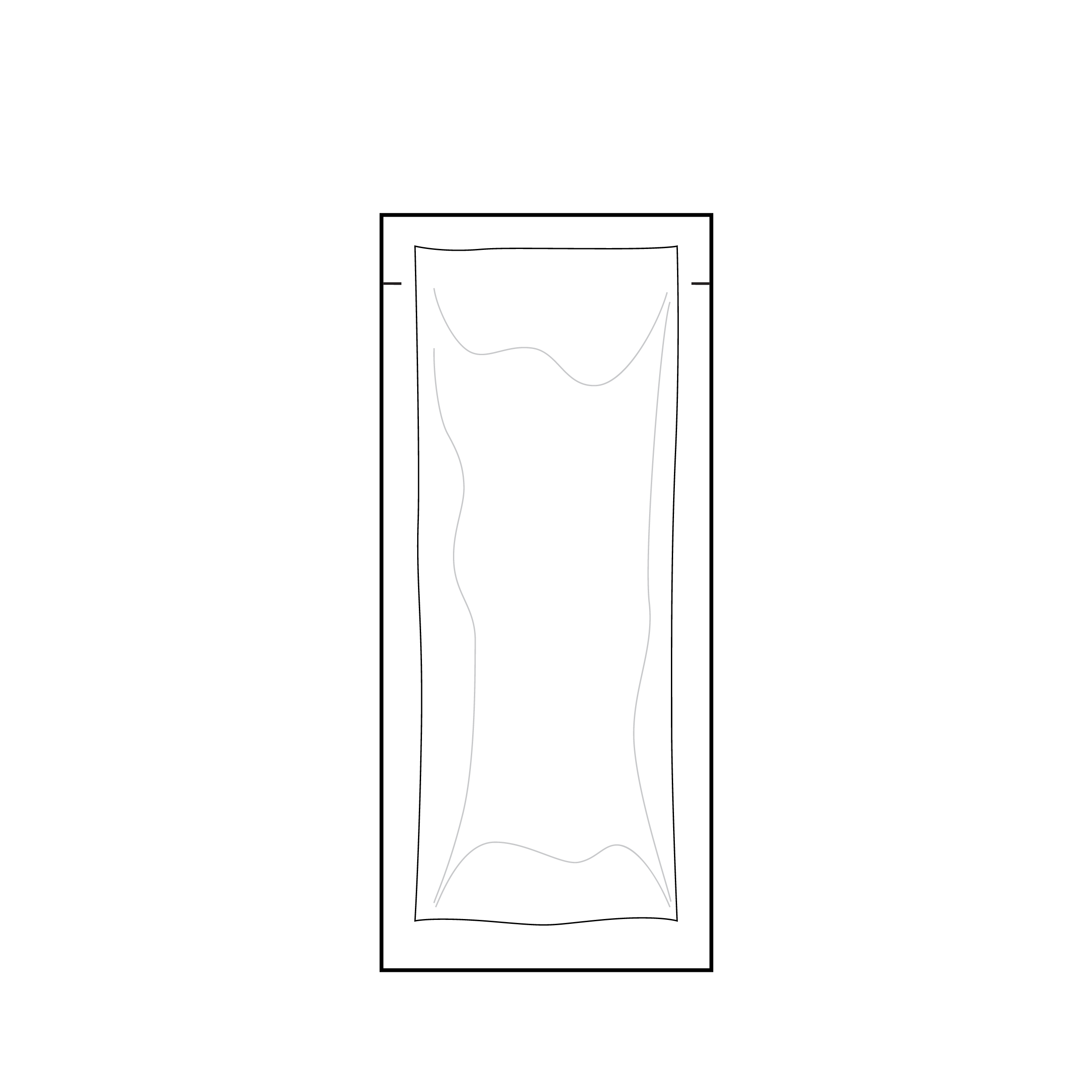
Recommendation
- Start with a brief description of how the feature will feel and follow with details of location progressing from broad to specific to yield one unique location. Conclude with a secondary visual descriptor.
- Example: “The notch is a small slit in the edge of the flat, foil pouch on the long side near one end. It is marked with a black arrow.”
- Description composition: [feature name = notch] [feature tactile reference = small slit in edge] [highest level location reference = flat, foil pouch] [increasingly specific location = long side, near one end] [secondary visual descriptor = black arrow].
- For results interpretation, describe the relative location of the result indicators.
- Example: “The results window is positioned closest to the rectangular end of the cassette. On the test strip secured in the results window, the control line is positioned closest to the rectangular end of the cassette and the test line is positioned closest to the rounded end of the cassette.”
Alternative Text
Alternative (alt) text is text included in webpage HTML code or in a digital file tag structure that describes non-text media such as graphs, charts, and non-decorative images. It provides equal access for those viewing content with a braille display or screen reader.
Issue
- Alt text may inadequately describe the content of an illustration.
- Alt text may inadequately convey information in visuals.
- Alt text length varies.
- Alt text may be overly informal.
Recommendation
- Alt text should build on the copy, translating visual content and providing supporting detail without being redundant. Together, alt text and instructional copy should enable a user to understand and complete the test workflow without visual references.
- Example: “an illustration of a swab breaking in half with the tip in a tube” would be better written as “with the swab tip in the tube, the swab can be broken in half at a notch in the middle of the handle.”
- Reiterate critical warnings provided in illustrations where the critical warning text is not included in the copy and digital read order.
- Generally, alt text should be kept to one to two sentences, though complex visuals may require longer alt text.
- If alt text is lengthy, consider incorporating it as part of the body text of test instructions instead.
- Maintain correct grammar and punctuation in alt text.
Braille
Braille is a tactile reading and writing system in which raised dots represent the letters of the alphabet, numbers, and symbols. [16] Braille serves as one approach to capturing and conveying the same level of detail provided in text content.
Braille is an inherently physical medium traditionally produced using braille “printers” that emboss paper capable of retaining raised dots. Braille has a fixed minimum character size roughly comparable to 28-point font. One traditional print page of text typically transcribes to multiple braille pages, depending on the character count and formatting. Particularly dense, information-packed documents could easily transcribe into significantly longer paper braille documents, especially if they include complex content such as graphs, charts, or non-decorative images. It is desirable to make paper braille instructions available to customers upon request.
Creating web-based, digitally accessible documents is a cost-effective method for manufacturers to provide additional access to braille. Braille displays enable users to access digital content through braille instead of audio only, so they can obtain the rich information embedded in text including capitalization, typographical emphasis, spacing, and punctuation. [16] Digital formats that can be readily converted to braille using assistive technology include:
- An accessible webpage with HTML content that is compatible with screen readers and braille devices.
- An accessible PDF document available for download.
- A braille-ready file (.brf) aimed at users who have braille devices but do not regularly make use of computers, smartphones, and/or the Internet.
Note: Product labeling should adequately inform users of the instruction formats that are available and how to obtain them.
8.4 Illustrations and Symbols
Issue
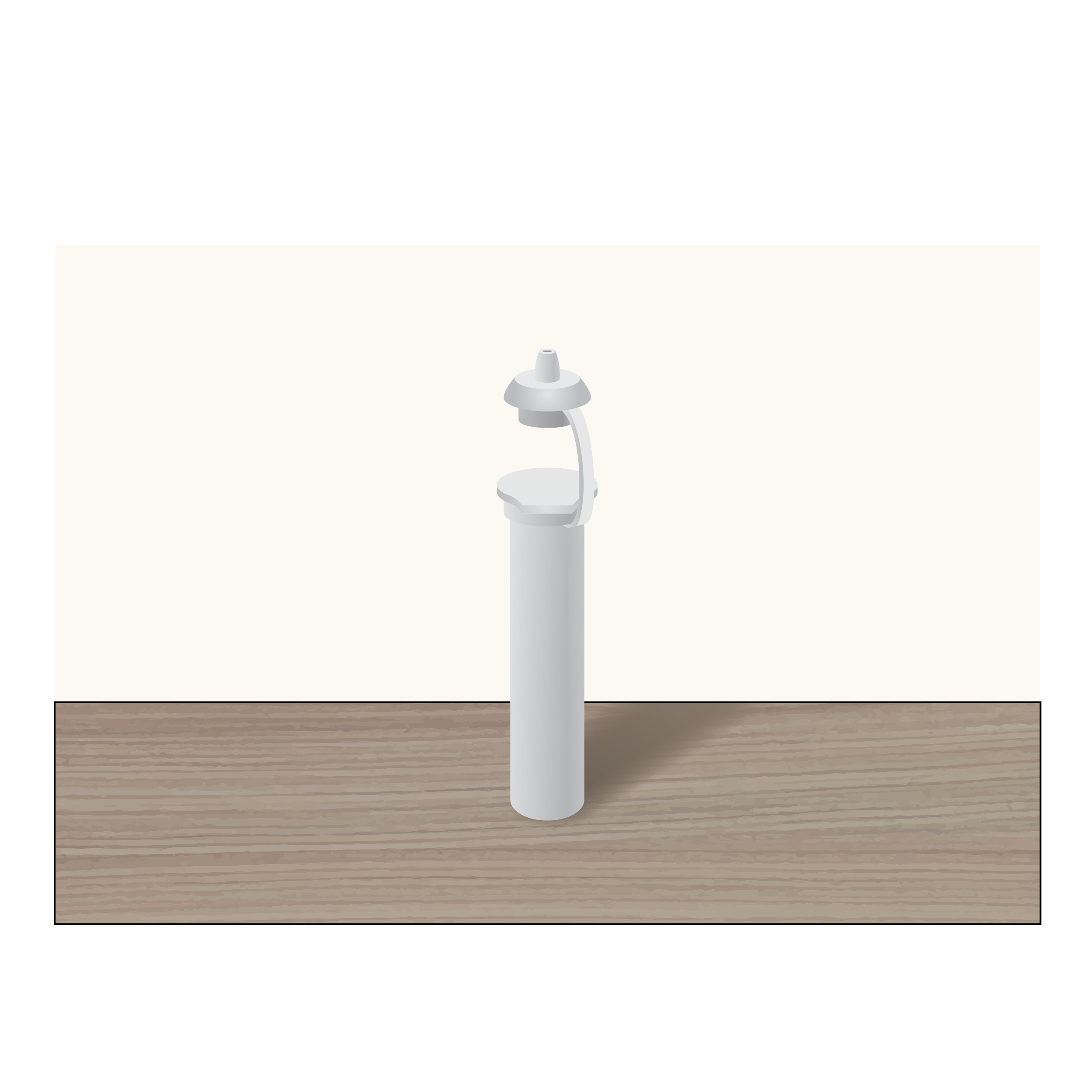 Photo backgrounds distract from product
Photos contain extra, unnecessary information making them difficult to interpret, especially when printed on an embossing printer.
Recommendation
 Line drawings improve comprehension
- Use line drawings with perspective instead of photos.
- Use varying line weights to distinguish detail and accent features (e.g., 1 point – 1.5 point for lines and 3 point – 4 point for accent features).
Issue
 2D thin line and low contrast drawings
It can be difficult to interpret 2D drawings, especially those with thin lines, low contrast, or lower image quality or sharpness.
Recommendation
 3D drawing with appropriate line thickness
Use high-quality, high-contrast, thick line drawings with shading, as appropriate.
Issue
 Illustrations without context
Illustrations without context do not inform readers about relative component size and force the reader to guess how components are to be utilized.
Recommendation
 Illustrations with context
- Use illustrations that provide physical context for the reader (e.g., include hands, noses).
- Keep illustrations simple, using only enough detail on features to clarify their purpose (e.g., a head does not need to include hair).
Issue
 Non-standard symbols
Symbols are hard to understand if they are arbitrarily chosen or region-specific. Their meaning may not be obvious to the reader.
Recommendation
 Standard symbols
Use unambiguous and globally accepted symbols. Follow the ISO 15223-1:2021 standard for symbols used on medical device packaging. [17] Include text labeling immediately adjacent to symbols (e.g., ‘Expiration Date’ next to hourglass symbol).
Issue
 Illustrations without realistic detail
Illustrations that are not presented with details that match the actual component may cause confusion.
Recommendation
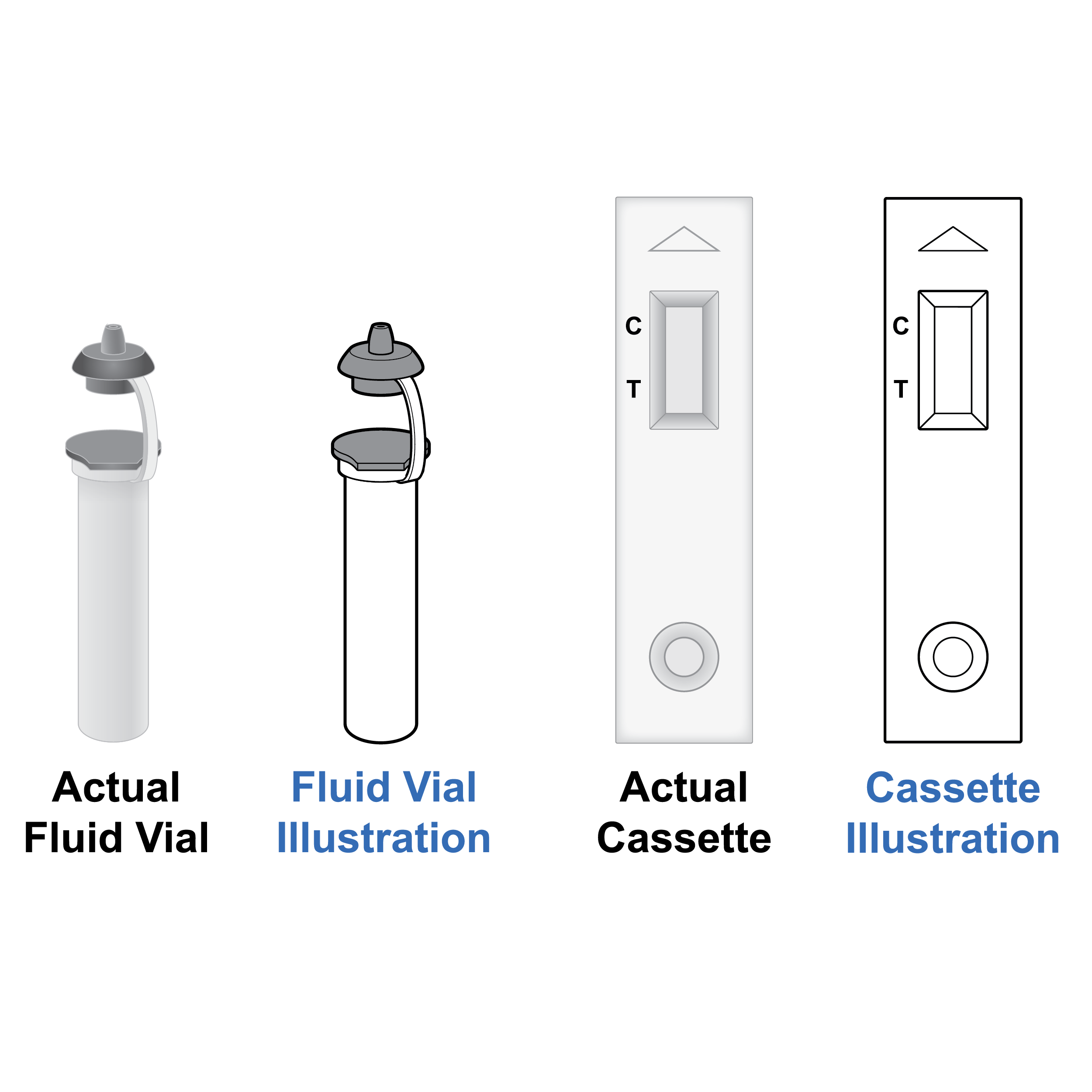 Illustrations with realistic detail
- Make sure illustrations match the actual appearance of the components (e.g., if a cap is gray, do not illustrate in white; if the cassette has text or other markings on it, include these in illustrations).
- Use grayscale as appropriate and retain outlining of gray features.
Issue
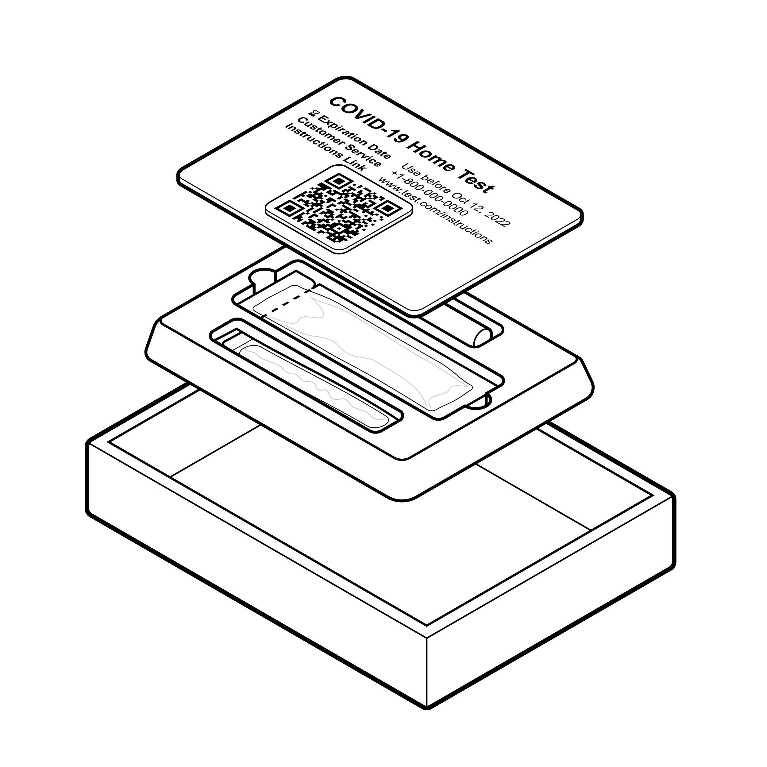 Unreferenced exploded view image with overlapping elements.
Illustrations with elements that are overlapping and appear to be floating in space without a composite reference are difficult to decipher.
Recommendation
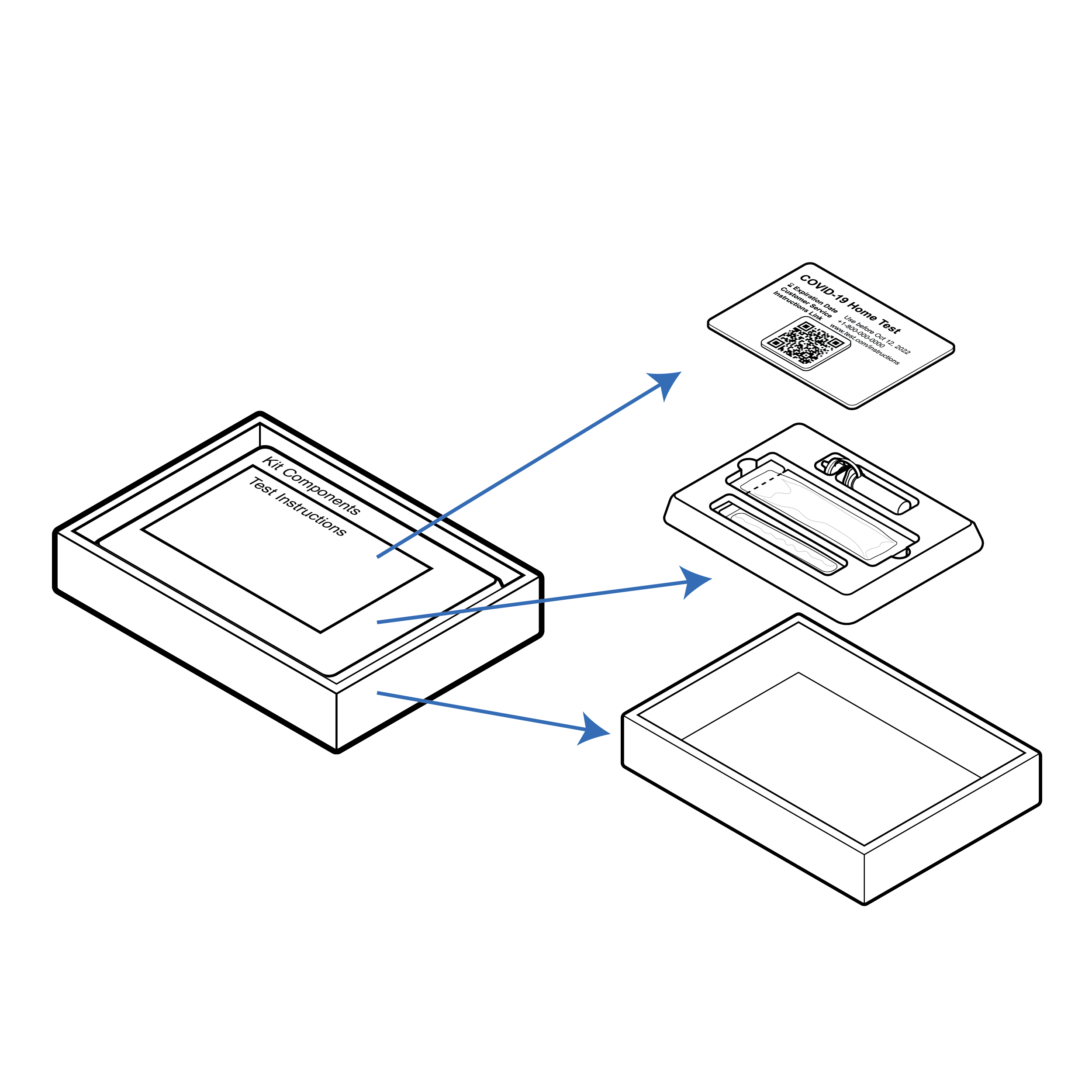 Referenced exploded view image without overlapping elements.
For exploded view illustrations:
- include a composite reference image;
- ensure exploded elements are not overlapping;
- utilize arrows to indicate each exploded element’s position in the composite reference image; and
- utilize solid arrows between exploded elements to signify stacking.
8.5 Printed Embodiment
Issue
 Information split across paper fold
Large instruction panels with folds can result in text crossing over folds. Same-topic information may be split across front and back panels, resulting in reduced readability.
Recommendation
 Information contained within folded panels
- Ensure paper creases only appear in text column gutters so it is easier to scan parts of a folded document for OCR.
- Place all information needed to run the test on one side of the paper or card. The other side can be used for supporting information.
Issue
 Test instructions that require full unfolding
- It can be difficult to physically place test instructions adjacent to test components due to size or material, which makes it difficult to reference instructions while using the test.
- Tests with fluid can result in spills that may deteriorate less robust instructional materials.
Recommendation
 Test instructions that can be unfolded by section
- Provide test instructions in a form that allows placement adjacent to a test on a table.
- Consider that lighter paper weights allow instructions to lay flat. Use materials that can withstand some amount of liquid spill. If coatings are used, limit reflectivity.
Issue
 Test instructions are too large for scanning
Paper (or similar) documents may be provided in an incompatible format for assistive technology. Pages or panels may be too large for flatbed scanners and smartphone OCR. Multiple panels without numbering make it difficult to navigate from page to page.
Recommendation
 Test instructions are an appropriate size for scanning
- Provide paper (or similar) documents in panels no larger than 8.5 x 11 inches (216 x 279 mm) U.S. letter size to facilitate flatbed scanning.
- Use page numbers for multiple panels on the front and back.
Issue
 Test instructions without orientation cue
Physical instructions lack tactile, page orientation cues.
Recommendation
 Test instructions with orientation cue
Include a tactile page orientation cue, typically a clipped upper right corner, on physical instructions.
8.6 Digital Embodiment
- Operating System Compatibility
- Assistive Technology Compatibility
- User Interface and Experience Features
- Standalone Audio Instructions
- Interactive Voice Response (IVR) System
- Video Tutorial
Operating System Compatibility
 Device operating systems
The ability for content to be recognized and understood by computer, smartphone, and tablet device operating systems (OS) and accessibility tools is vital for ensuring user access to information about the test.
Issue
- Test instructions are provided in a format that is not compatible with computer, smartphone, or tablet device OS and accessibility tools
- Some features that provide feedback (e.g., auditory and haptic) can compromise user’s privacy and others (e.g., bright mode) can cause eye strain.
- Applications sometimes require users to enter personal information to sign in before providing access or the ability to receive test results.
Recommendation
- Ensure application recognizes and supports native device OS accessibility settings. Custom video playback tools are not desirable.
- Recognize and apply the user’s system-wide accessibility preferences (e.g., font sizing or inverted colors) and provide an in-application option to turn auditory/haptic feedback on or off.
- Enable dark mode option.
- If the application requires data entry for sign-in/ results reporting:
- Enable autofill and/or single sign-on (SSO) through Google, Apple, Facebook, etc.
- Clarify which data entry fields are required versus optional.
- Save partial data (e.g., create a user profile) so user does not have to input data again for repeat testing.
- Ensure that all data entry fields are assigned screen reader-compatible labels.
Assistive Technology Compatibility
Digital instructions should be provided on a website that conforms to WCAG 2.1 AA standard and has undergone rigorous testing with assistive technology such as screen readers and voice dictation software. [18]
The website should be accessible via QR code and a plain text URL. Test-specific companion applications are another method for users to access digital test instructions.
Issue
Test instructions are provided in a format that is not web or mobile accessible and/or is incompatible with native device operating system (OS) accessibility features.
Recommendation
- Digital test instructions should be housed on a webpage that applies responsive web design.
- Audit all relevant webpages for WCAG 2.1 AA compliance with experienced digital accessibility professionals to ensure compatibility with assistive technology. Complete a follow-up audit for WCAG 2.1 AA compliance following any remediation efforts.
- Reference and implement best practices for making application content web accessible and mobile accessible.[19] [20]
- Ensure the test instructions are available as a PDF that conforms to Section 508, WCAG 2.1 AA, and PDF/ Universal Accessibility (UA) standards. [21] Note that while Section 508 compliance indicates an accessible digital file format, it does not confirm language is accessible. Content requires a separate and thorough review (see 8.3 Language).
- Ensure all images have meaningful, descriptive alt text (see that 8.3 Language • Alternative Text) supports nonvisual discernment of kit components (e.g., by shape, size, feel).
- Ensure all form fields, buttons, and other interactive elements have accessible names/labels.
- Provide a digital accessible information system (DAISY) format of the test instructions with sections and subsections defined in the file.
- Provide a direct link on the product website to a full digital version of the test instructions.
Issue
 Formatting incompatible with screen reader
Not all digital test instructions are compatible with screen readers. Key elements are often coded incorrectly or in a format that screen readers cannot detect, meaning content may be out of order, incomplete, or incomprehensible. Test instructions may be provided in a format that is not compatible with use on a smartphone or tablet or that cannot be digested by native OS accessibility features.
Recommendation
 Formatting compatible with screen readers
Ensure digital test instructions are compatible with all commonly used screen reader and operating system combinations. Confirm both computer and mobile screen reader compatibility of every screen element (e.g., images, fields, buttons).
User Interface and Experience Features
 User interface and experience considerations
The presence or absence of features in an application or web design can significantly impact usability and user satisfaction with the test. A small improvement in user interface design can have a major impact on the entire user experience.
Issue
 Important information integrated into text
Some important content can be missed with the use of a digital user interface if the content is not appropriately segmented.
Recommendation
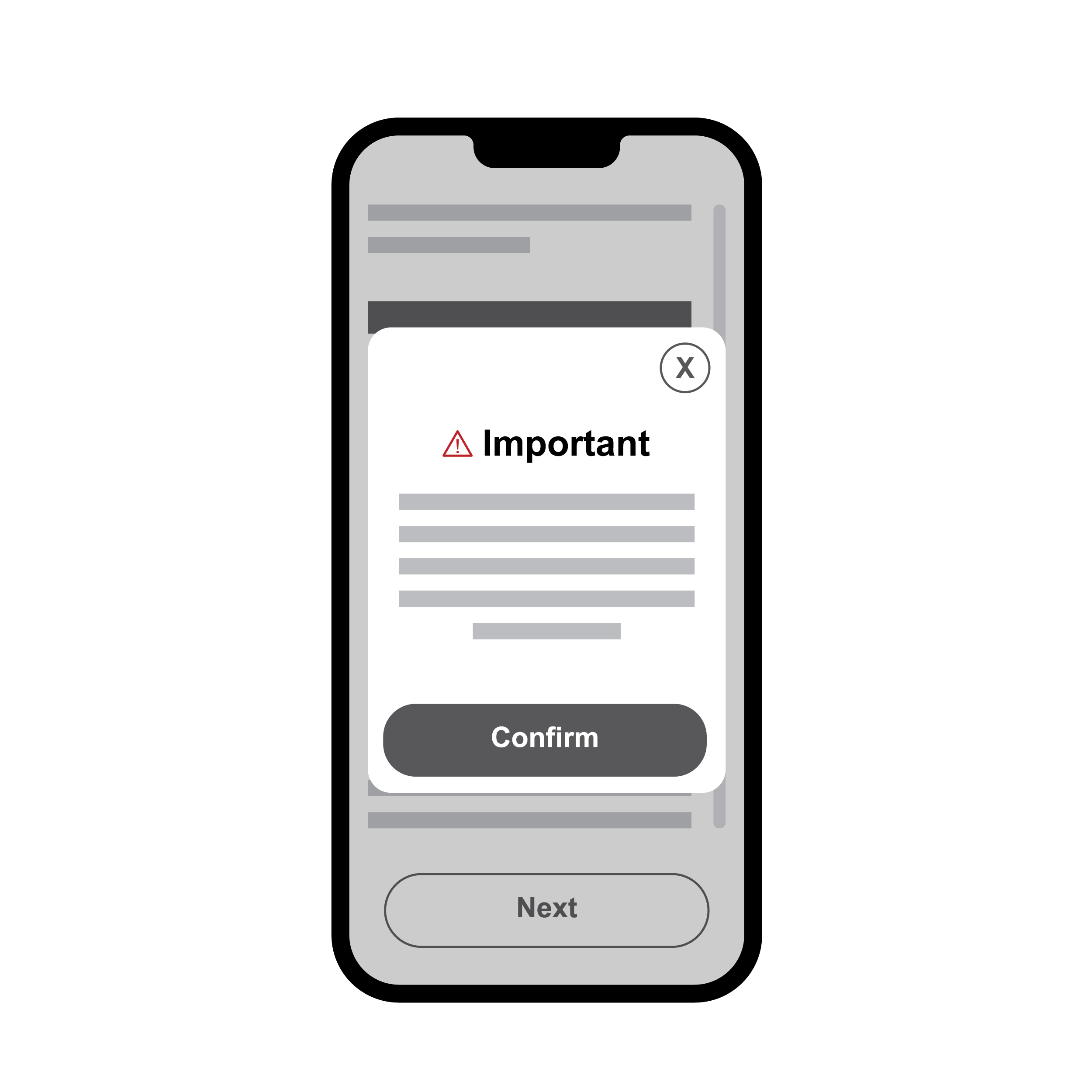 Important information presented in pop-up
- Provide pop-up messages for important content that remains on screen until user provides input to acknowledge the message.
- Errors, warnings, and success messages should not automatically disappear until the user acknowledges the message.
Standalone Audio Instructions
 Multiple platforms supporting audio content
Audio may be the preferred mode for some users to receive test instructions. Designing the audio content is critical to providing a comprehensive understanding of the product.
Issue
- Audio test instructions are not always available.
- Audio test instructions alone are not always sufficient for full understanding.
- Audio test instructions, when available, can only be accessed indirectly (e.g., via a webpage).
Recommendation
- Audio test instructions should always utilize the copy and alt text as the script.
- Written instructions and alt text together should provide enough description of components and actions for understanding without visual reference.
- Audio test instructions should be available in easy-to-navigate formats.
- Use of professional human voice is preferred to create the audio, but clear text-to-speech (TTS) engines may be used as an alternative. Audio test instructions may be provided as part of a tutorial video (see 8.6 Digital Embodiment • Video Tutorial). Suitable file formats for standalone audio instructions include:
- Podcast type file (M4A) with all sections of the test instructions included as timestamped chapters or episodes. Alternative open file types that support meta data and navigational features may be used.
- DAISY audiobook file with sections of the test instructions included as chapters.
- Enable direct access to complete audio test instructions via radio frequency identification (RFID) tags on the outer box.
Interactive Voice Response (IVR) System
-system.png) Interactive Voice Response (IVR) System
Interactive Voice Response (IVR) System
IVR systems can be used to connect users to instructions through a phone call. This is particularly useful for users who are less familiar with using web or mobile applications. Connecting users to test instructions via telephone allows them to use a well known, expected instruction format.
Issue
 Test Instructions without IVR availability
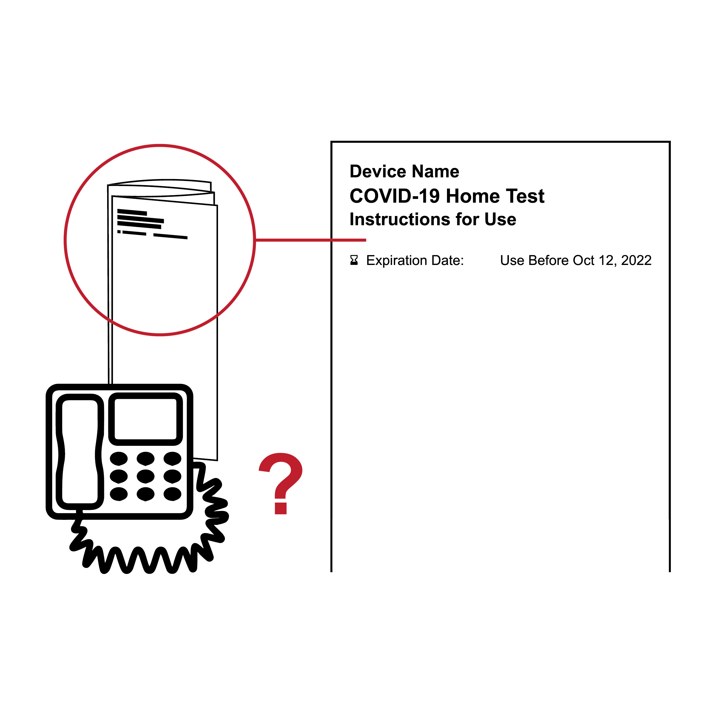
- Test instructions are not always available by phone.
- Audio test instructions made available via phone are not navigable by section and step.
Recommendation
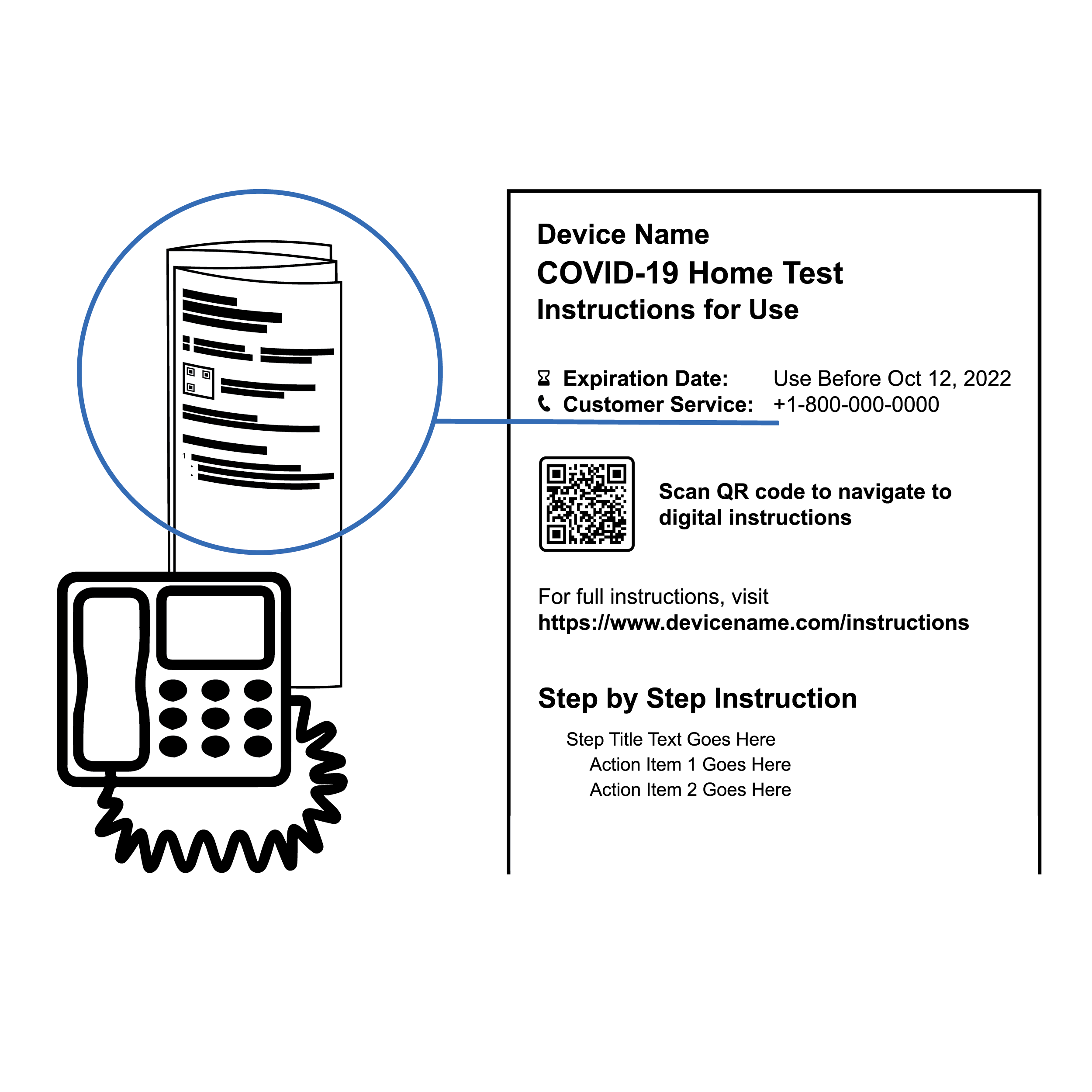 Test Instructions with IVR availability
- Provide audio test instructions via phone.
- Implement an IVR system where caller responds to prompts via button presses or spoken statements associated with actions, including navigation (e.g., continue to next step, repeat current step, return to previous step, return to main menu, connect to a live agent).
Video Tutorial
 Video demonstration of test procedure
Videos can be an effective way to inform users about the product. They provide dynamic demonstrations to learners who prefer to process information visually and audibly. Executed well, they can also provide an improved audio instruction experience versus screen reading digital instructions.
Issue
- Video test instructions are not always provided on websites or applications.
- Some videos do not provide the ability to pause, rewind, or forward in discrete increments, making it challenging to jump to the step a user is trying to review.
- Visuals with actors completing steps can be challenging to follow due to issues with lighting and contrast and general visual complexity.
- An abbreviated version of a longer video allows users to skip the complete video and miss important steps.
- Automatically looping videos can be distracting and challenging to navigate.
- Closed captions are not always provided or are not properly synchronized.
- Audio description – description of a video’s visual elements – is not provided, not easy to locate, and/or does not provide sufficient nonvisual context.
Recommendation
- Make video test instructions available via the product website
- Confirm video player is accessible. [24] [25]
- Provide the ability to control video playback including pause/play, rewind, forward, replay from the beginning, scroll through time or advance incrementally, and switch to full screen mode.
- Use high-contrast 2D animations with perspective/ depth and appropriate fill instead of live action.
- Do not provide an abbreviated version of a longer video.
- Avoid looping videos and/or audio with no ability to pause.
- Ensure closed captions are provided and synchronized with the video and audio content. [26]
- If the video tutorial is embedded in an application, allow skipping the video after it has been viewed once.
- Consistent with providing alt text for 508 compliance of digital documents ( see 8.6 Digital Embodiment • Assistive Technology Compatibility), video must include complete audio description. Refer to Digital.gov’s “508 Accessible Videos – How to Make Audio Descriptions” for details. [27]
- Provide audio description within the main audio, or preferably, as an option enabled by the user. [28]
- Include timestamps on the player for easy navigation to specific sections (e.g., getting started, workflow, interpreting results). Use native device OS video controls.
- Ensure on-screen buttons conform to WCAG 2.2 success criterion 2.5.8. [29]
9. Physical Components
- 9.1 Outer Packaging
- 9.2 Kit
- 9.3 Swab
- 9.4 Fluid Vials and Sample Preparation
- 9.5 Cassette
- 9.6 Test Reader
- 9.7 Disposal
9.1 Outer Packaging
- Labeling
- Accessing Contents
Labeling
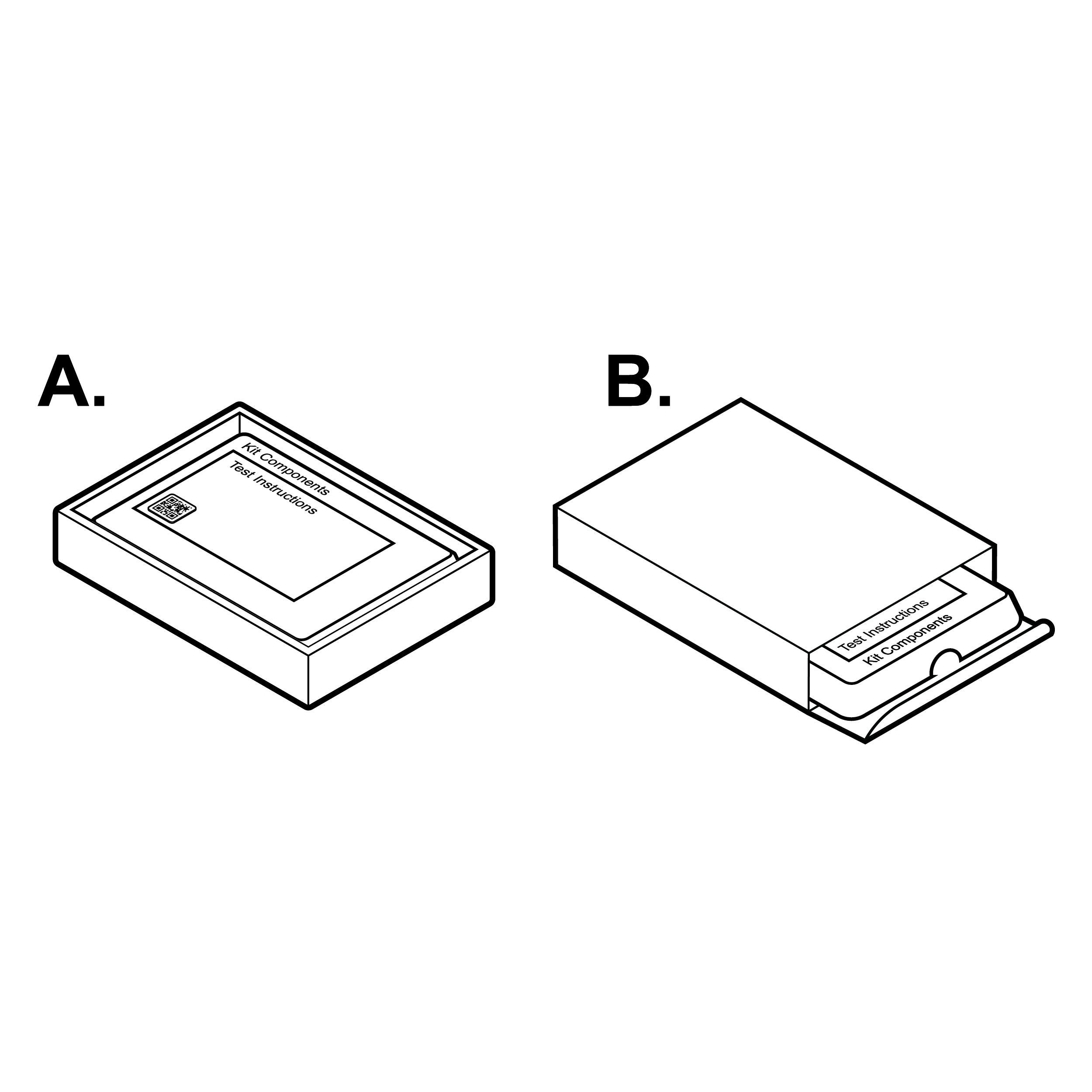
 Box with examples of good identification features
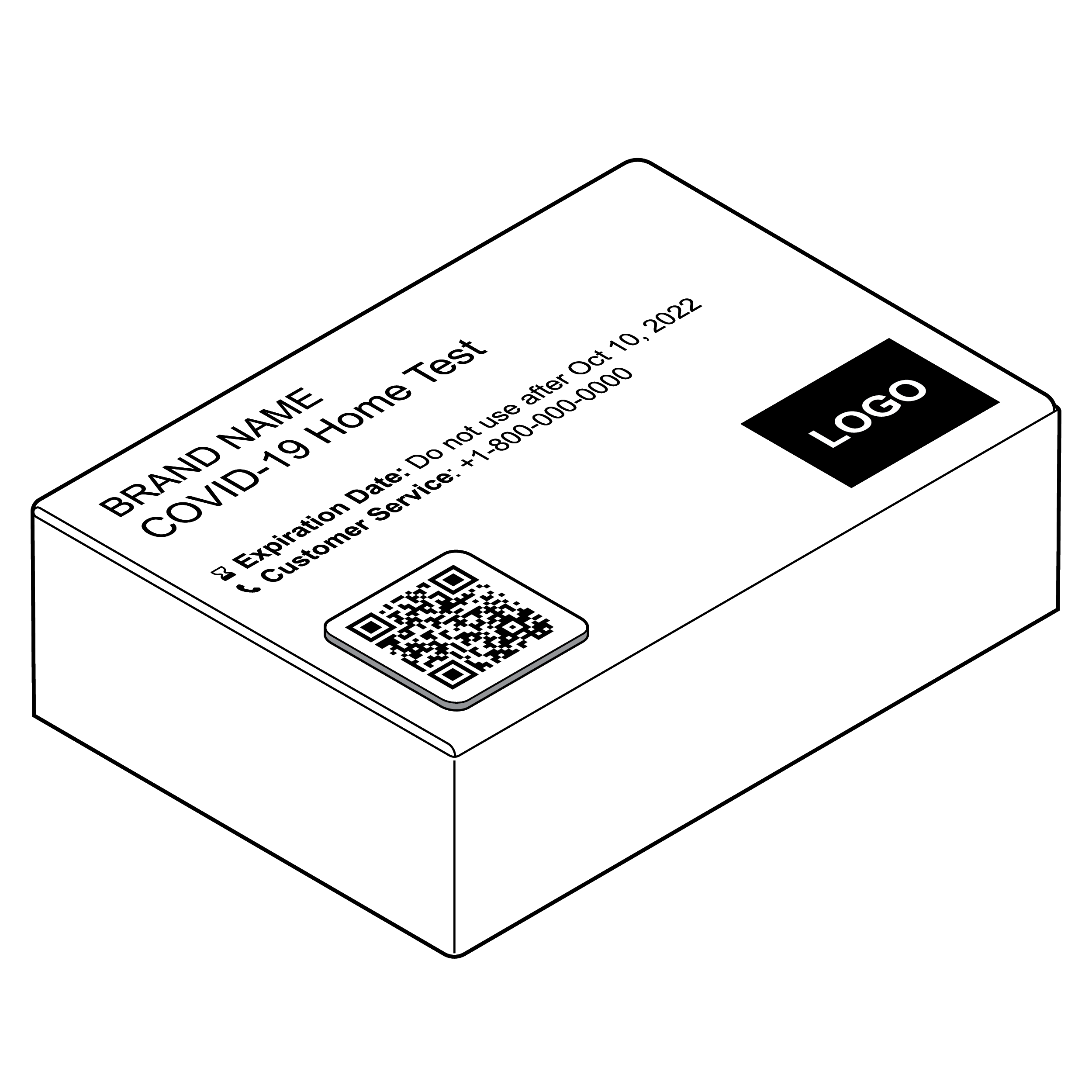
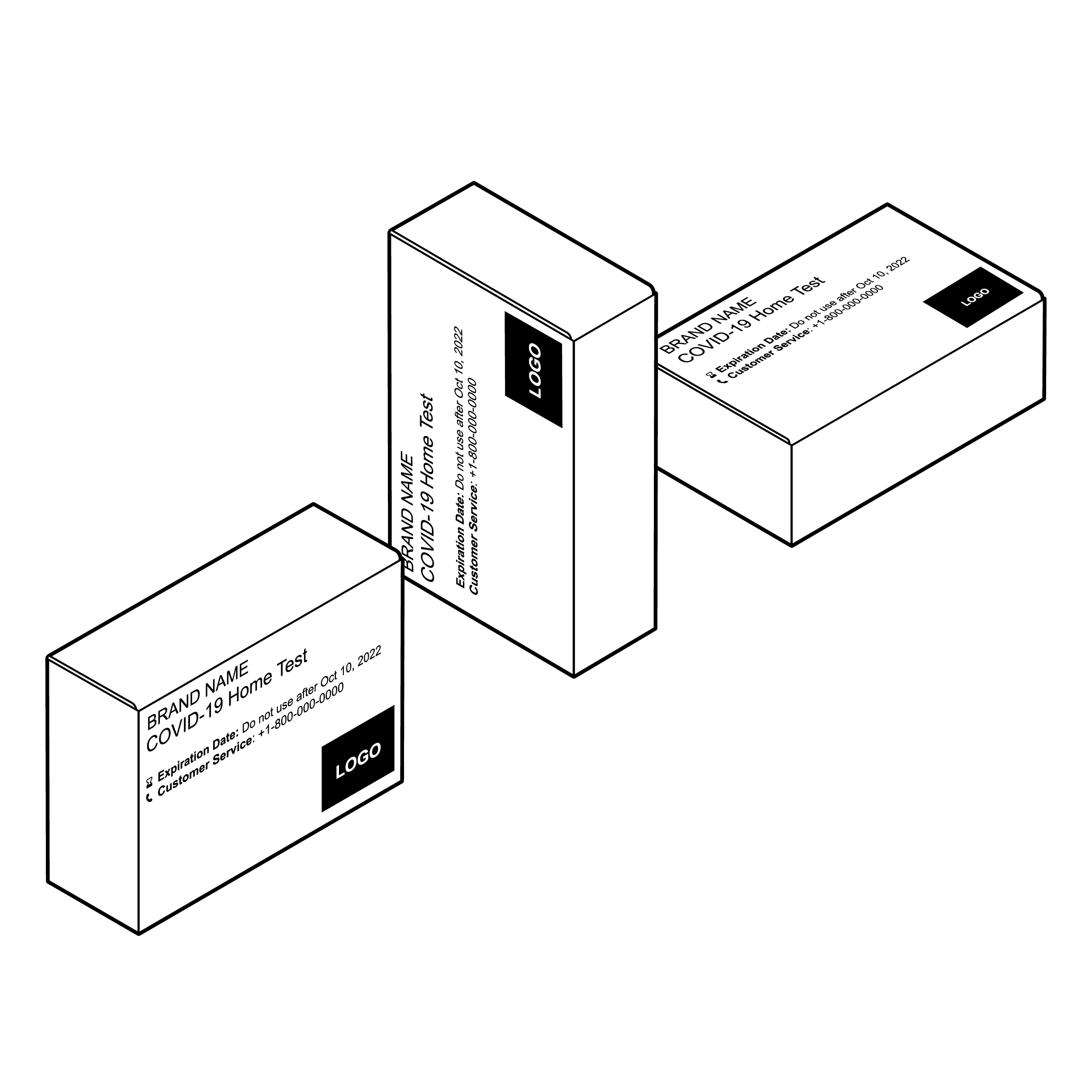
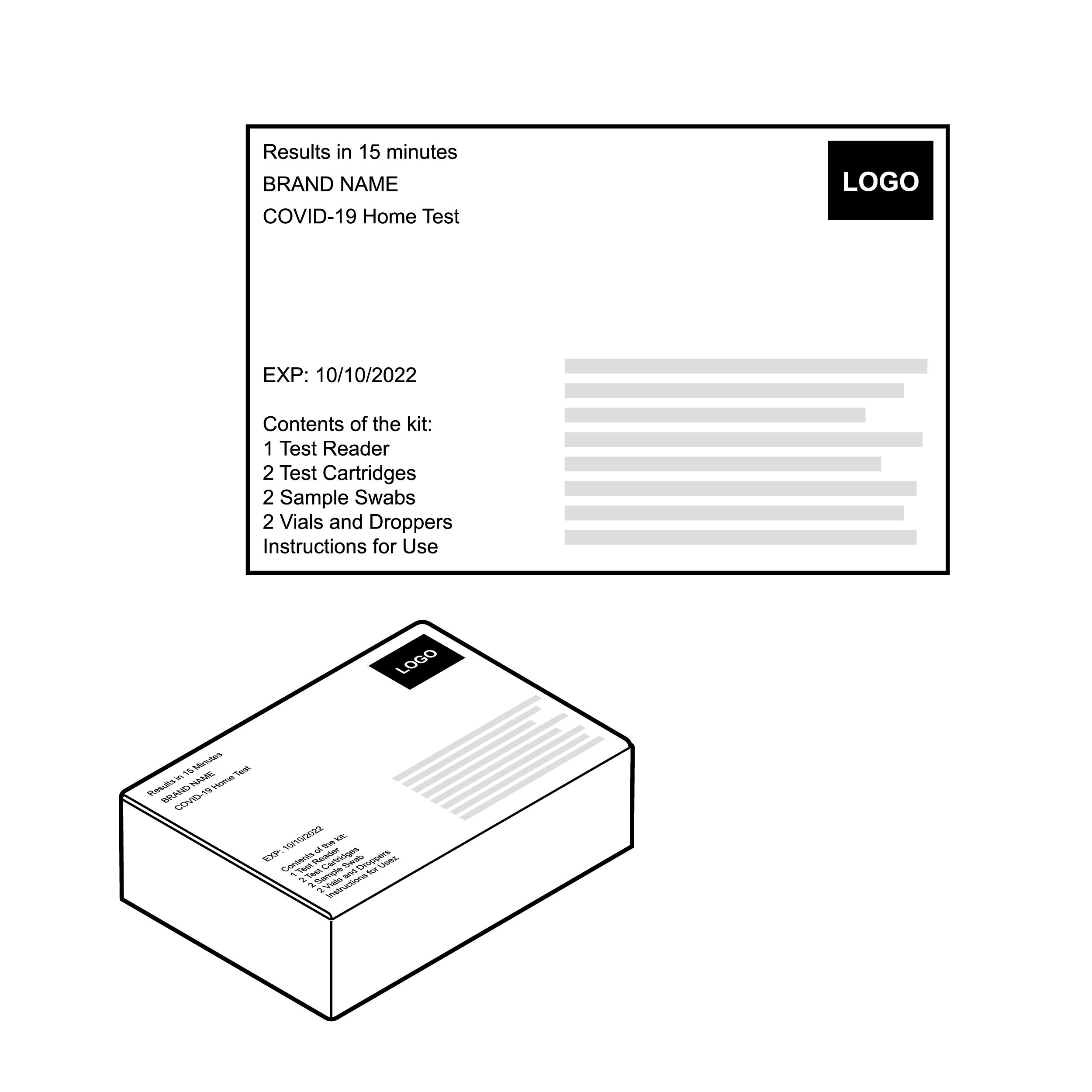
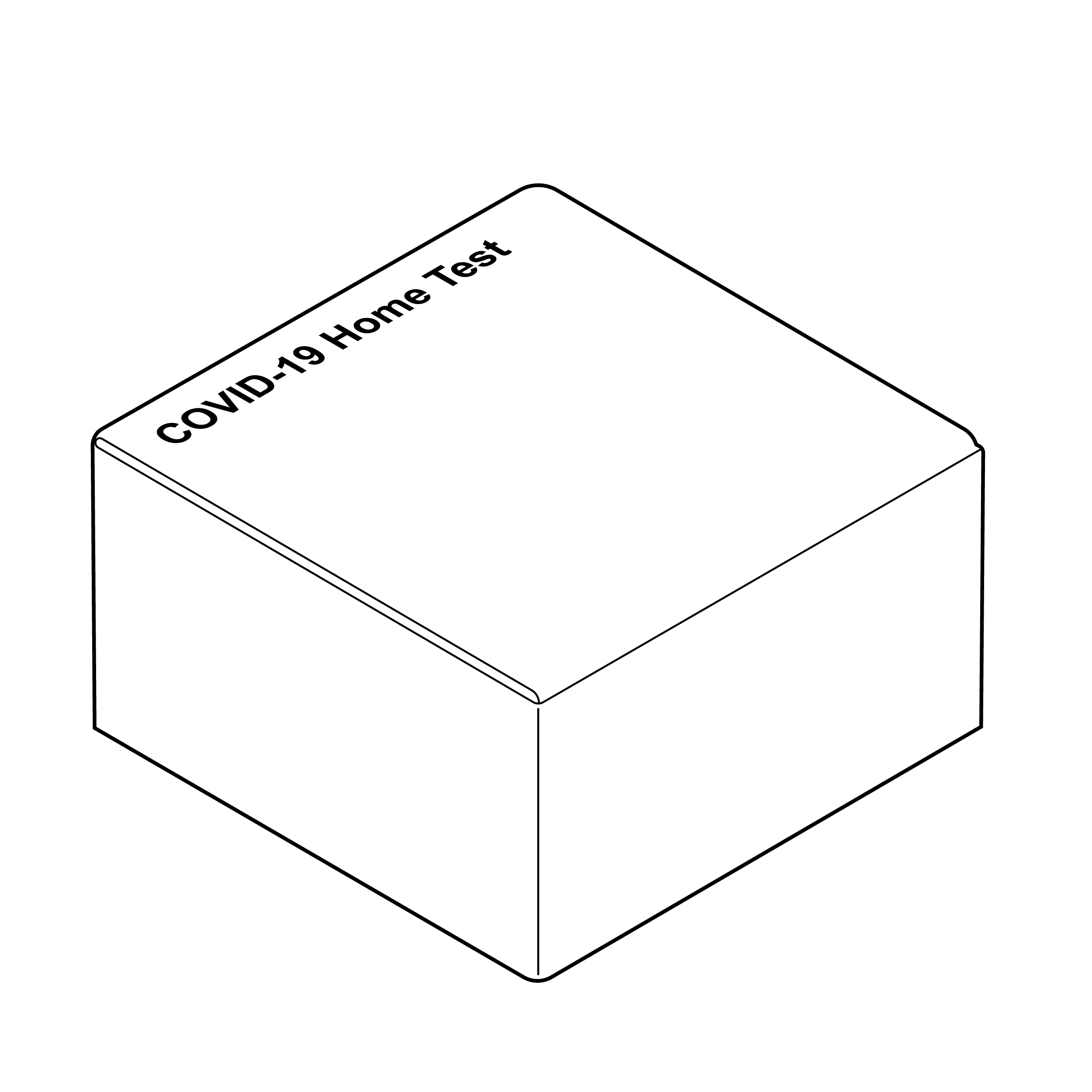
The outer box packaging is the initial introduction to any device, so labeling and interaction with the outer packaging should be carefully considered. Packaging typically conveys information through text, images, and symbols. Packaging can also convey information through shape and links to external information (e.g., QR codes).
Issue
 Box labeling viewable in only one orientation
Packages are often inadequately labeled and missing critical information.
Recommendation
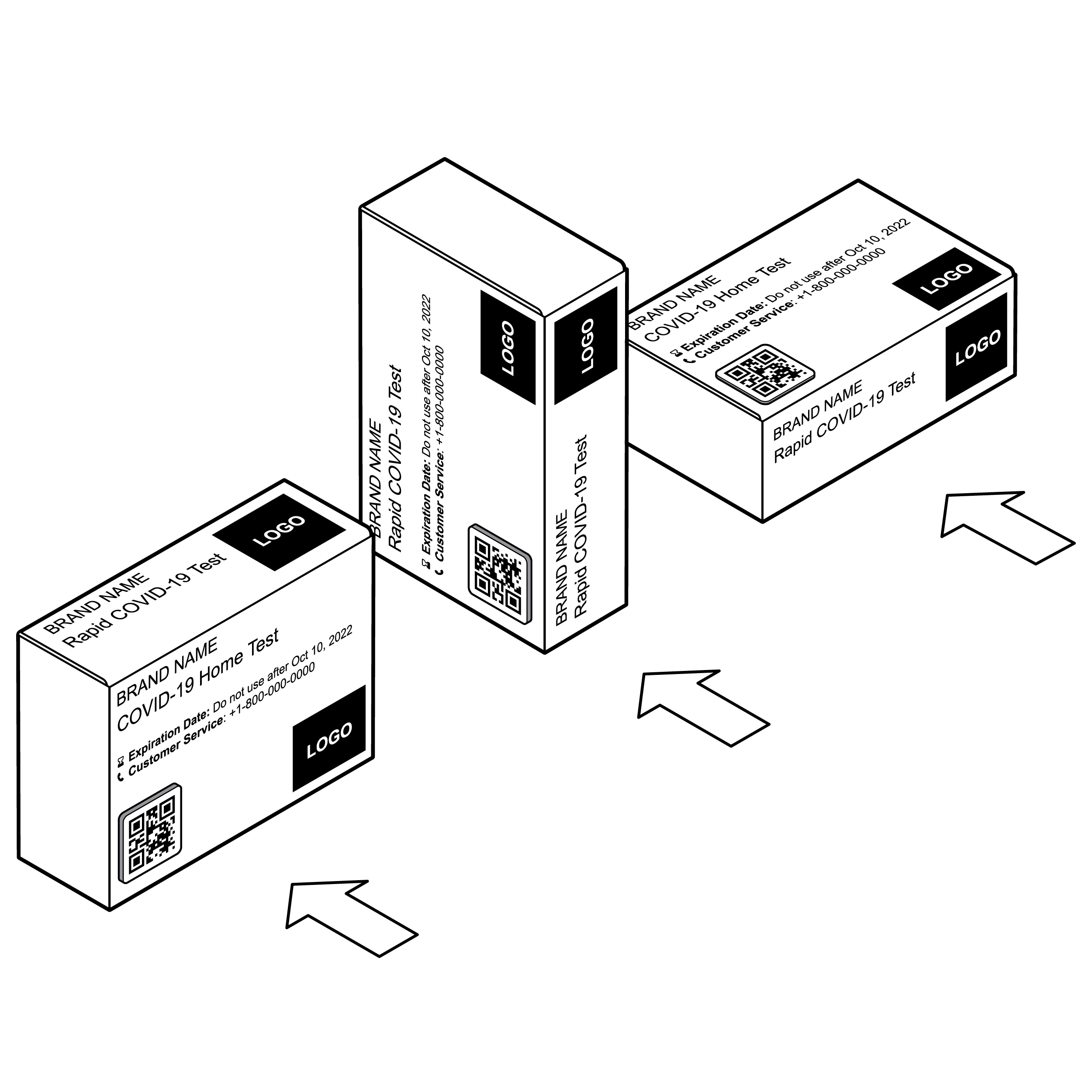 Box labeling viewable in multiple orientations
Consider how the package might be displayed (e.g., on a shelf in a retail setting) and what information the user will find most useful.
Issue
 Box labeling with poor legibility
- Outer box label information is presented without visual hierarchy.
- Outer box labeling is cluttered with excess information in a small font.
Recommendation
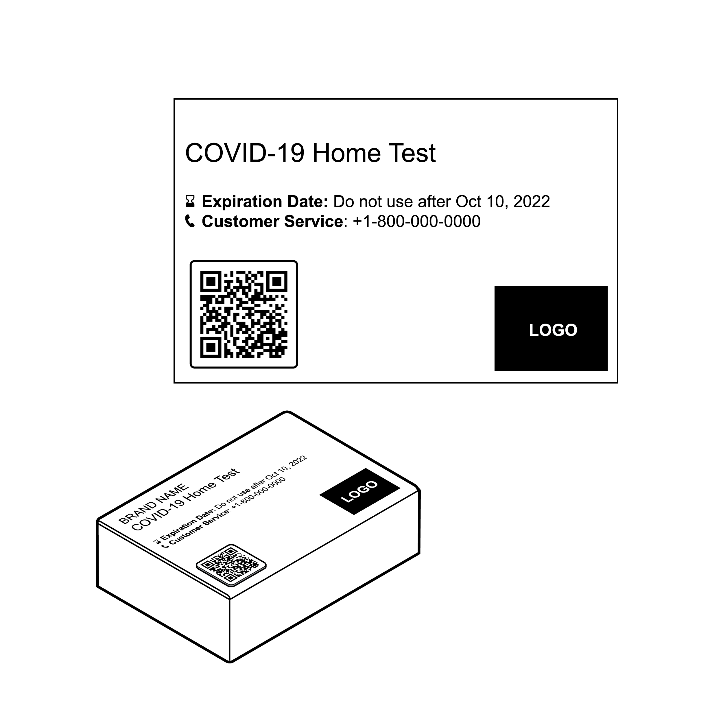 Box labeling with improved legibility
- Prioritize key information including brand name, device type, expiration date, links to test instructions, and customer service number by size and position. Ensure labeling complies with regulatory bodies’ requirements.
- Use minimum 14 point and ideally 18 point or larger font and legible sans serif typeface (e.g., Arial, Calibri, Helvetica, Verdana, etc.). Do not use decorative typefaces (e.g., Script, Slab).
- Use effective color contrast (see 8.1 Legibility).
Issue
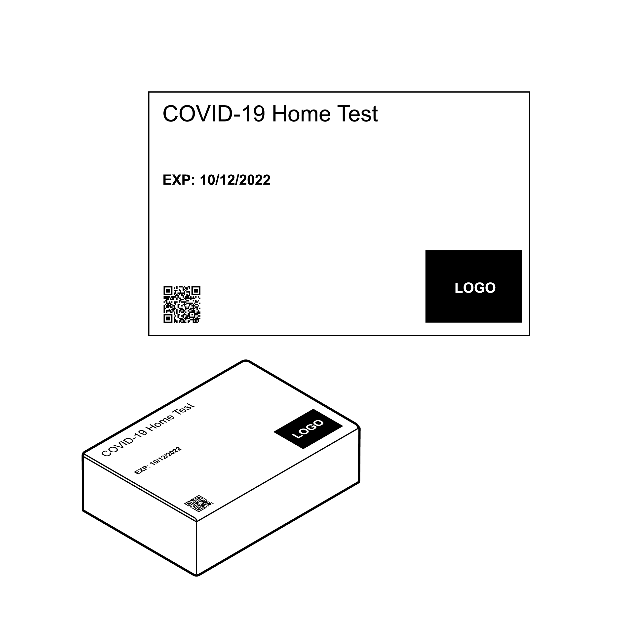 QR code is too small to easily locate
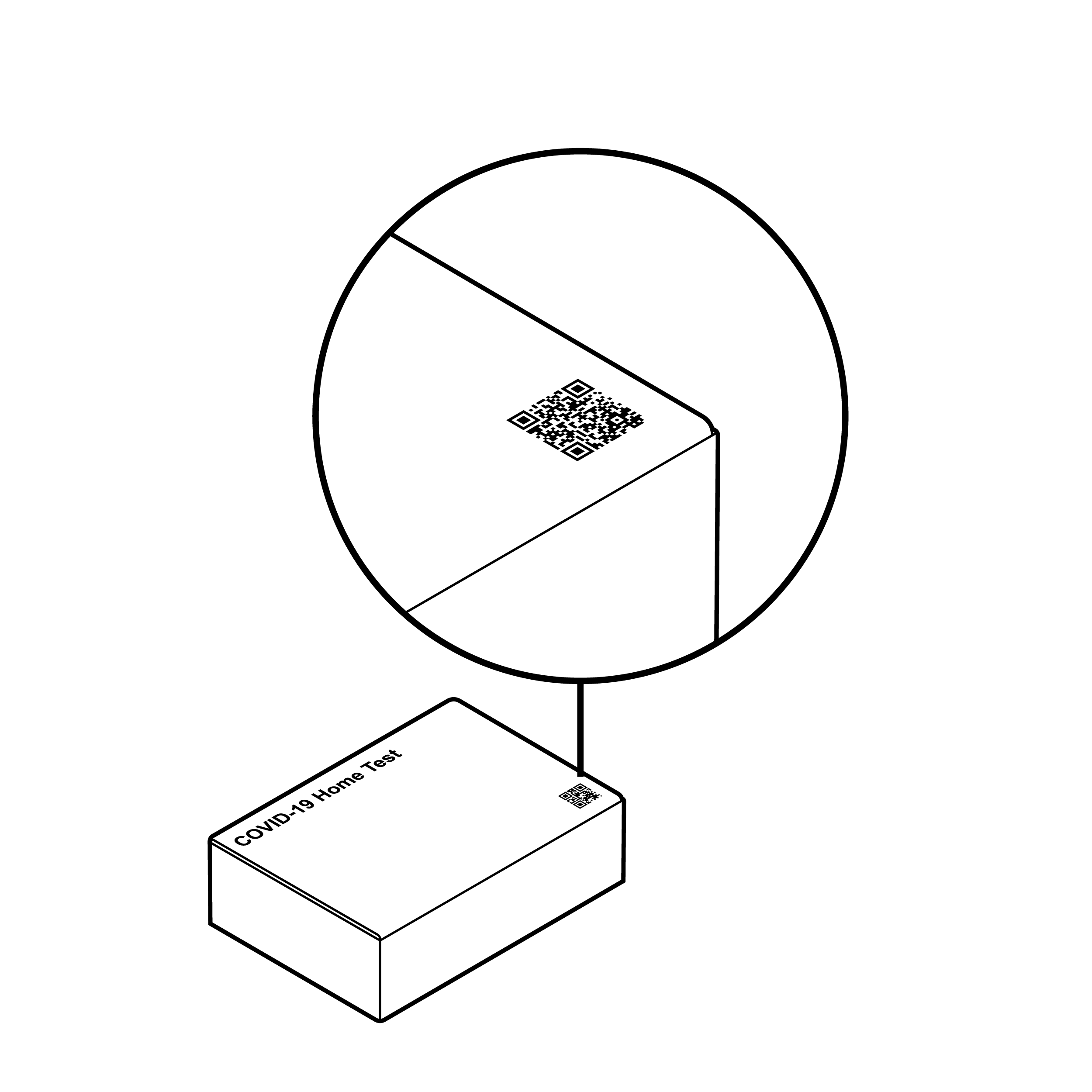
- QR codes are often missing or insufficiently sized.
- Expiration date format is not recognizable by common OCR applications.
Recommendation
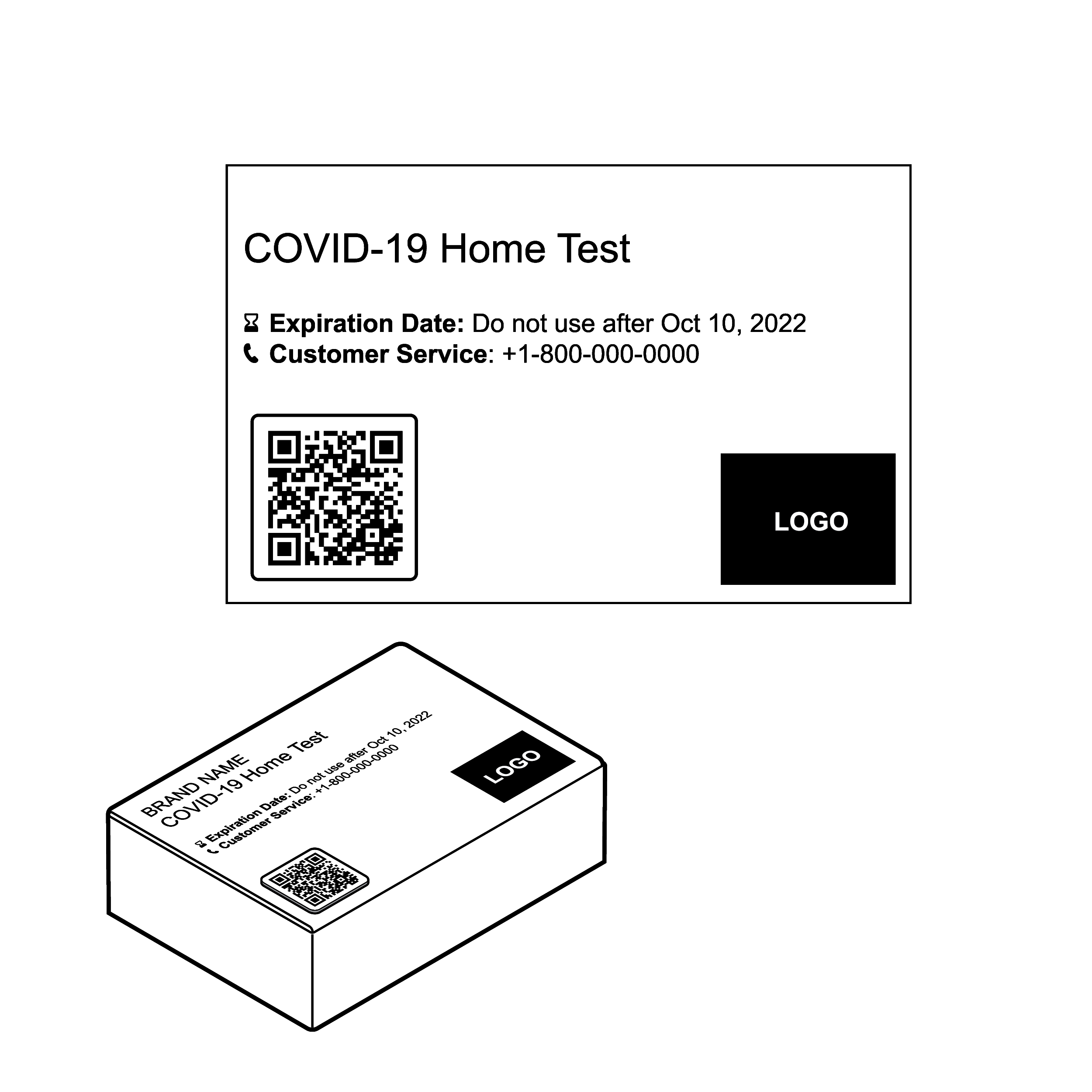 QR code is large and readily discoverable
- Present QR codes in a size 0.8 inches (20.3 mm) square or larger to align with current industry practice.
- See 8.1 Legibility for guidance on expiration date formatting.
Issue
 Example of a flat QR
Outer packaging may make it difficult to find or access information.
Recommendation
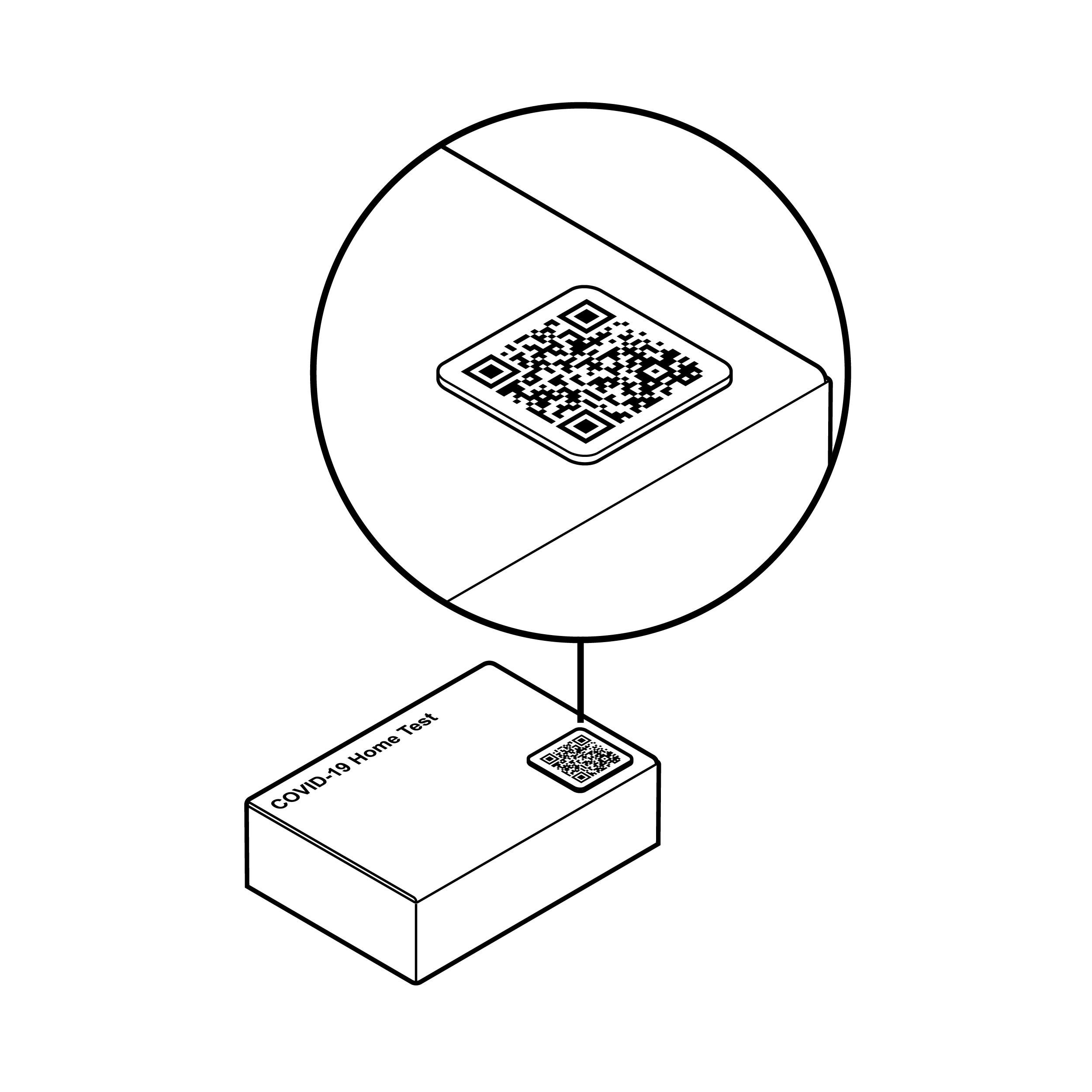 Alternative to flat QR code
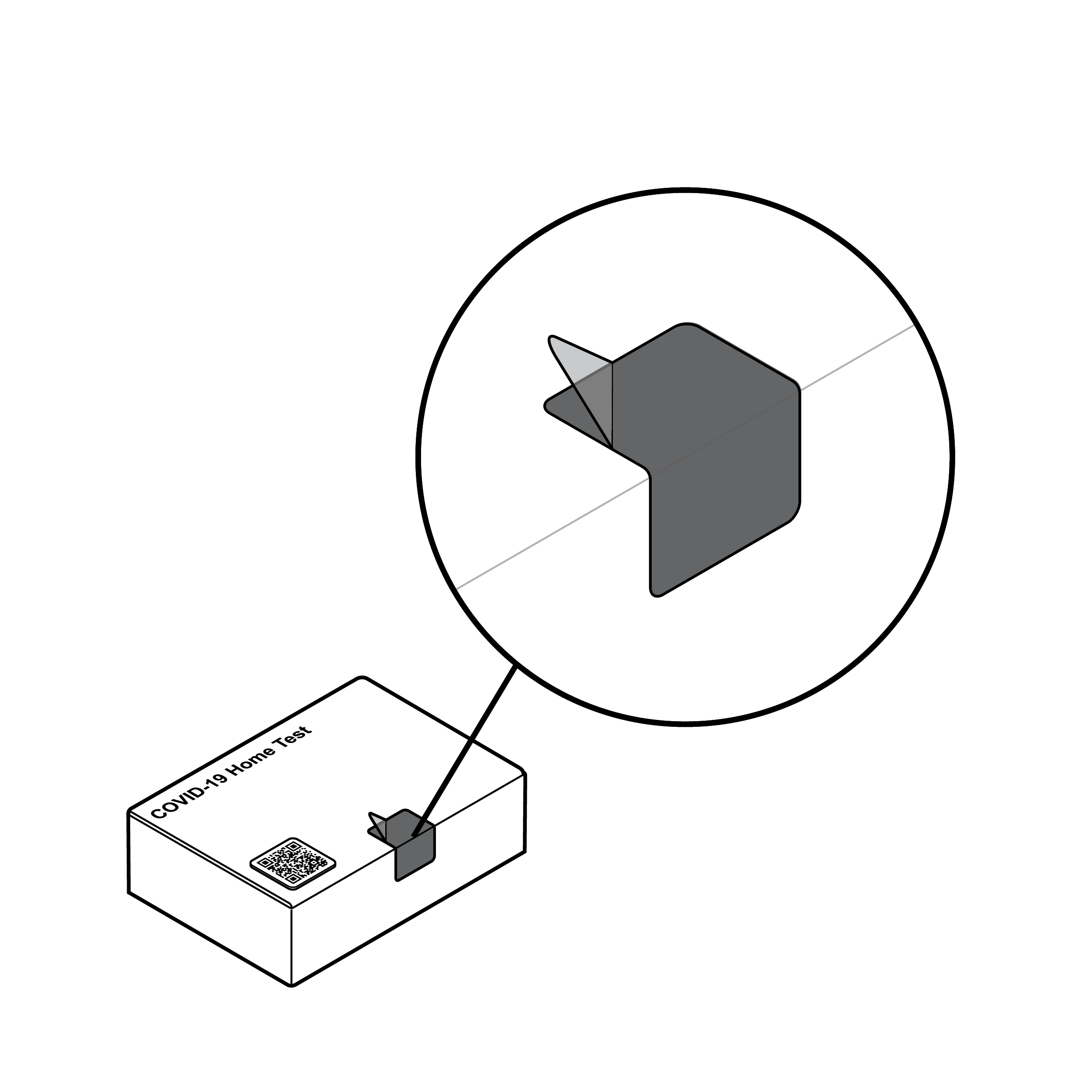
Provide a tactile means for finding information (e.g., QR code on sticker or within a raised outline).
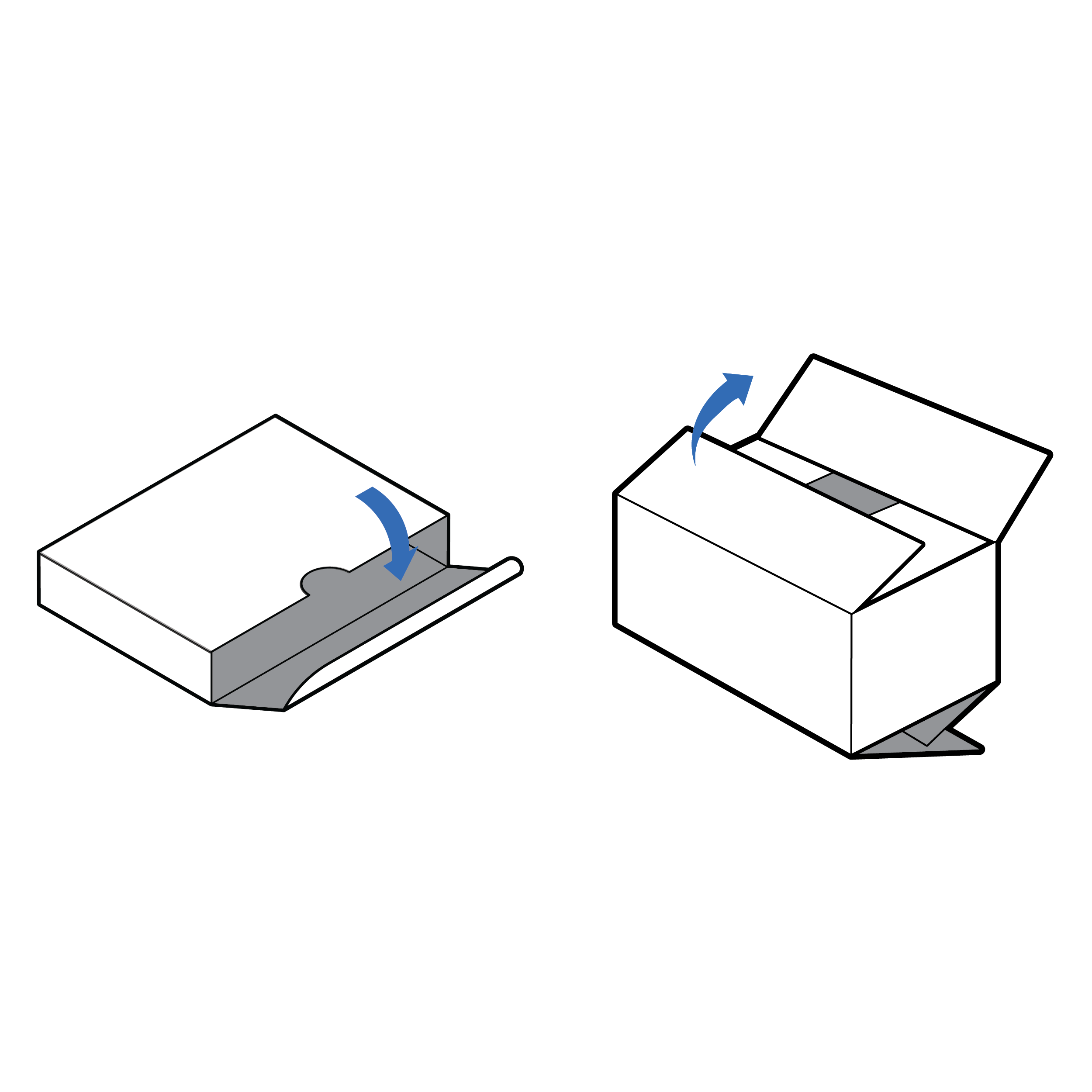
Accessing Contents
 Package with tamper-evident seal
Opening and accessing contents of outer packaging requires a balance of competing needs:
- preventing unauthorized users from tampering with contents;
- ensuring the package is easy to open for all users; and
- protecting internal components.
Issue
 Difficult to remove tamper-evident seal
- It can be challenging to find and remove small, clear, tamper-evident seals.
- Users may resort to external tools such as scissors to open a challenging package, which may result in damaged contents.
- Tearing open a package without removing the seal may result in damage to the package and the fluid vial holder if it is integrated into the outer box.
Recommendation
 Easy to remove tamper-evident seal
- The tamper-evident seal should be a contrasting color to the rest of the package.
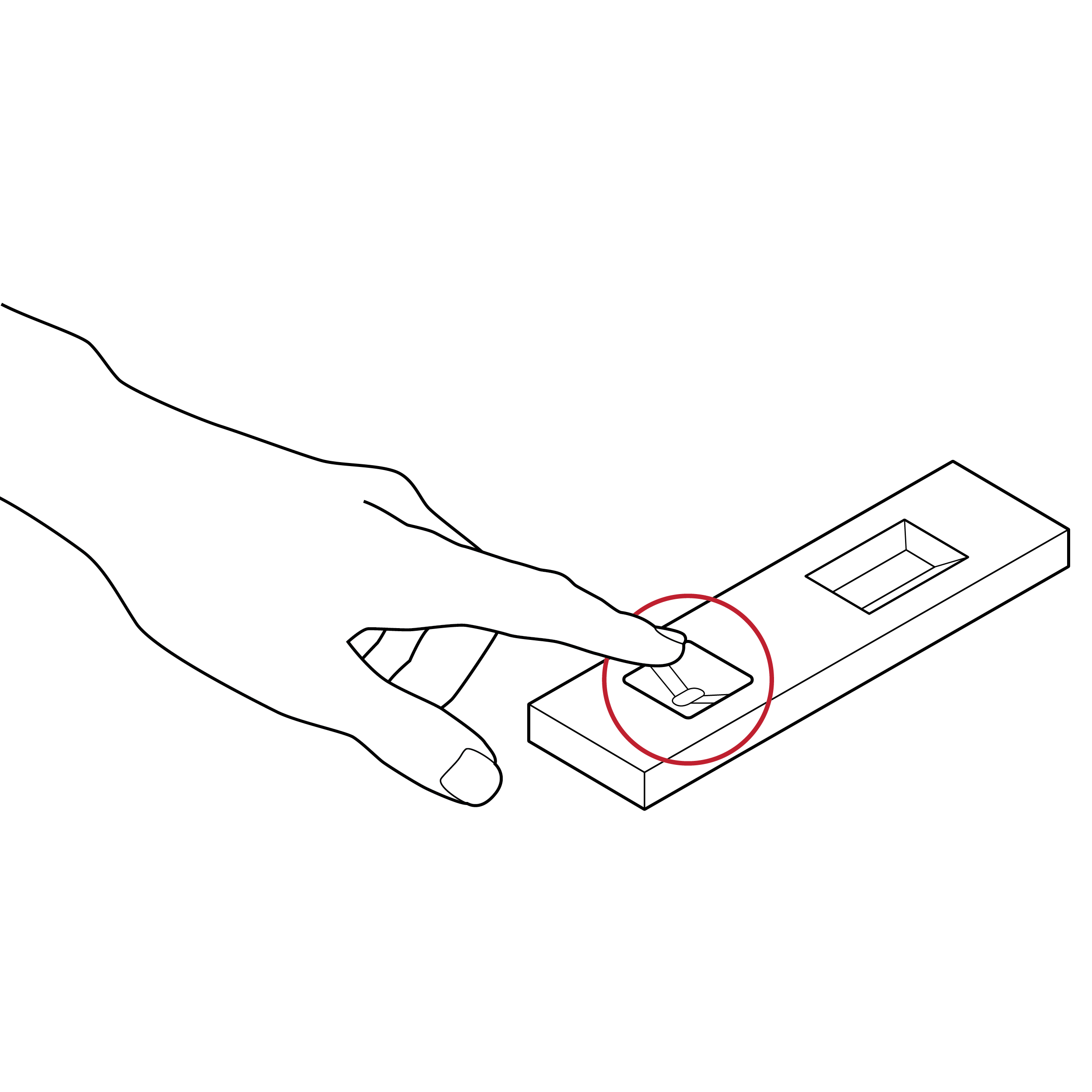
- For easy removal without the use of external tools, the seal should include a grasp feature with sufficient graspable area (e.g., at least 0.5 inches [12.7 mm] square).
- Force required to remove a tamper-evident seal should not exceed 5 lbs. (22.2 N). [30]
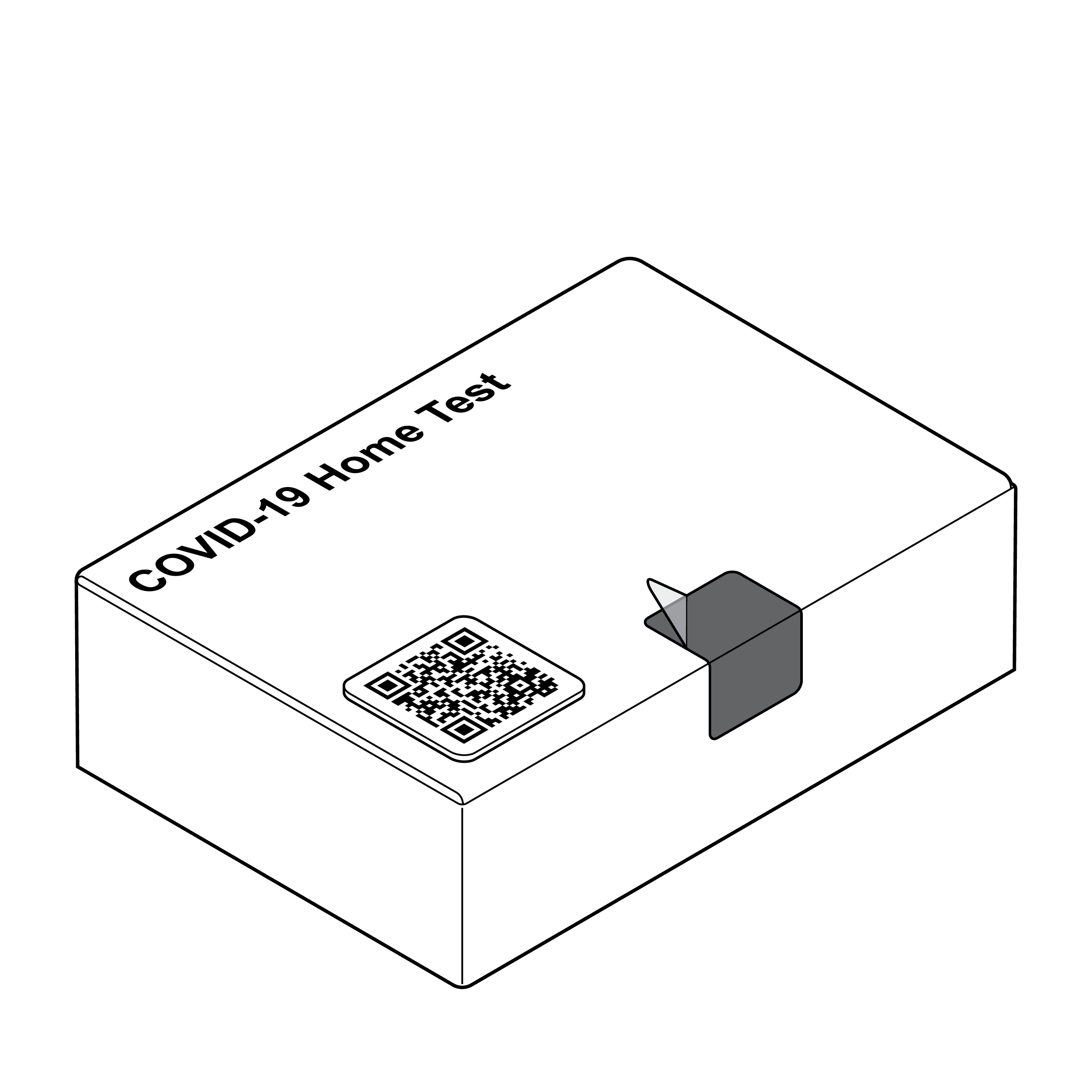
Issue
 Package without intuitive opening
It can be challenging to open a package when the only indication regarding top, bottom, front, and back is through visual, printed labeling.
Recommendation
 Packages with opening cues
Provide familiar tactile cues on the packaging indicating where a package should be opened (e.g., thumb cutout, overlapping flaps).
9.2 Kit
- Organization
- Internal Pouches
Organization
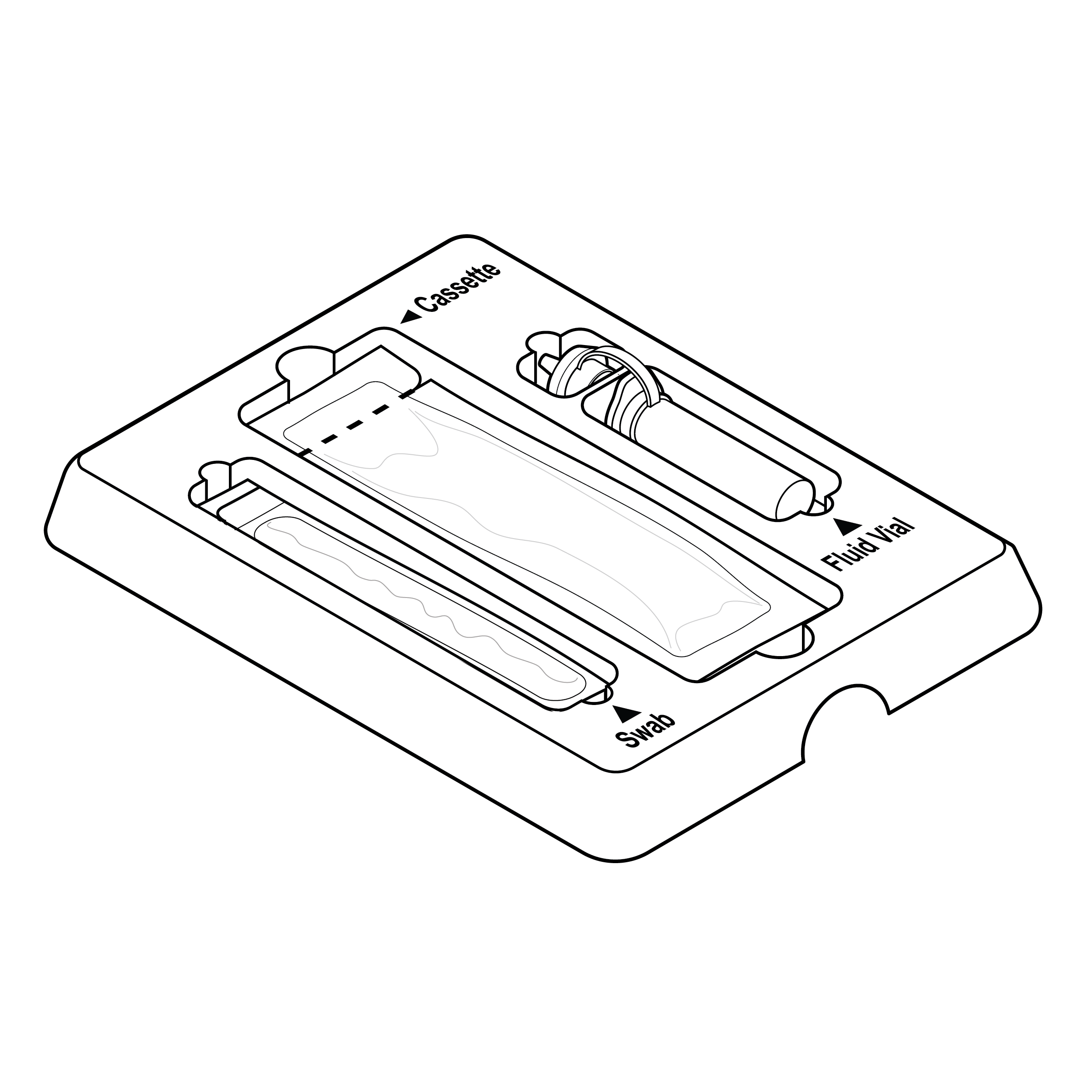
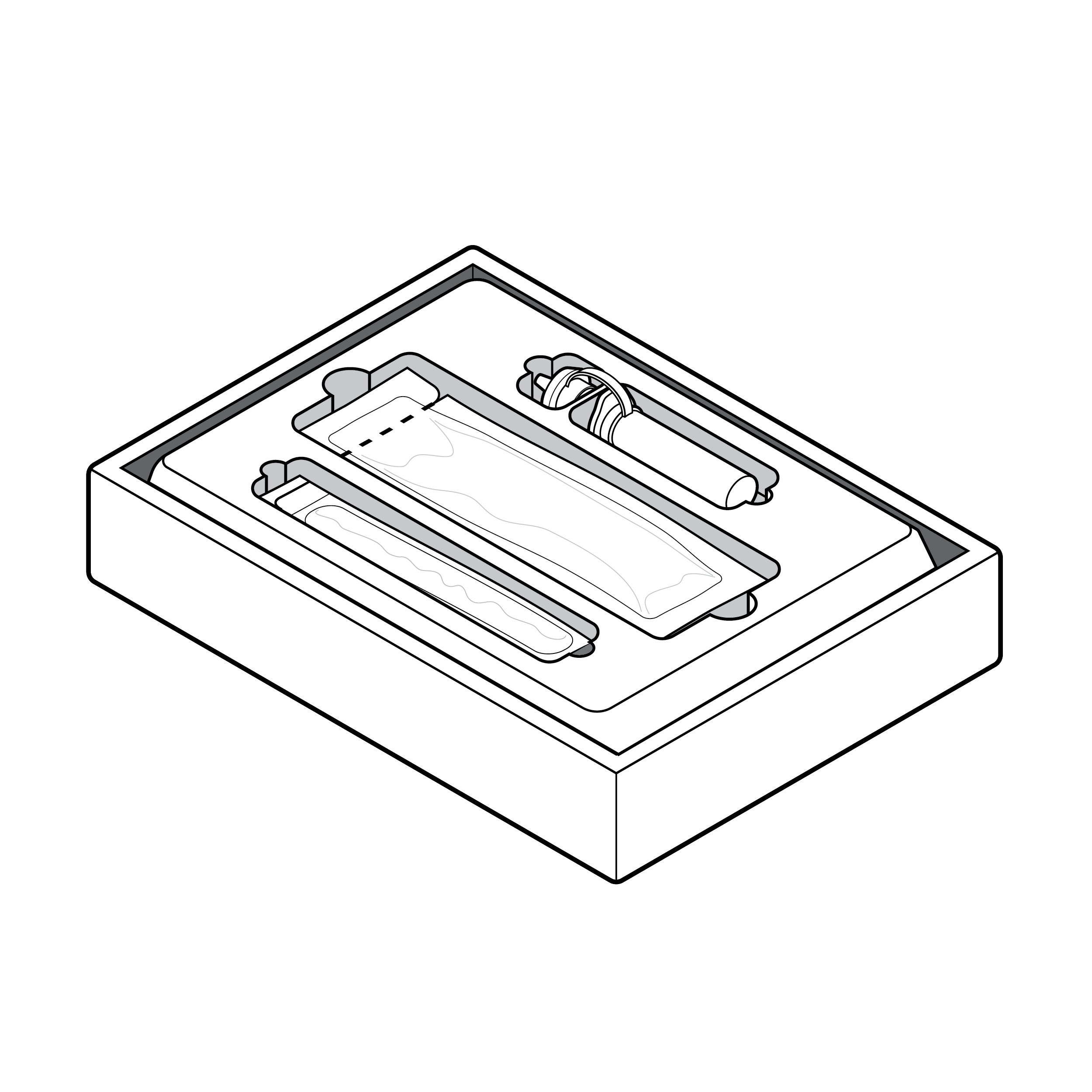 Kit contents
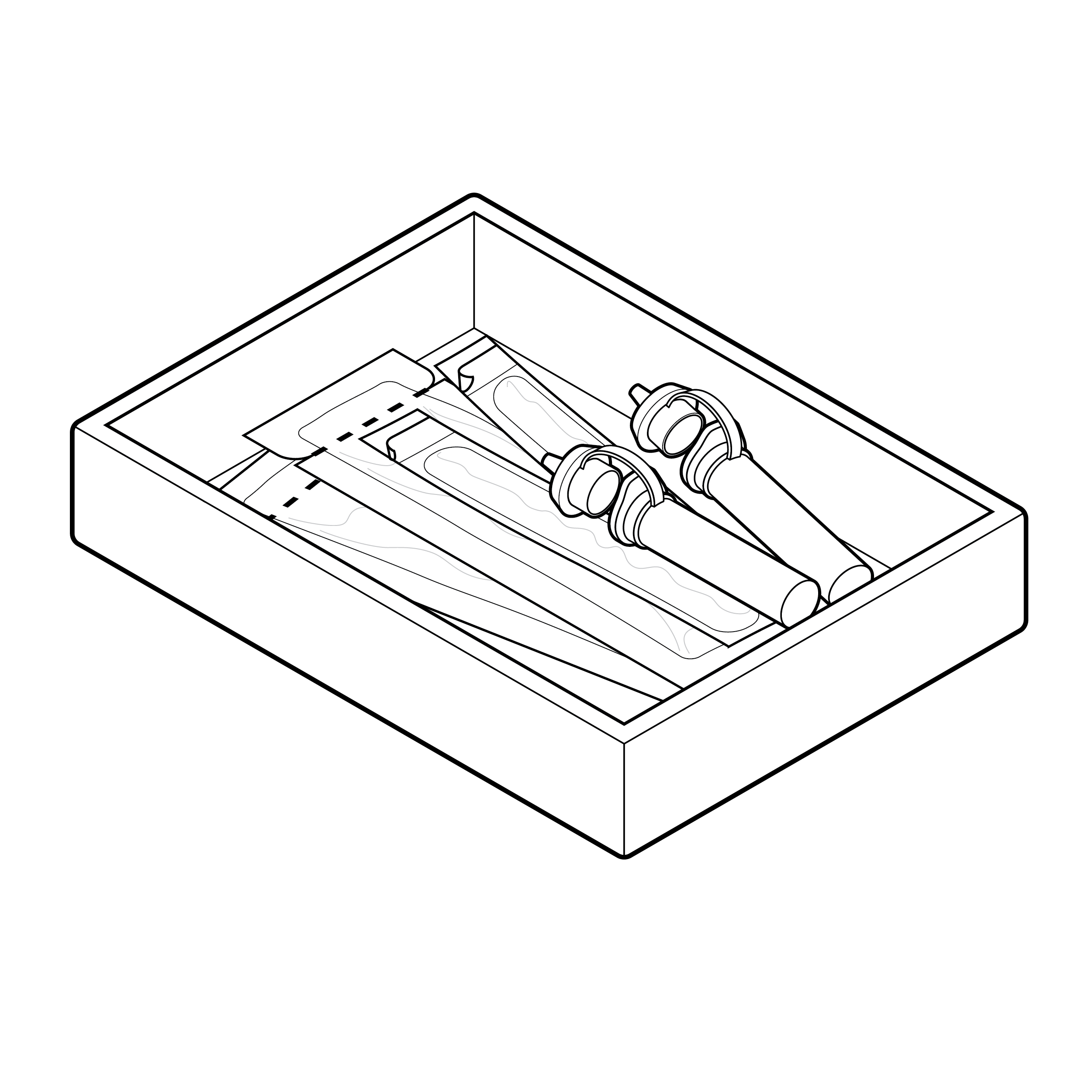
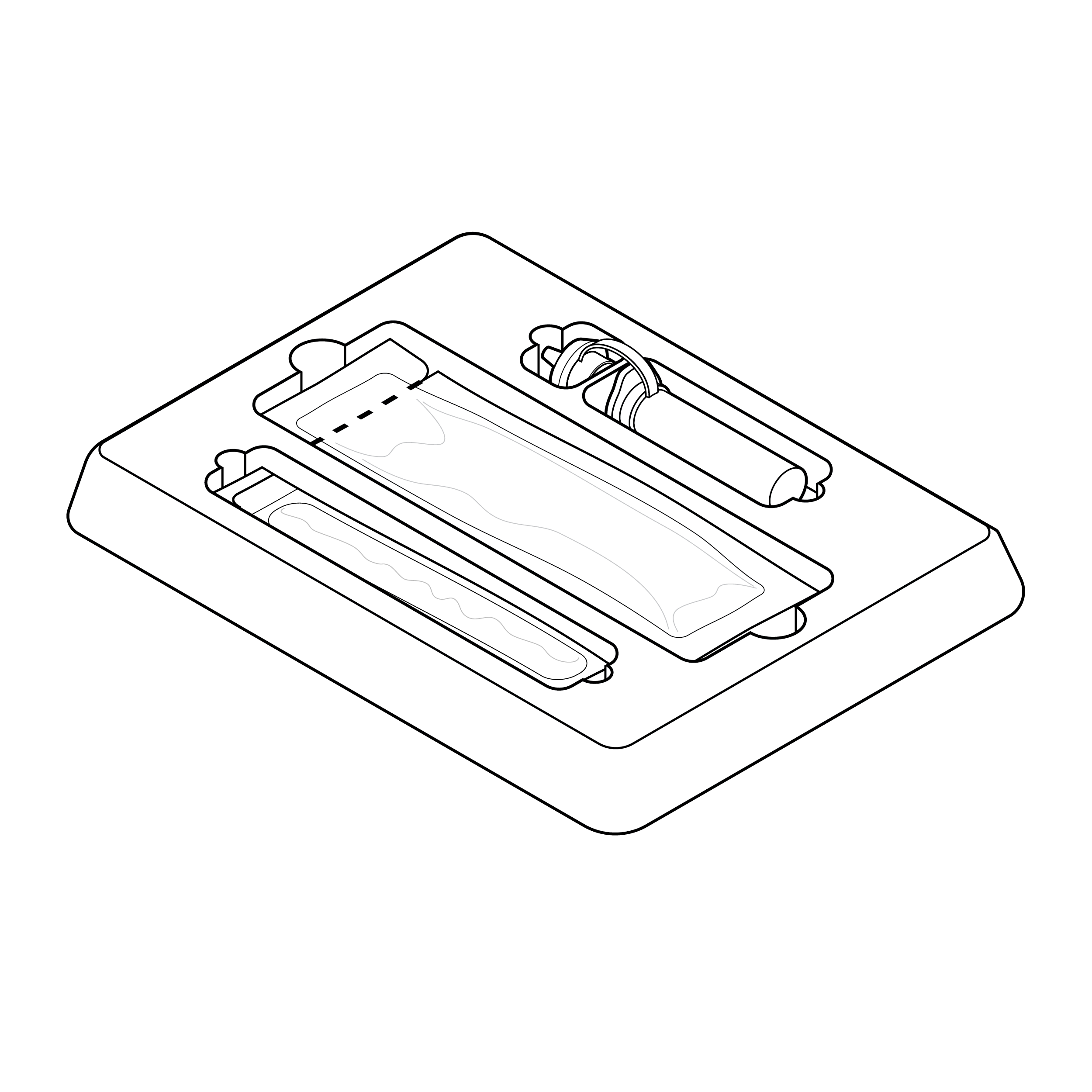
Test kits containing multiple components must identify the components, secure small components, and provide information about the order in which the components are to be used. Organizing package components thoughtfully can greatly enhance the user’s ability to complete the test. A tray is an optional accessory for organizing components and improving the user experience.
Issue
 Loose contents inside box packaging
Internal, physical test instructions and key information can be difficult to find.
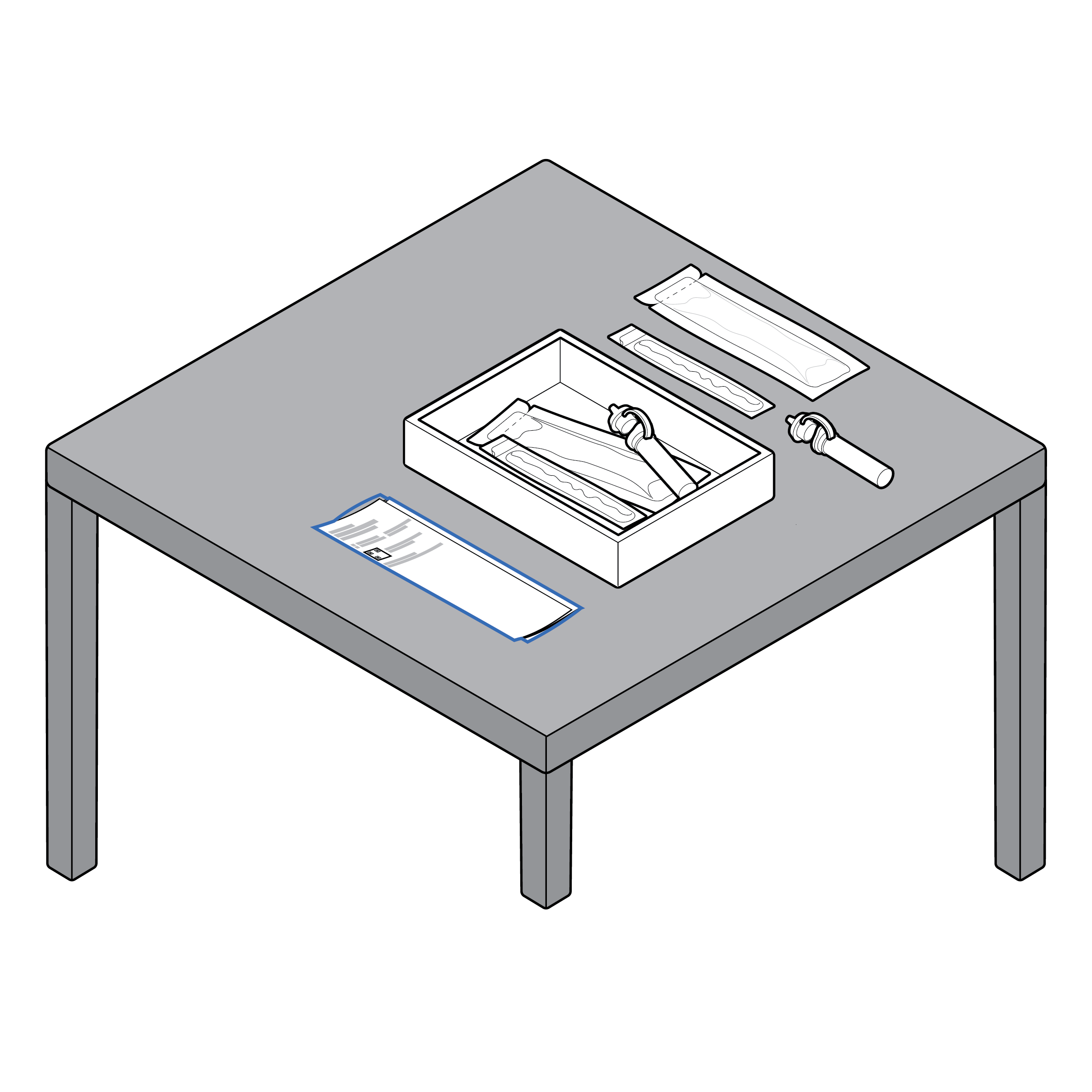
Recommendation
 Contents neatly organized within box
Provide legible (see 8.1 Legibility) test instructions face up as the first thing users encounter.
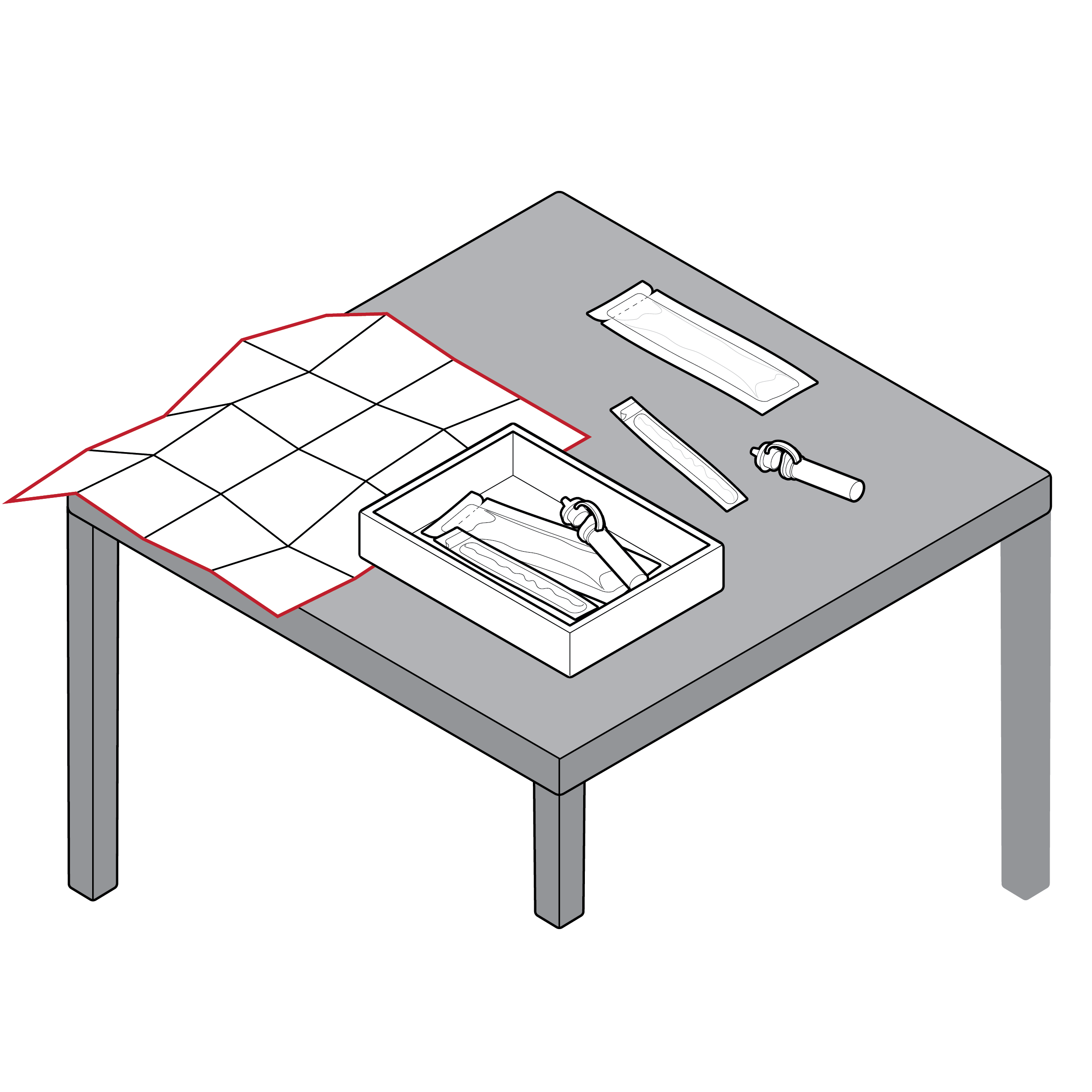
Issue
Loose contents inside box packaging
Packages can have multiple components and internal pouches loosely placed inside. When opened, the contents can fall out and be misplaced. The order in which internal pouches or components are meant to be opened is unclear.
Recommendation
 Contents neatly organized in a tray or a tear pouch
- Place contents in an organized and/or fixed manner (e.g., tray, bag, card, box dividers, etc.), in clear order of use.
- If including a tray, provide ample finger clearance and gripping space/features (e.g., pull tabs) for removing the tray from the box and components from the tray.
Issue
 Internal tray without labeling
Components in internal tray can be difficult to identify
Recommendation
 Internal tray with high-contrast labeling
Include high-contrast component text labels on internal tray.
Issue
 Fluid vial holder location hinders workflow
There is a risk of unintentional spillage when the fluid vial holder in a tray is improperly positioned.
Recommendation
 Fluid vial location aligns with workflow
The fluid vial holder should be positioned strategically in the tray to prevent unintentional disruption.
Internal Pouches
 Internal Pouches
Accessing internal components frequently requires opening secondary packaging. The user should be able to easily distinguish pouched components, identify where to open each pouch, and open pouches with less than 5 lbs. (22.2 N) force. [30] Design features such as grip areas, visual cues, and labeling play a pivotal role in usability of internal pouches.
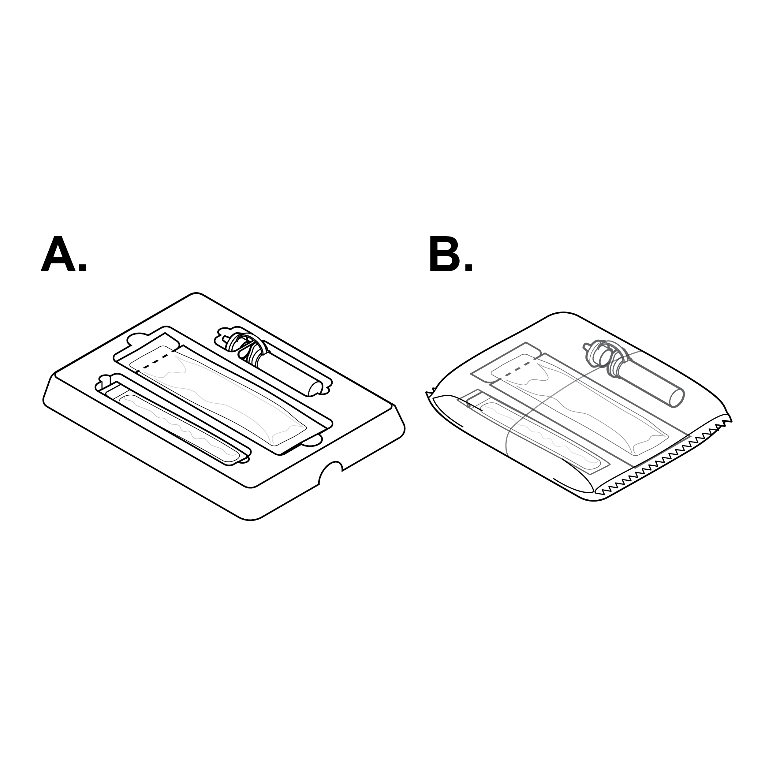
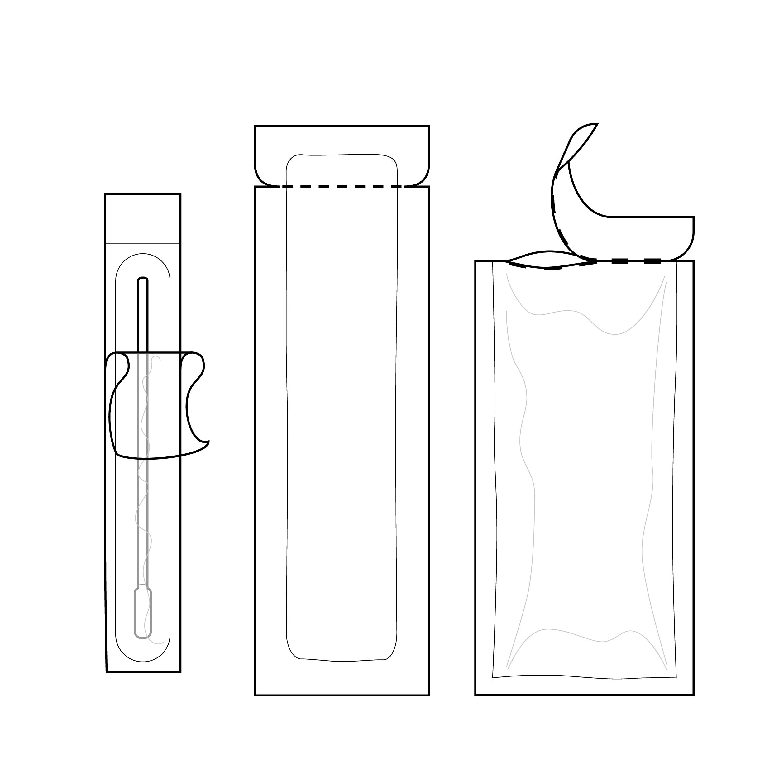
Issue
 Parts are packaged in foil pouches with the same form factor
Internal pouches that are similar in size, shape, and/or material, or insufficiently labeled, may be difficult to distinguish from one another.
Recommendation
 Parts are packaged with distinct materials and form factors
- Ensure that each pouched component is tactilely discernible from others (e.g., distinct internal pouch shapes/sizes).
- Label internal pouches with component names or illustrations.
Issue
 Pouch without clear indication for tear location
Internal pouches may be difficult to open.
Recommendation
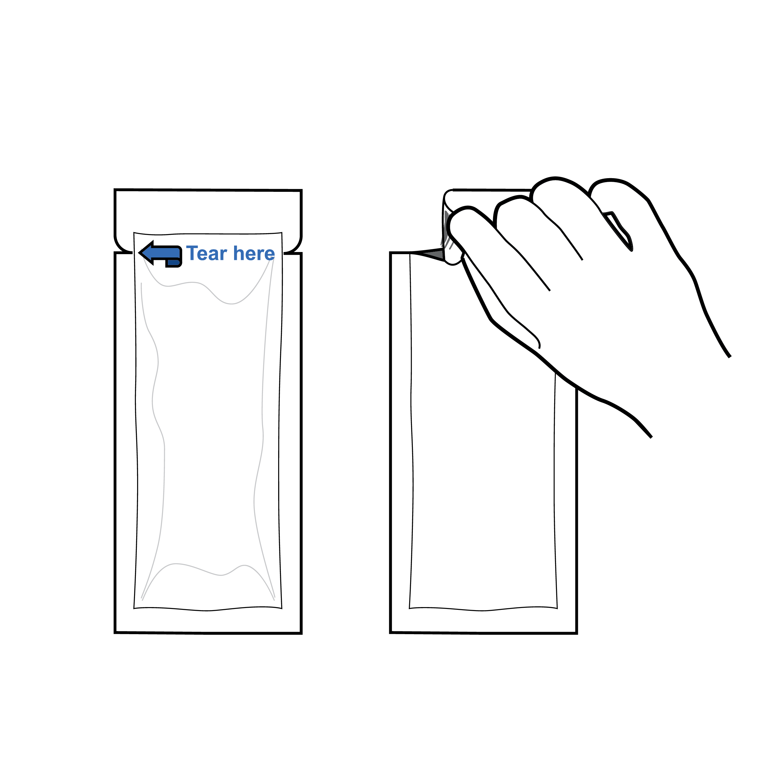 Pouch with evident tear locations
- Pouches should contain a notch labeled with high- contrast text or an arrow indicating tear location.
- Incorporate textured grip areas
Issue
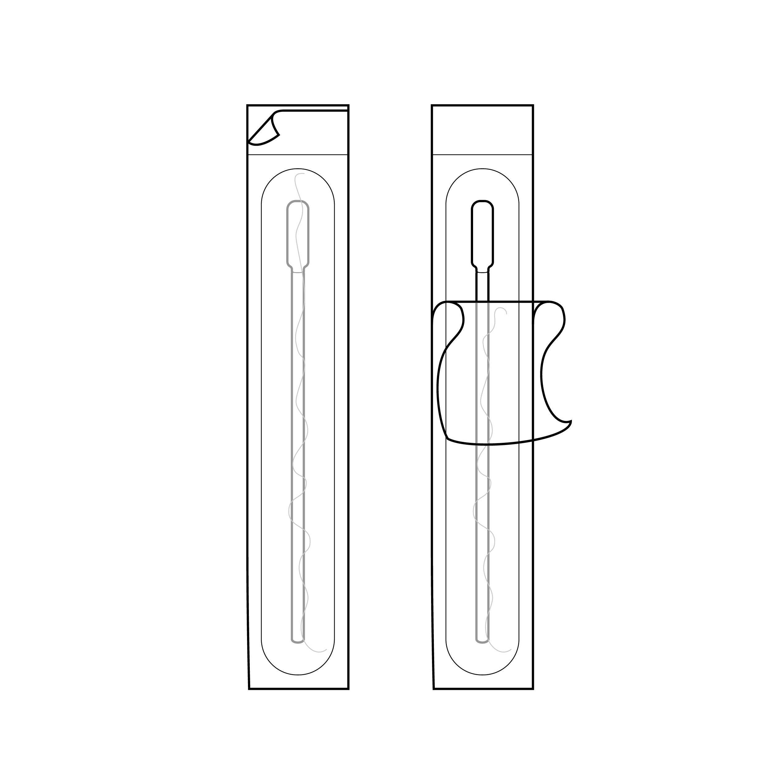 Swab packaging with swab tip near small peel tab
- Peel-apart pouches have layers that are challenging to differentiate and separate.
- Internal packaging may present a method for opening that exposes an area to contamination through touch.
Recommendation
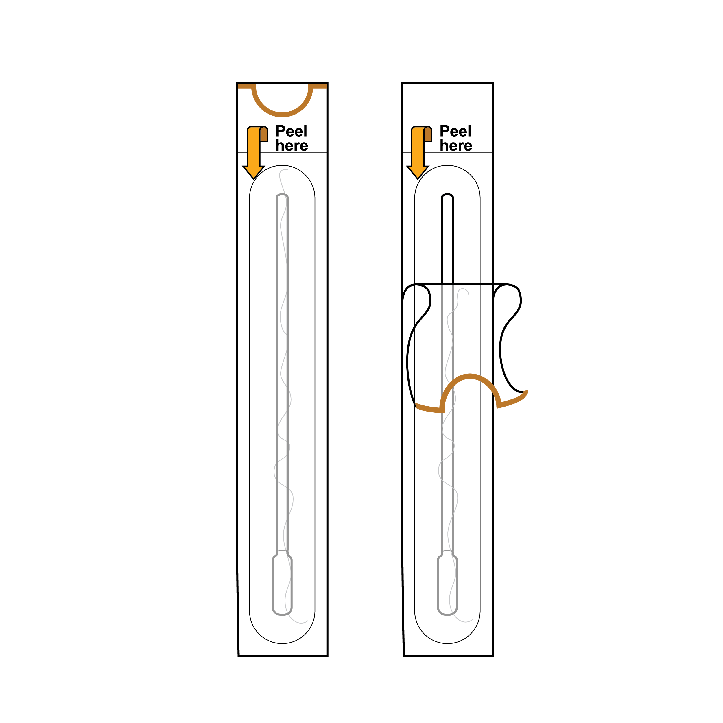 Swab packaging with swab handle near opening
- Include half-moon cutout in one of the peel-apart pouch layers or fold-over of one of the peel-apart pouch layers.
- Ensure the opening exposes a component part intended for touch (e.g., peel feature near swab handle rather than swab tip).
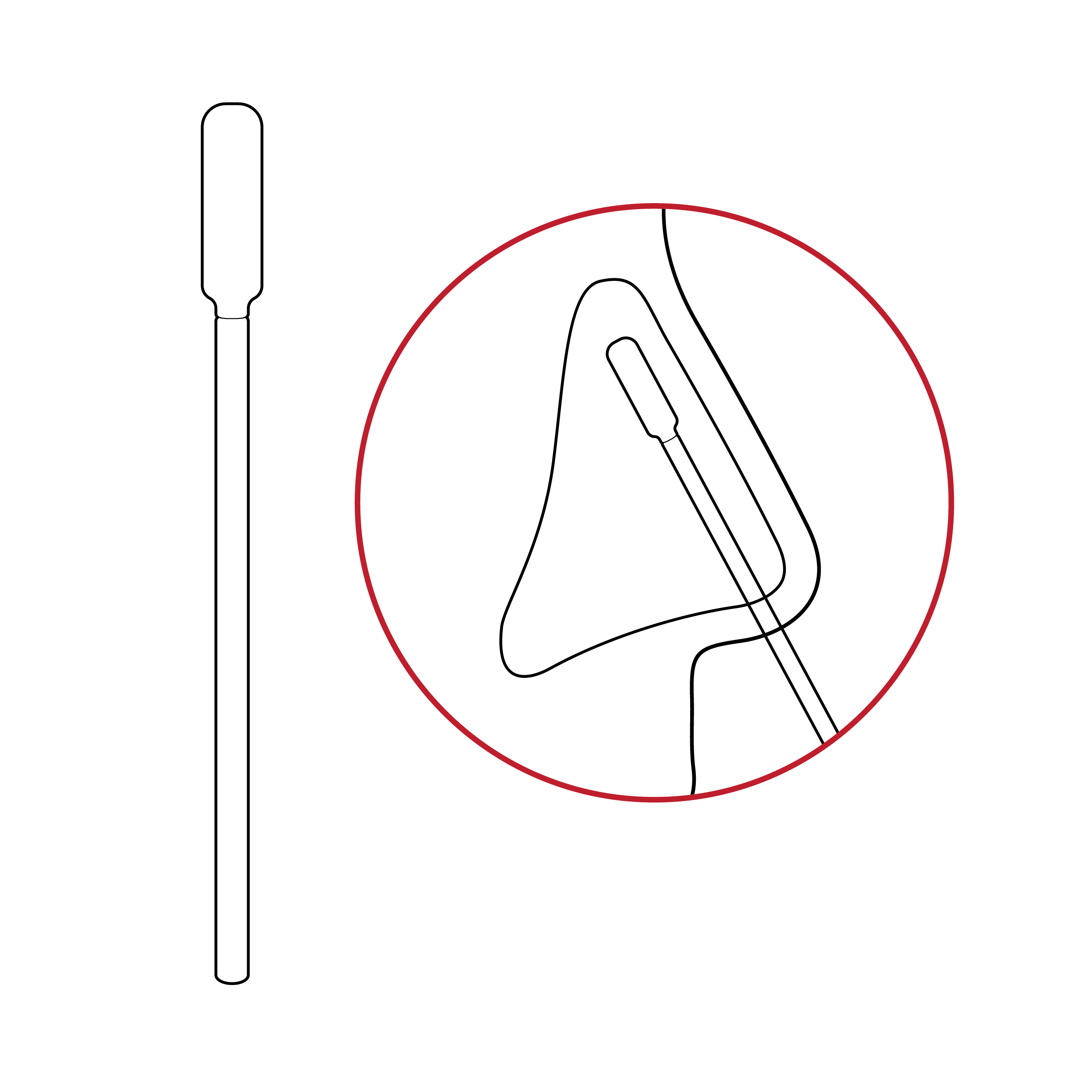
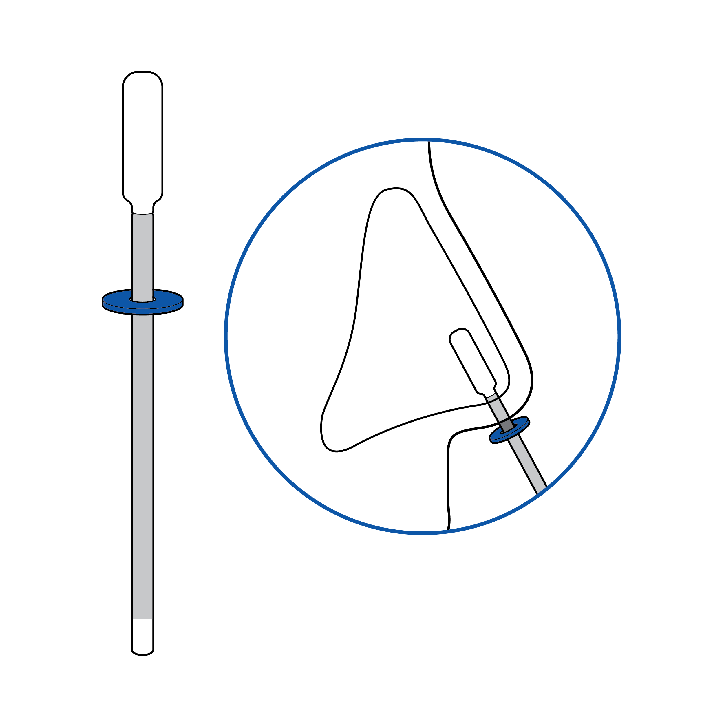
9.3 Swab
Issue
 Swab without handling feature
Swabs with no clear indications for handling may be contaminated by touch.
Recommendation
 Swab with grip area feature
- Swab shaft should have identifiable features (e.g., textures) so that the user knows where to grasp, preventing sample contamination.
- Employ contrasting colors for the swab shaft and swab tip so they can be readily discerned.
Issue
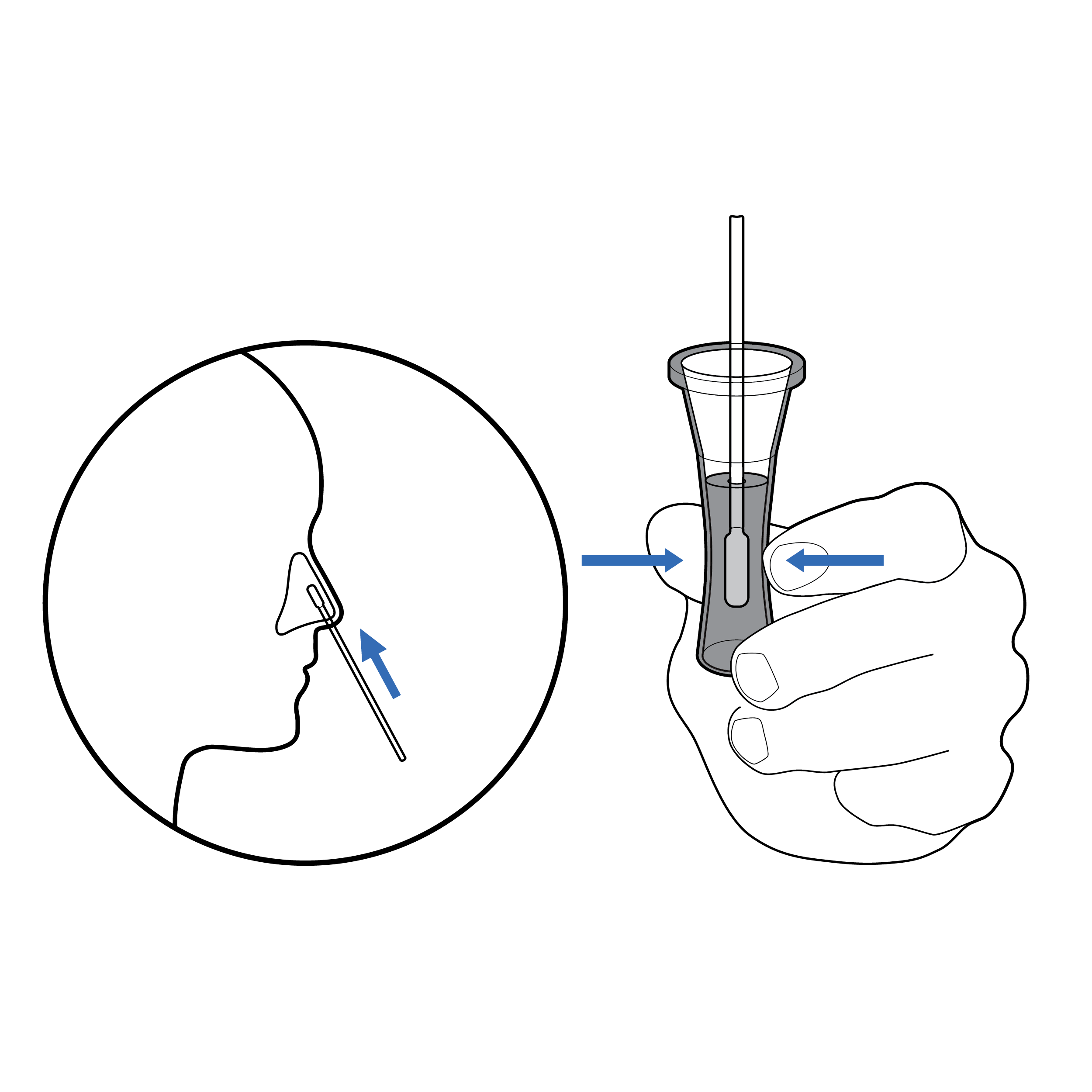
 No depth indication
Swabs have no indication for appropriate nostril insertion depth.
Recommendation
 Swab with depth indication
Incorporate a tactile feature on the swab to inform the user of the required depth of insertion.
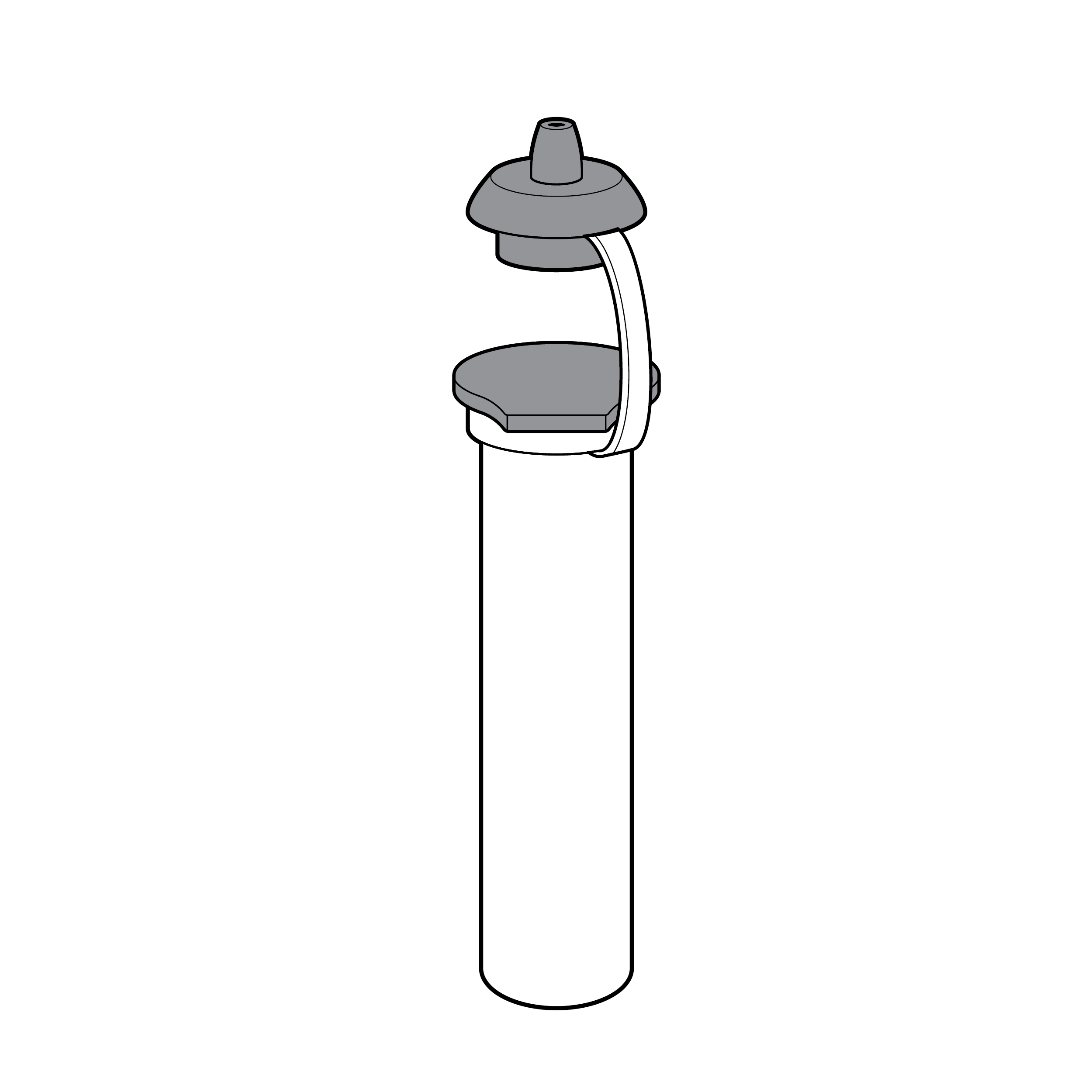
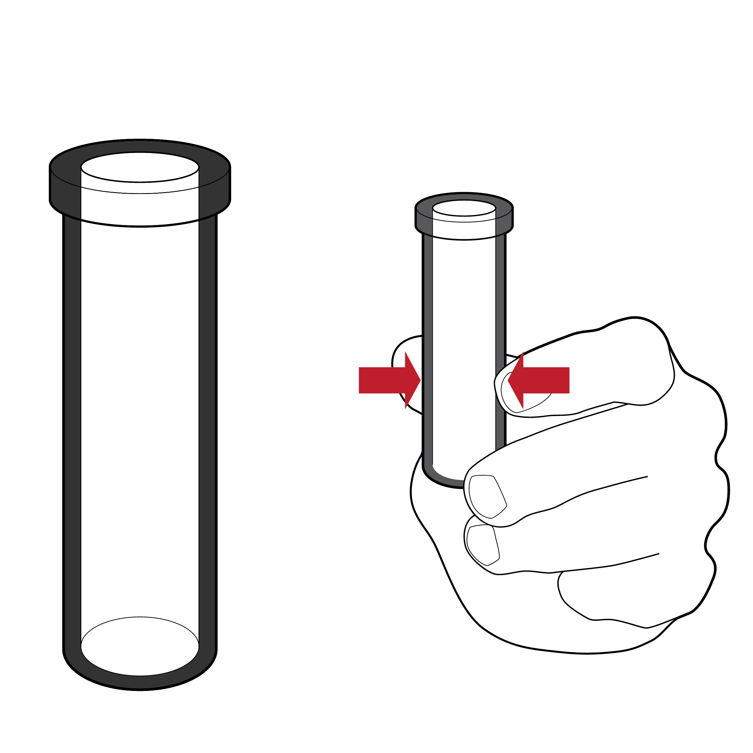
9.4 Fluid Vials and Sample Preparation
Issue
 Cap that is challenging to remove
Small caps and vials may be misplaced and are tricky to handle, creating a spill risk.
Recommendation
 Cap with features facilitating removal
- Large caps and vials with identifiable features (e.g., color, shape) help improve handling.
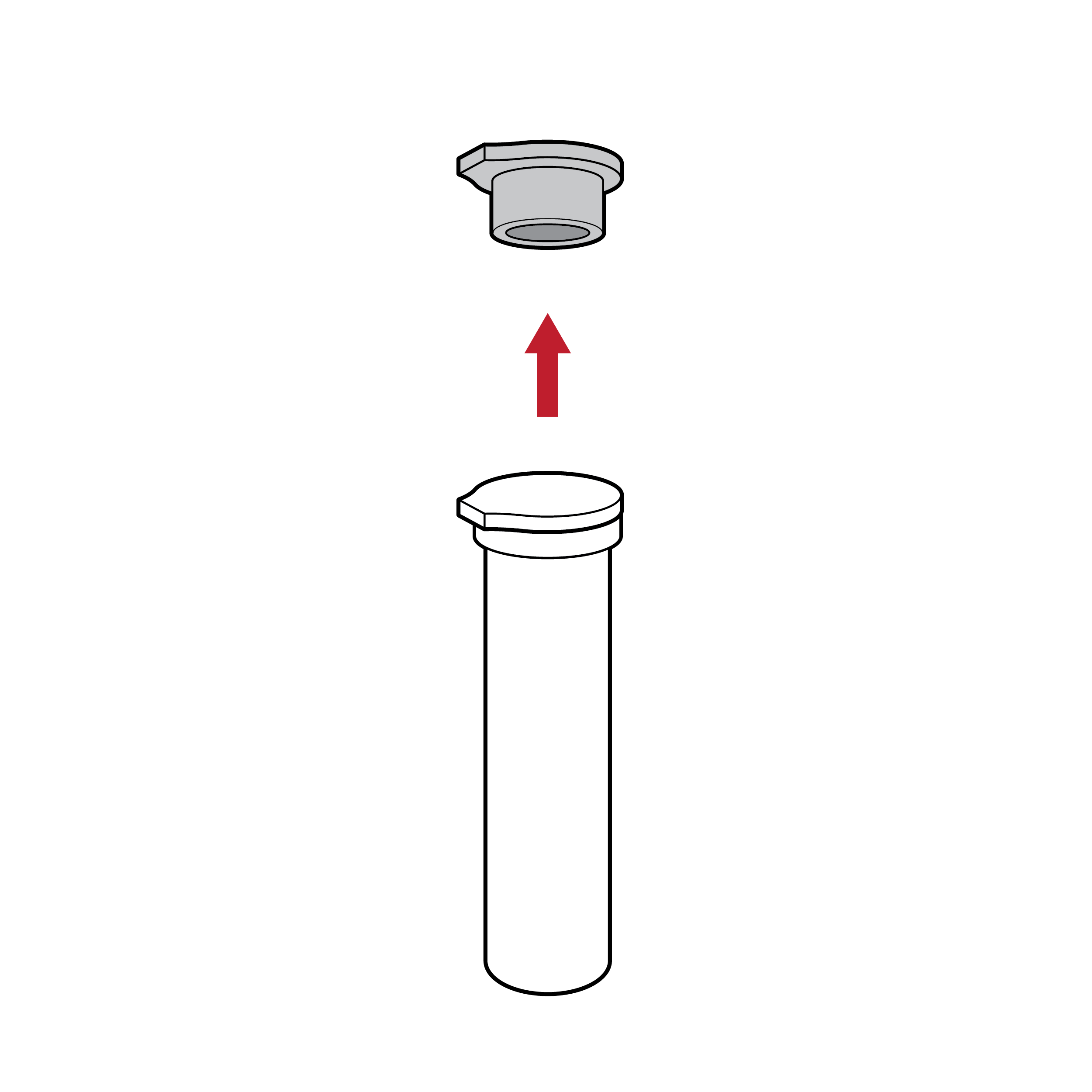
- Attach caps to the fluid vial (e.g., with a living hinge).
Issue
 Fluid transfer spill
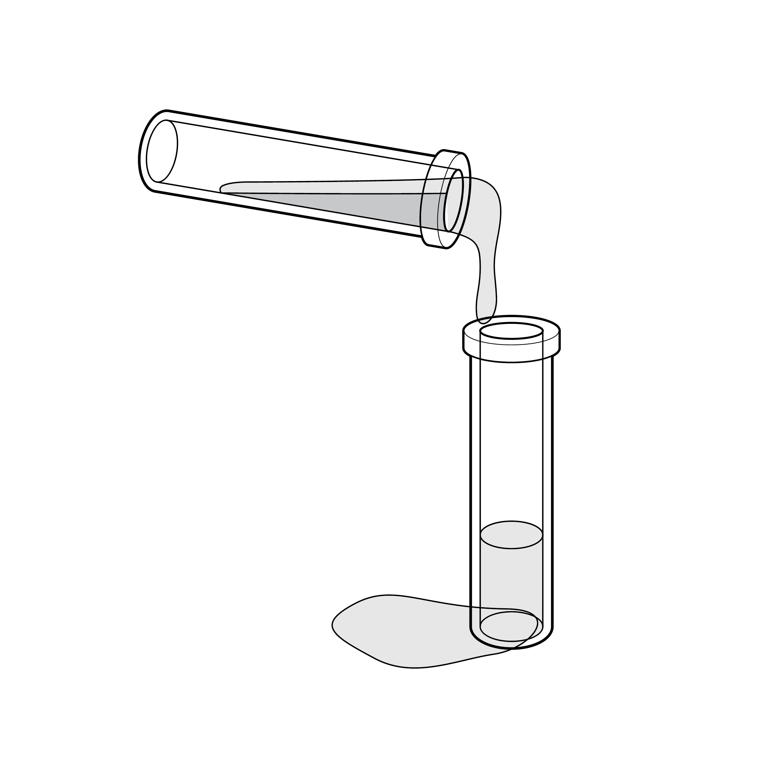
Tests may require transferring buffer solution (e.g., reagent) into the extraction fluid vial, which increases the risk for incomplete transfer and/or spill.
Recommendation
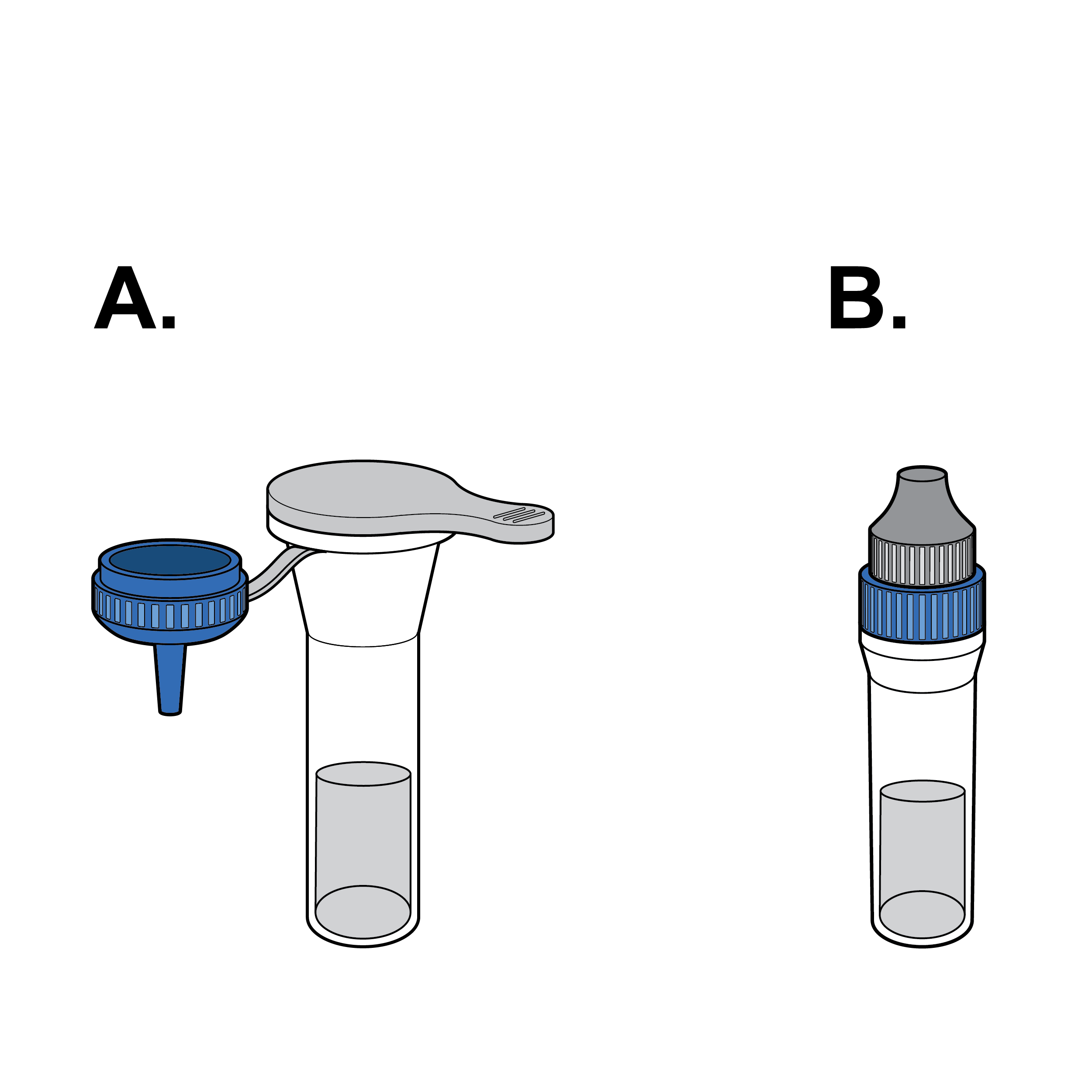 Elimination of fluid transfer
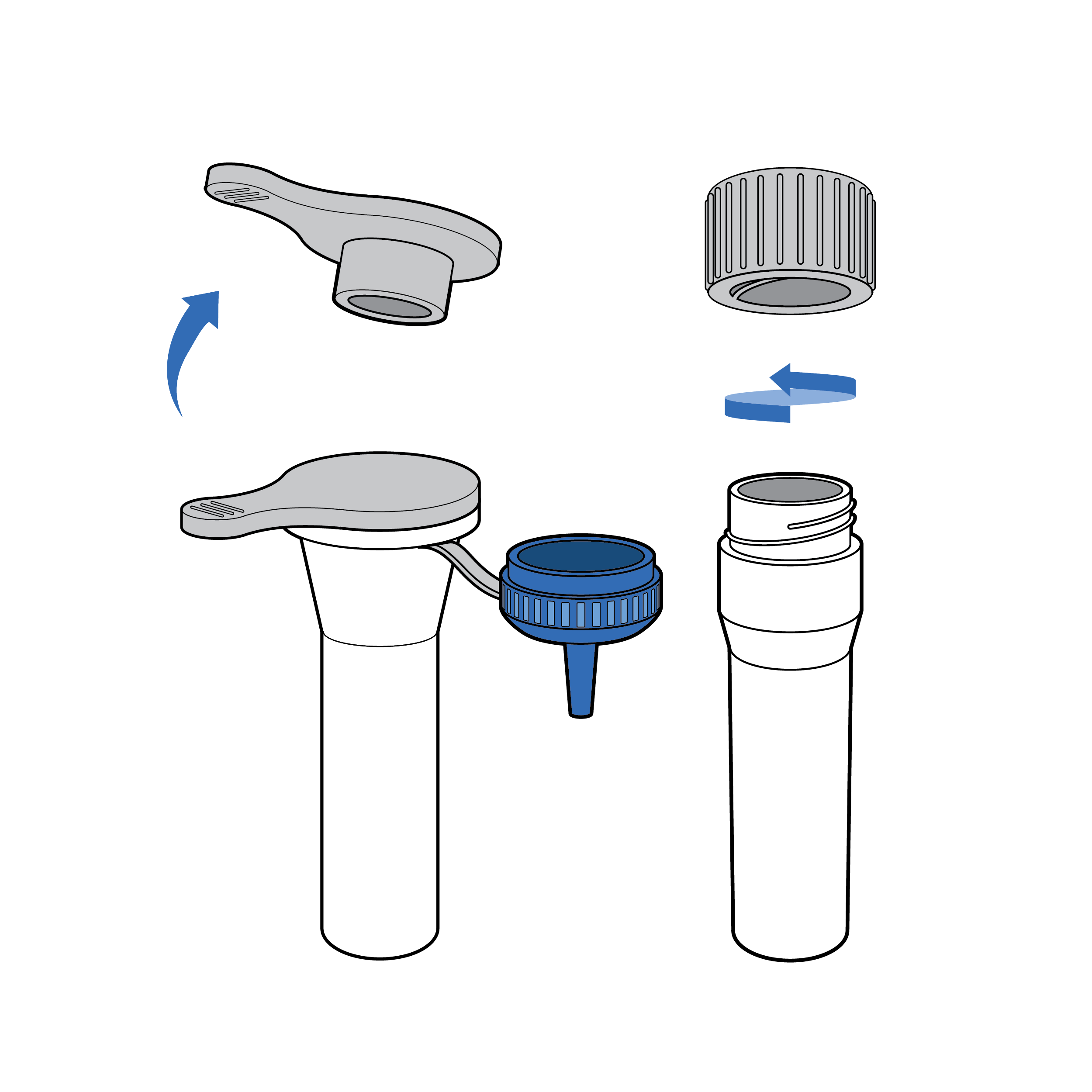
Eliminate the need to transfer buffer solution when possible (e.g., by integrating a prefilled fluid vial and dropper cap).
Issue
 Thick-walled vial
- Fluid vials with stiff walls (e.g., thick plastic) make it hard to dispense liquid by squeezing.
- Short fluid vials may be difficult to grip or manipulate.
- Depending on material opacity, it may be difficult to visualize liquid dispensing.
Issue
 Unstable vial
Fluid vials may be unstable, making them difficult to set down during the testing process.
Recommendation
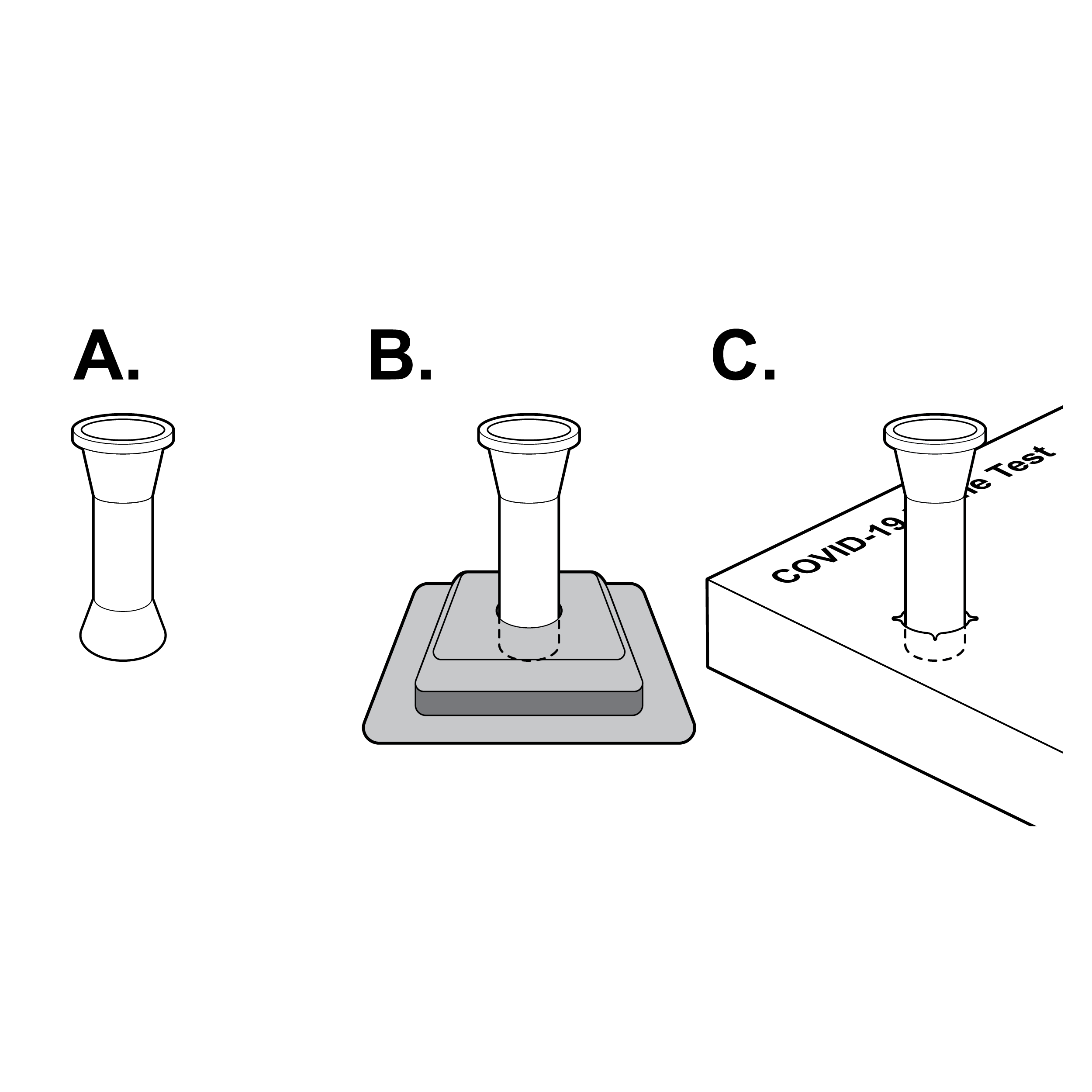 Stable vials
- Design fluid vials to ensure stability when set upright (e.g., integrated vial base, separate vial stand, vial stand punch-out in outer box).
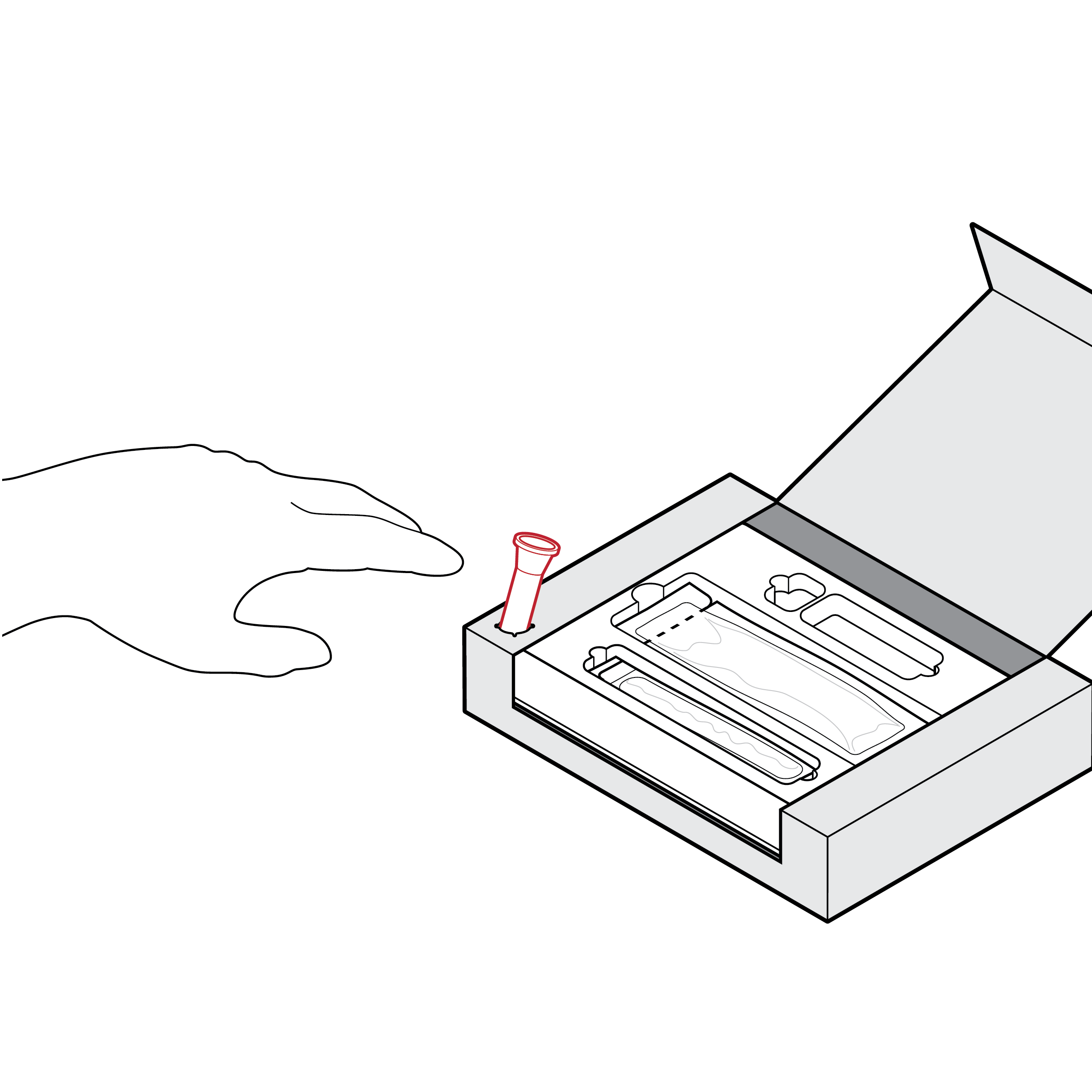
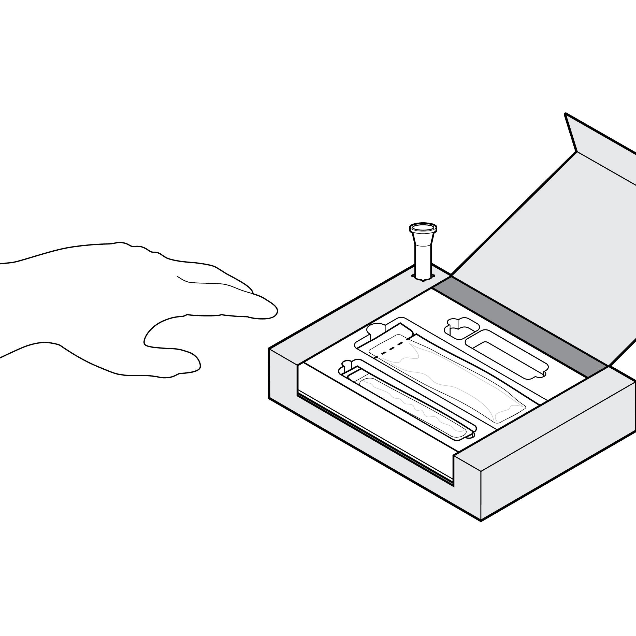
- For a vial stand punch-out in the outer box, ensure force to puncture is less than 5 lbs. (22.2 N) , use high-contrast labeling to indicate location, size to ensure secure fluid vial fit, and position in a location that does not interfere with box use (e.g., at box edge). [30]
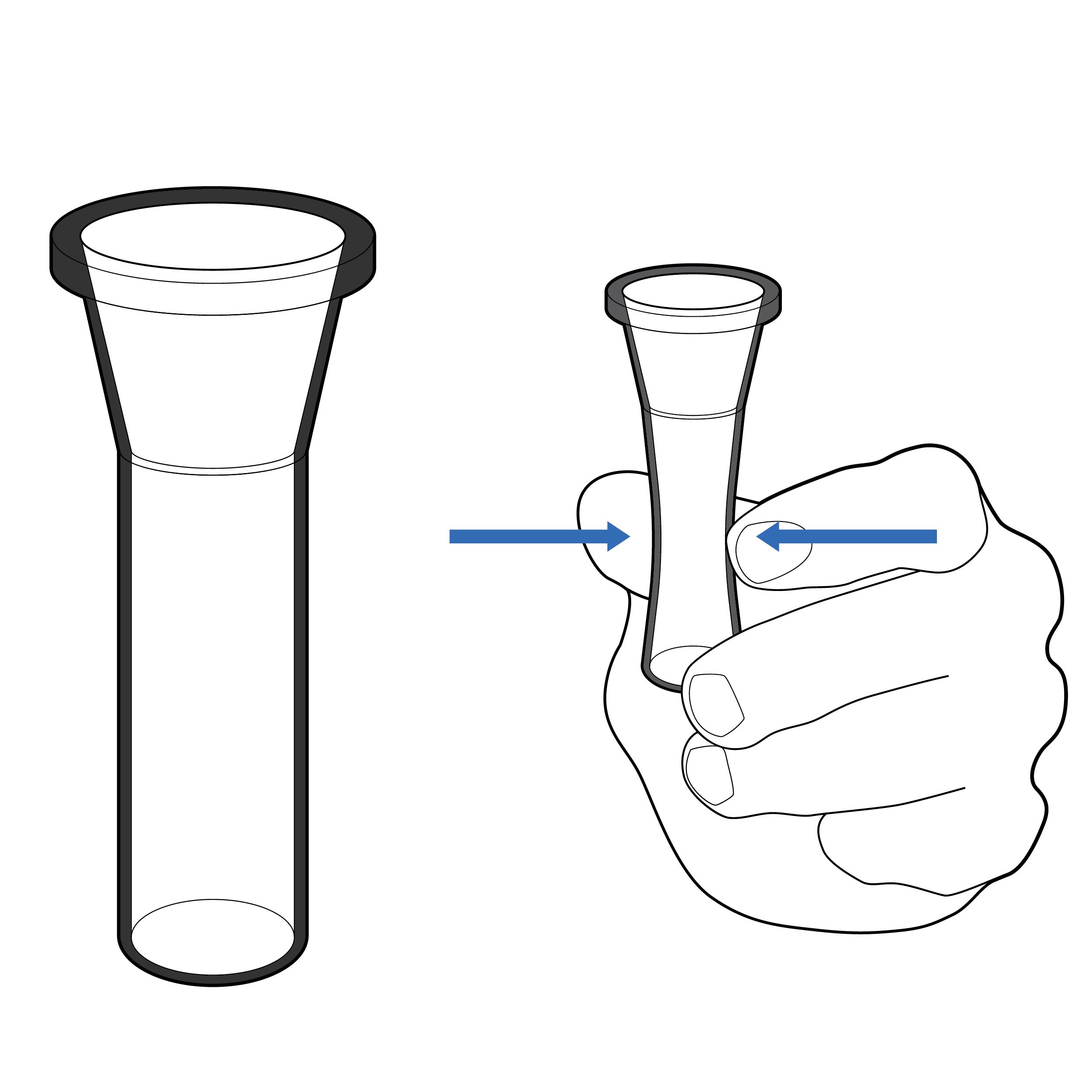
Issue
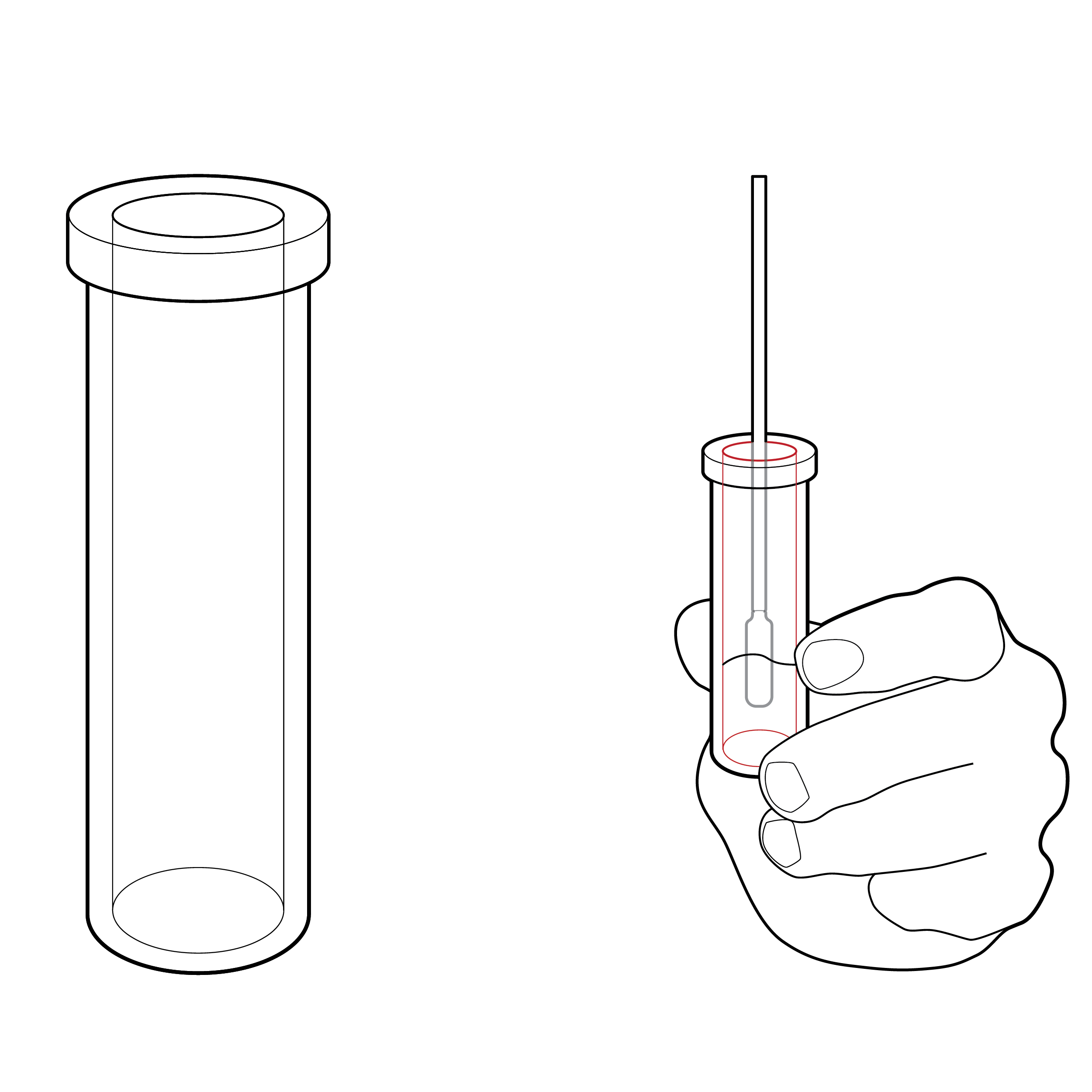
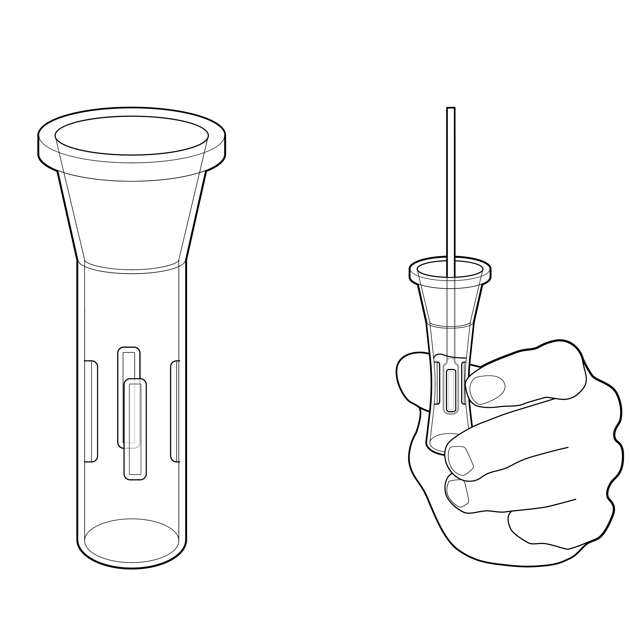
 Narrow vial opening
Narrow openings make it difficult to insert the swab into the fluid vial, which can result in the swab tip being touched and contaminated during insertion.
Recommendation
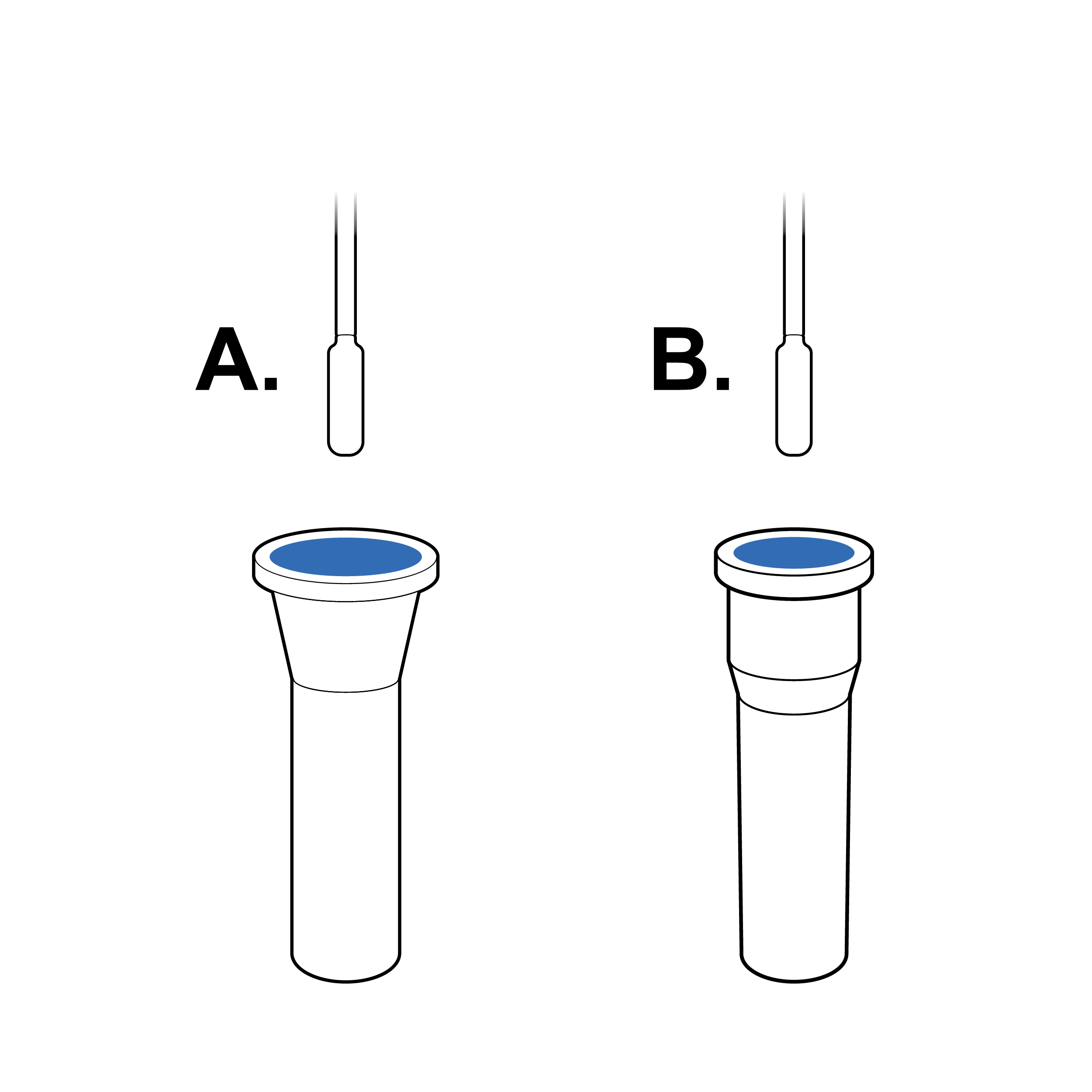 Tapered vial opening
Widen or reshape (e.g., funnel) fluid vial opening so that the swab can be easily and safely inserted.
Issue
 Vial without internal texture
Tests may require physically supporting the fluid vial during sample agitation, increasing spill risk.
Recommendation
 Vial with internal ribbing
Incorporate fluid vial design features that reduce the force that needs to be applied during sample agitation or sample extraction (e.g., internal ribbing).
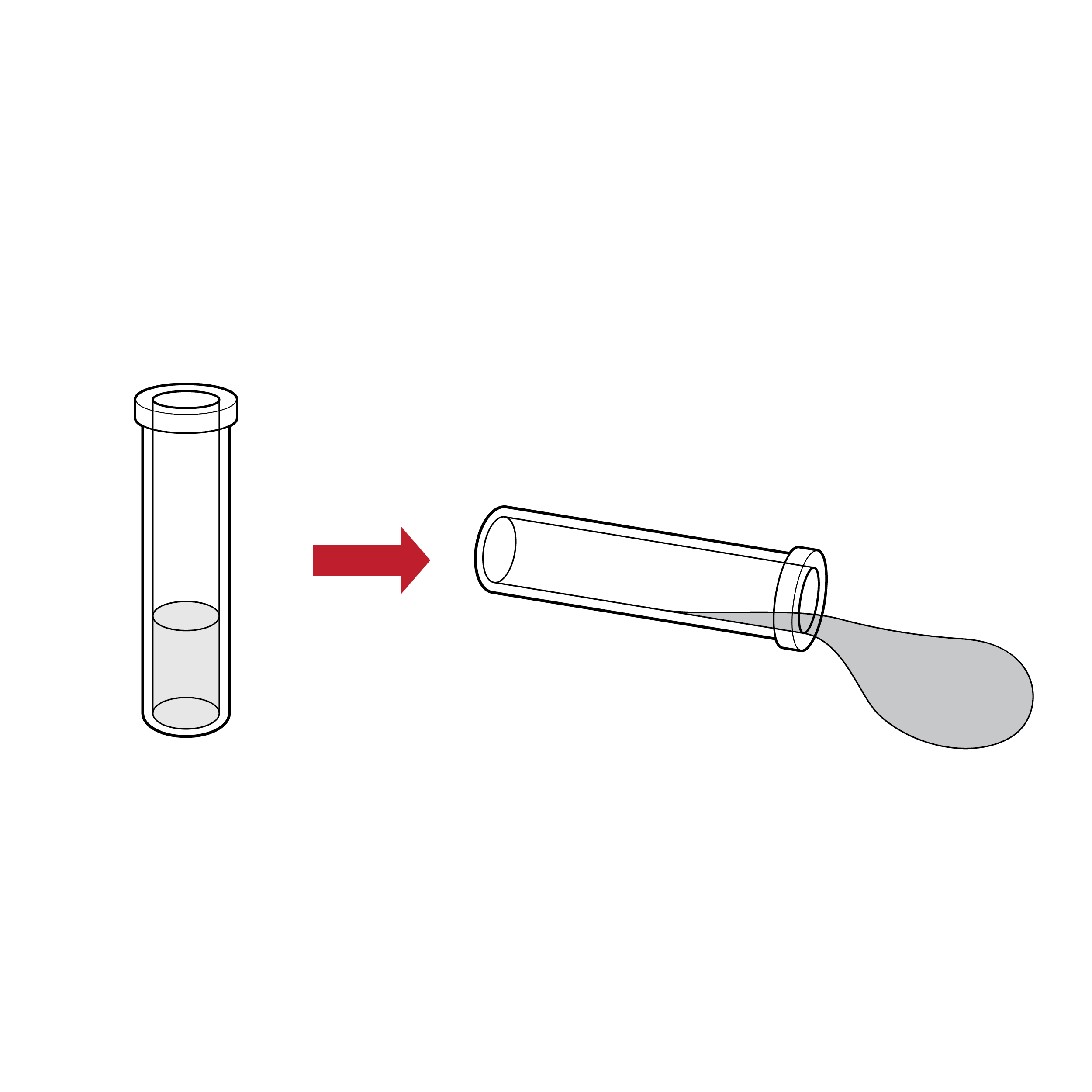
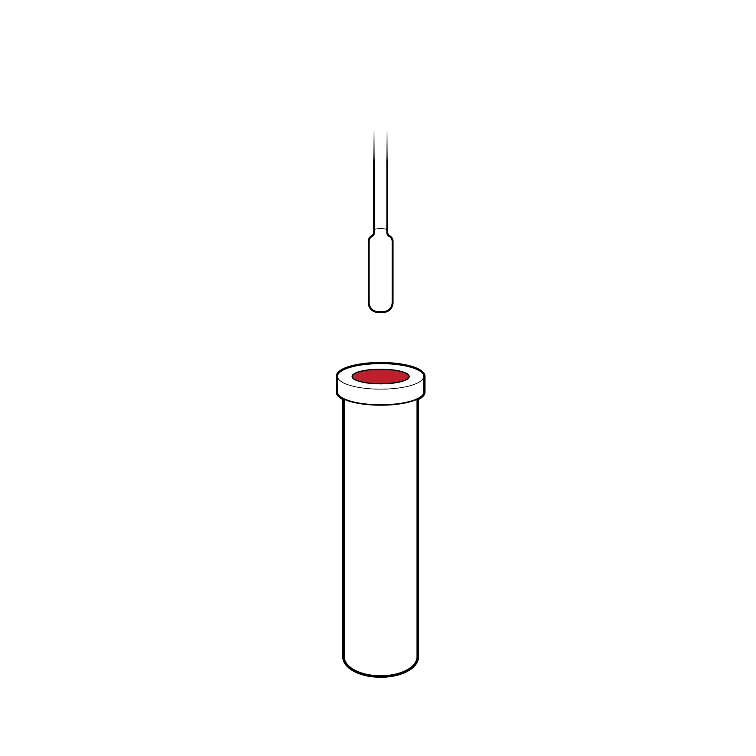
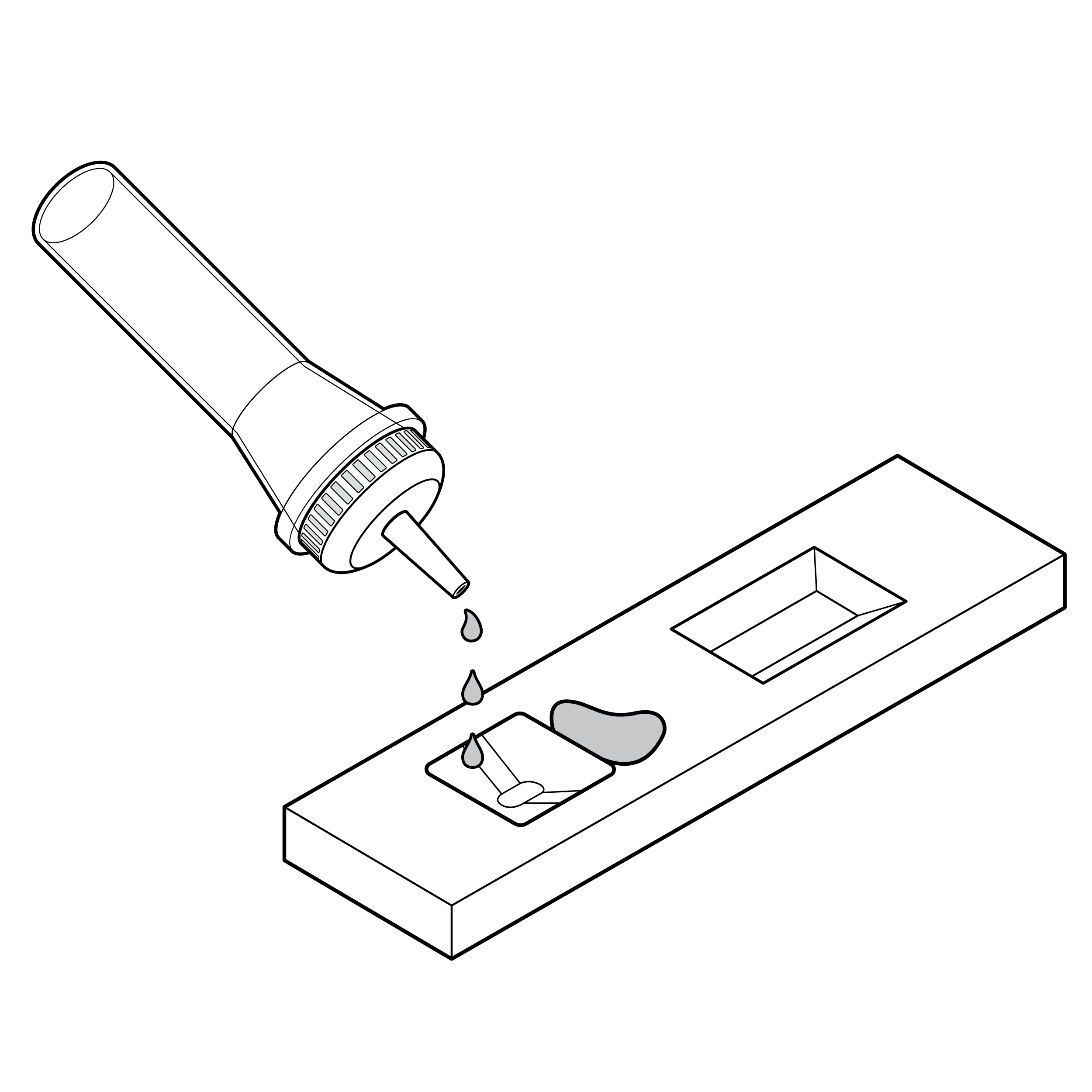
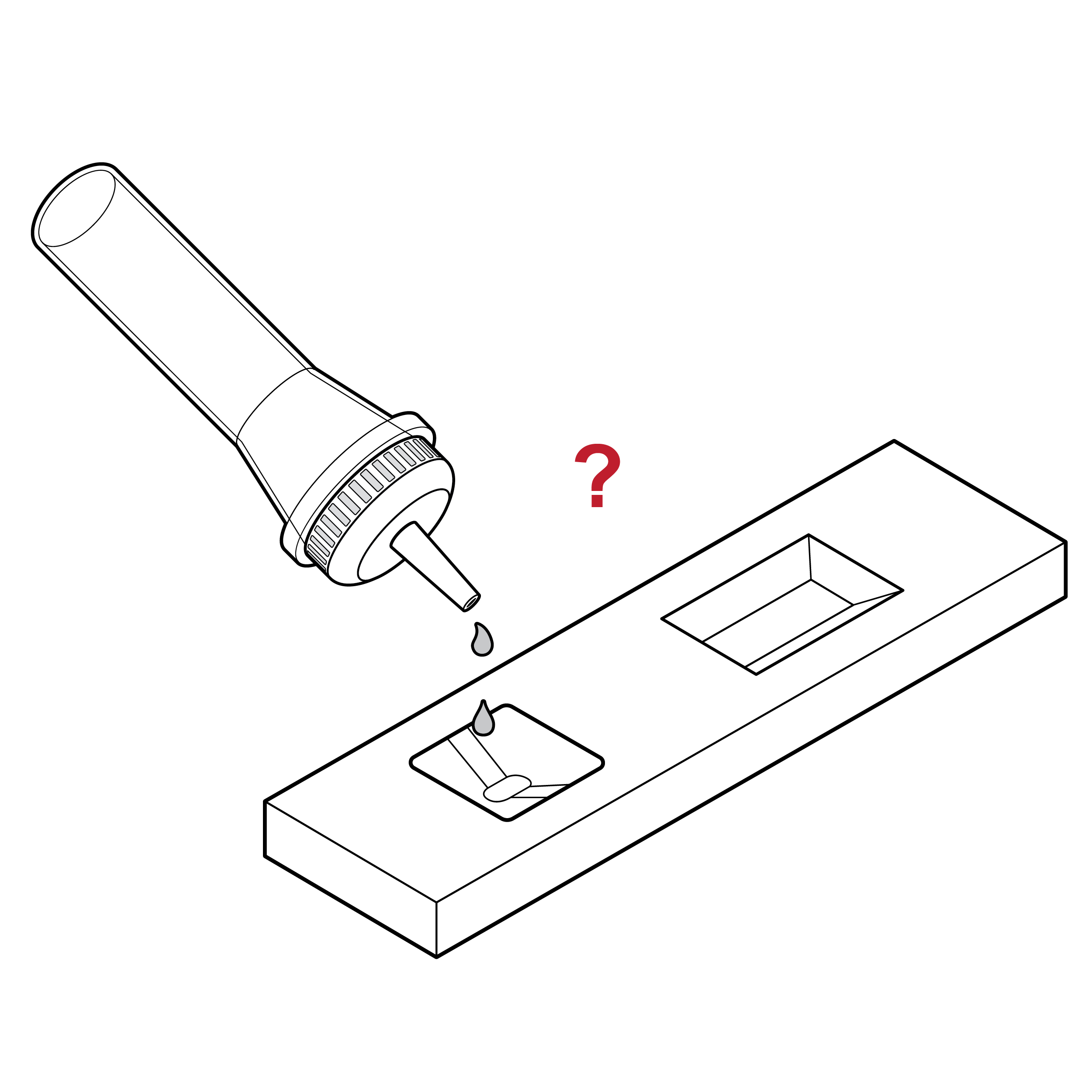
Issue
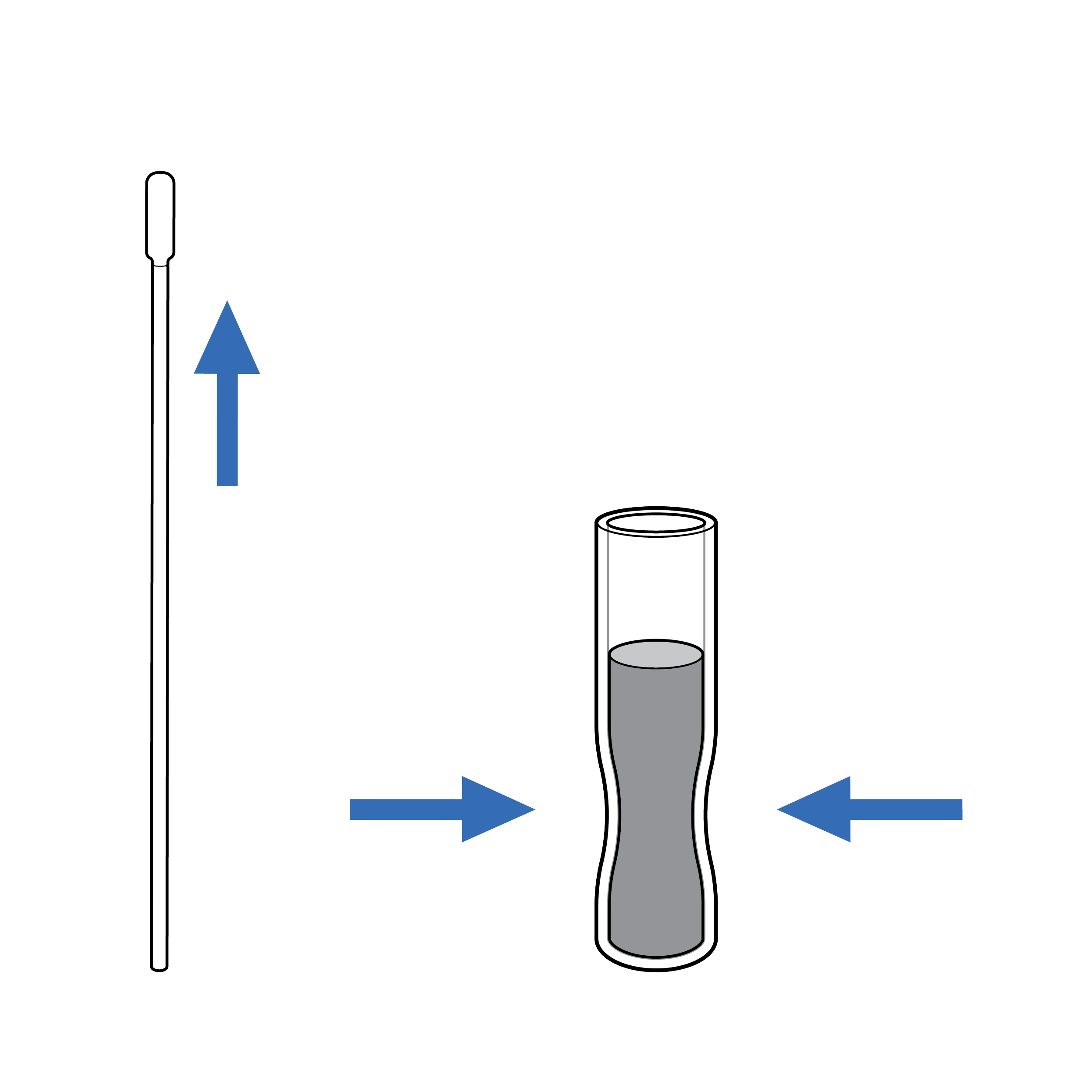
Counting drops delivered to the cassette sample well is challenging and creates potential for user error.
Recommendation
Design the test so that the complete volume in the fluid vial is used for analysis.
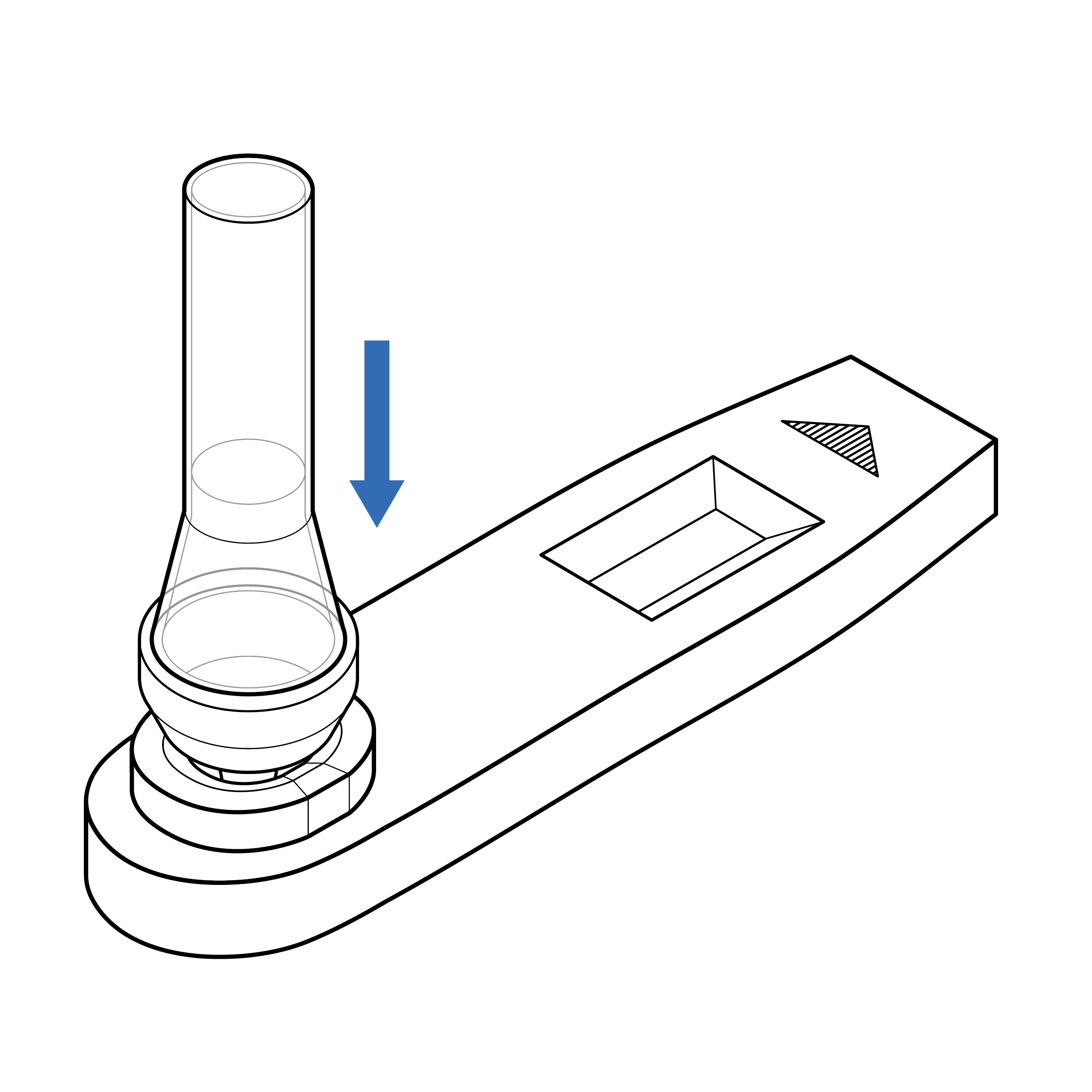
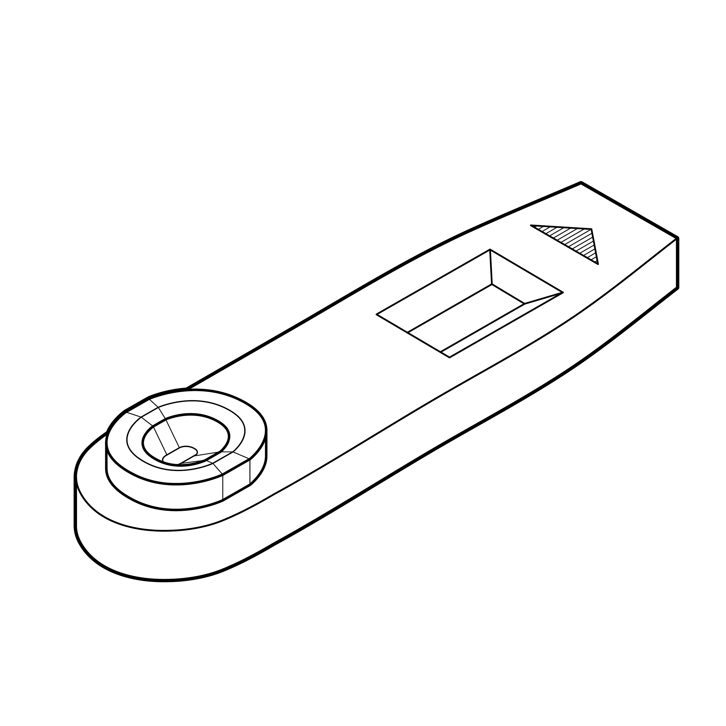
9.5 Cassette
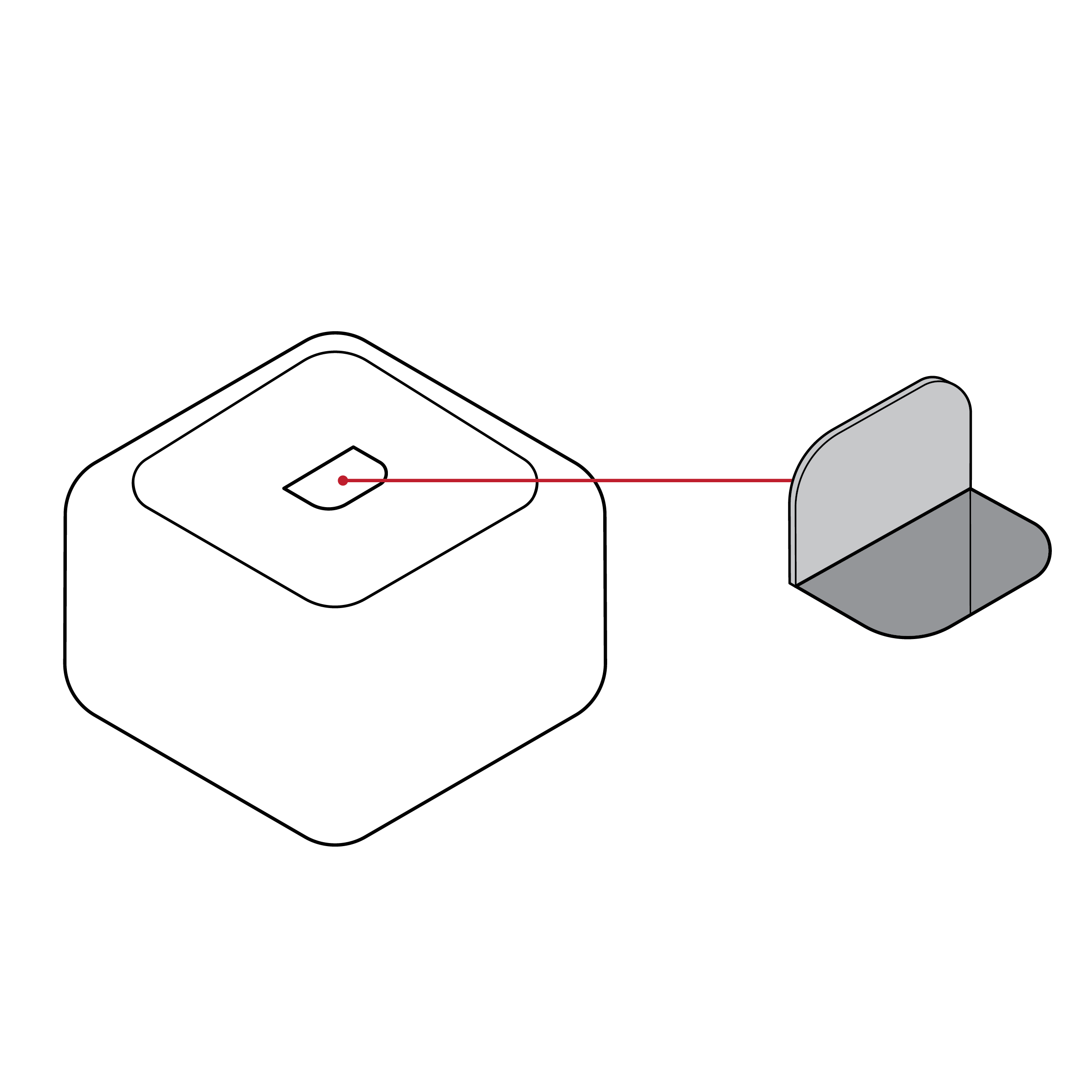
Issue
 Lack of orientation features
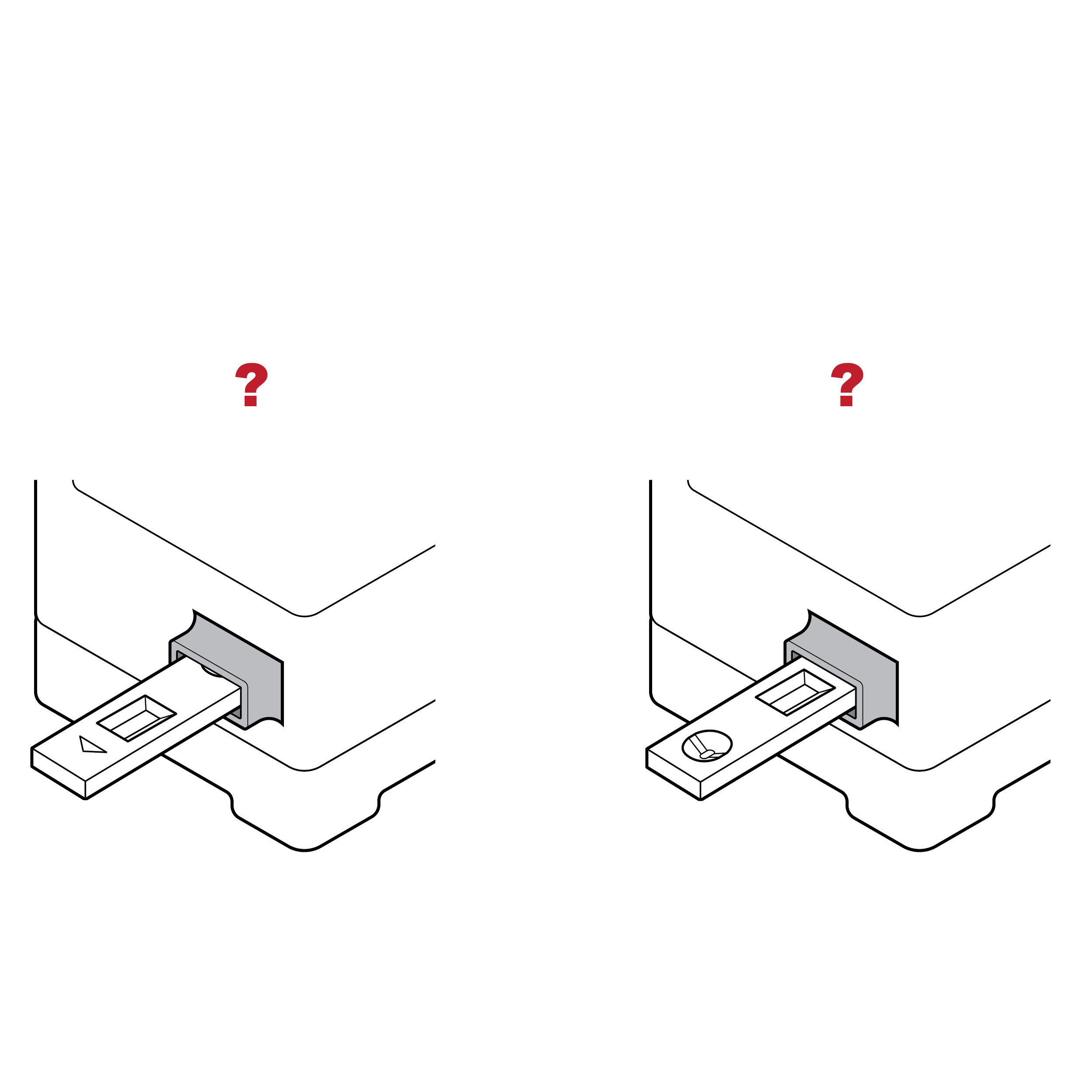
- An indistinct cassette shape may make it challenging to correctly orient the device and identify features such as the sample well and results window.
- An indistinct shape may also make it challenging to correctly load the cassette into a test reader, if applicable.
Recommendation
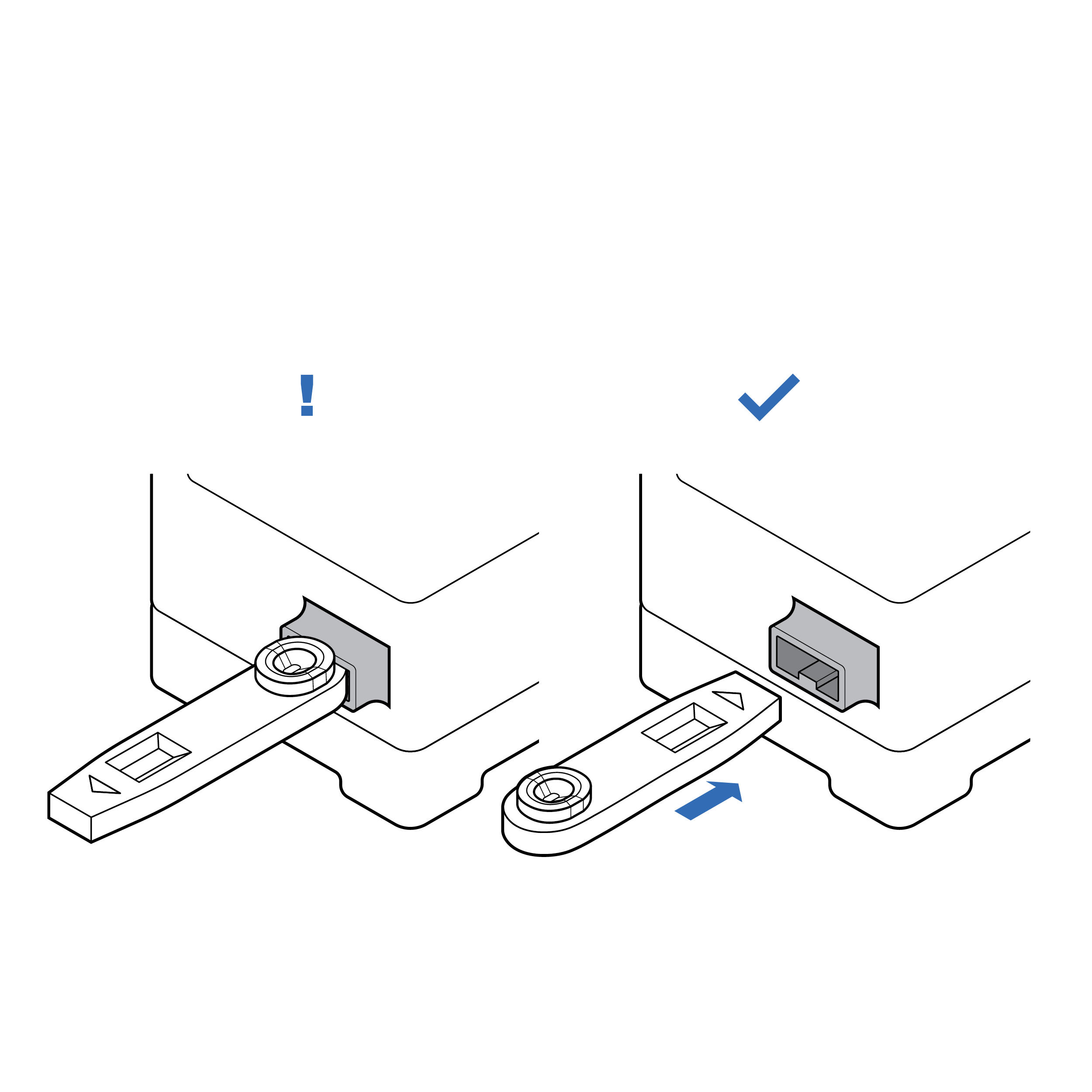 Mating features indicating orientation
- Design the cassette with distinguishing features (e.g., colors, shapes, textures) for easy identification and manipulation.
- Provide a keying feature so that the cassette can only be loaded into the test reader in the correct orientation.
Issue
 Cassette without distinguishable well location
- The location of the sample well and results window may be difficult to identify, especially by touch. This may lead to sample spills.
- The sample well and results window may be easily confused.
Recommendation
 Cassette with docking feature
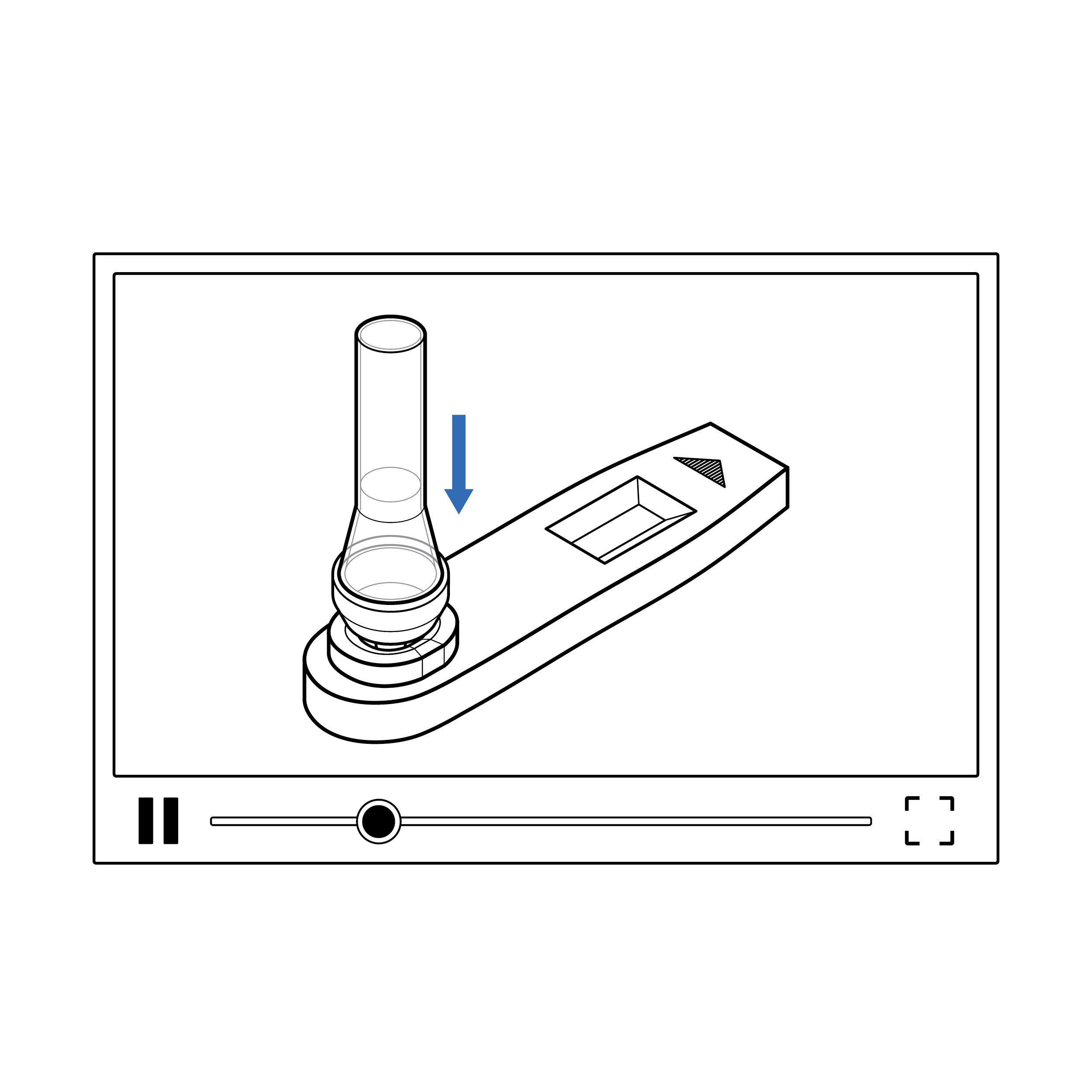
- If sample fluid transfer is required, incorporate features on the cassette that facilitate alignment or docking of the fluid vial and sample well (e.g., locking features, raised edges of sample well, contrasting color of sample well).
- The sample well and results window should be shaped differently and separated sufficiently.
Issue
 Cassette with exposed sample well
An exposed sample well increases the risk of touch contamination, which may affect the test result.
Recommendation
 Cassette with protected sample well
Include features on the cassette that reduce likelihood of touch contamination (e.g., raised edges of sample well).
Issue
 Cassette without drop count labeling
- Users may dispense an incorrect number of drops.
- Users may dispense drops in an incorrect location.
Recommendation
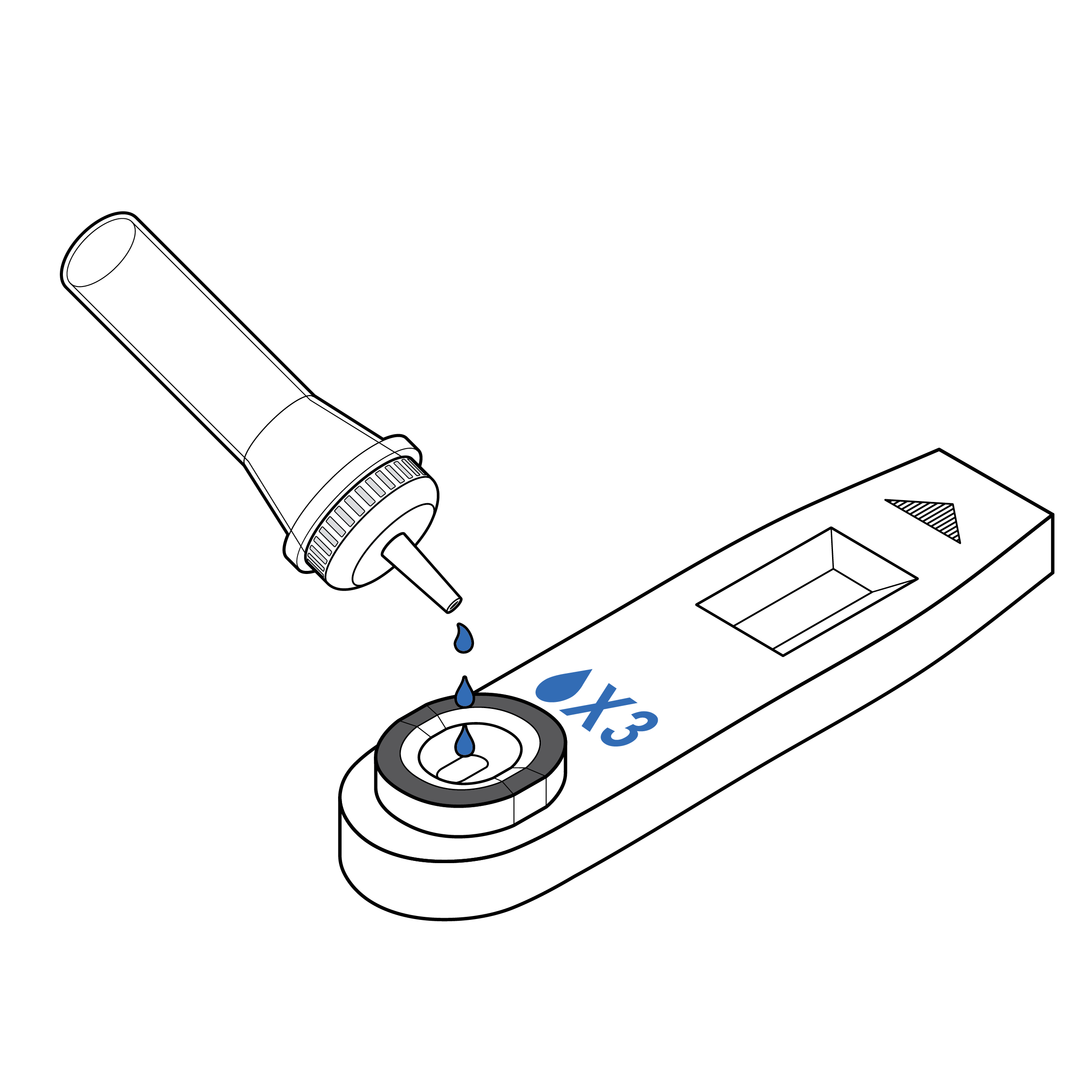 Cassettes with explicit drop count labeling
- If counting drops is required, include a high-contrast label on the cassette indicating the number of drops required.
- To facilitate identification of sample well location, include a 0.1 inch (3 mm) raised edge and/or a high-contrast outline.
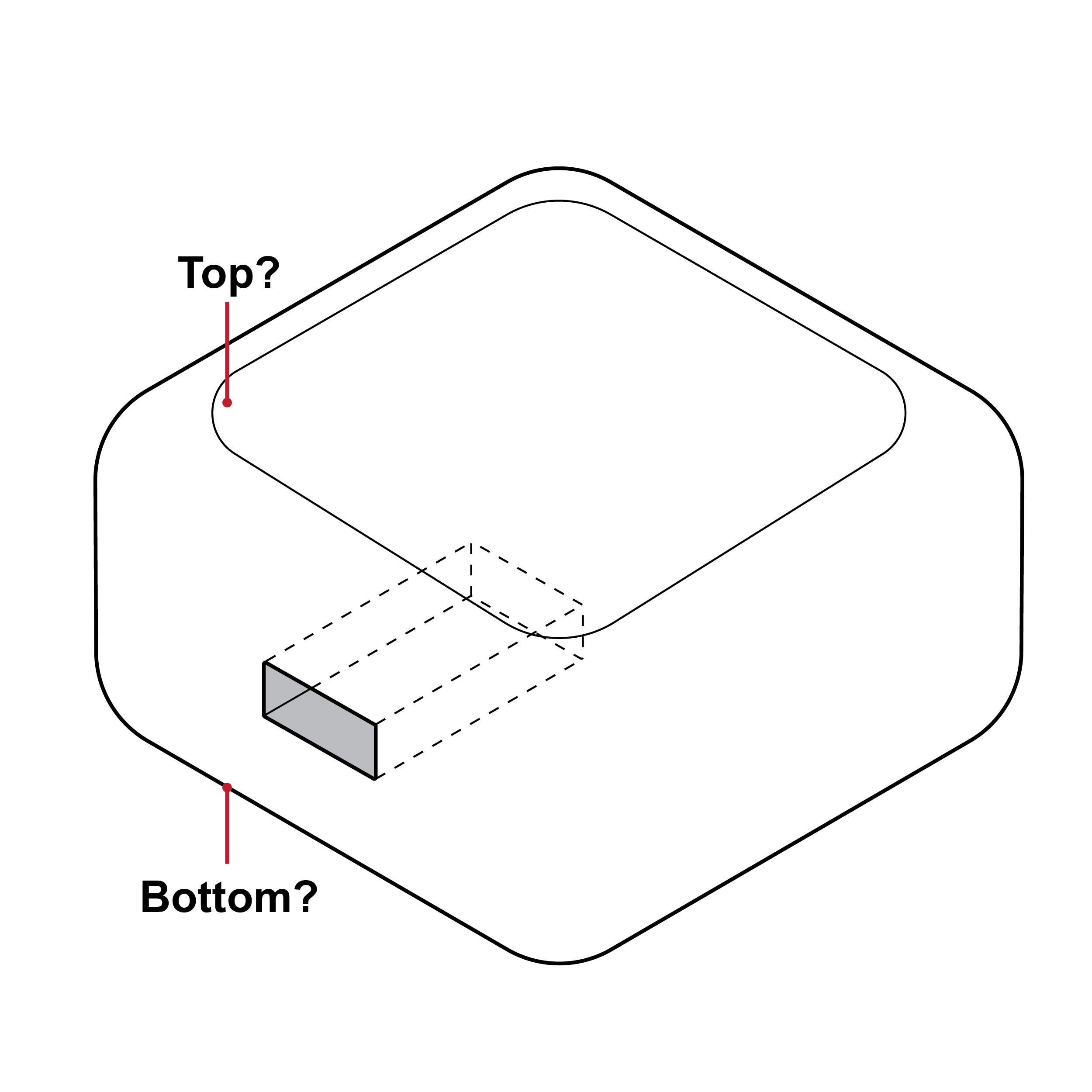
9.6 Test Reader
Issue
 Test reader without distinguishable features
The test reader shape may make orientation and identification of features (e.g., cassette insert area) challenging.
Recommendation
 Test reader with distinguishable features
Design the test reader with distinguishing features (e.g., colors, shapes, textures) for easy orientation.
Issue
 Small button interfaces
Physical buttons may be difficult to locate and activate.
Recommendation
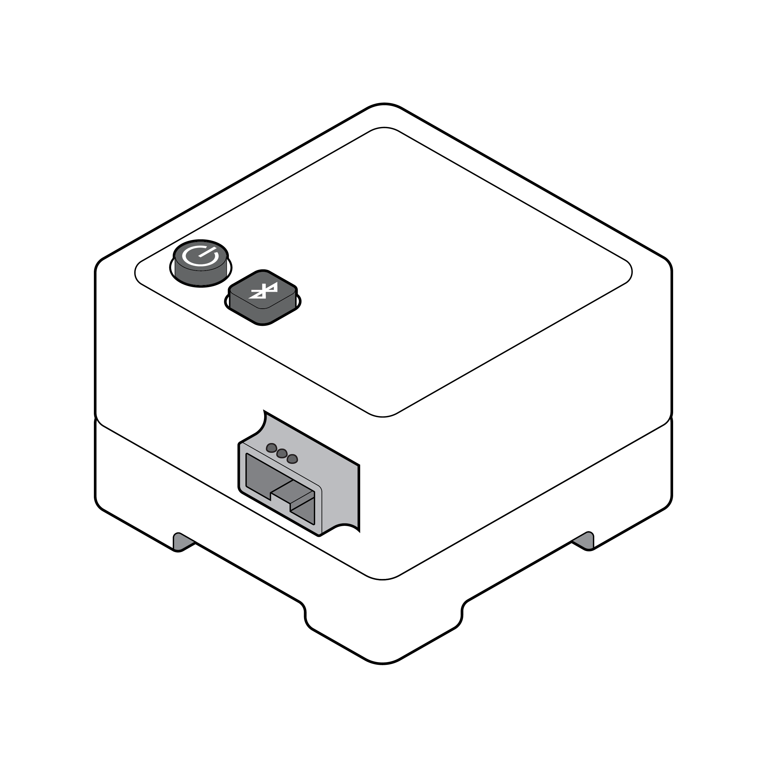 Large button interfaces
- Ensure physical buttons are a minimum 0.5 inches (12.7 mm) wide and are spaced a minimum 0.7 inches (17.8 mm) center to center. [33]
- Physical button features (e.g., shape, edges) should be distinct.
Issue
 Battery compartment difficult to locate
- Test kits or instructions may not clearly indicate battery location.
- Batteries may be located in an area that is hard to reach.
Recommendation
 Battery compartment easy to access
- If applicable, include an on-device label with a tactile symbol to indicate battery location.
- Position batteries so that they can be easily accessed.
Issue
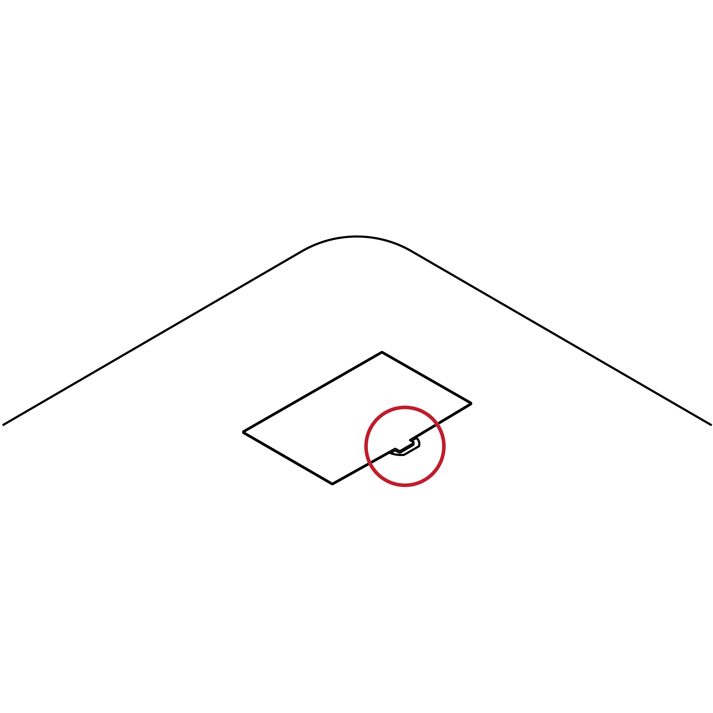 Small battery access feature
- Test kits or instructions may not clearly indicate battery access and removal method.
- Battery access doors may be difficult to remove due to small, hard-to-grip handles.
Recommendation
 Improved battery access and removal
- Clearly label the access door to indicate removal method (e.g., tactile features).
- Implement familiar battery removal methods.
- Include features that can be manipulated without employing fine motor skills (e.g., pull tag, larger divot).
Issue
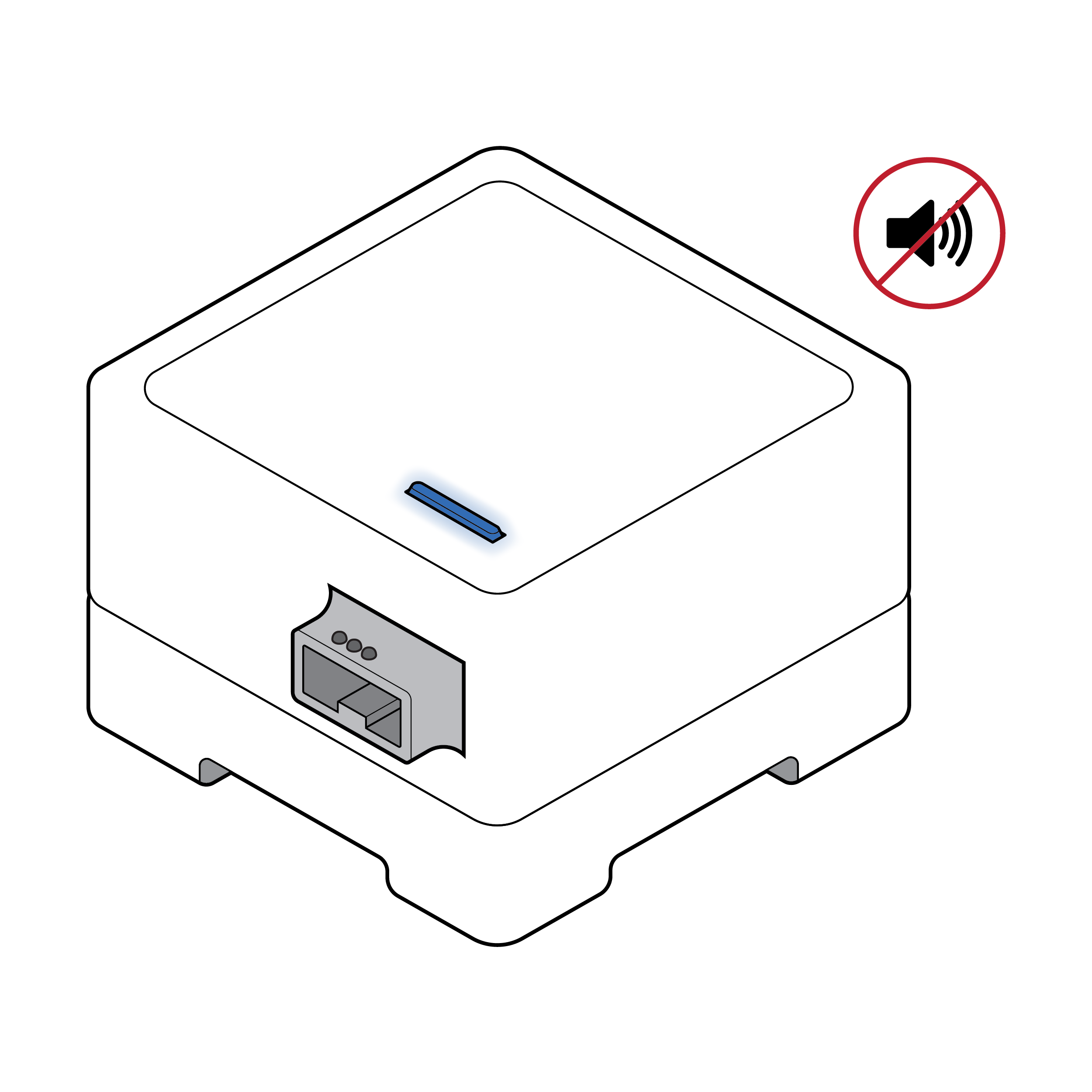 Test reader with exclusively visual feedback
Some test readers only communicate status (e.g., power, rechargeable battery level, results available) visually.
Recommendation
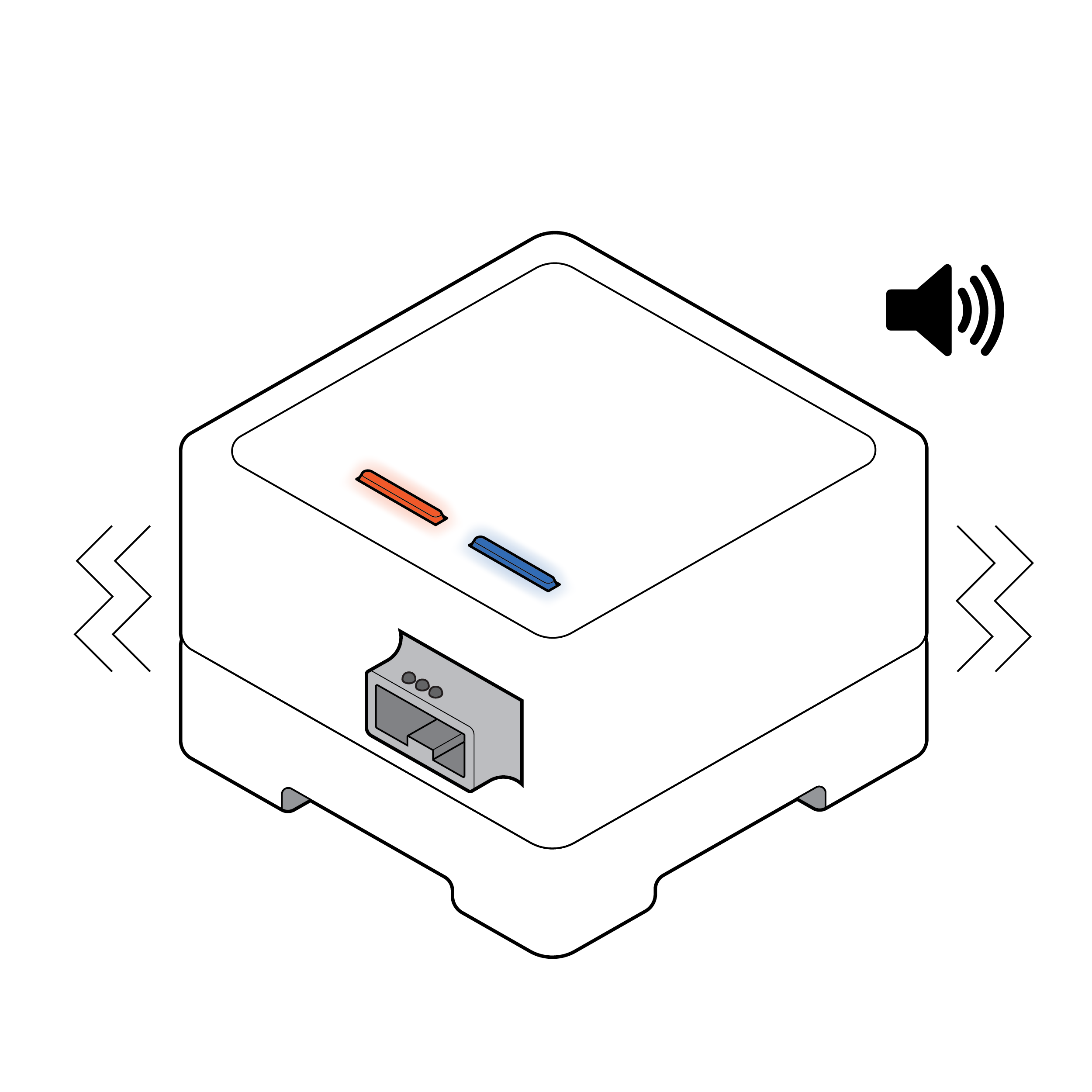 Test reader with visual, auditory and haptic feedback
Consider adding nonvisual indicators, such as audible and/or haptic feedback, to inform the user of test reader status. If using LED colors to indicate status, consider using multiple LED lights with spatial differentiation rather than a single LED light that changes colors.
Issue
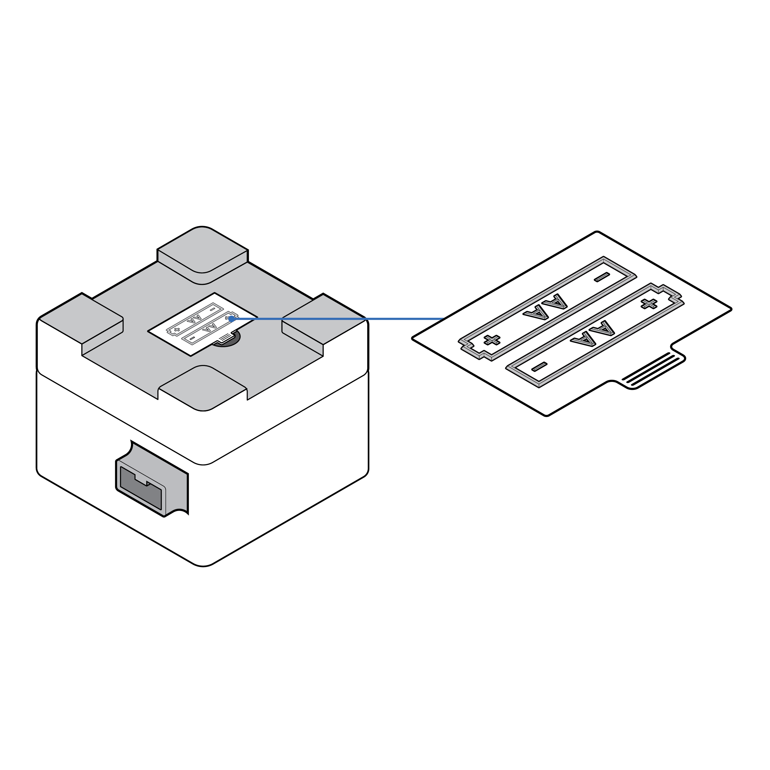
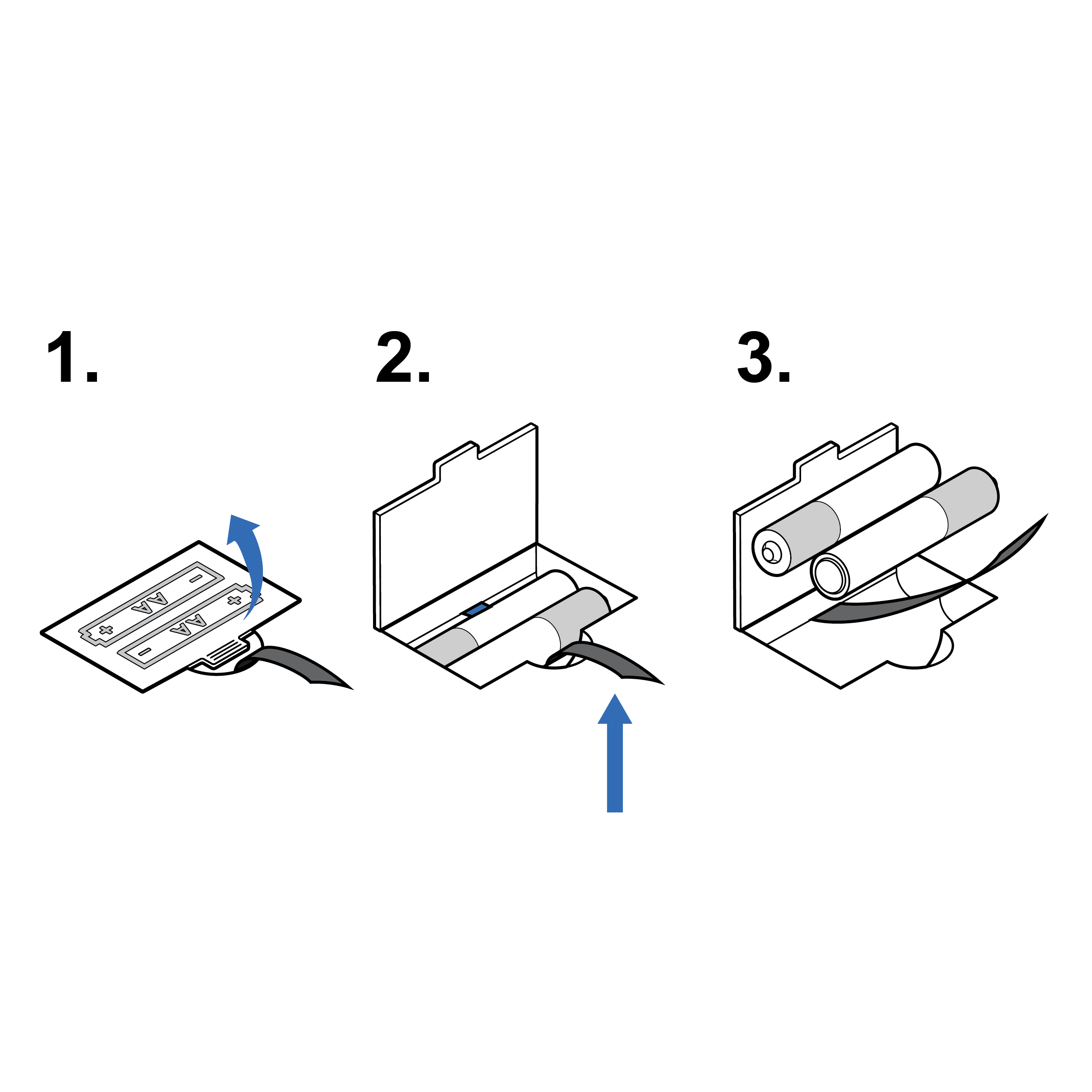
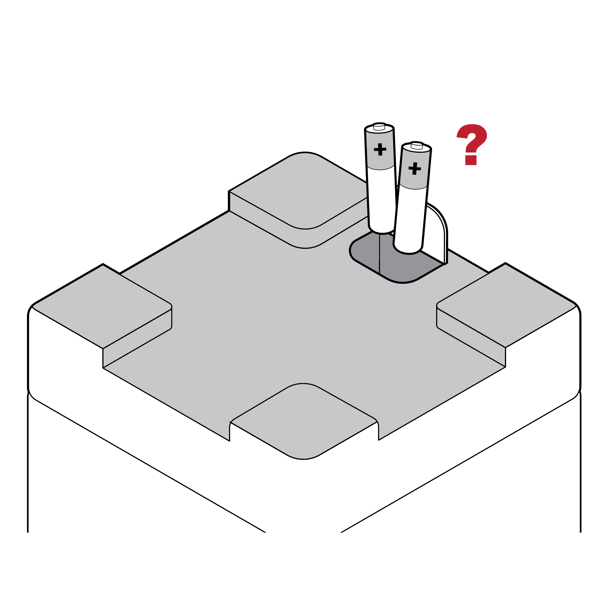 Lack of battery orientation cues
Battery-powered test readers may not clearly indicate the correct orientation for loading batteries (e.g., how to position positive and negative battery terminals).
Recommendation
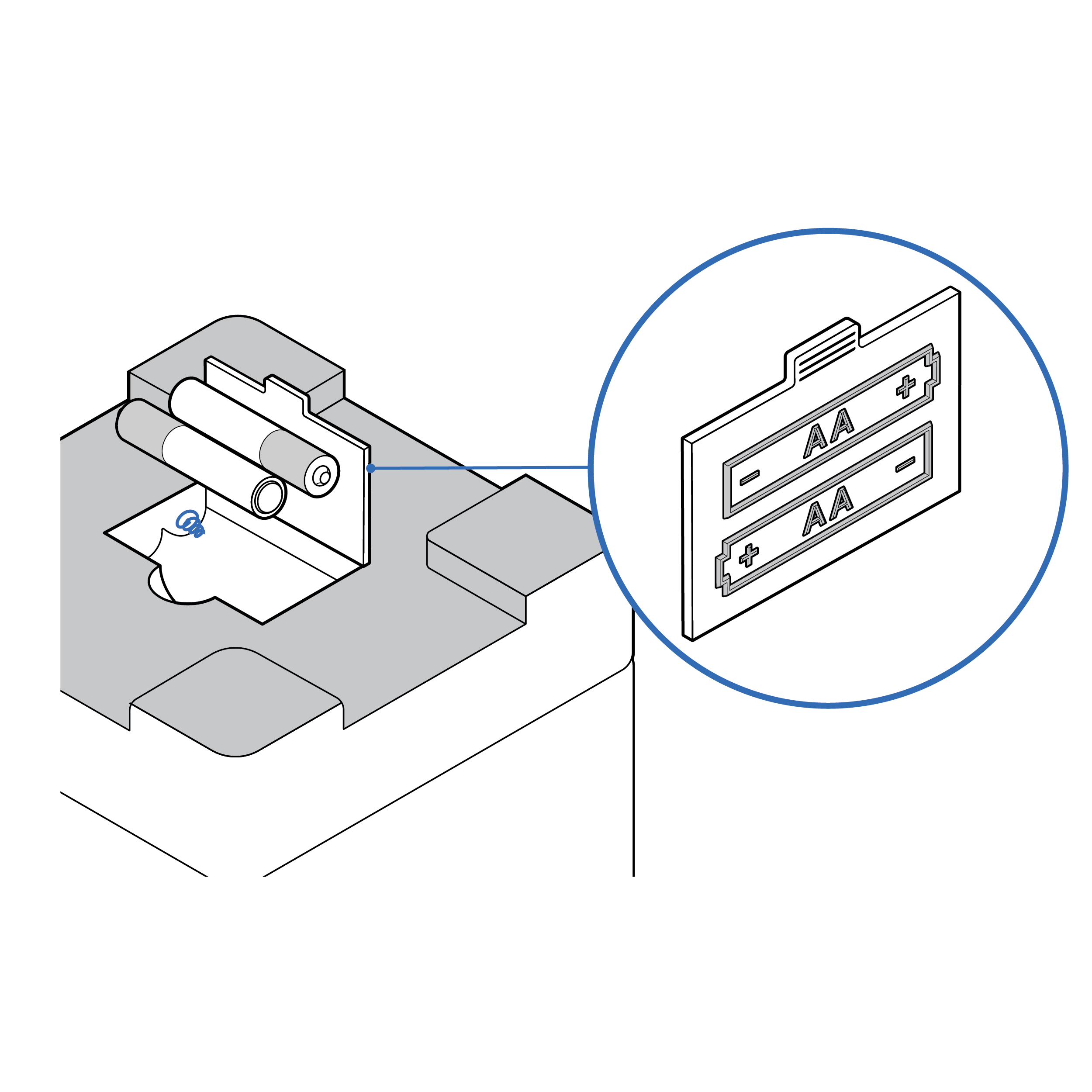 Explicit battery orientation cues
- Consider pre-loading batteries.
- Provide visual and tactile indicators of the correct orientation for loading batteries both on the battery access door and inside the battery compartment.
- Match existing consumer mental models about battery orientation to design (e.g., the negative battery terminal goes on a spring).
Issue
 Smartphone-based reader misaligned with a test cassette
Smartphone-based readers may require specific placement of a component (e.g., in a camera frame) using only visual cues (e.g., on-screen tracking markers).
Recommendation
 Smartphone-based reader aligned with a test cassette
- Provide auditory/haptic device positioning and camera visibility feedback to the user (e.g., “test identified” or “failed - move closer”; or “failed - increase brightness”).
- Implement automated image correction.
- Leverage native smartphone camera application accessibility controls.
Issue
Reusable test readers collect dirt and grime in hard-to-reach places.
Recommendation
If the test reader is reusable rather than disposable, design it with cleanability in mind. Eliminate crevices to facilitate easy wipe down.
9.7 Disposal
Issue
- Tests kits may not indicate which components are disposable.
- Test kits may not indicate appropriate methods for disposal (e.g., household waste, recycling, hazardous waste, etc.).
- Devices with batteries may not indicate the need for removal prior to disposal.
Recommendation
- Provide clear disposal labeling and instructions.
- If applicable, provide clear instructions for battery removal before disposal.
10. Test Procedure
- 10.1 Bluetooth Pairing
- 10.2 Test Analysis
- 10.3 Results Communication
10.1 Bluetooth Pairing
Issue
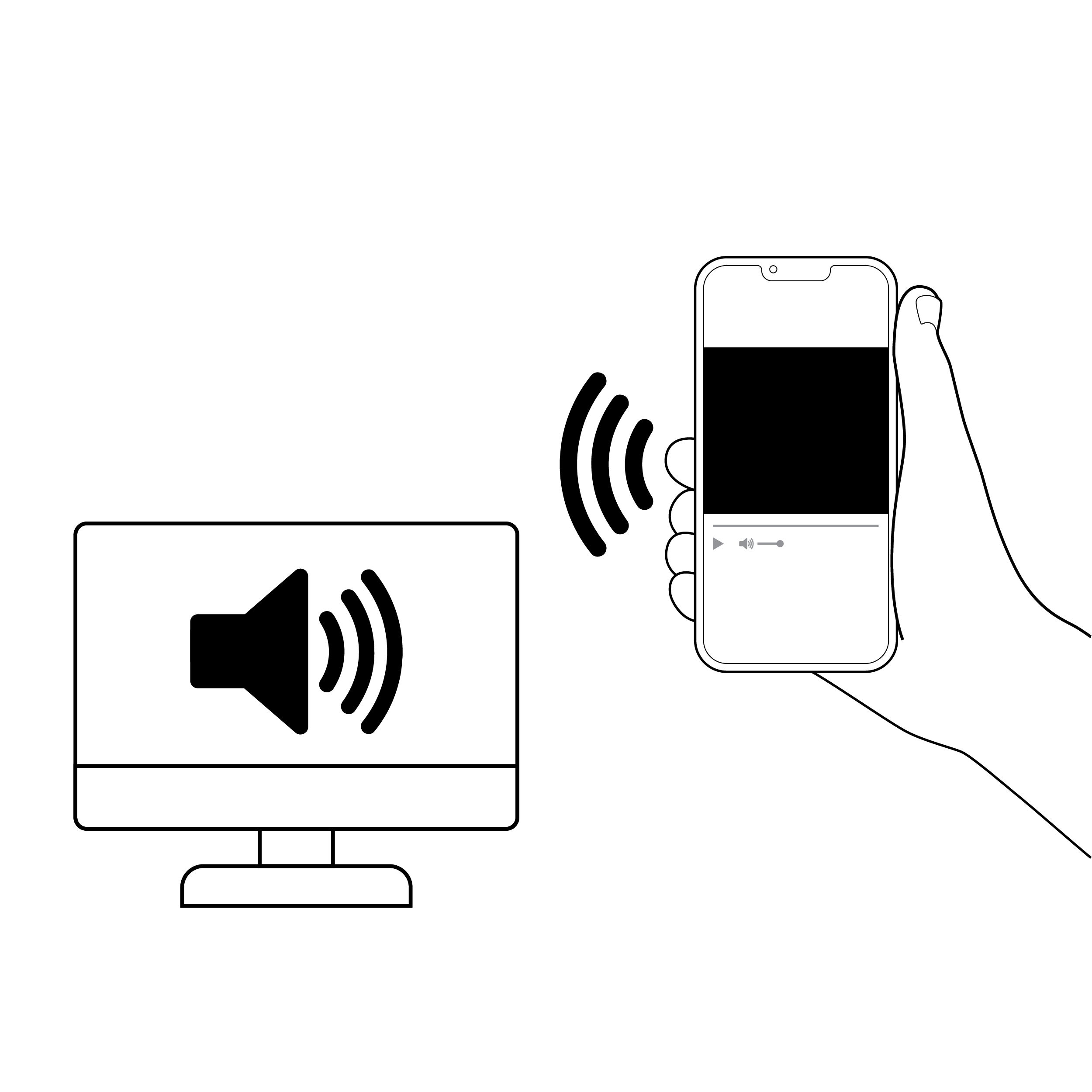
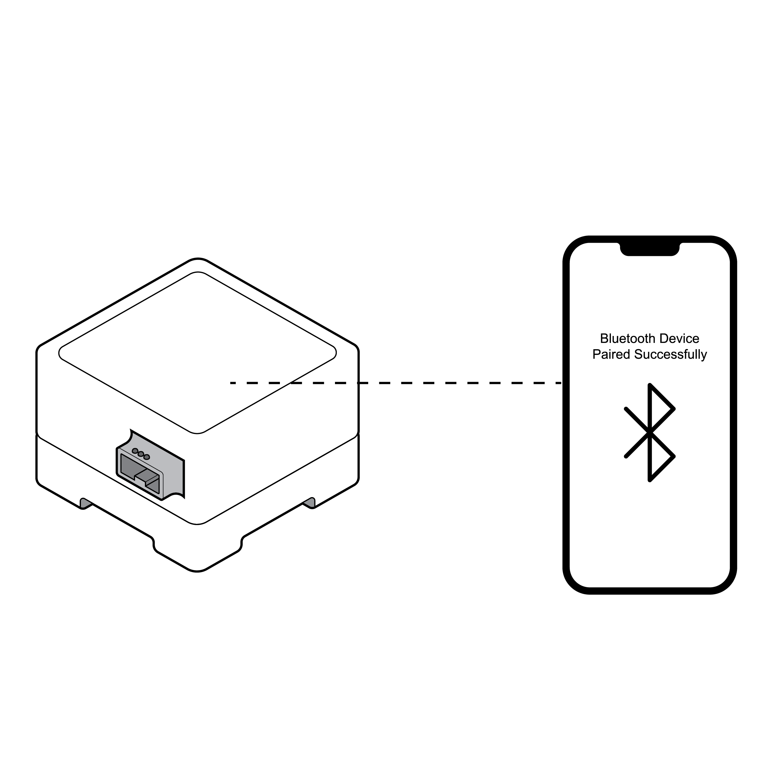 Phone connecting via Bluetooth with visual cues
- Some tests require Bluetooth pairing (connecting a smartphone and another device) to analyze and communicate results. Common pairing methods only provide visual feedback on pairing status.
- Some pairing requires devices to be placed in proximity with inadequate feedback on whether the devices are in or out of range.
Recommendation
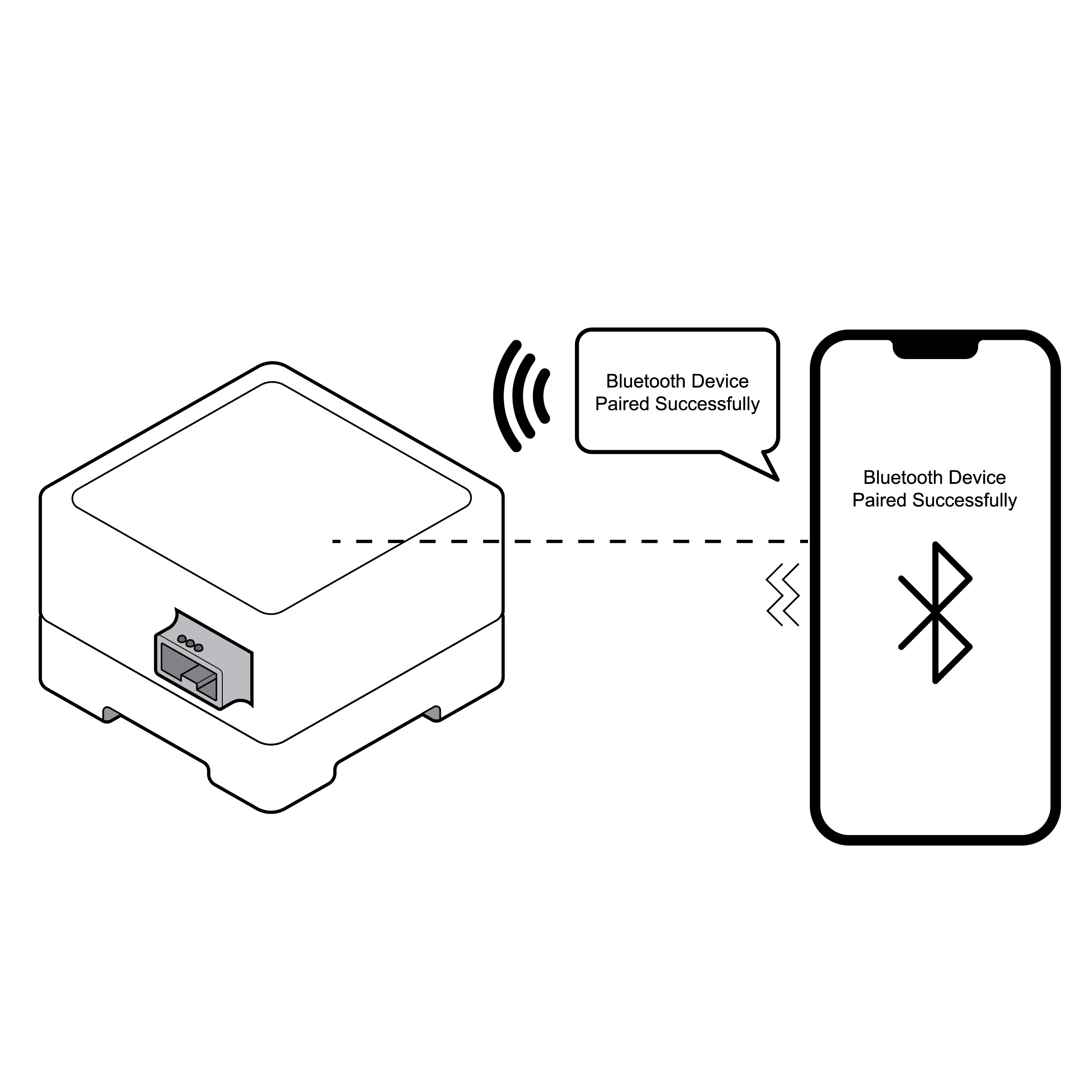 Phone connecting via Bluetooth with audio cues
- Provide multi-modal, clear feedback on pairing status (e.g., audible and/or haptic feedback).
- If devices are required to be placed a specific distance from each other, provide device positioning recognition to the user.
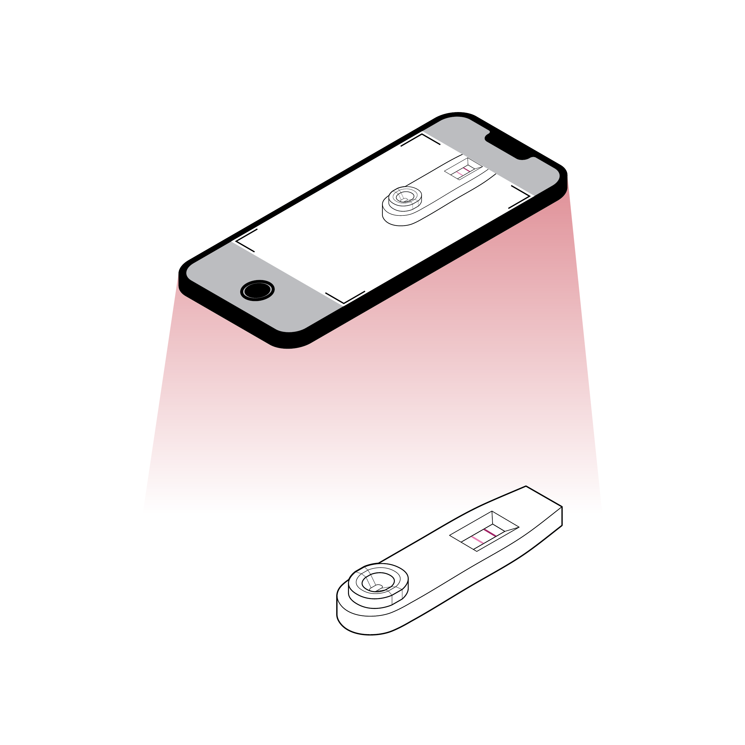
10.2 Test Analysis
Issue
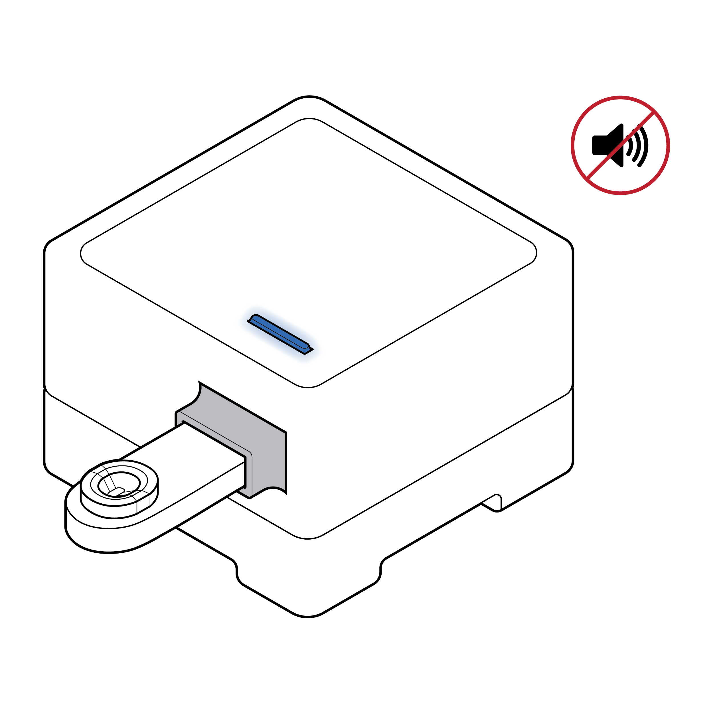 Lack of processing cues
- There is no clear feedback, visual or otherwise, indicating that the sample has been properly entered into the device and test analysis is underway.
- Most tests only indicate visually that the sample has completed processing and results are available.
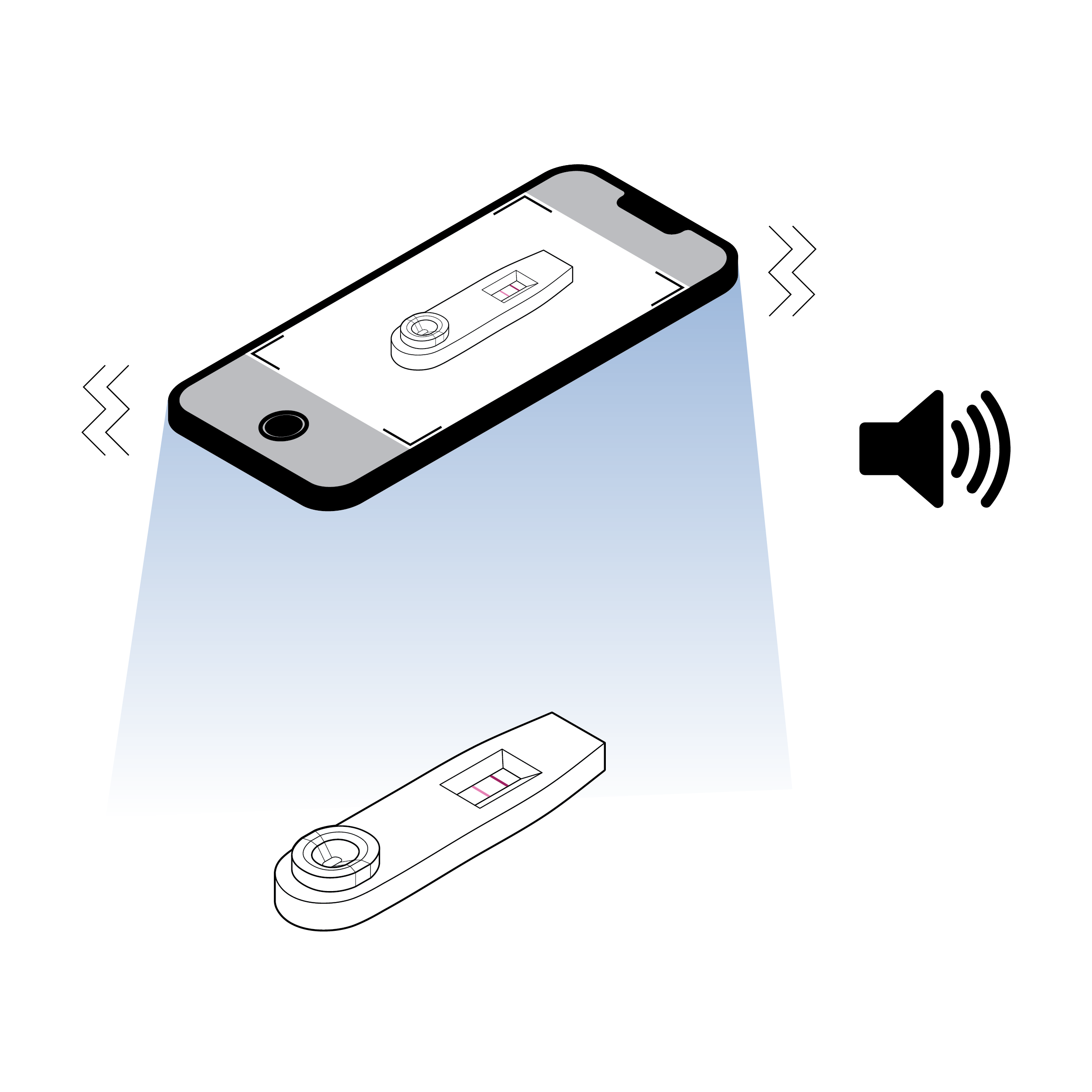
Recommendation
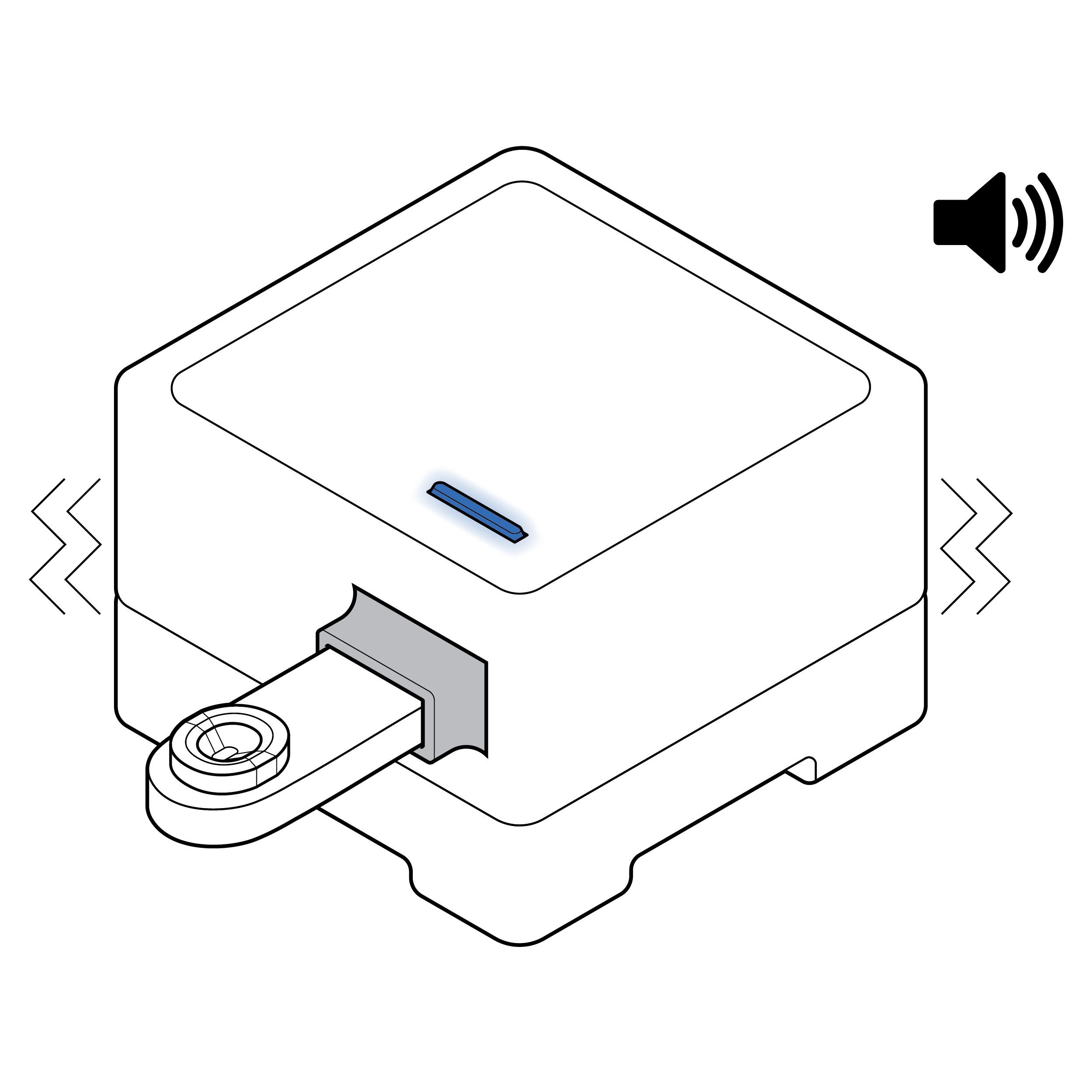 Visual and auditory cues
- Provide visual, auditory, and/or haptic cues letting the user know that the sample has been properly entered into the device and is processing.
- In addition to visual cues, consider adding auditory and/or haptic indications that results are available.
10.3 Results Communication
Issue
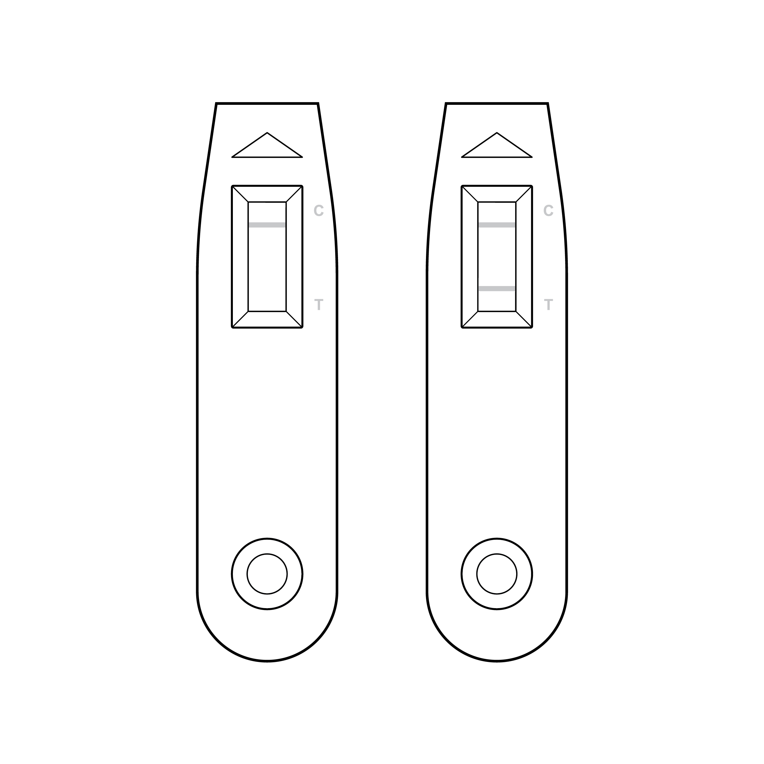 Faint result lines and illegible labeling
- Control and/or test lines on the test strip within the cassette can be very faint.
- Result labeling on the cassette may be too small or low contrast and may not align exactly with the associated position of the control and test lines in the results window.
- Results of cassette-based COVID-19 home tests are typically displayed in a ‘raw’ format that may be misinterpreted by lay users (e.g., ‘C’ indicating control could be misunderstood as ‘C’ indicating COVID-19).
- When cassette labeling appears in multiple orientations, the user must rotate the cassette to read labeling.
- A transparent shield over the results window can create optical challenges.
Recommendation
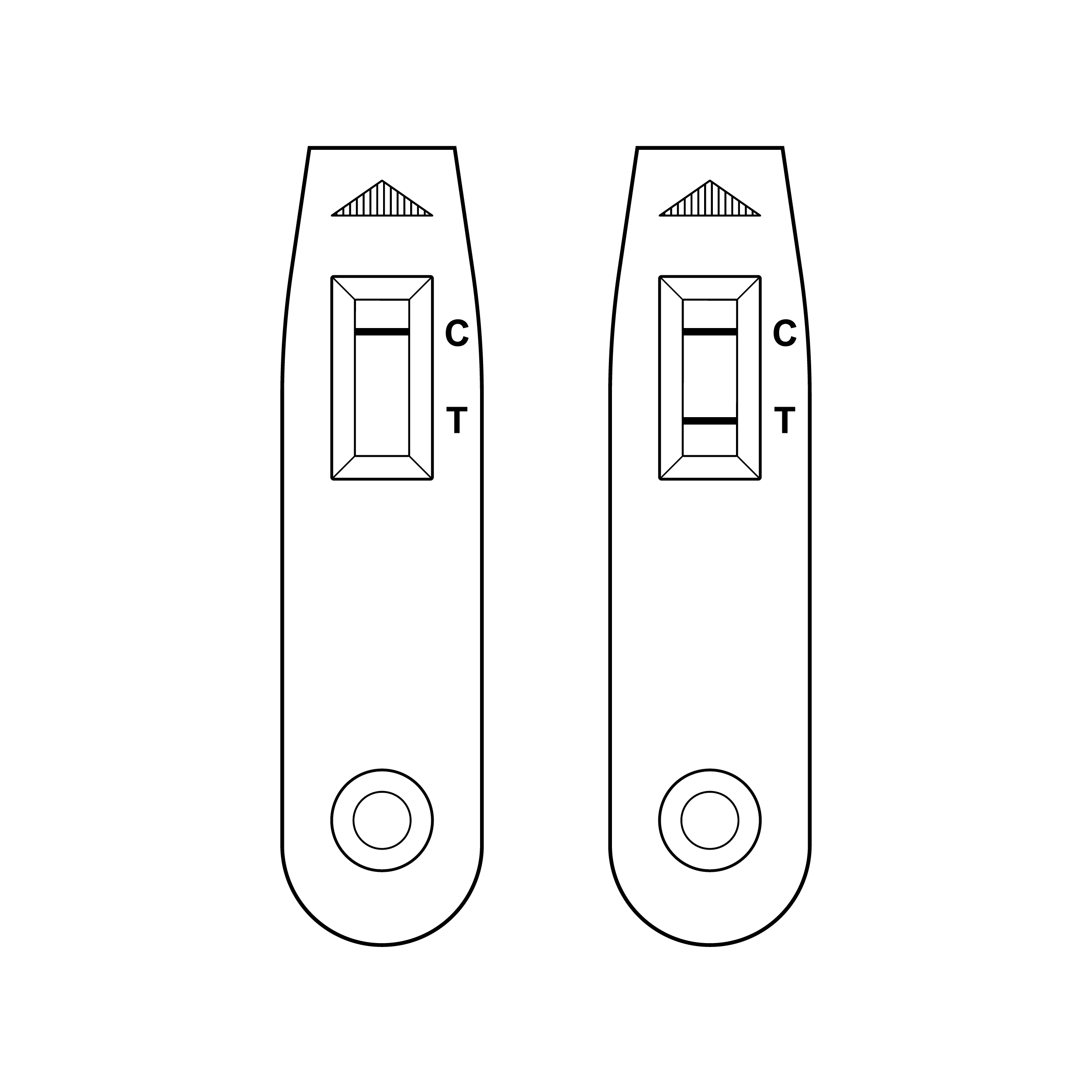 Bold result lines and legible labeling
- Optimize chemistry in LFAs to maximize control and test line contrast and sharpness.
- Result labeling should comply with recommendations in 8.1 Legibility.
- Ensure cassette labeling aligns exactly with the position of the control and test lines in the results window.
- Abbreviations should be adequately defined in the test instructions (see also 9.5 Cassette for additional labeling suggestions).
- When feasible, design the results status to be self-communicative and interpreted without the need for a key/legend (e.g., spell out ‘Control’ and ‘Test’ on cassette.
- Cassette labeling should all be in the same orientation.
- If cassette design includes a transparent shield over the results window, carefully consider how optics (e.g., refraction or reflection) might interfere with results interpretation.
Issue
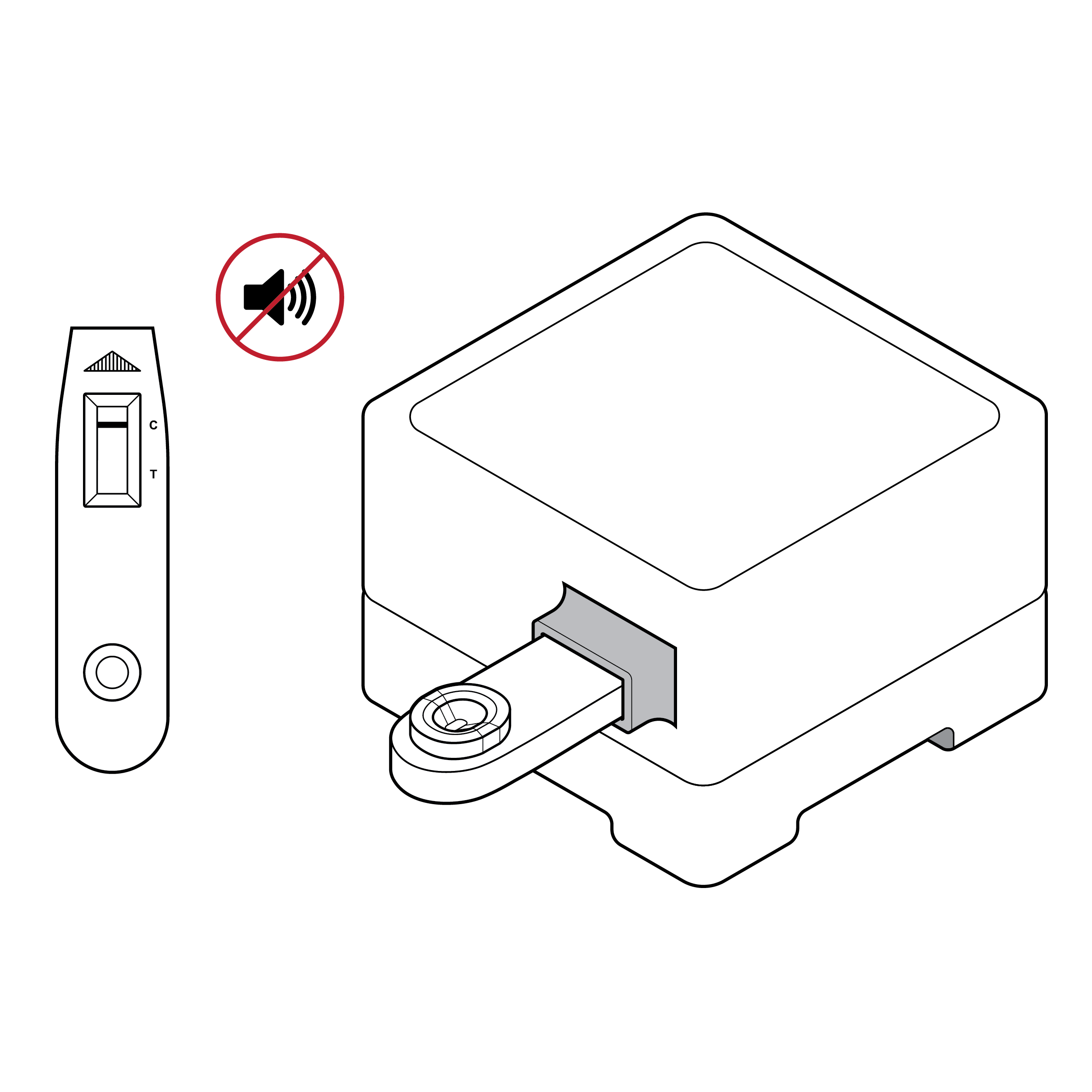 Lack of sensory feedback
Most tests only communicate results visually.
Recommendation
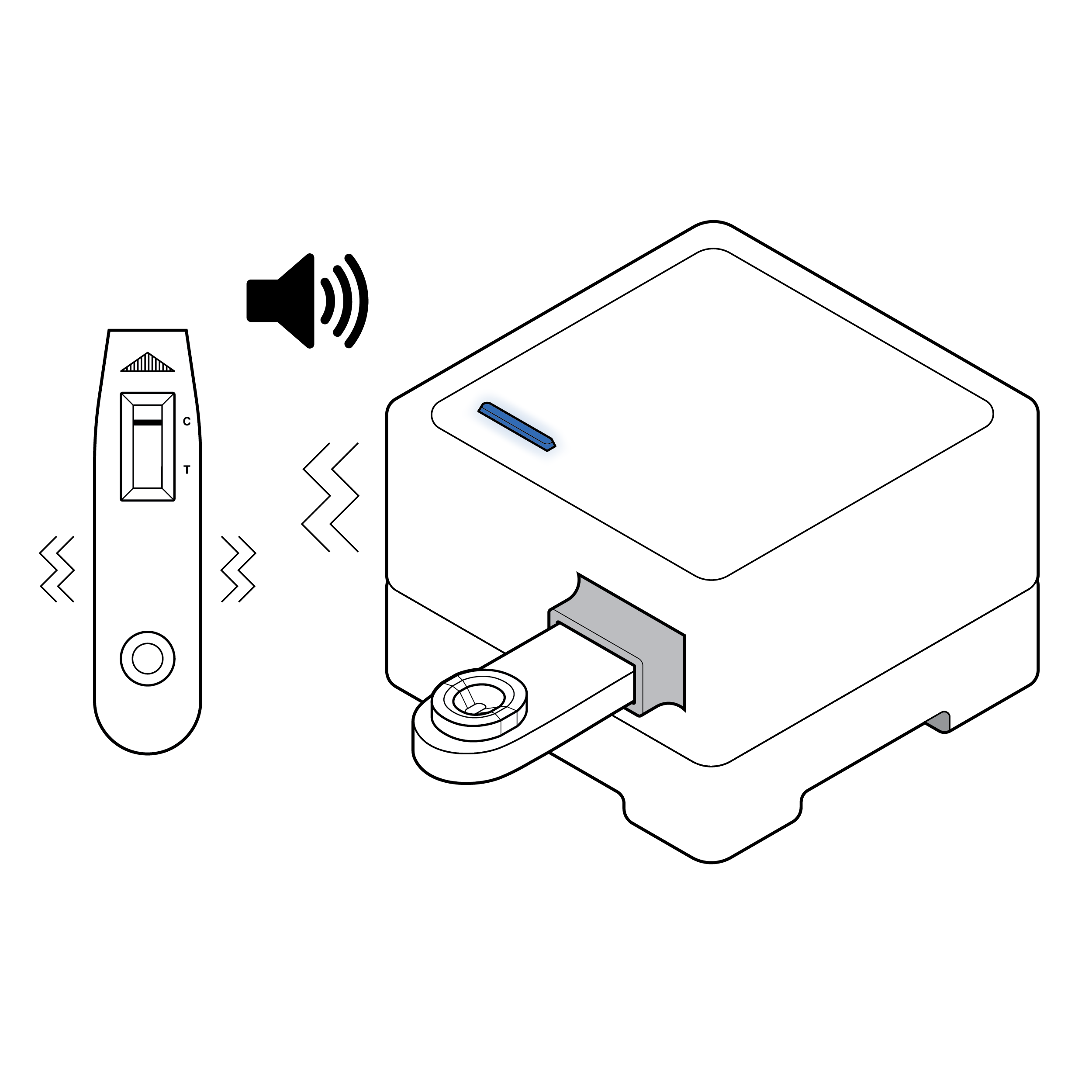 Visual, auditory, and haptic feedback
Consider adding nonvisual cues such as audible and/or haptic feedback to communicate results.
11. References
- Centre for Excellence in Universal Design, National Disability Authority. (2020). What is Universal Design. https://universaldesign.ie/what- is-universal-design/ [Return to endnote 1]
- U.S. Food and Drug Administration, Center for Devices and Radiological Health. (2018). What We Do. Fda.gov. https://www.fda.gov/about-fda/ what-we-do [Return to endnote 2]
- Sutton, B. U.S. Food and Drug Administration. Overview of Regulatory Requirements: Medical Devices – Transcript. (2021) https://www.fda.gov/ training-and-continuing-education/cdrh-learn/ overview-regulatory-requirements-medical- devices-transcript [Return to endnote 3]
- U.S. Food and Drug Administration, Center for Devices and Radiological Health.(2020). Classify Your Medical Device. https://www.fda. gov/medical-devices/overview-device-regulation/ classify-your-medical-device [Return to endnote 4]
- U.S. Food and Drug Administration. Center for Devices and Radiological Health. Division of Industry and Consumer Education. (2019) https:// www.fda.gov/about-fda/cdrh-offices/division-industry-and-consumer-education [Return to endnote 5]
- U.S. Food and Drug Administration, Center for Devices and Radiological Health. (2019). CDRH Learn. https://www.fda.gov/training-and- continuing-education/cdrh-learn [Return to endnote 6]
- 21CFR820.30. https://www.accessdata.fda.gov/ scripts/cdrh/cfdocs/cfcfr/cfrsearch.cfm?fr=820.30 [Return to endnote 7]
- U.S. Food and Drug Administration, Center for Devices and Radiological Health. (2016). Applying Human Factors and Usability Engineering to Medical Devices. [Return to endnote 8]
- The Association for the Advancement of Medical Instrumentation. (2009). Human Factors Engineering – Design of Medical Devices. ANSI/ AAMI HE75:2009 (R2018) [Return to endnote 9]
- U.S. Food and Drug Administration. How to Use Consensus Standards in Premarket Submissions. https://www.fda.gov/media/147787/download [Return to endnote 10]
- U.S. Department of Health and Human Services Food and Drug Administration. (2014).VIII. Human Factors. In Design Considerations for Devices Intended for Home Use. Guidance for Industry and Food and Drug Administration Staff. (pp. 13–14). [Return to endnote 11]
- TPGi. Colour Contrast Analyser (CCA). https://www.tpgi.com/color-contrast-checker/ [Return to endnote 12]
- International Organization for Standardization. (2022). Plain language – Part 1: Governing principles and guidelines. (ISO Standard No. 24495-1:2022). https://www.iso.org/ standard/78907.html [Return to endnote 13]
- Federal Plain Language Guidelines (2011). https://www.plainlanguage.gov/ [Return to endnote 14]
- National Eye Institute. (2019) Types of Color Blindness. https://www.nei.nih.gov/learn-about- eye-health/eye-conditions-and-diseases/color- blindness/types-color-blindness [Return to endnote 15]
- National Library Service for the Blind and Print Disabled (NLS), Library of Congress. NLS Factsheet: About Braille. https://www.loc.gov/ nls/resources/blindness-and-vision-impairment/braille-information/about-braille [Return to endnote 16]
- International Organization for Standardization. (2021). Medical devices – Symbols to be used with information to be supplied by the manufacturer – Part 1: General requirements. (ISO Standard No. 15223-1:2021). https://www. iso.org/standard/77326.html [Return to endnote 17]
- Web Content Accessibility Guidelines (WCAG) 2.1 W3C Recommendation. (2018). https://www. w3.org/TR/WCAG21/ [Return to endnote 18]
- W3C Web Accessibility Initiative, WCAG 2 Overview. (2023). https://www.w3.org/WAI/ standards-guidelines/wcag/ [Return to endnote 19]
- W3C Working Draft. Mobile Accessibility: How WCAG 2.0 and Other W3C/WAI Guidelines Apply to Mobile. (2015). https://www.w3.org/TR/2015/ WD-mobile-accessibility-mapping-20150226/ [Return to endnote 20]
- Department of Justice and the General Services Administration. (2023) Section 508 Report to the President and Congress: Accessibility of Federal Electronic and Information Technology to Congress and the President. https://www.justice. gov/crt/page/file/1569331/download [Return to endnote 21]
- En-Vision America, ScripTalk. https://www.envisionamerica.com/scriptalk-station-for-patients [Return to endnote 22]
- CVS, “Hi! It’s your prescription talking.”, Spoken Tx™. https://www.cvs.com/content/pharmacy/ spoken-rx [Return to endnote 23]
- W3C Web Accessibility Initiative, Media Players in Making Audio and Video Media Accessible. (2021) https://www.w3.org/WAI/media/av/player/ [Return to endnote 24]
- Digital.gov, U.S. General Services Administration. (2020). 508 Accessible Videos – Use a 508-Compliant Video Player. https://digital. gov/2014/06/30/508-accessible-videos-use-a- 508-compliant-video-player/ [Return to endnote 25]
- Section508.gov, General Services Administration. (2022) Create Accessible Video, Audio and Social Media. https://www.section508.gov/create/video- social/ [Return to endnote 26]
- Digital.gov, U.S. General Services Administration. 508 Accessible Videos – How to Make Audio Descriptions. (2022). https://digital.gov/2014/06/30/508-accessible-videos-how-to- make-audio-descriptions/ [Return to endnote 27]
- W3C Working Group Note 7. (2016). Techniques and Failures for Web Content Accessibility Guidelines 2.0. https://www.w3.org/TR/WCAG20-TECHS/Overview.html#contents [Return to endnote 28]
- Web Content Accessibility Guidelines (WCAG) 2.2. (2023). W3C Candidate Recommendation Draft, Success Criterion 2.5.8 Target Size (Minimum). https://www.w3.org/TR/WCAG22/ [Return to endnote 29]
- U.S. Department of Justice Civil Rights Division. (2010). 2010 ADA Standards for Accessible Design, 309.4 Operation. https://www.ada.gov/ law-and-regs/design-standards/2010-stds/#top [Return to endnote 30]
- Villafañe, J. H., Valdes, K., Bertozzi, L., and Negrini, S. (2014). Minimal clinically important difference of grip and pinch strength in women with thumb carpometacarpal osteoarthritis when compared to healthy subjects. Rehabilitation Nursing. [Return to endnote 31]
- Greiner, TM. US Army Natick Research Development and Engineering Center, MA., Anthropology Branch, Behavioral Sciences Division, Soldier Science Directorate. (1991). Hand Anthropometry of U.S. Army Personnel. https://apps.dtic.mil/sti/pdfs/ADA244533.pdf [Return to endnote 32]
- Human Factors and Ergonomics Society. (2007). Human Factors Engineering of Computer Workstations. ANSI/HFES 100-2007. [Return to endnote 33]
RADx Tech Accessibility Program Webinar
On February 28th, 2023, NIH RADx Tech accessibility program team members delivered a webinar titled “COVID-19 Accessible Testing – Best Practices.” This presentation was part of the 2023 RADx Tech Webinar Series and included a preview of key insights from the June 2023 “Best Practices for the Design of Accessible COVID-19 Home Tests” publication. The materials are available as a webinar recording on YouTube and as presentation slides in a PDF format.
